There is nothing so dramatic as a sea and cliffs, sometimes a sandy shore – but rugged rocks and trees clinging on for dear life always catch my eye. Northern California has its share, as do Oregon and Washington. All over the world such drama is there for our pleasure and to keep us humble.
My approach, thanks to having a sketchbook – my lovely sketchbook! – is becoming more deliberate and more patient. I am working with larger planes of color, going for the grand before homing in on the detail. I also wanted strong contrast of sun and shadow. Simplicity. Clarity. Less is more, etc. As well, warm and cool.
I am honestly very pleased with how this painting turned out. I think I will leave it at that!
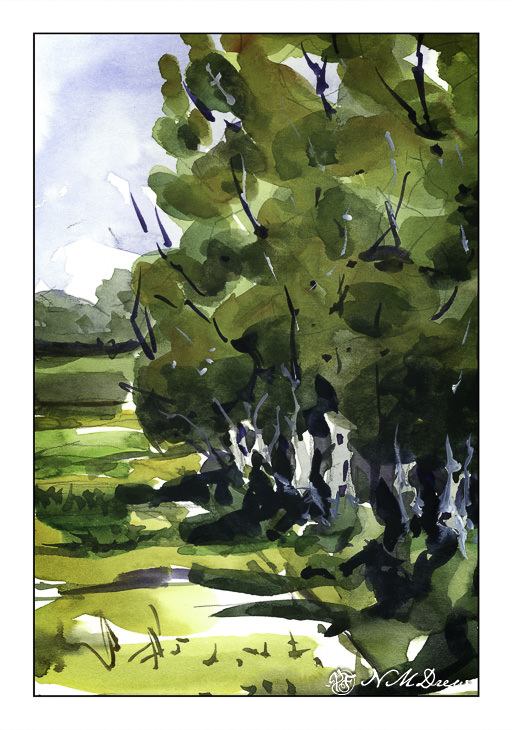
California is losing its farmland – development of tract homes played a big part in the loss of arable land. Now it’s floods and drought. But in a more perfect world, eucalyptus trees were planted between fields to keep the damage from wind – erosion – down, especially when the east winds blew.
Here, more working with broad swaths of similar colors laid out in a wash. I did this one in a few layers. The first thing I did was the sky and the tree trunks. From there, a pale layer of varying color for the tree foliage, and second and third layers of the same, increasing in darkness. At the end, the field and track and a bit of stuff in the distance. Branches in both dark paint and in gouache.
I have been using Strathmore “Vision” 140# paper for this and other studies, and it is not too bad! Reasonably priced, and it seems to be holding up quite well to wetness and working. I haven’t tried larger sheets, but this may make me interested for practice.
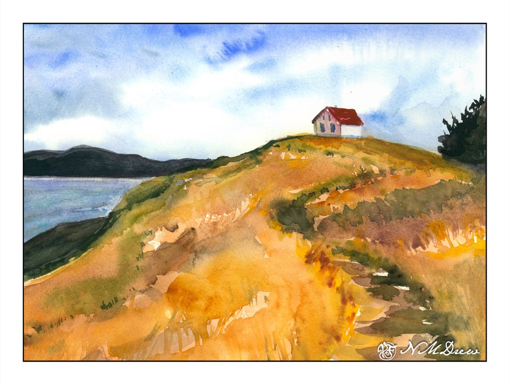
One of the things that is often a point of contention for many who work in watercolor is when to stop – when not to paint any more – when is overworking the painting happening. Today’s study is of a lone building on Saturna Island in British Columbia. It sits on a hill, silhouetted against the sky.
The building itself is not well done – it is overworked. That, though, was not the point of the painting. The point of the painting is the hill up to the house – paint it, work the colors, create depth and dimension and a sense of the vegetation. I worked wet-in-wet; put a few glazes on; re-wet the paper and painted again when I needed to add some detail, such as the shape of grasses or vegetation. I also wanted to create a way to get the eye up the hill to the house, and the pathway itself does the trick.
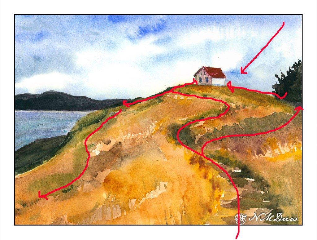
Composition is also something I was considering. How am I leading the eye to that little building? Above is a an overlay with some of my eye-deas. I can think of more, too, but I could also go nuts analyzing things. The darks acted as a balance on either side of the hill, but the tree on the right is too big as far as I am concerned. It just kept growing – spring??
Finally, values. Lights, darks, mediums. Is my contrast working? If I look, I see the zig-zag of the darker path leading up the hill, but more subtle is the light zig-zag to its left. The darker values on the right of the hill repeat the zig-zag. Various areas of light and dark point your eye toward the building.
I am pleased with the hill in this painting, and that is what I wanted to focus on. It is an oddly shaped mass of color, but within it are variations of all sorts – warm and cool, dark and light – that give it shape and depth.
My current focus on watercolor is planes and dimension. I am trying to break down my ability to create structure, and for me the natural shapes of hills and trees are far easier to work on for now, although buildings will come in the future. Negative painting was a first study, but that surrounds as well as creates other planes and dimensions.
As we move into winter, I think of the places I lived when I was a kid, where 6 feet of snow was a “mild” winter. Today, the low was about 56 F, and the high about 78 F. Very different – and as an adult, I admit to preferring a lack of snow to an abundance! Nonetheless, the seasonal changes are apparent here, just more subtle – the shift in light, the change in the blue. Even the air smells different.
Working with Inktober, I can feel a shift in how I am approaching drawing, and painting. I am simplifying but being more specific about the brush or pen size I choose and how to deploy a line or a brush stroke. While there is a lot to be desired here – such as a sense of architectural reality and non-topsy-turvey houses – I had a lot of fun looking at areas of color as a suggestion, not a reality, as a plane rather than the detail I normally hone in on.