
Back in me days in the Outback it took a bit to keep food on the table – snake and tasty ‘roo stoo. (You’re invited, too!).
AI conjures dinner, just like that!

Back in me days in the Outback it took a bit to keep food on the table – snake and tasty ‘roo stoo. (You’re invited, too!).
AI conjures dinner, just like that!
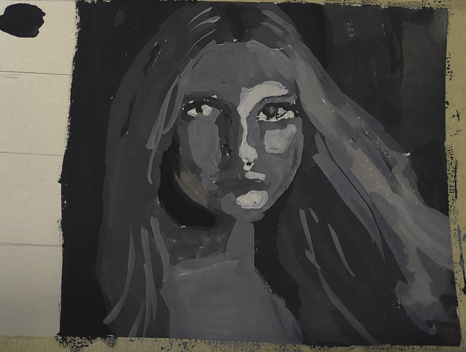
I just recently realized that I can use Photoshop to help me create shades of grey in a photograph. This is particularly useful when trying to render a portrait into a painting. Portraits are very difficult to produce with any reliability as a painting because the face is subtle in construction, and thence, subtle in gradation. My skills are lacking in this arena.
To begin, I found a portrait on Pixabay. From there, I imported it in PS and applied an “artistic” filter, using the “cutout”, keeping defaults. I then printed out the photo, sized to 5×7, and gridded it out to a correspondingly sized piece of paper.

Once done, I chose gouache as the medium to use – already out on the desk, and easy enough to use without making myself crazy. First done was all the darkest values on my drawing.

I just lay down the black in most of the areas that looked darkest to me. I missed a few areas, but since gouache is able to be applied over previous layers, I was not too worried. Also, as this is the first time I have ever done this, I was not too concerned about perfection – the experience was more important.
From there, some white was mixed in with the black to produce the second darkest shade. Truthfully, I did not mix in enough white as it was nearly the same shade as the black when it dried. That is the nature of gouache – it dries darker than it goes on. I had to lay on a second and third layer.

Next, the third shade of grey. This I tried to push into being lighter than I thought I needed. From there, the highlights as light as I thought I needed. Again. the white was really a light grey that dried rather darker than expected.
Finally, I increased the white, using titanium white instead of zinc white (the former being more opaque than the latter) and did some touching up and adding of detail.
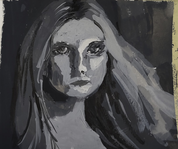
This is the final image. The paint is cracking a bit as it is really thick in some areas. Given this is 5×7 or less, the detail is not too bad, but I wouldn’t like to have this a portrait of myself! The goal of doing values is what is key here – light to dark, catching the face. Much room for improvement, but what I set out to do – a value study – worked out.
I plan to use this method with PS to do more portrait studies. Tools like this aren’t cheating – they help you see what is in front of you more clearly. Gridding the photo onto paper helps keep proportions relatively correct. I would like to do this on a bigger surface with acrylic, perhaps limning in only the white and black values, and from there adding the different shades of grey before moving into a final white.
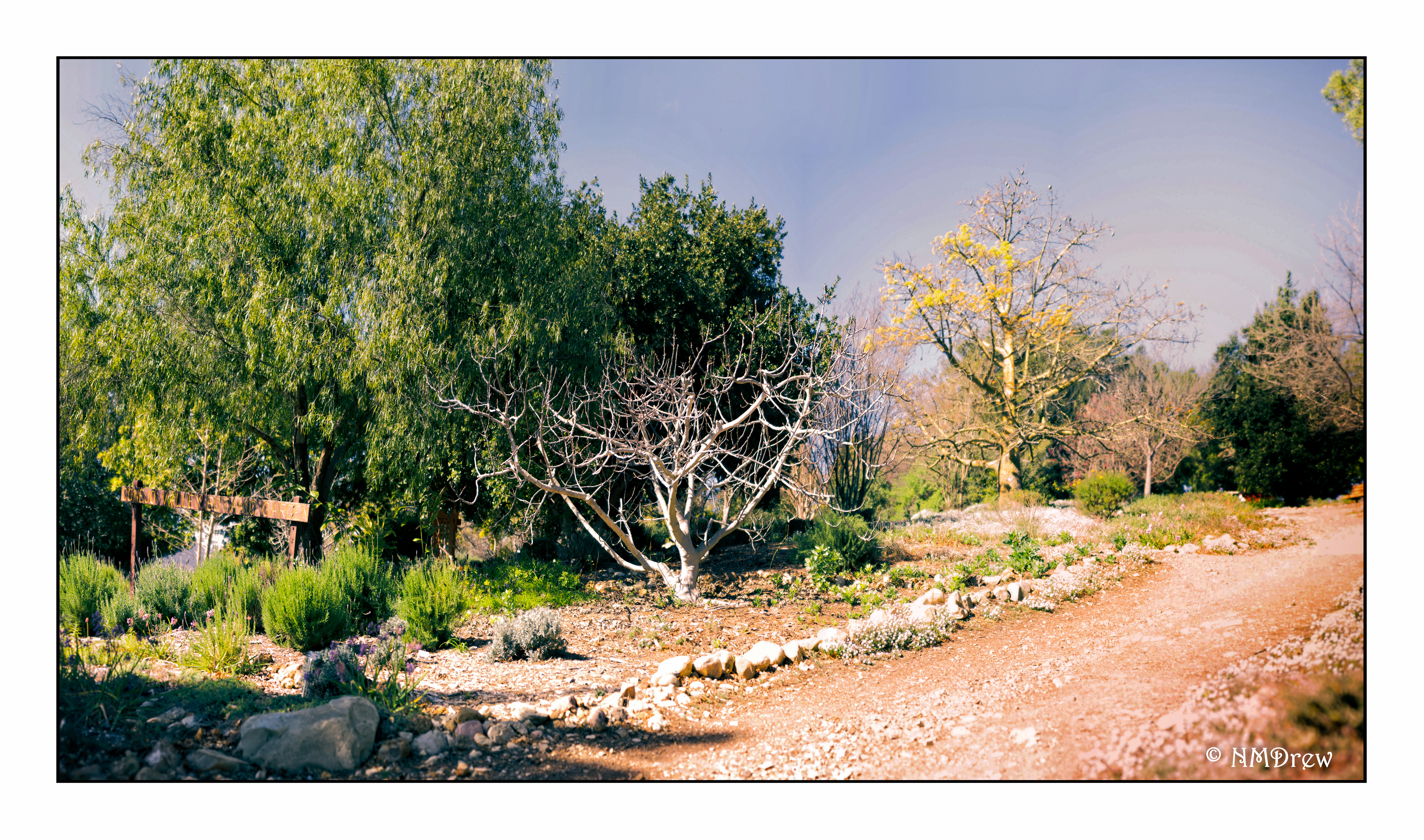
My interest in panoramas was sparked by the wedding photography of Ryan Brenizer and what has become called the Brenizer Method. Essentially, Ryan Brenizer became famous for creating a very narrow DOF in panorama portraits of couples. I think they’re great! I have used it in landscapes and still lifes with some success. It’s where digital cameras are so good to have in your camera collection.
Taking panoramas is fun with a DSLR or whatever D style camera you use. I think smaller numbers of pixels help if you tend to shoot a lot of images. I know I do. My Df is a 16 megapixel camera, and sometimes i just take a scattergun approach to shooting – lots of images covering more area than I think I want. I try to take a picture of my hand to show where my pano pictures begin and start.
To get consistent image exposure, it’s necessary to use manual exposure and turn off auto focus. Consequently, I like to take an image using my preferred f/stop and do everything else on auto. Test images are important and worth the few minutes required to do. This will give me my shutter speed and iso. If the image is too light, I might drop the EV and so on. Once I like what I see, I set up the manual techniques, take a picture of my hand – often out of focus – and begin to take pictures. On a conservative day, I take maybe 20 images; on others I have taken as many as 130 or so. Fewer images taken works out better – easier on you (that camera gets heavy) – and easier on your software and computer when stitching the images together.
I have also done panoramas using digitalized film images.
Once done, I import my images into LR. Looking for my hands, I export the images into subdirectories labeled, conveniently, Pano 1, Pano 2, etc. Use whatever you like. During the export, I change everything in size, using, for instance, 1024 as the length of the long side of the image. When you have a 100 images, reducing in size is important. You can also apply filters globally across these smaller images. These details I assume you know how to do, or learn.
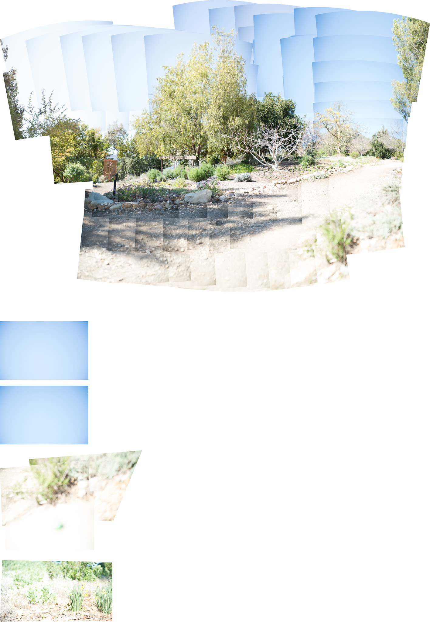
After reducing all the images in size, I do a Cntl-A in the subdirectory to get all the images, and do, in LR, Edit, Merge to Pano in PS (down at the bottom of the pop-up menu). Off to PS and after clicking OK, the magic begins. It can take awhile. The nice thing about using PS as opposed to LR for a photomerge is that any ones which cannot be used in the pano are kicked to their own spots in the final image.
Here is an example of a panorama I took the other day. All told, 137 images. You can see that PS decided some did not belong in the final merge.
This pano was also just plain bad. I redid it and this was the result:
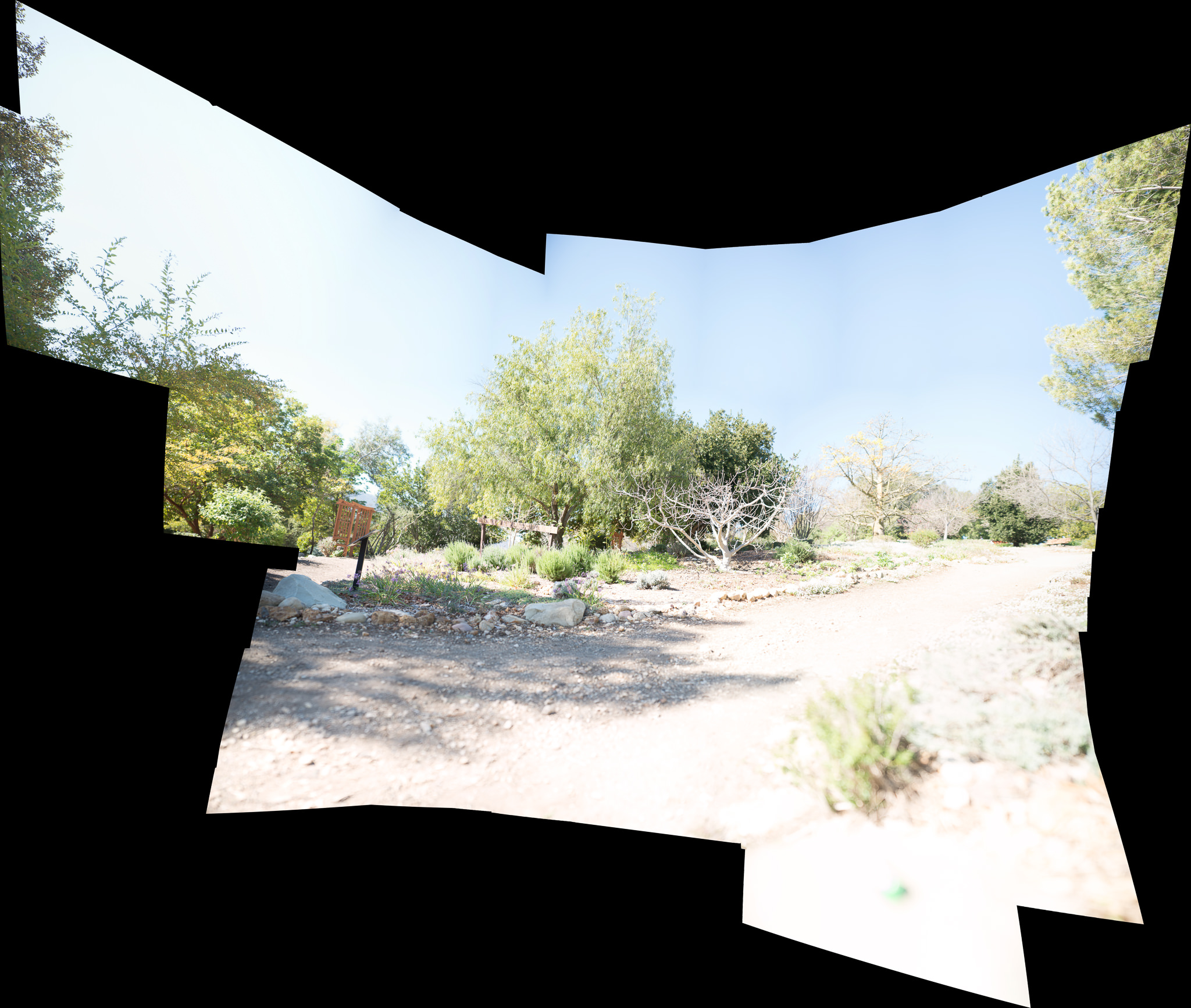
The panorama in PS can be more than huge! Make sure you go to Layers and choose Flatten Image. If you try to save it without doing this, PS will bug you to remind you. Do it. Then save it and it will go back to whatever directory you have the original images in LR.
After cropping and editing, the final result was this one you see at the top of this post.
Pretty lurid, wouldn’t you say? I would, for sure!
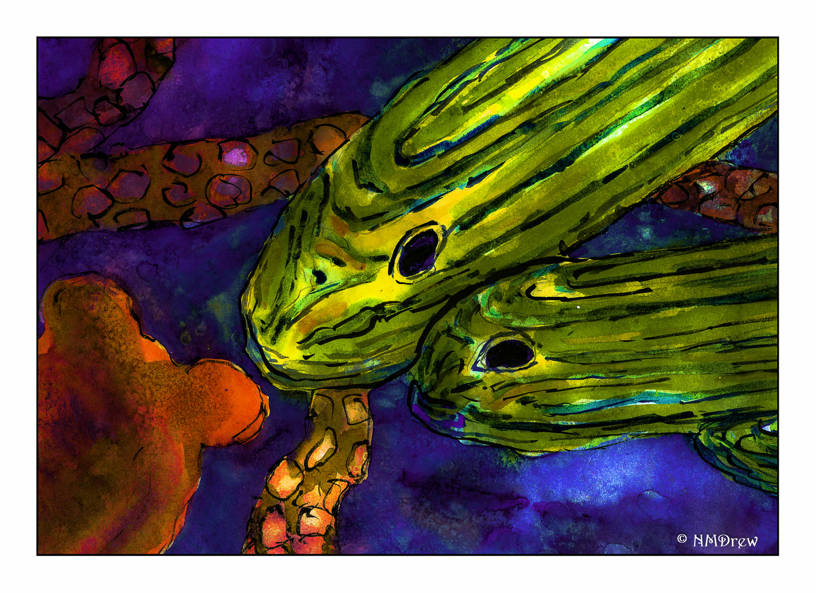
I scanned this painting, and in Lightroom and Photoshop, pushed and pulled the colors until they were off the chart – but got the effect I wanted. Tropical fish in the deep sea have so many magical colors. I like it much, much better than the original. And, it is interesting what one can do in the computer age – certainly I could not have accomplished this with my current sets of paints.
Gotta swim in the digital world now and again!
For 35mm film, you cannot go wrong with a Pakon scanner – it comes in a lot of flavors and price ranges. The problem is that it is no longer being manufactured. Models vary in price and availability, usually on eBay. On the other hand, the Epson V600 scanner is still being produced, and is about $200 US, depending on where you shop. It is a great way to scan your own medium format film.
As we all know, YouTube is an endless resource for information, opinions, silliness, and instruction. One photographer whose videos I enjoy, and learn a great deal from, is Matt Day. In particular, his video on using the Epson V600 is invaluable. The video below is for scanning black and white film.
Scanning black and white film is easy, but one of the issues you might find is that the Digital Ice is not useable with b&w. Digital Ice is the software which reduces scratches and dust on negatives as they are being scanned. It works great with color film – scan the same color negative twice, and you will see the differences. The reasons why are found on the web, but essentially it is because the chemical content of color and b&w film are different. Therefore, having a very clean negative for b&w scans is necessary, although you can remove dust manually through software, such as Photoshop or On1 Perfect Photo Suite / Photo 10. NB: Digital Ice will work with b&w C-41 processed film (color film is C-41).
The Epson Scan software is quite robust. It does a great job, and has a lot of tools to help the end user modify individual images prior to the final scan – yeah, use the preview for sure! Below is an image of what my settings are in b&w.
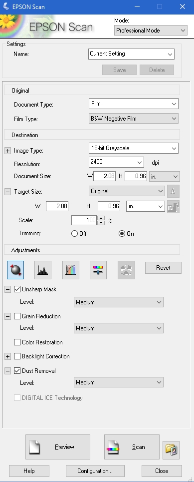
The best way to use the software is to just explore it. Check or uncheck boxes as you desire. Take the time to play with it, to get used to what the software does. Matt’s out-of-the-video settings are very good. I checked the “dust removal” box for a particularly nasty set of negatives – don’t know if I saw much difference, but I didn’t look too closely.
Color negatives have different configurations – as you can see in the image below.

These are what I use, and am fine with them. In the middle of the screen are adjustment buttons – check them out to see what they do (try reading the manual, or googling them, if you need help!). The two items checked are the ones I use – unsharp mask, per Matt’s recommendation, and the Digital Ice, per my recommendation.
Also, do not be lured into much more resolution than 3200, as the files can become very big, and perhaps not worth the size for post-production work. Some people have noted that beyond 3200, quality begins to degrade.
Directly below are three items which are important to look at. The “Preview” button lets you see what you are going to end up scanning. If you watch Matt’s video, you will see how he uses the previewed images to make adjustments. The button labeled “Scan” will be activated once you are ready to roll, but BEFORE YOU SCAN, go to the button directly to the right of the “Scan” button. You must use this to give the final info to the scanner – where to send your scans.

I always save my images to specific file directories, where I keep all my photos that I later import into Lightroom. I save as Tiff, and try to renumber to 001, but if I rescan, I change the file number to 100, and so on. I like having the image folder opening after I scan because then I can double-check my foggy brain and make sure I have done this job! I don’t want my Ektar in my Portra scan folder.
Also, while I think the Epson Scan software automatically detects the film size(s), if you notice anything weird, go to the “Configuration” button on the bottom of the page. Here you will find info for Preview, Color, Film Size, and Other.
Altogether, I like my Epson V600. The price is right for me, and because I am just getting into film in a bigger way, I don’t want to spend too much money – film costs add up quite quickly! Other software helps develop an image to your final liking – as you can see below. The first picture is directly from the scanner, and the second one has been manipulated to the nth degree because it was so crappy (an image from my previous post, Catastrophe in the Darkroom.


Click on the images above to see the crap in the first, and the final clean up in the second.
To clean up the final image above I did the following:
And there you are – a brief review and some post-processing steps.
