Another Class – Lotsa Boats

Once more, a class by Shari Blaukopf, “Sketching Boats: Simple Solutions for a Complex Scene,” has changed my approach to subject matter in watercolor and other media. I think this class amazed me the most in how it affected my own painting. As Shari writes:

I love painting boats, but this course is not really about that. It’s about simplifying a complex scene. So, while boats and their reflections are our ostensible subject, I’ll be sharing my tips and techniques for making visual sense from any scene of complexity.

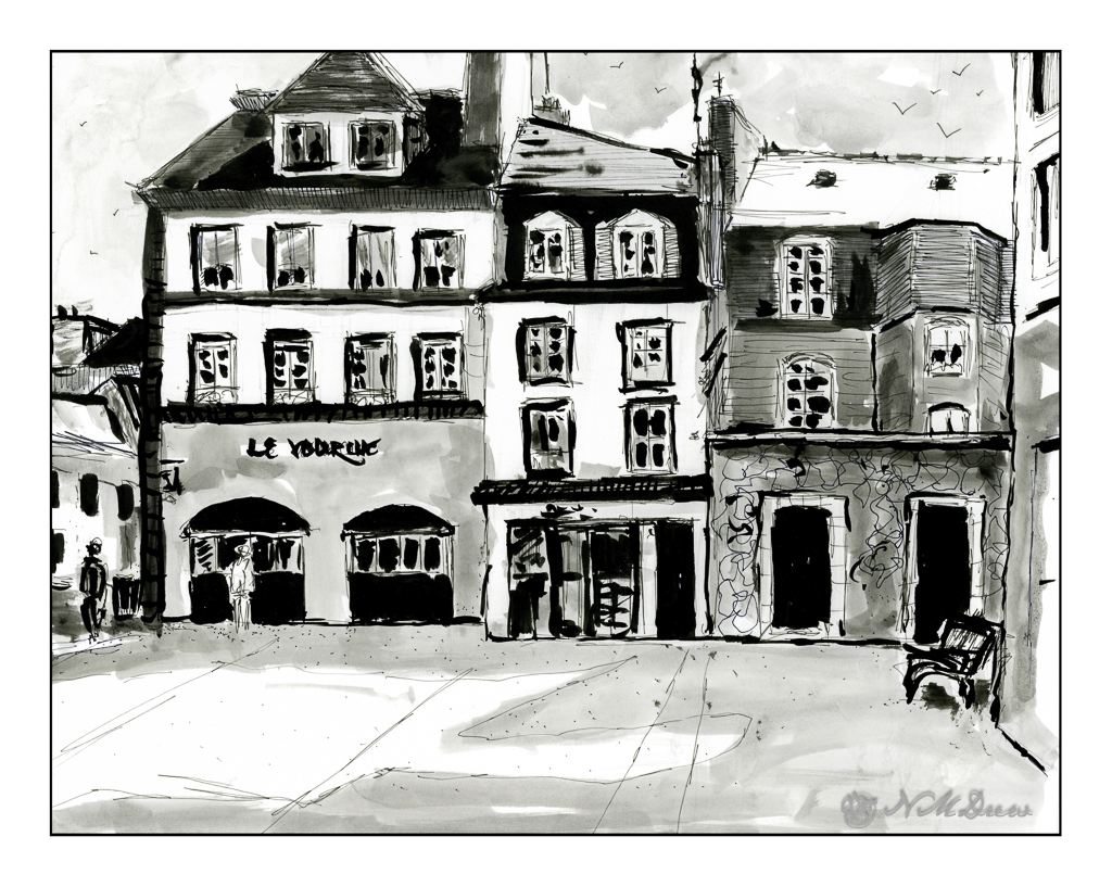
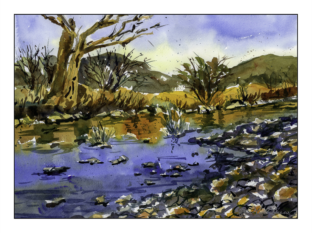
Complex scenes – other than landscapes – overwhelm me when it comes to painting. I just have no idea where to begin. Looking at a bazillion things cluttering up the subject matter and deciding what to do is sometimes so much that it is better to walk away and try something simpler. For me, buildings are often the culprit, and this means city scenes go unpainted. Certainly scenes of harbors and boats and marinas are even more complex as boats sit on the water and are all about the same height – masts being the main difference in a marina full of sailboats. However, this class broke it down quite nicely, and while I am not especially enamored with the results, I am really happy with what I learned from this class and the general success of the painting.

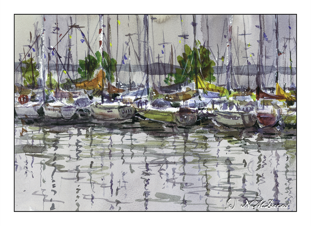
Essentially, the process is very logical and simple. The scene is drawn in pencil. The horizon line is determined, and then the drawing is begun. The boats, as they are the main subject, are drawn on an even level – they all are pulled up against a dock and the water is the surface. There are no hills or valleys. The boats closest to the viewer are drawn in detail, and the rest are suggested with shapes and lines, with their “oh, that’s a boat” qualities indicated when painted.

The sky and the forefront water first were painted along with the land in the distance behind the boats. Areas for larger masts, the white ones, are left unpainted. Then the detailed boats were generally limned in with color. Masts and reflections are indicated in this early period. From there, the painter works back toward the more distant boats and such. Eventually, details are added and final, tiny touches with color and white gouache complete the painting.

In summary: the simplest areas are completed first. The complex areas where detail counts is narrowed down to the first row of boats. Large to small. General to specific.

Writing this does absolutely no justice to Shari’s wonderful short course. I recommend it for watercolorists and any painter intimidated by complex scenes. Her breakdown of a complex scene is very simple – but I personally would never have thought about painting this way!

I was floored by my results – I did not expect to be able to do this painting at all.

Watercolor, short course by Shari Blaukopf, Arches Rough 140# paper, 10×14.

Sketching with Shari, ii

It seems as if my life has been in a frenzy with multiple little tasks to be done before the day’s fun can begin! Today is no exception – banking, bills, dishes, housework – and then little petty things that pop up, like buying a bit of something for dinner as we have no leftovers today. Yes, we have no leftovers! And no bananas.

Nonetheless . . . I did complete the second exercise series in Shari Blaukopf’s most recent online class of pen and ink. This time we have a square somewhere in France. I know because she said so! This time it was to be done with a water soluble ink, of which I have none, so I again played with diluted permanent ink. In a few areas I wet the paper and then drew with a permanent pen, but I don’t like that as it seems to mess up a pen’s nib.

This is done on Bristol paper, very smooth but fairly heavy. The lack of tooth can be very nice when drawing with pen and ink as well as washes. My lines are a bit wonky here and there – earthquake? – and people are not well done, but I struggled most with the park bench on the right!! I will say I don’t like my results as much as I did the first exercise, but this is also a far larger drawing, taking up the entire sheet of 11×14 paper. Still, it was fun and satisfying to do.

Bristol paper, 11×14, ink, pen, ink washes.

Sketching with Shari, i

I think I have purchased every single course that Shari Blaukopf has online! She is such a good teacher, puts together short and affordable courses, and I always learn a few things – or oodles of things – from her! Her latest one is “Sketching Techniques with Pens and Inks” which you can check out here. I do a lot of pen and ink, but figured I would dip into this one just to see what I could learn. And, I did – such as a more clear way to view things from eye level. Ellipses become more round below and above eye level (duh!), and she explained it in a way that made me review my own way of drawing a bit, and perhaps will help me solve some perspective problems.

So, this first one is a potted plant in a planter somewhere in France. It’s a cool planter, too. Shari pointed out that it is good to begin with the big shapes and determine ratios. Top is a circle for the pruned tree or bush. Make a square, insert your circle. Below is the trunk, and beneath that is a large rectangular shape which you can divide into upper pot and lower pot, as well as the stand. Texture a bit for the gravel and stones upon which this planter stands. Shari put in light pencil lines, which she later erased in her video, but I left these in. You can see them very lightly in the painting. Contrast and shape coupled with expressive lines and here we are.

The Victorian door is considerably more complex than the planter, but once more Shari’s clear instructions helped me set up the proportions to make things work. Both the planter and this door came with reference photos, which is very helpful because things can become a bit confusing. This subject was definitely a challenge.

The detail in this subject matter makes for a desire to put it in – one of the good things about pen and ink – but I also needed to make sure I did not lose a sense of light and dark. I used waterproof ink, but to get the greys I put a bit on a plate and used it straight or diluted it as needed. I check the values to the side of the drawing before inking. Lines and dots also add to the texture and contrast of the drawing.

I like my potted plant as it works well with contrast, value, and textures. The Victorian door is more complex. Under the stairs is a second door, and I may go back in and fictionalize it a bit or darken it a bit to the right of the stairs. Something to look at and rethink.

Sailor black ink; fountain pen with Sailor ink; water and brush. Strathmore Bristol paper.

Watercolor Triad – Desert Wash Scene

Well, the electricity is off again. I feel like I am living on a little island because only a few people in my neighborhood are affected. Fortunately, we have our generator! So, light, electricity, internet, and the opportunity to continue with my course on color triads by Shari Blaukopf.

I did the first one, a tropical scene in Florida, and this is the third, the Arizona desert. The second one is winter and since it is cold and rainy outside, the desert appealed to me a bit more. The color triad used here – and easily, too – consisted of New Gamboge (yellow), Ultramarine Blue, and Burnt Sienna. I did not have the New Gamboge, so I mixed Cad Yellow Medium with a bit of Pyrrole Orange to get the color she suggested. These colors are perfect for a late evening in the Arizona desert.

The above scan is with VueScan. It is a bit more subdued than the one below, scanned with Epson Scan. I like both of them, but think the richer colors of the Epson Scan are a bit more to my liking. The warmth of the scene is well done here, and matches my own colors perhaps more closely.

All of Blaukopf’s courses have been a real pleasure to follow. If you like watercolor, I suggest her more than any other online teacher. I never fail to learn something new. For instance, in this class, the golden middle ground, just above the opposite shoreline, included painting the colors up into the trees on the left. From there, at a later point, more detail was added.

The other thing I learned was a really interesting and unique way to do reflections in water. The two colors – golden yellow and then blue – were mixed up in big puddles. First the golden yellow was laid in, with a bead of color at the bottom. Then, with the blue, with space between it and the gold, the blue was brushed in with only a touch onto the golden yellow here and there. This allowed the colors to merge, but not become murky or form blooms. Finally, the darker water of pure ultramarine was mixed with a bit of the golden yellow mixed with burnt sienna.

This triad study was so much fun to do! Time to try some of my own from my own photos.

Watercolors, Arches 140# CP, 9×12. Cad Yellow Med, Pyrrole Orange, Ultramarine Blue, Burnt Sienna.

Color Triad, i

With the threat of fires and losing our house, I feel a bit crazy. We ordered a generator, but it would be ironic that it gets burnt up and our house. No, our house is not in danger, but it is so scary to be contemplating its loss, as well as realize people have died and lost everything. So, it is as if I have to grab onto life and what I love, from people and pets to things I love to do. Watercolor painting is one of them, and the artist whose work I enjoy the most is that of Canadian watercolor artist Shari Blaukopf. Her colors are fresh and cheerful, her personality soothing and calm, and her mini online workshops are always a pleasure.

So, today, her most recent one: Expressive Triads. In painting, a triad is three colors, all primary, but within that the colors vary. This first one, for her tropical scene, consists of Cobalt Teal, Hansa Yellow, and Organic Vermilion. We begin with mixing color swatches.

She also adds ultramarine blue at times, toward the end, to mix really dark values which can vary depending on how much yellow or vermilion you add to the mix. I normally don’t swatch but today it just seems so important to attention to details and savor them.

From there, a piece of 10×12 paper and a pencil sketch for the general shapes of the scene. This is from a trip Shari took to Florida. She points out the warmth and colors of the scene – yellow clouds, teal sky, grey sky / clouds. As she paints, she explains what she does, colors used, brushes, talking as she paints. She suggested that you watch her video and then paint along after watching it. It is a good idea!

Her first scene – one of three – is this one. Her videos explain each section as she does it. So this scene itself has three sections – the sky, the foliage, and finally details. I don’t want to give away her course details, but suffice it to say she is clear. I learn a lot from watching and then doing. The beauty of her video courses is their clarity and brevity and extremely reasonable pricing. I spent about 2 hours with this first painting – watching and then painting.

While her sky is representation of the tropical skies in Florida, here, in the midst of the fires in LA, this sky makes me think of the conflagrations flooding the news. Palm trees and semi-tropical vegetation is common here, so the yellow clouds and sky mixed with grey make me think of smoke and fire on the horizon. Our sky is clear, and let us hope it stays that way. The above picture is scanned unedited with Epson Scan software.

The above scan is with VueScan and is less intense – especially in the yellows. I wonder if I need to permanently switch the software to VueScan as it seems more accurate, at least with this painting.

Final Touches

Below, some final touch-ups to the painting. I blurred out the bloom in the sky below the upper telephone wire, added shadows to the eaves of the house, and painted in some lines to the trunk of the left side palm tree. Once more, scanned with VueScan.

Watercolor, Arches 140# CP paper, short course by Shari Blaukopf.