One thing I love about California is the fact that the geography varies so much! Oceans with flat beaches, oceans with cliffs, mountains with snow and mountains with pine trees, and deserts stretching flat and hot, surrounded by mountains and creating a secret world fascinating and forbidding. Worldwide, deserts host animals and plants and insects which survive on little water, are stark and seemingly dead – but of such beauty. Deserts are not for everyone – familiar and comfortable landscapes full of trees and greenery are very different. It took me a long time to appreciate a more stark landscape than the rolling green hills and woods of the midwest and eastern seaboard.
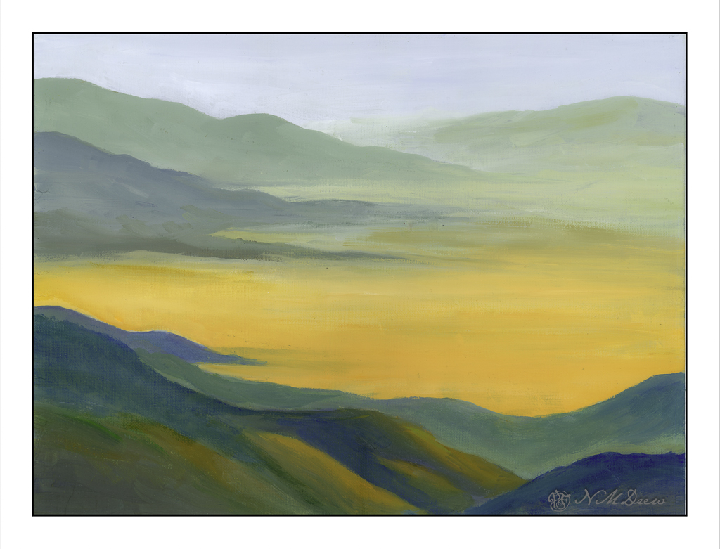
This is a painting I have been working on in my weekly class, inspired by multiple memories and photos taken. I had a limited palette of white, ultramarine blue, Indian yellow, and light green. I tried to catch a golden glow as well as give a yellow-orange cast to the desert floor and hillsides – and create a softly blended painting.
I have been busy. Some things I want to do, others things are in process, being forced to listen to really bad jokes (i.e. What do you call a dinosaur with really good teeth? A flossoraptor.), and just sort of shuffling along. Artwork has been rather time consuming as I have been painting in oils and those take time to dry, so no artwork is easily posted. And I have been working on my ukulele practice, which obviously cannot be posted unless I record myself. And who would want to hear that? I am no musical genius and notoriously tone deaf.
Today my next term of oil painting begins. This is the painting – in progress – I will bring to class this afternoon to work on. It’s been drying a bit so I scanned it rather than photographed it, which never really works out well as far as I am concerned.
It’s somewhere in the southwest. I am trying to make things very soft and blended and it is a challenge. We will see what happens this afternoon. Oil on panel, 16×20 inches. I also have a few small, blank canvases to play on should I get stuck or need to stop in class before the class time is up.
The other thing I have done is restrung a ukulele – my very first time changing strings. There are a lot of videos out there which discuss strings (i.e. nylon vs fluorocarbon, low G vs high G and which one is best). Different bridges have different tie-offs. Tools, too, can be used – or not. Me, I have a tuning peg winder, a wire cutter, a pair of pliers, and a Snark ukulele tuner. It took me an hour to replace 4 strings, but I am rather pleased with the results. I watched this video and learned a lot.
The ukulele I had was not an expensive one with nylon strings. I figured it would be a good idea to use fluorocarbon strings as they are easier on my fingers. I used D’Addario strings and pretty much followed along with Cynthia’s suggestions. It worked out quite well. Now I am playing and tuning the uke, and playing and tuning the uke, and playing and tuning the uke as the strings stretch and settle in. Amazing how often this has to be done.
So, there we are. Not an exciting post, but it feels good to write a bit!
Death Valley is up and off Hwy 395 along the Eastern Sierra Mountains in California. It’s a strange and eerily beautiful place with a lot of surprises and history. It is preserved as Death Valley National Park. The website is filled with great information and it is one of the best places to visit – in the right season, and in the right weather. People die in the desert because they do not understand it, so if you go, be careful!
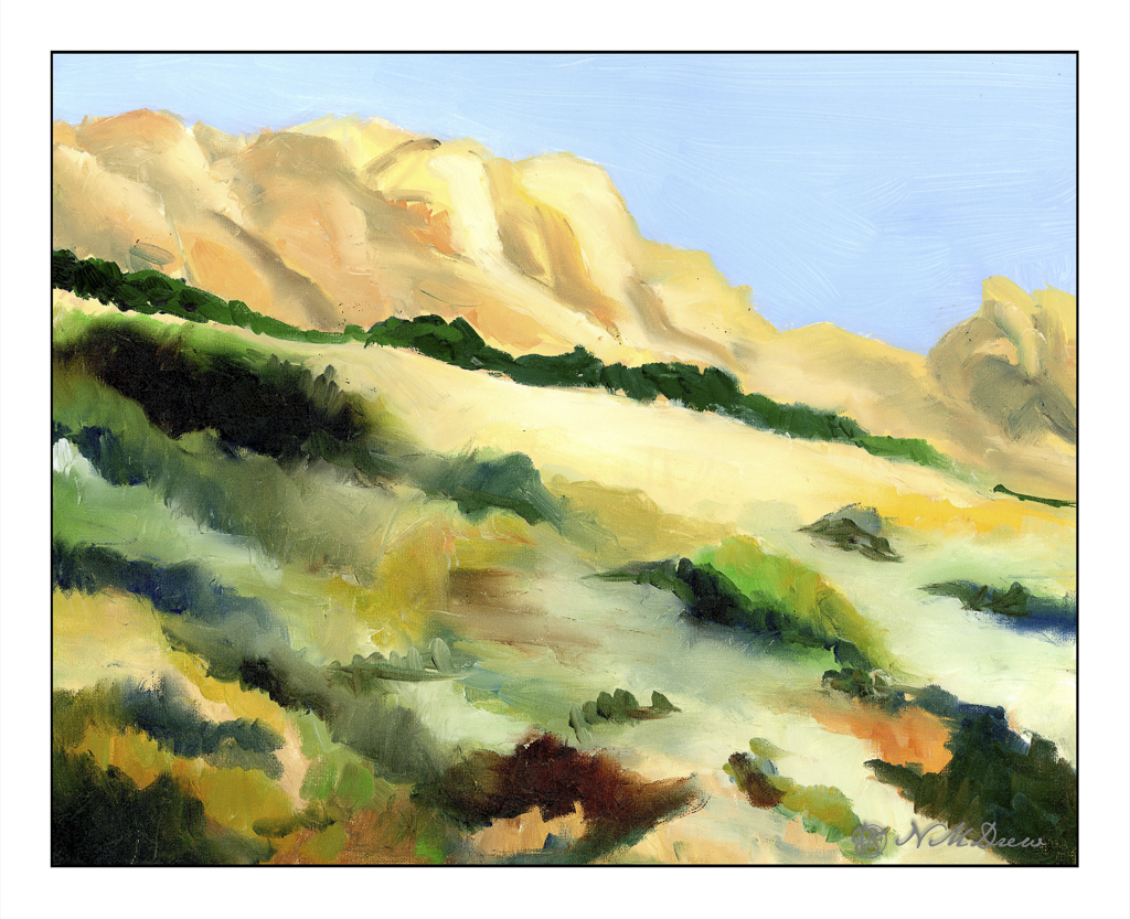
Sand dunes always amaze me. I am still stuck in my child’s view of the world that sand dunes exist only in the Sahara, and can only be found by riding a camel. Silly, yes!
There are sand dunes everywhere – beaches and deserts mostly, but sometimes in places you least expect. Their shifting shape in the wind and blowing away foot prints or burying ancient cities all lead to a fascination as they make everything seem so temporal.
Anyway . . . . this is an oil painting using a limited palette. Some of the goals in doing this painting included smooth, smooth brushwork for the dunes. I tried to catch the gradual gradations and color changes I saw. In the distance is the flat valley before the towering mountains. For each I used directional brushwork and a deliberate vagueness to create a surreal effect. The mountains, when I look at them afresh, can also be visualized as swirling clouds. Interpretation I will leave to your eye.
A lot of people I follow in the contemporary oil painting world are of the school of “paint it and forget it”. That is easily done if you have a lot of experience perhaps. For me, since I don’t plot out compositions too much nor do preliminary studies, this doesn’t work too well. I am of the wing-and-a-prayer school, using what I do know, and proceeding to let things evolve. Somehow I find that more satisfying.
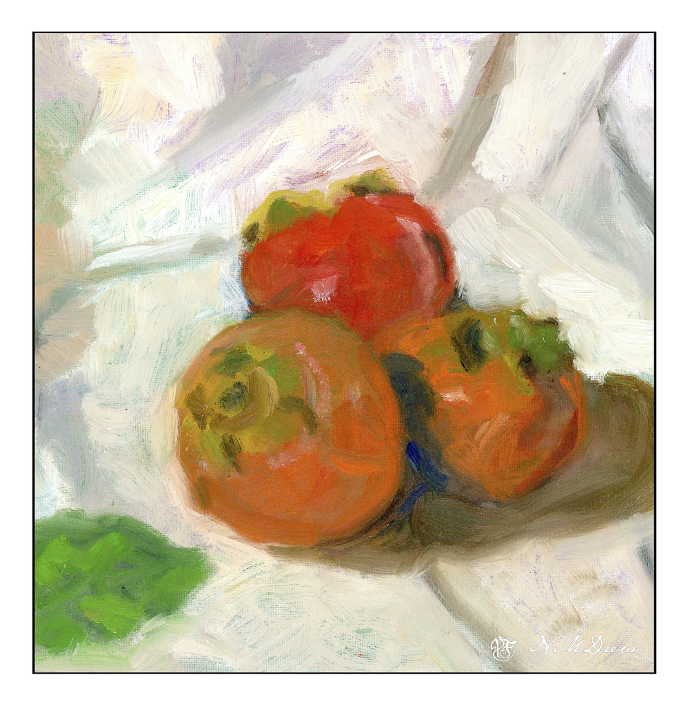
Below is the final (for now) rendition of some persimmons. These are fresh fuyu persimmons which appear in the grocery stores for a few weeks and then vanish. They can be dried and are quite delicious. Hachi persimmons make great bread – a fruit and nut bread. There are even persimmons native to North America and may be found in the southeastern areas of the United States.
It seems pretty well settled as a painting except for the background to the upper right of the persimmons. It is a bit too yellow for my taste, but as I am considering whether or not to leave the overall back and foregrounds on the lightish side, this is something to be addressed once that decision is made.
Prior to this painting, I made an underpainting to set up colors and values and composition. This one I was pondering about – the lower left hand corner needed something, so I put in a persimmon leaf. Then, the painting was banished for about a week, to dry as well as to be able to look at it with fresh eyes.
I didn’t like the leaf. In general, though, I did like the painting. I decided to remove the leaf using the generative background PhotoShop element to remove it. You can see the results below.
Much better!! And so I painted the leaf out with fairly thick paint and made the adjustments you see in the first painting of this post.
Like I said, painting is an evolutionary process in many ways. With watercolors you are sort of stuck with what you put down, so plotting and planning – to a point – is necessary. Being able to anticipate is a big part of watercolor. All other media can be fixed and corrected. Mistakes can be hidden and reworked. I prefer oil to acrylic and gouache as that the paint is very malleable – you can moosh it around, wipe it off, and so on. Acrylics dry too fast for this, even with retardants. Gouache paint can lift (with artist gouache, not acrylic gouache) up and reveal the layers beneath if applied too thickly. Alkyds added to oil paints speed up the drying process and odorless mineral spirits help make oil painting a less stinky medium.
I will continue to paint in oils for the most part. Acrylic paint may provide an underpainting at times. Evolution can be a bit of fun, and these persimmons have been a real delight so far.
Oil paint, 10×10 cotton canvas on board.
Below, click through the paintings to see the progress of with leaf, without leaf, and semi-finalized painting.
This painting took forever! And it is only on a 10×10 inch canvas! I used oils and labored over it for about 3 class sessions while it dried in between. The upper left corner is still drying.
I am quite pleased with it, so will leave you with that.