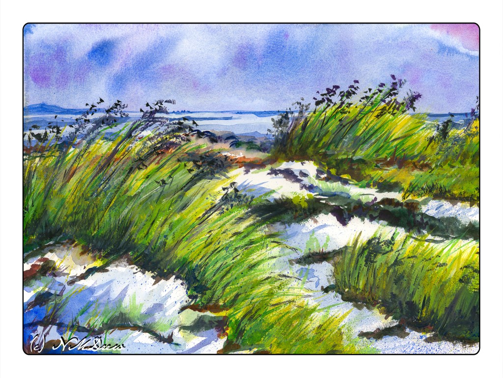
There are days which are blustery and cold, the wind whipping through your hair, and a walk on the beach, slogging through sand, and enjoying the wild freshness of the sea is not a bad way to begin a new year!
Wishing you and yours the best in 2022.

There are days which are blustery and cold, the wind whipping through your hair, and a walk on the beach, slogging through sand, and enjoying the wild freshness of the sea is not a bad way to begin a new year!
Wishing you and yours the best in 2022.
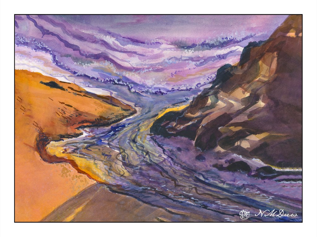
A mixture of mostly watercolor touched up with white gouache mixed with various watercolor pigments. It certainly came out differently than I planned!
Yesterday’s painting got rather fussy when I looked at it this morning. So, determined to work on simplification, I decided to use a huge brush for the most part. Again, Kilimanjaro 300# 11×15 paper from Cheap Joe.
To keep myself in a “logical” sequence, I worked top to bottom after taping off the horizon line to keep it straight. (Yesterday’s painting needed to be straightened up when scanned – it was going uphill!) It worked with very little seepage into the other half. So, sky first, wet into wet, blotting as necessary, using a spray bottle to coax color and water, tilting the paper this way and that. Then the blow dryer.
One the sky was to my liking, I did the islands in the distance, again focusing on simplicity and distance. Not gonna get fussy! It worked. Then, the blow dryer.
I didn’t draw the water or sand. Instead, I used the big brush to delineate the sand and rivulets of water from the sea. To pull the painting together, I used glazes and washes, mixing in colors from sky and islands into the sand. I put a few details in with a very fine brush, using some tiny dots to represent sand, and larger blobs of brown / blue to make stones and pebbles and other bits of detritus.
While this is not my favorite painting of late, it is perhaps one of my more successful watercolors. It doesn’t feel overworked and the colors reflect the overcast, wet day. Wet, wet skies are always fun and a crap shoot, but a delight because watercolor is not predictable and has its own beauty. I think I would like to wander here a bit more . . . .
The same painting, scanned with an Epson V600 and merged. However, two different software were used to merge. One was Microsoft Ice. The other was the photo merge bit of Lightroom. It’s hard to really tell which software impacted the final image more as both were manipulated a bit in post. However, the difference was that the LR version had dark paper around the edge and was rather muddy. The MS Ice was lighter and more clean in overall appearance.
This is the image merged in Lightroom. .
This is the one merged in MS Ice.
It’s hard to see the difference in some ways, but I think either is fine to my eye.
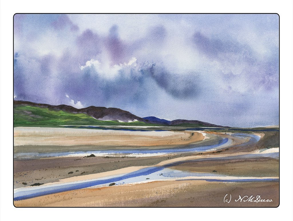
Anyway, I am rather pleased with the result here. I think I got the depth of field properly done for once. Perspective doesn’t seem off. The sandy berm really pleases me because sand is hard to do! I mixed together ochre, alizarin, and cobalt blue and then added a gallon of water to make the wash. The shadows are ultramarine with a bit of carbazole violet.
Another thing I like is the murky, seaweed filled foreground on the right that fills the shallow water. And, too, I did some justice to the reflections of the island in the right background. In the end, I applied a light glaze to the foreground water on the right and to the grasses to the left of the sandy shore in the middle left background. Painted on 300# Kilimanjaro from Cheap Joe’s.
I have few other WIPs, but they need a bit more consideration at present.
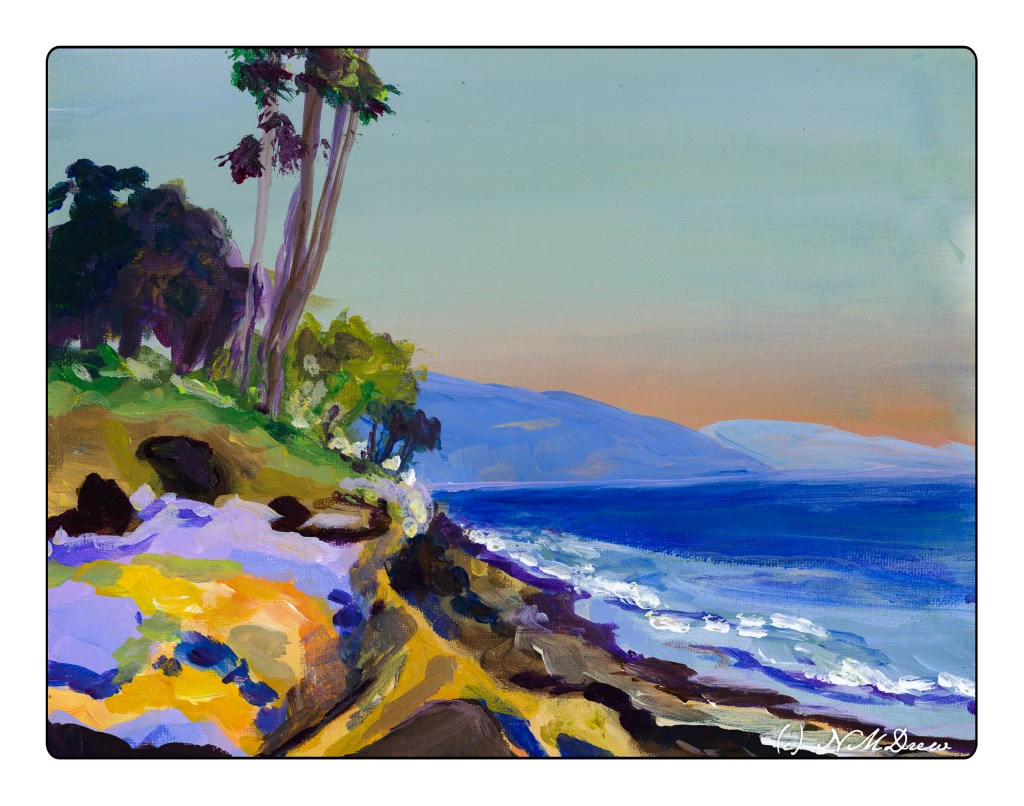
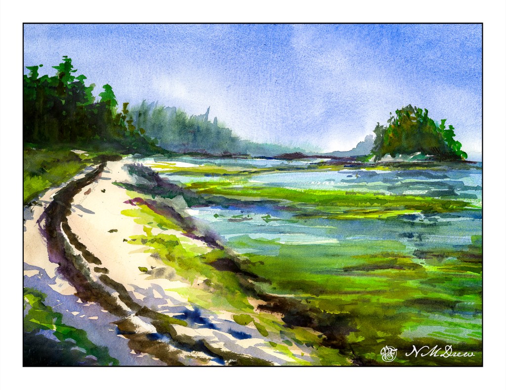
A quick study from a photo I took some time ago. Depending on where you are in California, the beaches can be flat and wide, beneath sandy cliffs, or covered with rocks. Wherever you go, you have legal access to the coast – no private beaches!
8×10 on canvas board.
