21-24 / 30

I am getting burnt out on these drawings! I decided to take a few days off and will pick up again tomorrow. Since I have committed to 30, I only 6 more to go by 4/17. I think I can handle that!

Day 21

Cannon Beach, Oregon. Figure is too big, some foot prints too dark and too big in the distance.

Day 22

Initially I had drawn this shack so that the beach and waves in the distance were parallel to the edge of the paper. After scanning it, I realized it looked better with a bit of an angle to it. Interestingly, a comment said it made no sense because the ocean is out there, straight ahead. Obviously, too realistic of a person, or someone who hasn’t taken a photo. Really, to me, a very interesting and odd comment and viewpoint!

Day 23

Here is a scene of looking down onto a beach. The distant cliffs look okay, but the descent to the shore in the midground is definitely confusing.

Day 24

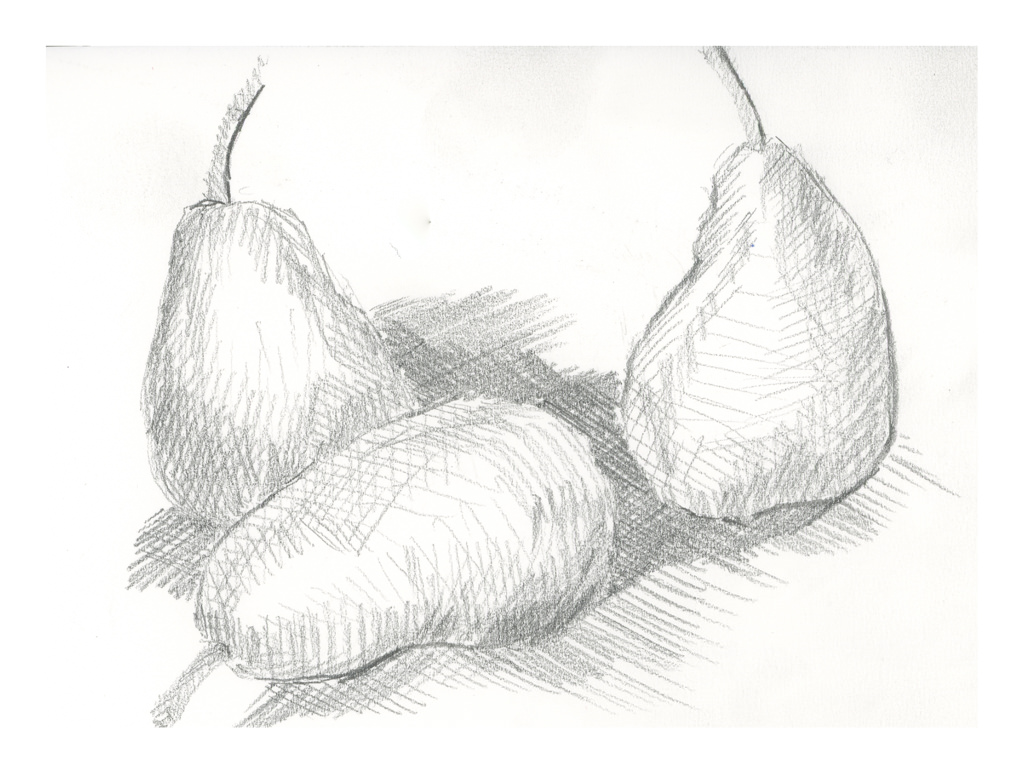
During last Saturday’s zoom meeting, Ian talked about cross hatching. I use it a lot in ink drawing, but not in pencil since the idea for a lot of this 30-day challenge is to limit marks to horizontal and vertical. The idea is to create value studies, not finished drawings. Interesting lines do not make for good value studies of light, medium, dark. However, a simple use of lines, cross hatching, vertical, diagonal, horizontal, helps delineate shapes, such as curves. I based this drawing off a study of 3 pears by Cezanne.

Commentary

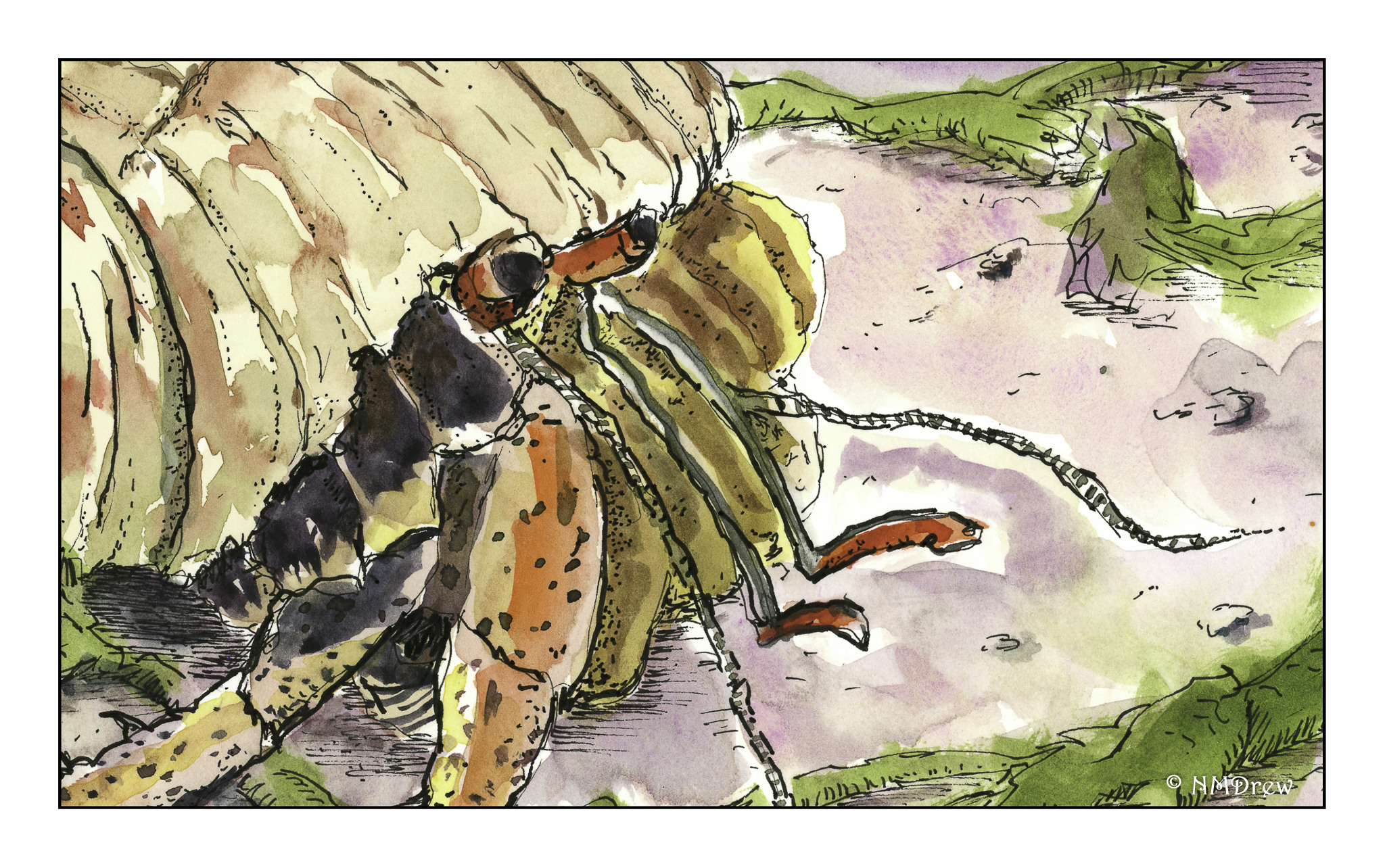
These studies are making more sense and getting easier to execute so that shapes have shape, even if not always understandable.

WWM #30: Wild Things

Today, when I was trying to figure out Wild Things for #WorldWatercolorMonth2019, I was really in a sourpuss mood.  I had to cancel a photo shoot with a friend and was not happy about it.  When you are tired and don’t feel well . . . you are absolutely crabby!  Hermity.  Crabby.  Hermit crab.  (How is that for subtle?)

I didn’t feel patient, and I didn’t feel capable of anything with a bit of subtlety.  I needed containment.  I wanted my shell.  I wanted limits and boundaries.  I wanted to feel safe.  Lines are perfect for that!  And as I have not done a line-and-wash watercolor for a month now, today I indulged.

And lets face it – hermit crabs are downright cute and fun with all their different colors and shells and homes.  Seeing them always makes me laugh – don’t know why, but they are such a delight.  And, as a result of this drawing, I, too, am in a much nicer mood!

Kingfisher (Drawn with Iron Gall Ink)

This morning I did a quick sketch of a kingfisher using iron gall ink using a dip pen.  As you can see, there is a bit better variability in lines than when drawing is done with a quill pen (see yesterday’s post).  Both have qualities I really like – expressiveness, boldness, delicacy.  As I am used to using fountain pens, a dip pen is no problem once I learned how to control the amount of ink on nib.  What must be remembered is how to load the nib, and as nibs are all different, a bit of testing on scratch paper helps.

At present, I am deciding if I want to colorize this drawing – which is why for now, it is not!  If I do, I want to use very dilute but vibrant colors.  It is my hope that the ink will shine through the paint without my having to re-ink parts of it.