Loquats for the Picking

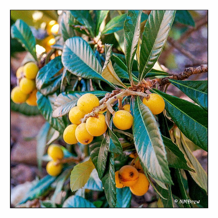
A couple of weeks ago I took a photo of loquats, not really ready to be eaten, but certainly not too much sooner!

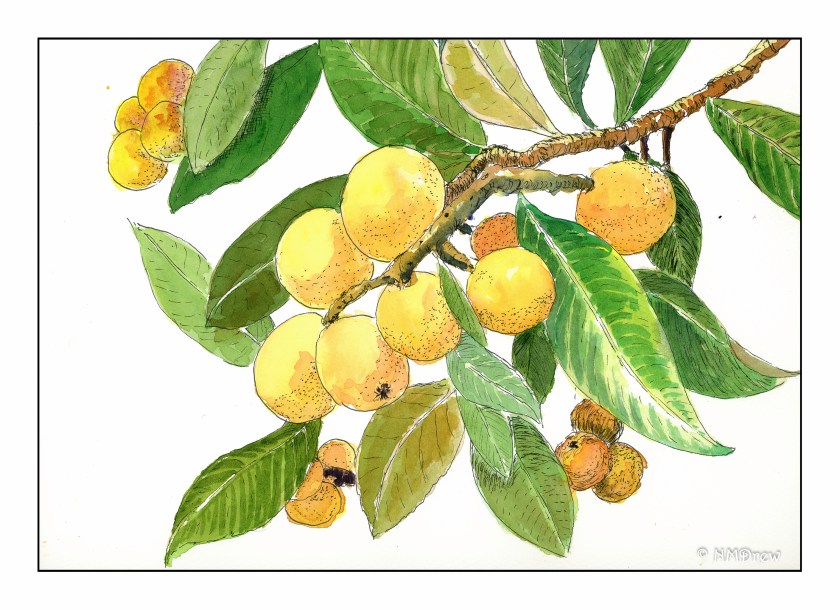
The loquat is a fruit tree indigenous to southeastern China. It is frequently grown in California gardens for its fruit and decorative qualities. The fruit is a pale yellow to a golden color, and the leaves are stiff and dark green. The contrast of the roundish fruit with the wide, pointy leaves makes for an interesting painting subject.

The photo from which the drawing evolved:

Painting the loquat has a bit of cross-cultural history behind it, too; ink painting tradition honors the loquat in Asia.

It would be easy enough to paint a loquat in watercolors, without ink, as well.

On the Forest Floor

A few goals for this mornings painting.  First, keeping the white flowers white.  Outlines helped here!  Second, wet-in-wet painting.  That worked well, too.  As an afterthought, I worked on the shape of the vignette within the frame.  Top, bottom, sides.  The far right could run off the page a bit more – I could crop it, if I wanted, but I rather like the reminder of the flaws I see, too.


Once Waitlisted Weekend Watercolor Workshop

How’s that for a few Ws or so?

This past weekend I spent immersed in painting and drawing and sketching, all focused on watercolor.  This lucky girl got in after being waitlisted to a workshop with Brenda Swenson, an excellent watercolorist, and as it turns out, a very good teacher.  Three days of organized to increasingly looser structure was perfect.

Day 1 began with continuous contour line drawing and lost edges.  At first I got it – and then didn’t – and then did again.  These drawings then led to watercolors using lost edges to blur and bleed color into color – wet working with deliberate movement of color.  This helps with reflected light.  The mind fills in what the brush does not.

From there, on the second day, we moved into landscapes from photographs, all of which were provided by Brenda, and from which all the landscapes in this post are derived from.  For some reason I couldn’t seem to think straight – I was restless and goofy and my mind was all over the place.  Somehow, I managed to survive and produce a few pictures of value.  The still lives I did sucked.  Structure of the day, if I recall, along with the first was draw, format, paint.  Formatting was finding a border for the image, where edges might break out of the line, and give an interesting look to the painting.  Good graphics!

And on the third day, structure loosened.  The focus was on painting vignettes.  A vignette, I knew, had white around the borders of a painting – a piece of a painting.  Brenda put it into a different perspective, on which I never had heard of – cruciform.  Don’t touch the corners with paint, touch one or all of the 4 edges of the picture’s ostensible borders, and focus on how the shape – the negative space of the corners – looks in relationship to all the other.

Lessons each day, thoughts for each day.  If I get another chance to attend here workshop, I will – if you get a chance, do it!

Now, a few things done during the workshop . . . click on a picture to see them bigger!

Daffodil Season, 3

More daffodils!  This time I did a value sketch before I began to paint.  I think it did help me with the final painting.  The sketch is not to scale for the picture, but it does give the areas of light and dark.   You can see the light is sort of to the left, and perhaps a bit to the front.

Next, the basic outline of the daffodils on the paper.

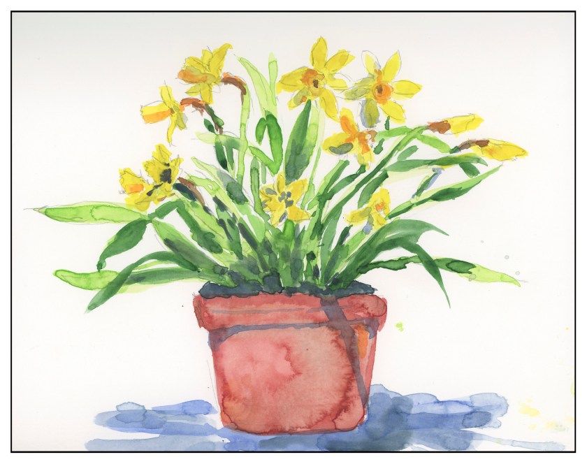
Finally, the painting itself.  It’s better in some ways than the earlier ones I did, but it just isn’t what I want to accomplish.  Parts of it look forced – specifically, the flowers.  Still there is a better sense of painterly-ness here!  And, the value sketch helped a lot.

Currently I am using Canson XL paper, which is a student grade paper.  For really wet washes, it doesn’t work that well, yet I find it quite to my liking as a practice paper for the most part.

Mesa, Sunrise

For the next week, my schedule is a bit different.  I have to be in to work 30 minutes earlier than normal, so I did this quick sketch in my Stillman & Birn softcover book.  The ink is iron gall.  I tried to keep the lines minimal, enough to capture important elements of the landscape, but not so much that they become dominant or what will (eventually) hold the image together.  Hopefully I will be able to work on shadows and light, working to good contrast.  I seem to need lines – I am comfortable with them – that are clearly visible.  Interesting to find out how we all work, eh?