If you think that the SoCal coast can be foggy, Oregon is by far more foggy at times! It’s an incredibly beautiful coastline with wide, nearly empty beaches. Out to sea are the sea stacks, some large, some small. In clear weather they are stunning, in the fog, spooky and eerie.
Today, a limited palette and paying particular attention to laying down water and thin colors. Washes are the dominant technique used here. My little picky brush strokes had to give way to broad ones for the beach and damp sand. It actually worked fairly well. Water, water, everywhere!
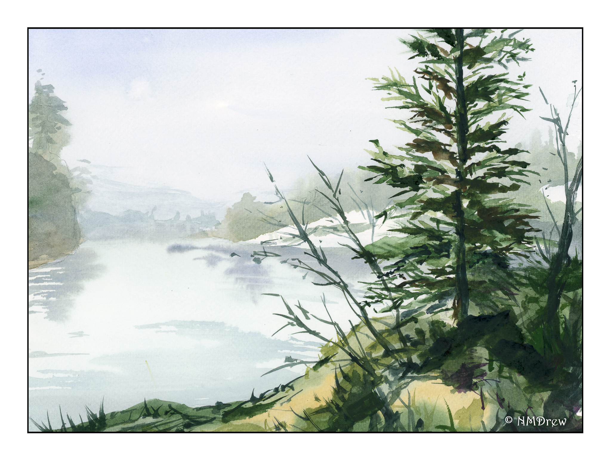
California is not all joyful sunshine and playing on the beaches. Fog is a large part of the coastal environment. It is known as “May grey” and “June gloom.” This morning I woke up to it . . . . inspiration for a foggy lake in the frozen (or not so frozen) north.
I’m still focused on water. Today I wanted fog and water and hoped to use very wet paint thinned to mostly water. I also wanted to work with wet-in-wet in the attempt to catch the softening of edges, increasingly more blurred and colorless, to denote distance. A dull, muted foreground with intense color to add to depth of field. I think it all worked out pretty good.
I have been breaking out of my safety zone and moving on to using more expensive paper and larger sized sheets for painting. Also, another is to use a somewhat limited palette, working to create colors by mixing in different strengths and blends. Ultramarine and cobalt blues, burnt sienna and burnt umber, a dash of sap green. Other colors include a mix of cadmium yellow and red, and some of Daniel Smith’s Primatek Sodalite (a black) for the road.
As always, there seems to be a lack of depth in my painting, despite my efforts . . . or maybe the road is not properly proportioned for its curve?
There is nothing like knowing Spring is nearly here, and see hints of emerging from the snow.
Another landscape, another limited palette. For this painting I used ultramarine blue, burnt sienna, burnt umber, sap and cobalt greens, a splash of raw sienna. 9×12 Fabirano Artistico.
I wanted to see if I could convey a good sense of depth, moving from the foreground with warmer colors to the distance with more neutral and greyish colors. Contrast, too, was considered for eye appeal, leading lines, depth.
If you look at the grasses in the foreground, you can see grass blades. I used a very dry flat brush to accomplish this, sometimes using a lighter green and brushing upward, or darker green to brush into the lighter green. Negative painting!
Today was a day of “firsts.” I decided to paint a big painting for me – 16×20 inches. I also chose to use a more professional paper than I have been; here, 140# cold press Arches.
I wanted to test out how Arches handles water – lots of water. Hannema is the master of the wash and wet paper approach. His current paper is Saunders Waterford, which is different, of course, from Arches. I think the Arches handled the water really well. I, on the other hand, still need to master my washes. Blooms are visible here and there, and I need to learn how to control those or eliminate them if I find them later on.
The palette of colors I used was initially what Hannema used: ultramarine blue, alizarin crimson, burnt sienna, and raw sienna. Because I did not like greens I was getting, I threw in some sap green. If I had used yellow ochre, perhaps my greens would have been more satisfactory – something to make a mental note of to try next time around.
I always learn from a video. As I have mentioned, water is one thing I am working on, along with buildings. Today, I wanted to just work with a new paper and a lot of water. The study was successful altogether methinks.