Cliffs

There is nothing so dramatic as a sea and cliffs, sometimes a sandy shore – but rugged rocks and trees clinging on for dear life always catch my eye. Northern California has its share, as do Oregon and Washington. All over the world such drama is there for our pleasure and to keep us humble.

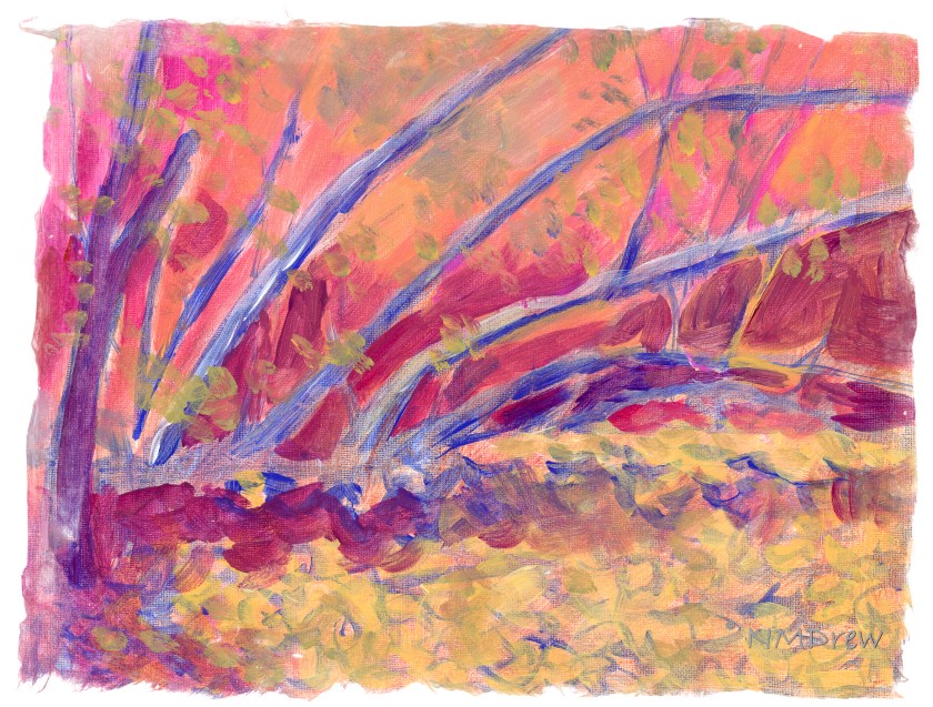
My approach, thanks to having a sketchbook – my lovely sketchbook! – is becoming more deliberate and more patient. I am working with larger planes of color, going for the grand before homing in on the detail. I also wanted strong contrast of sun and shadow. Simplicity. Clarity. Less is more, etc. As well, warm and cool.

I am honestly very pleased with how this painting turned out. I think I will leave it at that!

Tanglewood Underpinnings (I)

Back to “Tanglewood” – done already in gouache and watercolor and pastels. Now it is time to do it in acrylic! (If you want to see these, and the photo, click on the tag “Tanglewood”.)

Here I decided to work on setting up values – light and dark, warm and cool. I thought it might be fun to set up areas in complementary colors, but who knows. The whole thing could end up very odd looking, certainly for me and my boring outlook and driveness to reality. I am seeing this as an adventure. The photograph itself is rather dark and murky.

Colors used on Fredrix canvas pad are cobalt blue, Naples yellow, quinacridone magenta, and zinc white. These are applied atop 2 layers of gesso and then a substrate of yellow ochre mixed with Marigold (Holbein’s cadmium orange).