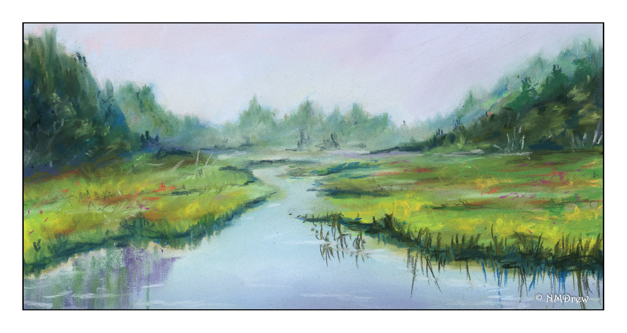
It’s Green Around Here

After playing with yellows yesterday, I decided to try to mix greens.  A very green landscape seemed appropriate.  Most of the greens were mixed using hansa yellow, quin gold, and cadmium yellow along with cerulean blue, ultramarine, and cobalt.  At times, I pulled in Hooker’s green, which I really like, along with some sap green.  Others at times, too, mixed with yellow or blue, or even orange!

Looking at the painting, the sky seems to not really match much of the linear quality of the rest of the picture – technique, I expect.  I had wanted the trees, foliage, and foreground to be softer, more blurred perhaps, but still full of greens.  One thing I should have done is to have not painted the sky across the entire upper portion of the picture – this kept the green foliage from being more discernible or distinct.

Overall, I am rather pleased with the final result.  The goal was green, which I certainly got, but the composition and style, while not what I envisioned, are not too bad.

Somewhere in Wyoming

Last summer we spent a couple of weeks traveling around the western part of the US, visiting states such as Wyoming and Arizona and Utah.  Open space, loneliness, long drives through incredible country.  This is a photo I took out of the car window on the way from Laramie, WY, to Grand Teton National Park, where we stayed for several days.

I pushed the colors in post production, to pull out greens, reds, and blues.  The view of the house / barn was fascinating – and I expect the view from it is even better, rather than zipping by in a car.   Anyway, I’ve decided to do some sketches, in ink then color, and hopefully an unlined watercolor based on elements of this photo.  Below is this morning’s sketch.

Watercolor Workshop, Day 2

Another day just painting!  What a pleasure to be able to do it!

Today we did two different things.  Actually, three.  For warm-up, we returned to the quick three minute sketches, which eventually morphed into a still life with three objects.  Mine were a piece of dried corn, a plastic mushroom, and a plastic artichoke.  I was not particularly nimble this morning, but here is one I produced.

From there, we moved on to landscapes, but I will hold off for a moment on those.  We did an exercise which I found fascinating:  take one object and paint it 6 different ways.  I chose a really lovely fake pear – golden and red, reminiscent of autumn.  Take a look  . . . they are in a gallery format, so click on one image to be able to scroll through them larger than they are here.

This was a lot of fun to do – nothing I ever have considered as an exercise.  And then . . . we moved on to landscapes from photographs Brenda took, laminated, and brought to class.

The idea was to take a photo and modify it.  This one is in the wine country of Northern California.

This one is, I think, in Carmel, but I don’t recall.  All the speckles are from the fact that it is a ghost image from a wet painting.  Truthfully, I was surprised it was a success at all.  All day I felt restless and unfocused.

Finally, this one.  I think it is the best of everything I did today.  The mantra for the day was draw, frame, paint.

Studies from Kautzky

After the disastrous lilies, I had a good think.  I really am not a decorative painter at heart.  What I love most are landscapes.  The outdoors is to me the most exciting thing . . . mountains, water, trees.  Thus, with this in mind, I pulled out the very first “how to” art book I ever bought, back when I was 16:  Ways with Watercolor by Ted Kautzky.  I still love this book and find his style and words soothing and thoughtful.  To ease my frustration, I did two of his exercises.  The first below is in 2 colors only, ultramarine blue and burnt umber.

The next one is in three colors:  burnt umber, ultramarine blue, and Hooker’s Green.

Kautzky’s palette of colors is one with which I am comfortable and familiar, so it was very reaffirming to feel somewhat skilled after the lilies fiasco.  That really upset my little apple cart!