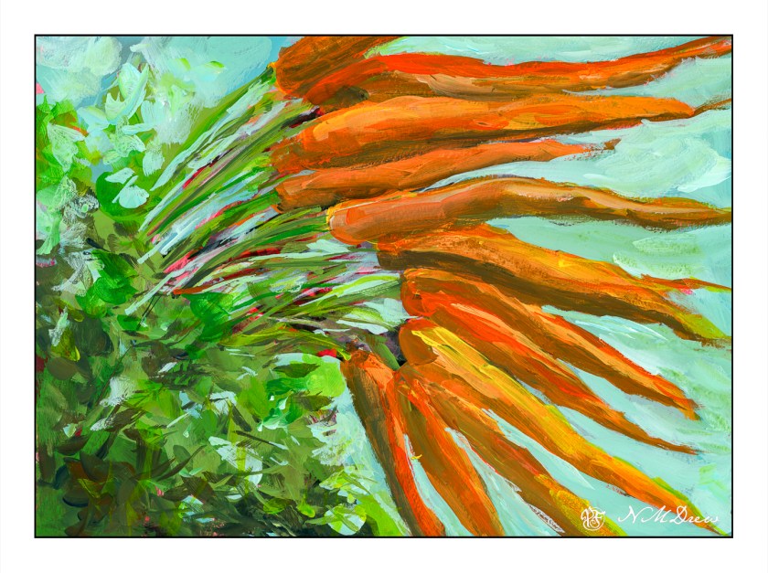
I watched a few videos by Jane Slivka, an acrylic painter out of Florida. She tones her canvas with a reddish orange color, paints in the major shapes in Hooker’s green, adds white for highlights, then proceeds to build her painting. Her paints are heavy body while I have been using fluid acrylics. I thought her process was quite interesting as it is seemingly spontaneous, but not without structure. Her steps give it structure, but she is not a slave to her subject – she sort of moves along with a game plan and no game plan, if that makes sense.
What really fascinated me was how she actually creates values by working in the lights and darks before adding colors. Additionally, the red tone beneath the brushwork pops through, and adds a bit of sparkle to her paintings. Negative and positive space and shapes are worked back and forth.
I tried to follow this approach, and found it really quite interesting. In many ways it simplified what I wanted – lights, darks, values, contrast. Carrots are not especially exciting things to paint, but they are quite cheery with their bright colors of orange and green.
Painting the carrots and their tops was really fun. I didn’t take this painting seriously, and sort of slapped around colors, working to see what might be successful, might not be. Never before have I toned a painting surface with cadmium red, but I think it could become a favorite thing to do. Yellow ochre is a wonderful color, but it is not especially dramatic. The little bits of red poking through the greenery is quite pleasing to my eye. I expect I will try more paintings like this.
Golden Fluid Acrylics, Strathmore 300 watercolor paper, 10×14.

