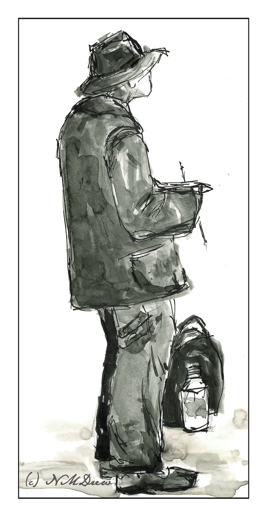
Another pleasant break to be had yesterday afternoon! Tasks and chores shucked and done; dinner to be prepared. In between, back to Shari Blaukopf’s short course on ink and pen and drawing.
I tackled the section on drawing people, and I think I accomplished my task quite well. As always, a few good tips really helped move my sketches into more successful areas – in particular the one about getting the shape of the shoulders correct and then moving up and down the body as needed.
The hands in the above drawing are not at all good, but such is life. The basic drawing was done in pencil, which I did not erase after applying the ink. The line drawing was done using Sailor’s black pigmented ink, and the washes were done with India ink, diluted to make the washes.
From there, we moved on to water soluble ink in color. The color Shari used, and which I bought, is called Ancient Copper. The pen I used is my trusty Spencerian nib in my vintage Edwardian pen hold made of silver (yeah, posh!). The Spencerian nib is great as it provides a very fine line, but with pressure yields a good thick line.

Looking at my signed and scanned image, it looks like there is black ink used here, but there is none. It just shows how scans can mutate color, but also just how variable the ink itself is – from on the nib, to dissolved with a brush dipped in water and applied across the lines.
First a pencil drawing, then outlines and cross-hatching with the pen. Darker areas have more hatching. Then, let the ink dry and erase the lines with a kneaded rubber eraser. From there, a brush dipped in water to create the lights and darks by applying it over the lines. Areas with more lines = darker areas. Then, while the paper was damp or dry, I used my dip pen to apply more ink. In particular, I used it to outline the man, his clothes, and the edges of the bench. This helped emphasize contrast and to help separate different areas of the drawing from other areas.
Bristol paper, 11×14, India ink, Sailor pigmented black ink, Ancient Copper ink, Spencerian dip pen, brush.


