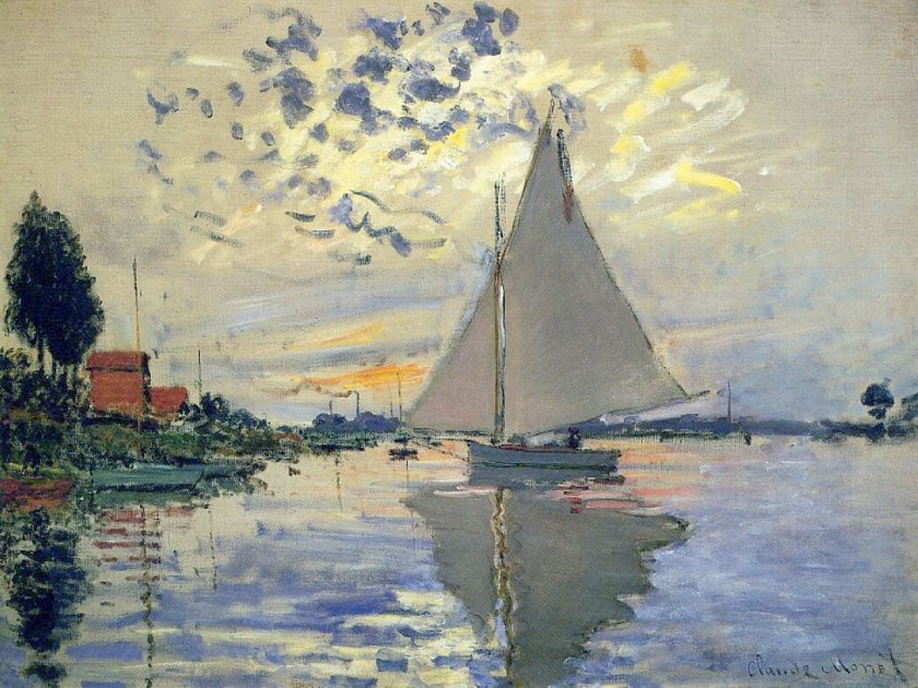
The original painting by Claude Monet was painted in 1874 and measures approximately 22 x 29 inches. My painting measures 11 x 14 inches, so it is close to the same proportions. I left out a few things simply because I was not trying to replicate Monet’s painting but catch its sense of spontaneity. This spirit is what I found refreshing, and while Monet probably finished this painting alla prima, I spent about 6 hours in the studio. He used oils. I used fluid acrylics.
As I started to look more closely at Monet’s painting, I saw that his brushwork was very quick in many areas. The smudges of smoke in the left middle ground, the dark, wispy clouds used up a rather dry brush, one where paint was nearly gone. The white-blue swash across the sky seems like a quick thought. As well, it was interesting to see how the dark bits of clouds worked with the yellow and white areas to focus the viewer’s attention on the sailboat itself.
My own painting is more blue than Monet’s, but I saw a lot of blue in my reaction to his painting. Comparing the two is really interesting when I compare my scan to the Wikimedia online image presented here. It is hard work to get a good, warm grey and I did struggle with it. I also had to work on observing little things, such as the boats on the left middle edge – I couldn’t figure them out initially. The chimneys on the horizon also needed to be considered – what were they? The smoke on the left horizon gave it away. Once I had the boats on the left sorted, the vertical lines reflected in the water made a lot of sense.
What I really love about this painting is how it catches the light, which, of course, is the idea behind Impressionism. The moody sky with bits of cloud and fog and light as evening descends is what caught my attention. Even now, as I compare my master copy to Monet’s painting, I see even more subtleties which I could have caught. But, at some point, you just have to stop!
Fluid acrylics, Centurion OP DLX linen canvas pad, 11 x 14.
For the past several weeks I have been immersed in painting classes – 2 or 3 a week, and too many hours to count. I finally decided I was doing more than was good for the rest of my life, and decided to cap it to a few hours a day. That balanced things out as I was getting rather nutso.
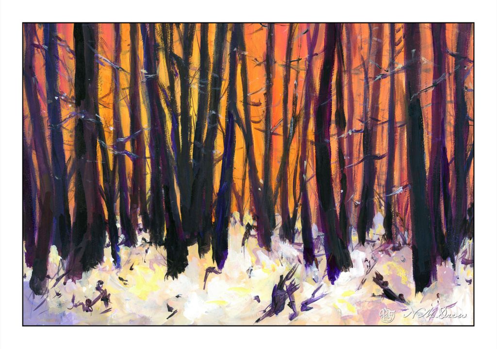
This is based off a Pixabay photo of trees and snow, at sunset or dawn. I am not sure if this one is “finished” yet, but think it is done enough to scan and put online. It is acrylic paint on a piece of 11×15 watercolor paper. I decided to use it as the paper is 100% cotton but the sizing is not good. As I bought the paper a long time ago, I cannot return it.
One thing about painting in acrylic, you can paint on a lot of different surfaces. I like the feel of paper beneath my brush more than a canvas panel that I have gessoed. Maybe it is because I am used to its surface texture, but there is more of a connection there with its surface – smoother than a cotton canvas panel, but with some tooth. I do plan to learn more about oils later this summer but need to play with it a lot more and figure out where to paint as oil solvents, while now often odorless, are still volatile and not exactly something to be breathing in a closed space.
As I work on learning how to paint I also explore different artists. Right now I have been looking at a lot of the Russian artists of the Impressionist variety along with ones from the 1930s, such as Nikolai Timkov and his fellow painters. Impressionists and more modern painters appeal to me because their sense of color and brushwork, as well as subject matter, are more to my liking than any other era. I like abstraction, too, so a bit of all of these appeal to me. Strong graphics, elegant composition, good colors get my eye. Art is really a personal thing anyway. What I want to hang on my walls may be nothing you would even consider . . .
All this painting is also making me think about brushwork. It expresses so much. Smoothly blended or broken? I think the next exploration will be broken brush strokes and trying to choose a color and put it down – paint it and leave it, as Ian Roberts is telling us!
We all have prejudices for or against something. For me, my prejudice is what is labeled “mixed media” in artwork. It brings to mind things I don’t like, much less understand, to be “art” – and that is pretty narrow-minded, I admit. I think of “art” as being pictures of things I can relate to, things I love, and bring a visual beauty with them, even if a bit disturbing. For instance, I find Picasso’s “Guernica” to be quite disturbing – it’s not a pretty painting. The subject matter and colors are not “nice.” But, what is said and expressed in paint is the point.
Truthfully, I would rather look at a landscape versus a bloodscape any day. Google “landscape” and all sorts come up – sadly, in my opinion, many of them are really gaudy and unattractive. I prefer ones with more natural colors, ones which play with light, ones that catch a mood, such as fog or bright sun and a whipping breeze.
Fine Arts Museums of San Francisco, Public domain, via Wikimedia Commons
Above is a painting by Lucy Bacon, an American artist. I’ll put her paintings up on my wall any day.
So, back to the “purist” in me. Merriam-Webster defines a purist as “a person who adheres strictly and often excessively to a tradition” – and that is me in the world of art. (It also applies to usage of language, but I am all for its development and change – but that is another story!) For me, this means if you use watercolor, you only use watercolor. Oil paints? Only oil paints. A painting is a painting, and not a mish-mash of collage, ink, paint, etc. Pretty limiting view, eh?
So, enter a book I bought back when it first came out, back when I had no time, no studio, little experience, and the aforementioned attitude. The book is Creative Colored Pencil Workshop by Carlynne Hershberger and Kelli Money Huff. Back in 2007, it didn’t teach me what I wanted simply because I was not ready for it. Today is another story, and to be truthful, I am so glad I kept this book. It is opening my eyes to other ways of creating a drawing or a painting by demonstrating, though clear exercises, what can be done beyond a “pure” medium.
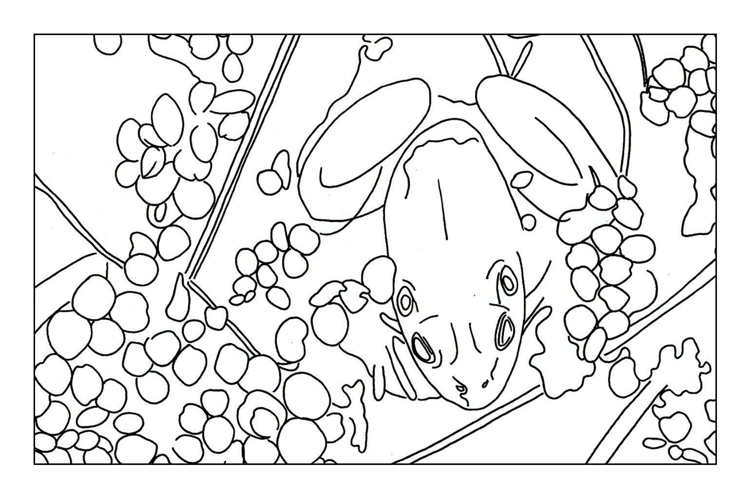
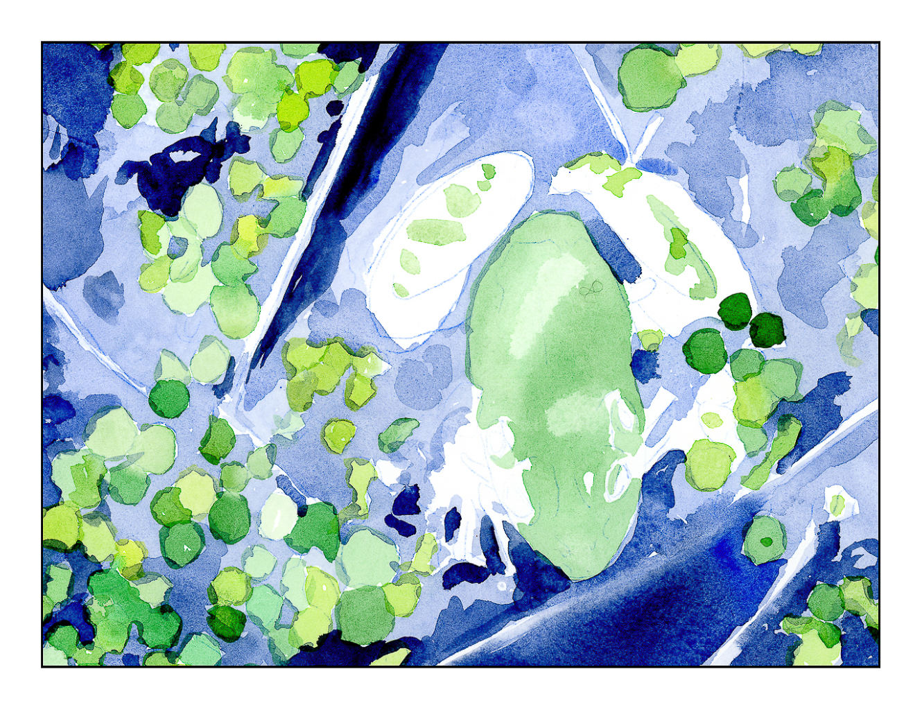
I started their exercise using watercolor and colored pencil. The study is a frog in a bit of shallow water. Step-by-step instructions. I did this exercise years ago, liked the result, but the purist in me was not happy with mixing the two together. Now, having started using colored pencil on a “serious” level, I appreciate the underpainting of the watercolor before the surface addition of detail in colored pencil.
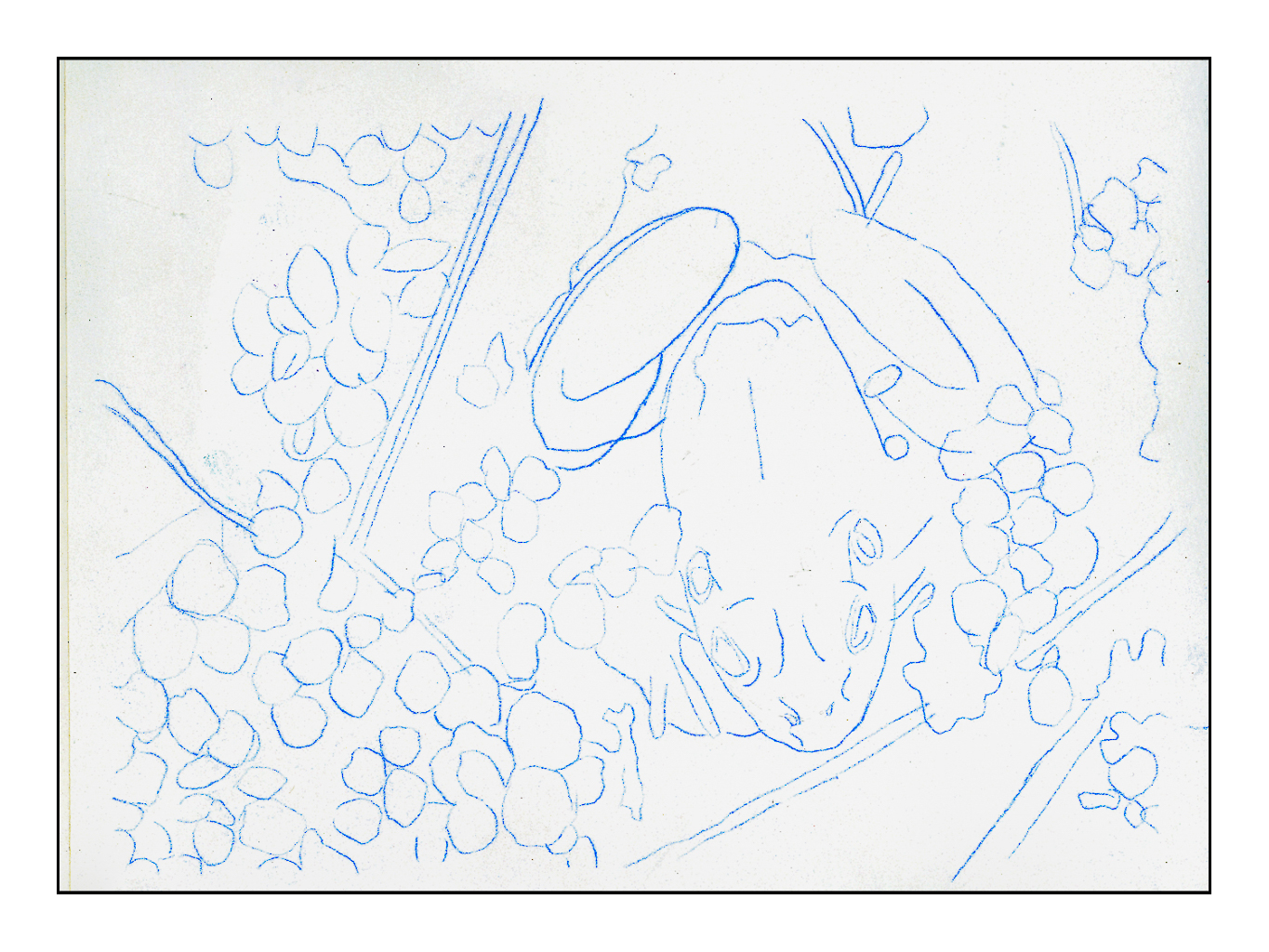
I scanned the original line drawing from the book, enlarged it, and then used Saral transfer paper to draw it onto a piece of Arches CP 140# paper. Initially I thought of using HP 140#, but changed my mind. The third picture shows the green watercolor laid in on frog and water plants, as well as varying blue watercolors for the pond. From there, browns and reds were added to the frogs body. These were all the watercolors used, essentially providing an underpainting for the colored pencils.
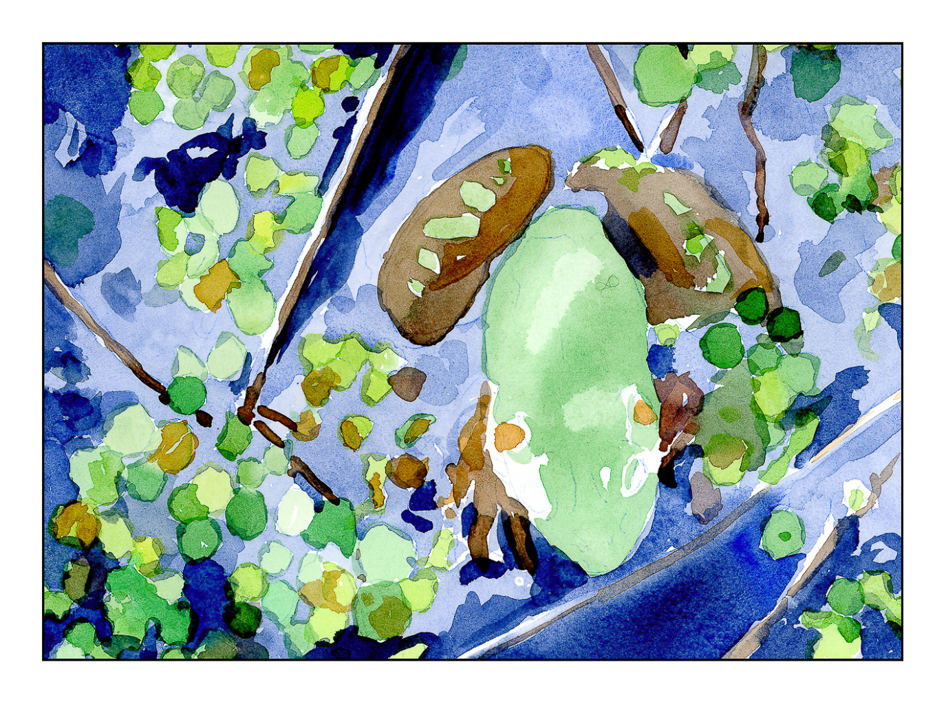
After the watercolor was done, the blues of the watercolor were covered with blue pencils. The same for the water plants, but greens instead. The frog itself remains untouched by colored pencils – that is for later! The pencils I have used so far are Prismacolor Premiers that I chose to meet my own taste. The book suggests colors for pencil and for watercolor, but after having given up the desire to create an exact duplicate of a study, I felt free to choose my own!
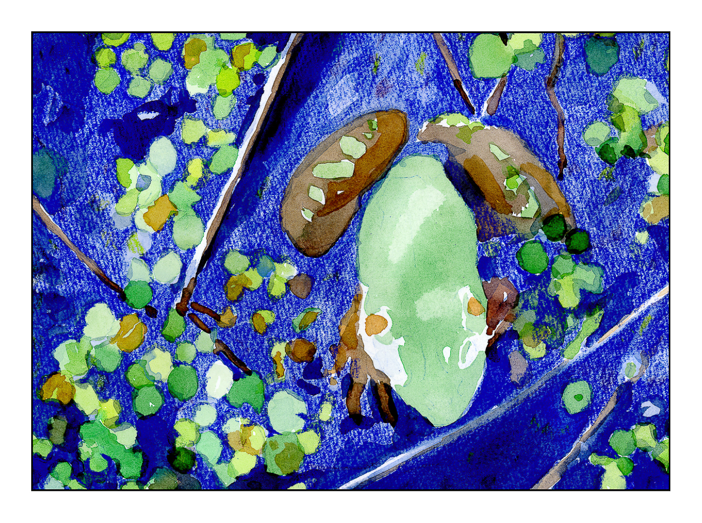
Current status of frog painting in watercolor and colored pencil. More to come!
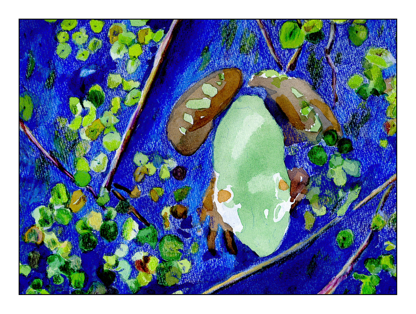
The final picture in today’s post is the last one. Obviously, more work needs to be done. I hope to finish this fine fellow soon, but over the next couple of days other activities call.
Meanwhile, the purist is leaving town. The perfectionist has already left.
For me, color is an excessively important part of my visual world. I see colors before I see people or things. I think in colors. From there, reality intrudes and I can identify what is around me. Because colors are my primary draw, when I paint, mud has often been the result. Learning to separate colors and learn how one color works with another in painting has been, and continues to be, a difficult lesson for me. My emotions want the color, but reality is that all colors do not create better ones. Thus, “patience, grasshopper”!
According to Wikipedia:
Impressionism is a 19th-century art movement characterized by relatively small, thin, yet visible brush strokes, open composition, emphasis on accurate depiction of light in its changing qualities (often accentuating the effects of the passage of time), ordinary subject matter, inclusion of movement as a crucial element of human perception and experience, and unusual visual angles. Impressionism originated with a group of Paris-based artists whose independent exhibitions brought them to prominence during the 1870s and 1880s.
If you know your art history, Impressionism was ground-breaking and revolutionary. Smooth blending and invisible brush strokes gave way to a different sense of light and its workings on the world seen by the artist. As with all things, evolution occurred, and from this first rebellion against the “acceptable” art of Europe came other schools. A direct off-shoot is Pointillism. Color still is extraordinarily important, but instead of “impressions” being important, the usage of pure color became more distilled. According to Wikipedia:
Pointillism (/ˈpɔɪntɪlɪzəm/) is a technique of painting in which small, distinct dots of color are applied in patterns to form an image.
Below is a short, clear video about Pointillism, its derivation and its influence.
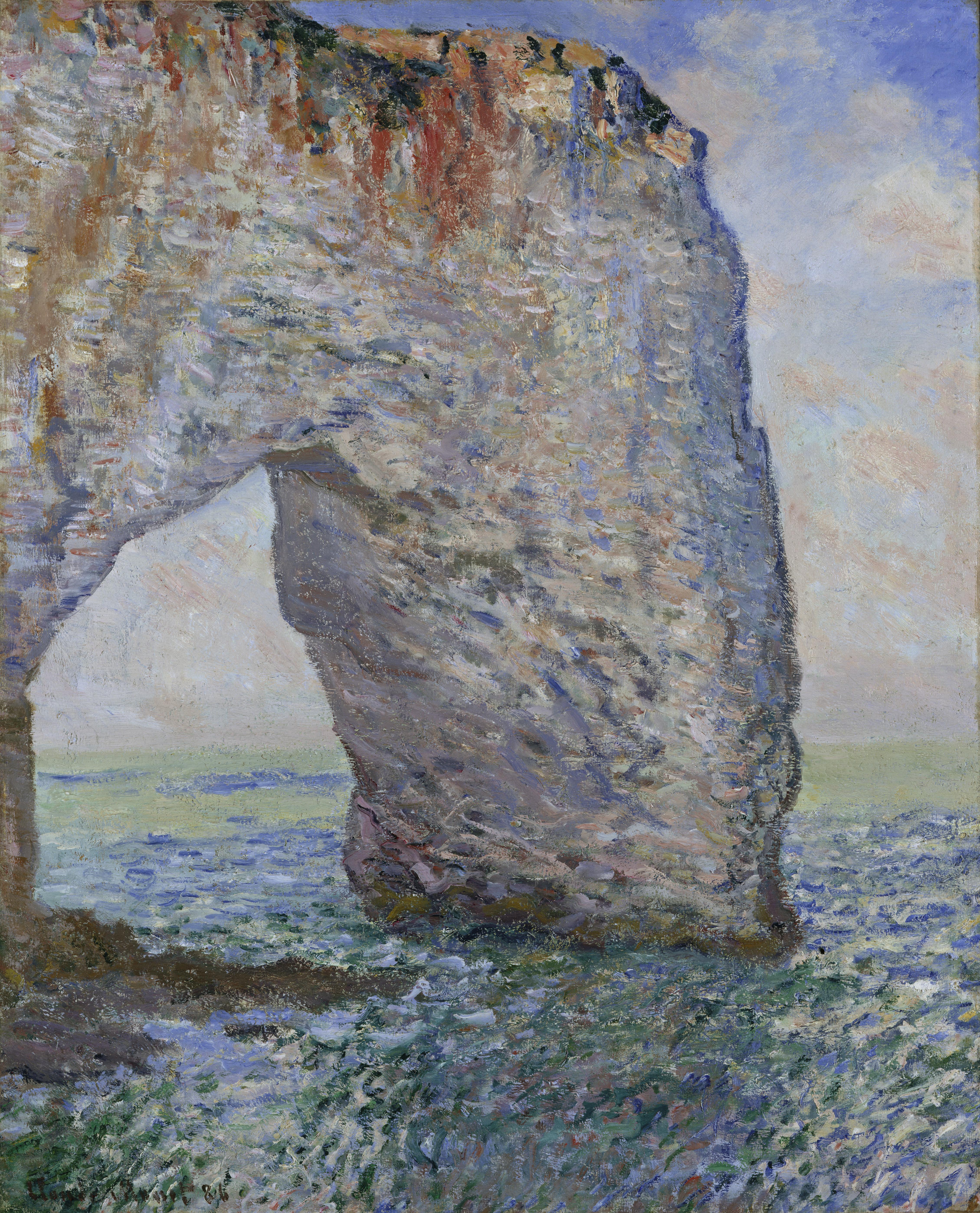
What does this have to do with me? My need to work with color successfully requires a certain amount of intellectualization and rational thought about color – how color works, how colors interact, how Cobalt Teal reacts with Quinacridone Gold, and so on. I find breaking down colors into individuals before combining them helps. So, I decided to turn to the works of Monet and his studies of the ciffs at Etretat. I looked at several Monet studies, but I will use this one in particular:
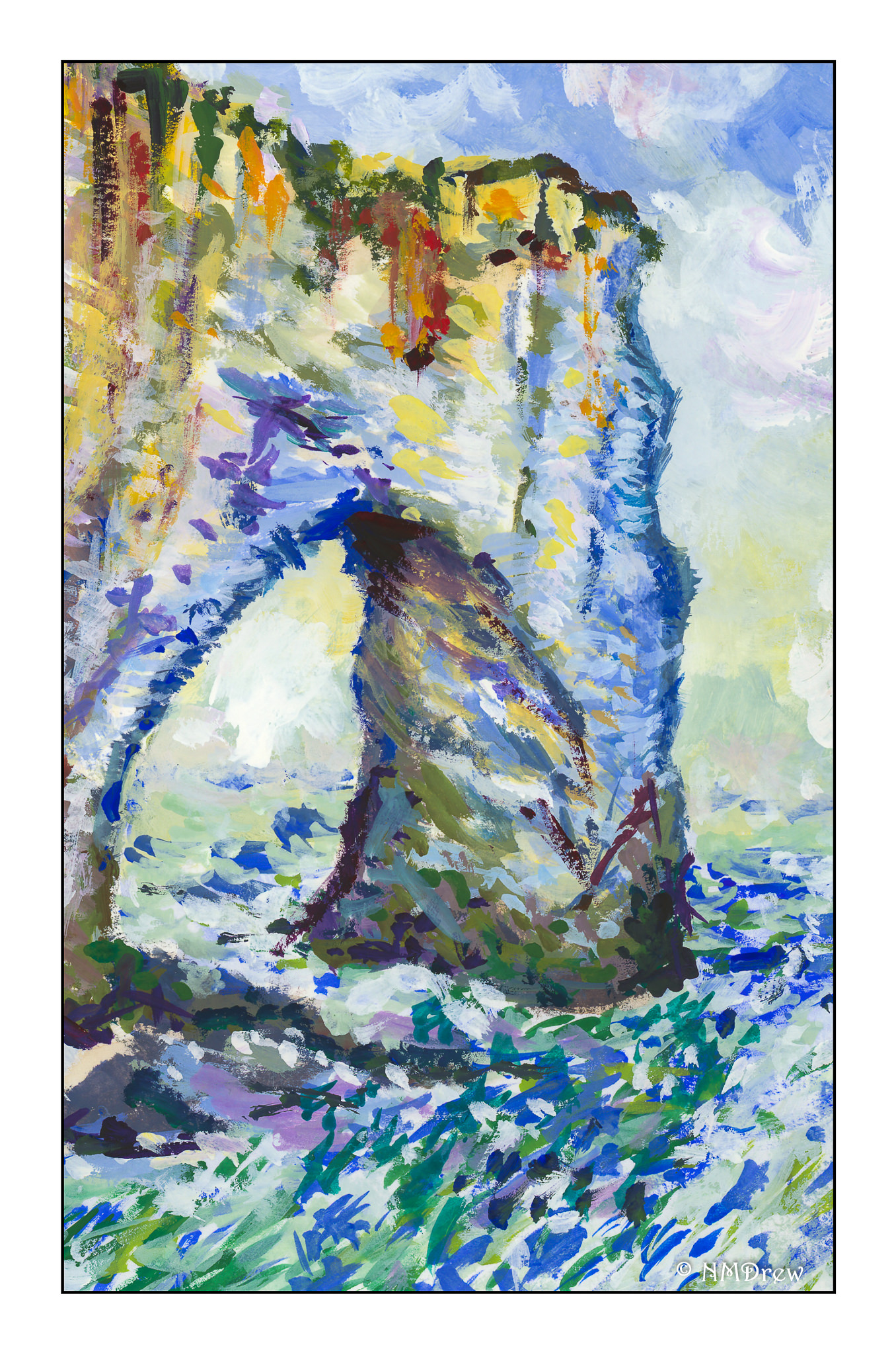
And here is my interpretation of it:
Obviously, my colors are more intense, but the impact of light on surfaces was the focus. After a few “Monet studies” I realized that this was not quite was what I was looking for. I knew of Georges Seurat but do not care much for the start graphic quality of his work. Exploring other Pointillists, I remembered Paul Signac, and it is here that I found my current muse.
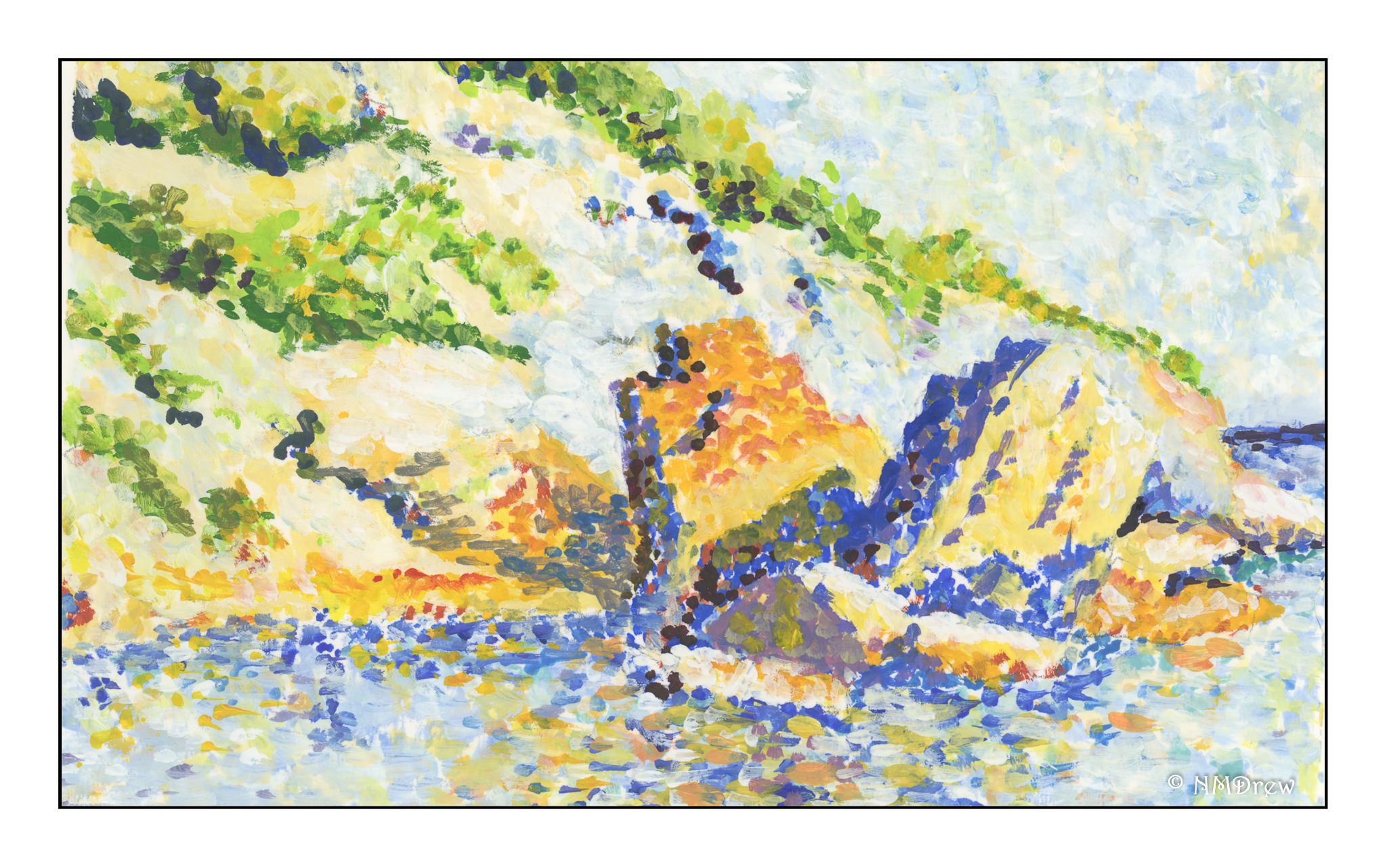
Signac’s works vary from graphic and sharp to blurred and “painterly” (for want of a better term). His more purely Pointilistic works have an energy and vitality I prefer to Seurat’s – more modern, more attractive, and more elegant in composition. He also works with the precepts of Pointillism, but still in a more Impressionistic way. I did my first Pointillistic painting by painting a detail of this painting by Signac, Cassis, Cap Lombard:
I took a small section, enlarged it, and painted a detail of it without following the exact structure of Signac’s painting. If you click on Signac’s painting above a couple of times, you can enlarge it, and find the blues and oranges together in the shadows, which I studied and used in my sample below. Additionally, I studied both warm and cold blues and oranges to get a sense of the temperature of the painting, but I will admit at this point I am rather befuddled and cannot describe my observations
My goal was to look at the usage of color, in particular, the juxtapositioning of colors. In the stones along the shore, and in the reflections in the sea, you find blues and oranges, complements of each other, in play to create light, shadow, reflected light, and reflections seen in the lap of the waves.
Did I succeed? As far as color usage, yes, to a degree. In doing this study I also learned about making a Pointillistic painting. I began with just dots and soon learned it took forever! So, in further studies, I laid in the primary background colors in given areas and then applied the dots. I am working in gouache, and so I can blend colors into each other on the paper to create new ones since artists gouache is never permanently “dry” unless sealed. Gouache is the perfect medium for this, but I can also see the value of acrylics as each layer can dry and then be painted over without dissolving the layer beneath. The other beauty of gouache is that it is an opaque medium and so painting over other colors can be done, unlike watercolors.
More studies will follow using the principles of Pointillism, and I know that I will evolve into my own methods. Copying from the works of a master is a time-honored tradition and an important part of any student’s learning, no matter the field. Such practice causes one to think, analyze, and apply; it is from this one learns.
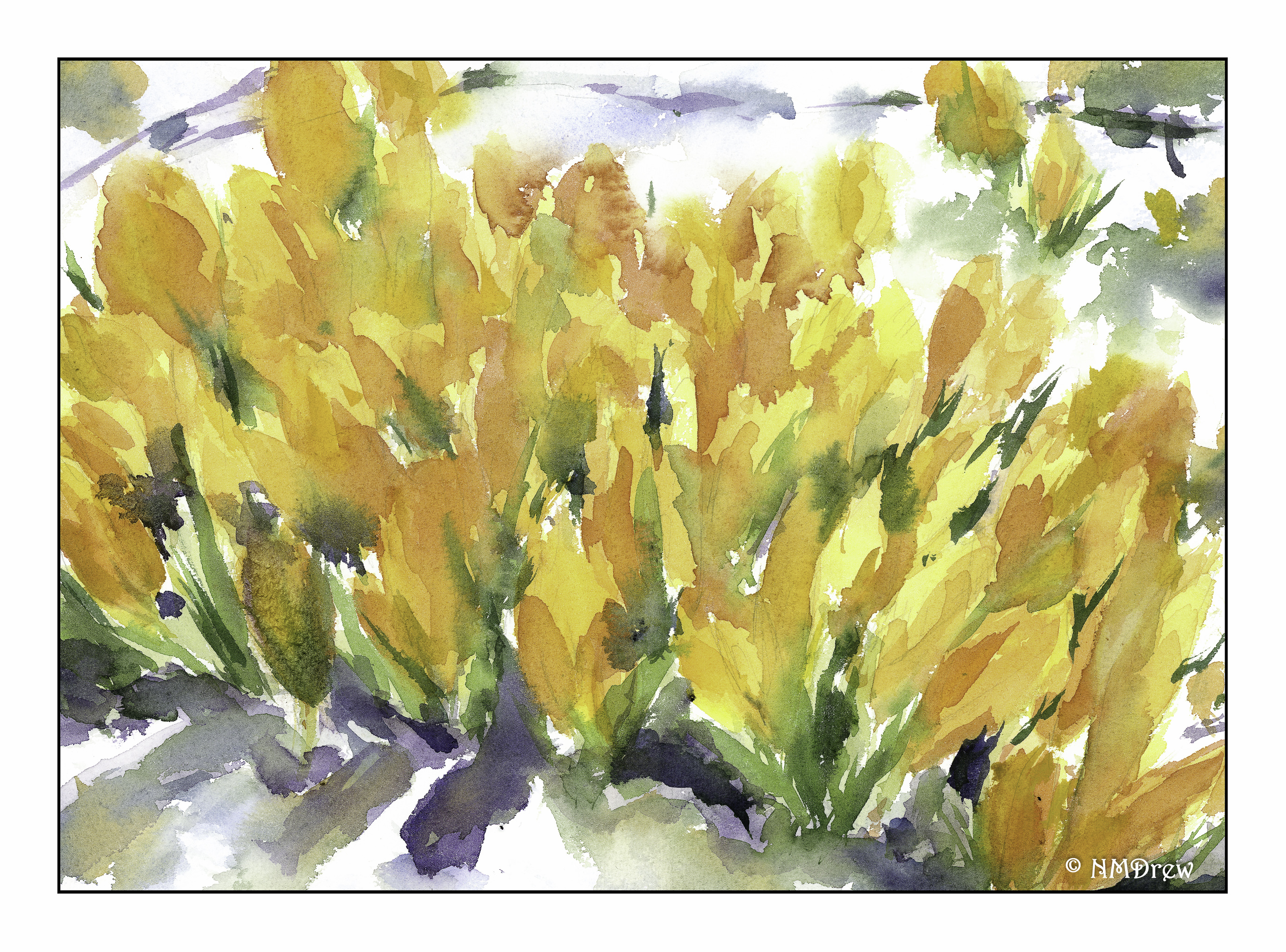
This became more of an impression of crocus rather than a detailed study. To tell the truth, I have never seen a crocus in my life! I can imagine the joy they bring, though, as they peek through the last of the winter’s snow. Hyacinths were the bulbs that bloomed in the snow in the midwest, soon followed by tulips and daffodils. I tried to work with negative space to define the flowers, as well as blur the background and put a bit more detail in the foreground – perspective in action on a conscious level!
This is the reverse side of the paper I used yesterday, St. Cuthbert’s Millford. This paper has a really nice tooth, not smooth or CP, and smoother than rough. It catches the brush bristles rather nicely. Colors are dreamy when blending together. It also lifts well – some color ran into another area and I was able to lift it out and recover to a degree from the mischief. I don’t know if Arches would handle it as well as this paper, but that is something I should check out.
In addition to no longer making masses of mud, I find I am actually remembering things – make long brush strokes, lay down large areas of light colors and leave the whites in the process; think about the direction of the light; a few rules about perspective.