Greens Against the Sky – 2

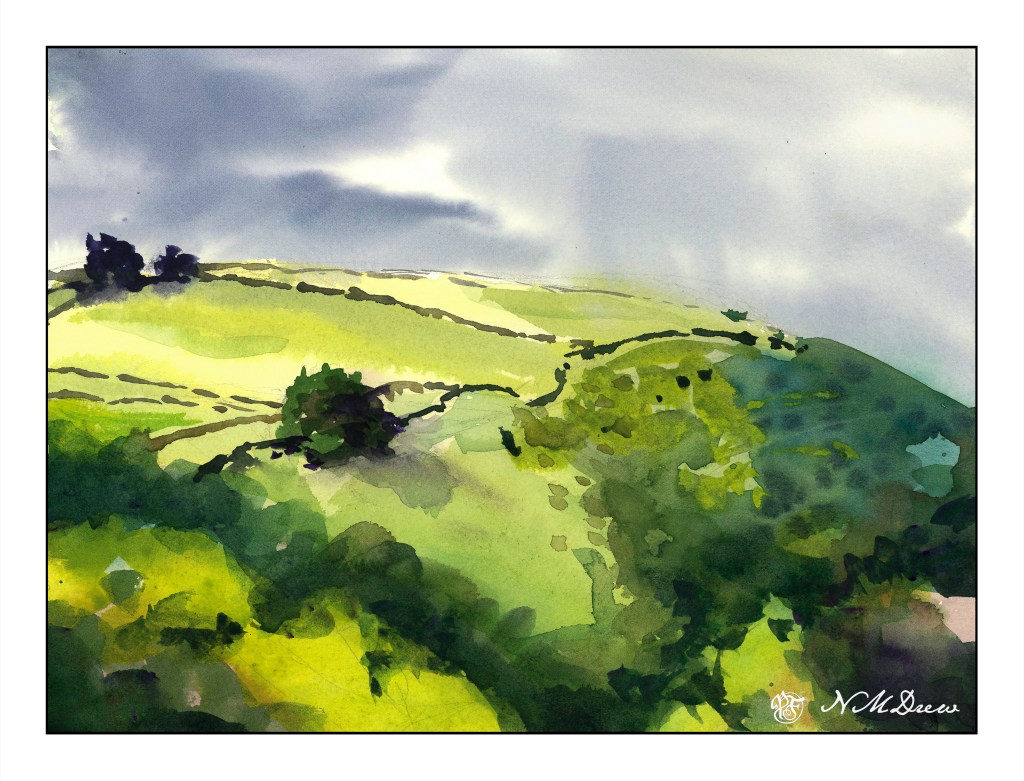
I was not especially pleased with yesterday’s painting. After leaving it alone, looking at it again, it seemed to have all the same values for the most part. Today I decided to look at shapes and values a bit more in depth.

One thing I did was to change the elements of the picture a bit. I cropped off a lot of the left side and then made a composition out of that. Left side, middle value sky against light land and dark trees. Right side, darker land against lighter sky. In the middle, land and sky of similar value, mainly middle.

Obviously, the right becomes darker, and what I attempted to do was to create a shape of dark values with connections throughout the painting, connecting with right side to bottom and then to the left. Darks were connected throughout with the stone walls and into the trees. The dark trees in the upper left shift into a darker middle value with the sky.

I also tried to work with shapes – dark shapes with the middle ground tree being the focal point. The lighter shape is the land and the slope down the hill from the same tree. I have been reading a bit about how to work values to create focus – such as light and middle values as focal points surrounded by dark. The same can be light and dark to focus, and then surround that by middle values. Maybe that is what I was doing with the tree and shadow on the hilltop.

Anyway, my head is spinning. I know what I was trying to accomplish – shapes, values, warm and cool colors. Words are not easy to find to describe, so I will leave you for now with my mental and painterly chaos!

Up the Hill: A Plane of Color

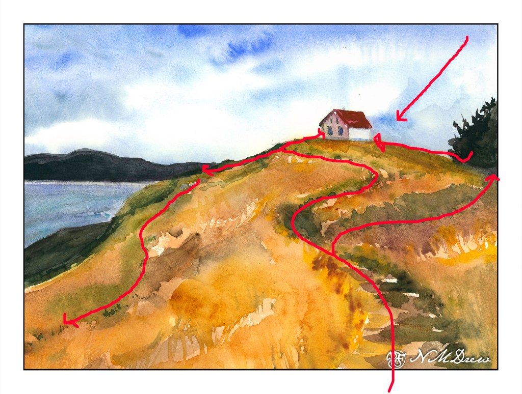
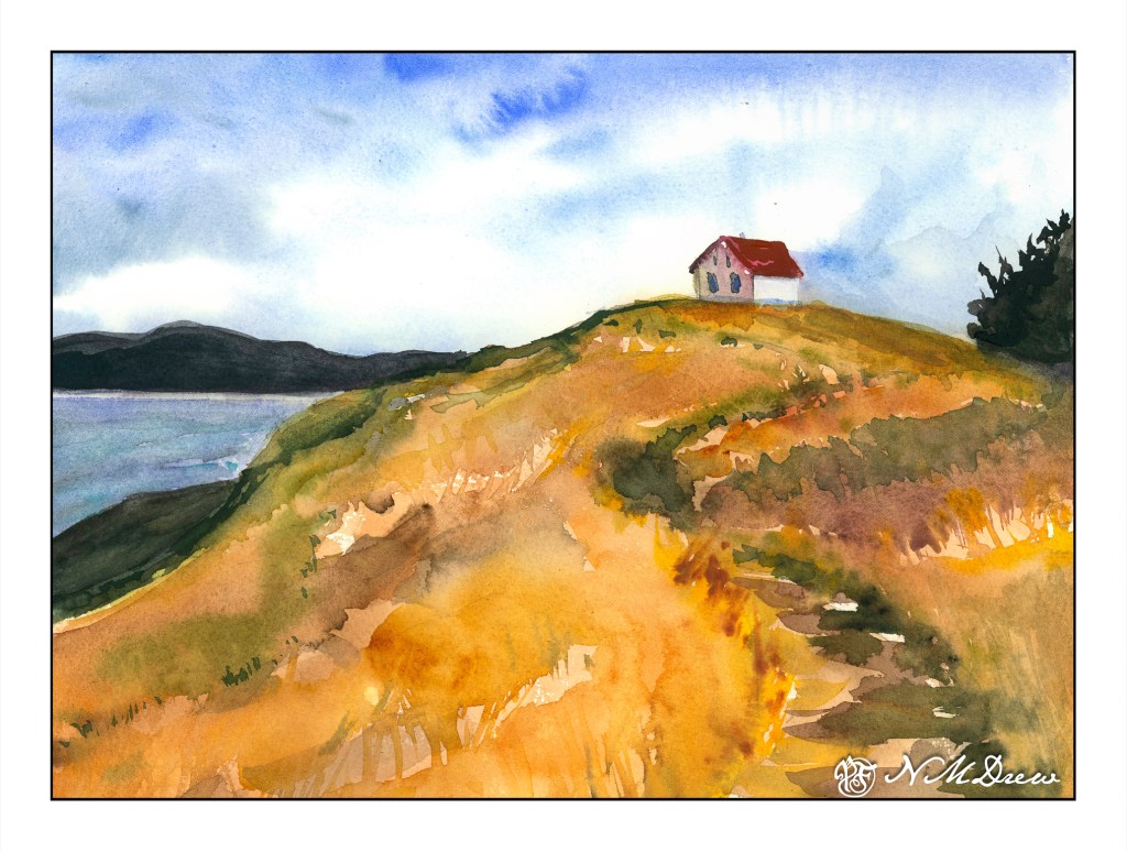
One of the things that is often a point of contention for many who work in watercolor is when to stop – when not to paint any more – when is overworking the painting happening. Today’s study is of a lone building on Saturna Island in British Columbia. It sits on a hill, silhouetted against the sky.

The building itself is not well done – it is overworked. That, though, was not the point of the painting. The point of the painting is the hill up to the house – paint it, work the colors, create depth and dimension and a sense of the vegetation. I worked wet-in-wet; put a few glazes on; re-wet the paper and painted again when I needed to add some detail, such as the shape of grasses or vegetation. I also wanted to create a way to get the eye up the hill to the house, and the pathway itself does the trick.

Composition is also something I was considering. How am I leading the eye to that little building? Above is a an overlay with some of my eye-deas. I can think of more, too, but I could also go nuts analyzing things. The darks acted as a balance on either side of the hill, but the tree on the right is too big as far as I am concerned. It just kept growing – spring??

Finally, values. Lights, darks, mediums. Is my contrast working? If I look, I see the zig-zag of the darker path leading up the hill, but more subtle is the light zig-zag to its left. The darker values on the right of the hill repeat the zig-zag. Various areas of light and dark point your eye toward the building.

I am pleased with the hill in this painting, and that is what I wanted to focus on. It is an oddly shaped mass of color, but within it are variations of all sorts – warm and cool, dark and light – that give it shape and depth.

My current focus on watercolor is planes and dimension. I am trying to break down my ability to create structure, and for me the natural shapes of hills and trees are far easier to work on for now, although buildings will come in the future. Negative painting was a first study, but that surrounds as well as creates other planes and dimensions.

Let’s see what is next!

The Hill

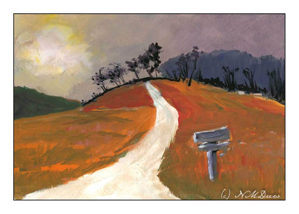
I’ve spent the last two afternoons following along with an online class in gouache. It’s been fun. The main focus has been skies and their moods as shown by clouds and color and time of day and weather. For some reason the dark and stormy sky stayed in my mind’s eye, and visual memories of days of yore came back.

I don’t know about where you live, but here in California where I am, the clouds are seldom domineering and frightening like they can be in the tropics or midwest. I remember one day when I was about 9 coming home from school and the sky was nearly black with clouds. It was still daylight, but it was in the fall of the year and cold. It was eerie and scary and beautiful. All the colors in the surrounding fields and meadows and trees were brighter than usual, almost to the point of being unreal.

That is what I have tried to catch here – intense light, strange light and colors, a wildness waiting to happen.

Gouache, 9×12, CP cotton 140# paper.

Up the Hill – Final, Finally

Up the Hill – Final Painting – Signed on Lower Left in Liquitex Acrylic Black Marker!

Finally! I am dee-oh-en-ee. I took the painting I thought was sorta done, talked with my teacher, and we decided to add a few more flowers. So, I did, and signed my name on the left. On the right I have my digital signature.

I really enjoyed doing this painting. It is on 12×16 Fredrix canvas pad, primed with gesso, and painted over about a 3-4 week period. It is a pleasant break from monochrome – but that is for another time. Today, let’s enjoy Spring as we go up the hill.