Carolina Sea Shore

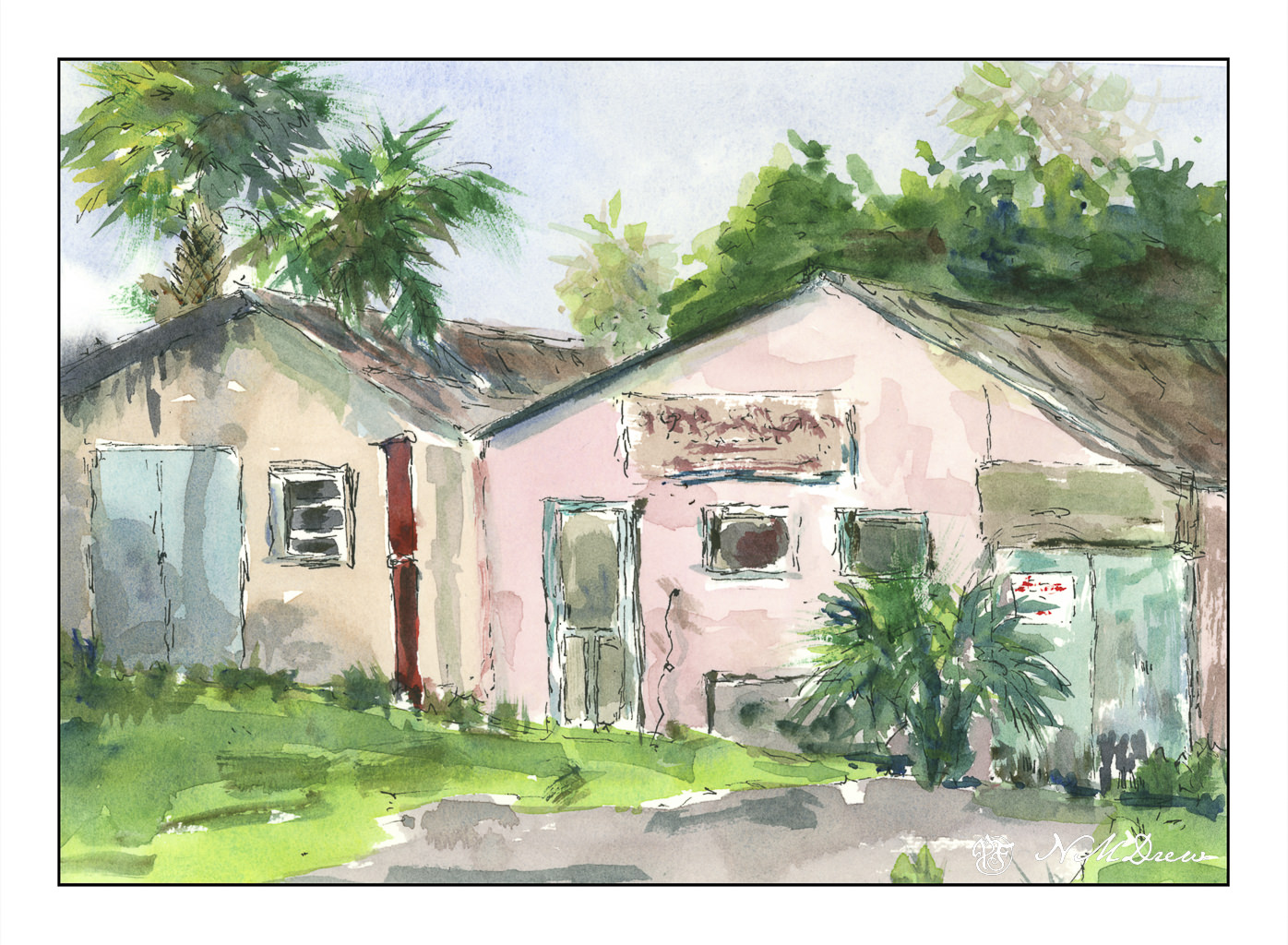
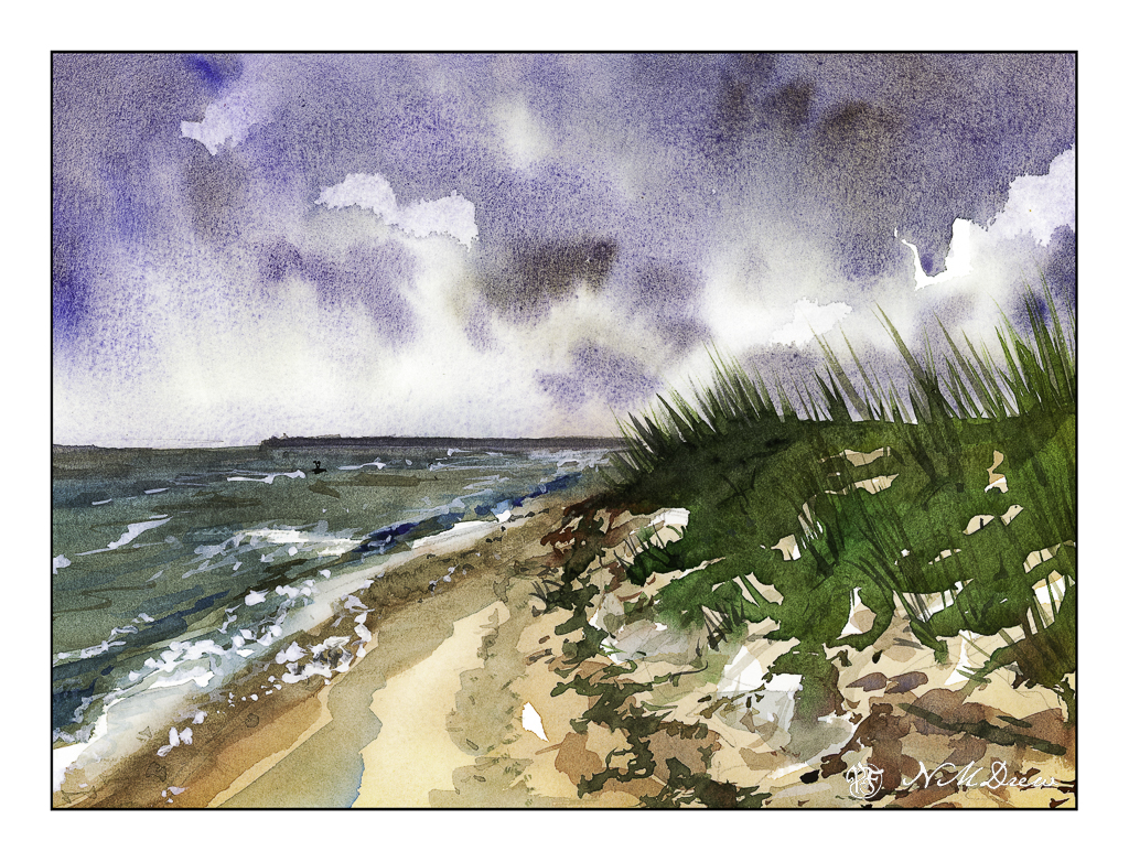
Beaches differ so much, but one thing they have in common – the ocean! The shore between land and ocean can vary, from rough and rocky, to wide and sandy and flat, and everything and anything else.

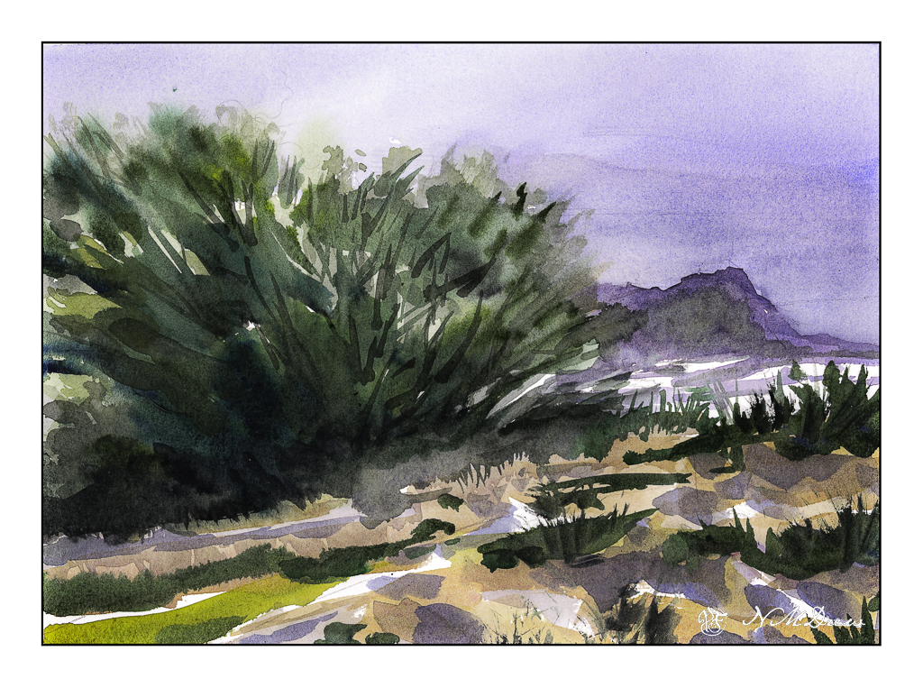
Once more, the simplicity of Seago’s watercolors was in mind, but my own rather picky or detail-oriented tendencies made simplification really hard to achieve. Along this shoreline is seaweed and other detritus, differing levels of shoreline, dunes and grasses. In the distance is an opposite shore – island or land arm of a bay? I had to force myself to stop!

And there is a giant bird shape in the middle of the sky . . . funny how you don’t see these things – at least I don’t – until I scan the painting and look at it days later. Maybe I’ll fix it, maybe I’ll leave it.

Again, a limited palette of ultramarine, Hooker’s, ochre and sienna. I also used a bit of phthalo blue, an as a touch-up, white gouache. Hahnemuhle 9×12 140# CP paper.

Above the Bay

Back to California, Edward Seago as a mindset.

Up north along the Pacific are many beaches with dramatic cliffs, sandy beaches, fog, and it is always exciting to drive along the coastal route – usually Highway 1 – to enjoy the scenery. Sometimes you need to wander a bit off the beaten path to find a bit of paradise, but exploration is always fun!

I don’t remember what colors I used specifically, but I do recall ultramarine and cobalt blues, burnt sienna, yellow ochre, cadmium yellow, Hooker’s green, and possibly a bit of alizarin. The scene is a bit soft because the coastal fog, prevalent along the California coast, is in the distance. The air is moist. And, it is chilly! Mark Twain supposedly said the coldest winter he ever spent was a summer in San Francisco. You know what I mean if you have experienced it!

We all have our own styles and methods of painting, and in some ways I like the way I paint, in other ways I dislike it a lot. Here, I focused on simplification but in some areas did a bit more working of a subject than I should have, such as on the right distant cliffs, ocean, and sky. The estuary below the headland is simple enough – at least I realized that and didn’t do anything more to it. My bush is also okay, but perhaps it could have been simpler – or the foreground, too – but when something is close to the viewer, details do become important. Each leaf and blade of grass, though, would be excessive.

Hahnemuhle 9×12 140# CP paper, watercolors, Northern California.

Abandoned

Yesterday’s splish-splash was fun, and it seems that I need to take time to paint in watercolor and acrylic as I work toward mastery of oils (on some level!).

I love watercolors, and some days I find I have no patience and just do not want to be too serious. This is when play and messing around are best. Because of yesterday’s madcap painting, today I felt calm and inclined to taking time to pay attention to detail and think. Watercolor really does require thinking as you cannot correct a lot of mistakes.

When I draw with ink and then add color, I never use a pencil to create the rough outlines. Ink and I just get along really well, and usually proportions and details are sufficient to get me started. After painting, I go back and add more ink in areas I think need it, but as today was a minimal ink day I used the watercolors to create more details and information. It is also interesting to note the amount of time a painting takes – sometimes hours, sometimes minutes. I spent about 90 or so minutes here, and am pleased with the results over all.

9×12, Hahnemuhle CP 140#, watercolor.