Spring Growth

Spring Growth-Edit

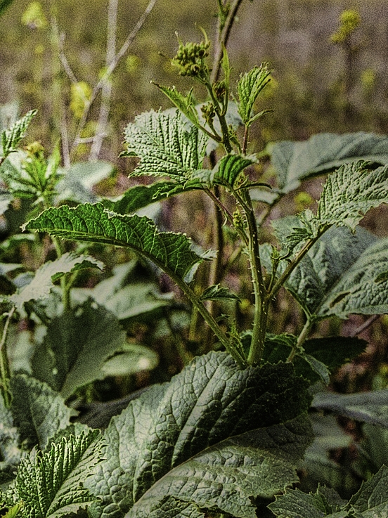
I did a little post-processing of one of the few images I liked from my “checking for a light leak” roll of film. I pushed the colors, and upped the detail a little, as well as the contrast. Below is a detail of the same image.

Spring Growth Detail

I am rather intrigued by film and how it processes from analog to digital. I now have a roll of Kodak TMax 400 in the Nikon FM2N (same camera that had this image in it), and took it out for a walk under the nearby oaks. Black and white in the woods. I will have the TMax processed and scanned at a professional lab.

A View of Irish Fest

A View of Irish Fest

I spied these two in the crowd, and kept losing them.  I was delighted to see them coming toward me on the ski lift!  The orange and green combo was just too funny, though I know some who would find it extremely offensive.  BTW, Irish Fest is one of the many summer festivals held in Milwaukee, WI, on the shores of Lake Michigan.

Green

Greens

Green is one of my eternally favorite colors. In my opinion, most mixed greens lack greeness, if that makes any sense. The best greens are already made, and then modified with other colors, such as the addition of more yellow or blue, or even red. The clarity of viridian, Hooker’s, and sap just have a lot to offer.

Traditional greens are mixed from yellow and blue, and in watercolor, you can use cerulean and cadmium yellow, burnt sienna and ultramarine, and all other yellow-blue combos. Some pigments are more “settling” than others, which can be more transparent, and this will affect the final color quality.

Maybe I just need to work on mixing them more . . . but can you really get such a clear green as sap?

Spring Vine

Spring Vine

Los Angeles never ceases to surprise me. This is from a park tucked up into the mountains north of the city, in the middle of a rather nice bit of suburbia. With the recent rains, the hills are green, and soon to be filled with wildflowers, for which I will return better prepared to take pictures.

I pushed this quite a bit because the original picture was quite dull. Somehow, ordinary greens never seem to speak of the lushness of spring, so adding contrast and increasing the yellows already in the picture made it more interesting to me.