
Any time I see the Sinclair brontosaurus, I can only say it delights me beyond any reasonable measure! I took this a few years back on a road trip and I think it was in central California . . . .
Nikon Z6ii, 40mm, f/2.

Any time I see the Sinclair brontosaurus, I can only say it delights me beyond any reasonable measure! I took this a few years back on a road trip and I think it was in central California . . . .
Nikon Z6ii, 40mm, f/2.
Today the rains are pouring down. The backyard is flooded and the pump is working to keep the water levels acceptable by shunting it out to the the street and into the storm drains. This is the second of the two Pineapple Express atmospheric rivers causing concern and evacuations throughout the county and elsewhere in California. There is charm to living up a canyon until the rains erode it all – I live on a small hill in a tract with a creek in a park a ways down the hill. I’ll settle for that! Our clay soil and poor landscaping creates a boggy lake in the backyard, held in place with our clay soil, but we are lucky overall.
And on a rainy day, oil painting is not something I want to smell throughout the house even though I did think about it. Watercolors called – because of all the water around me? Who knows – but rain brings green growth and soggy ground, and that is a delight in our dry, dry land.
Hahnemuhle CP 140#, 9×12, watercolor.

Over the past two or three weeks – really, since the last posting – I have not had time to lift up a paint brush or pencil. It makes for a good break up to a point but when I look back, some of the stuff keeping away from watercolor and paint have been the less attractive necessities of life! Today I have finally settled a bit, enough to take the time out of the day to see if I could even focus on paint without creating mud.
Apparently I can!
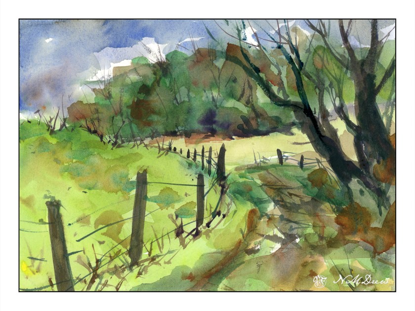
Whenever I have not painted for a bit, I like to dive into something which is comfortable – landscapes – and makes me happy – brilliant greens against an intense sky. The American Southwest can provide it, as can spring in California, but today I went to Pixabay to look at pictures of Great Britain. I love their landscapes, especially the Dales and the South Downs, and anything along the coast. Here, living in dry California, such lushness always appeals to me.
This is certainly not my best work, but it is not my worst. The usual lack of depth dogs me except perhaps for the hilltop in the upper left below the sky. I do like the simplicity of my colors, though; it is too easy to do detail after detail after detail.
Anyway, I spent a few hours somewhere in England, and it feels pretty good.
If you have been following along here, besides Inktober 2019, I am also working my way through Rick Surowicz’s online class “Abandoned.” Here I am trying to apply some of the points learned in his class about greens, how to mix them, and how to create warm and cool greens to demonstrate environmental temperature and distance.

To mix a cool green, Surowicz used Cerulean Blue (to give coolness), Sap Green at times tempered with Pyrrol Red, Raw and Burnt Siennas. Varying the mixture in strength and dilution determines if it is light or dark. Here I applied the mixture to the hills behind the hut, as well as put a few streaks into the foreground.
Warm greens hold the same formula as cool greens except the Cerulean Blue is not used. The result is a warmer green, and depending on need, the Pyrrol Red is added, creating a darker green while keeping it in the warm arena. The Raw Sienna creates a warmer, yellower green, and the Burnt Sienna creates a more autumnal tinge to the grasses in the foreground.
In addition to creating warm and cool greens, I also worked on lines to demonstrate direction and texture, as well as to break up horizontal and vertical.
As a study, this has been successful. Critiquing it, I would say that the right lower portion of the stone hut should be lighter so as to contrast much better with the middle ground. Right now it recedes and gets lost.
Practice is important in all we wish to master – here, a practice study to apply some lessons.
Painted on Fluid 100 CP 140# paper.

After playing with yellows yesterday, I decided to try to mix greens. A very green landscape seemed appropriate. Most of the greens were mixed using hansa yellow, quin gold, and cadmium yellow along with cerulean blue, ultramarine, and cobalt. At times, I pulled in Hooker’s green, which I really like, along with some sap green. Others at times, too, mixed with yellow or blue, or even orange!
Looking at the painting, the sky seems to not really match much of the linear quality of the rest of the picture – technique, I expect. I had wanted the trees, foliage, and foreground to be softer, more blurred perhaps, but still full of greens. One thing I should have done is to have not painted the sky across the entire upper portion of the picture – this kept the green foliage from being more discernible or distinct.
Overall, I am rather pleased with the final result. The goal was green, which I certainly got, but the composition and style, while not what I envisioned, are not too bad.
