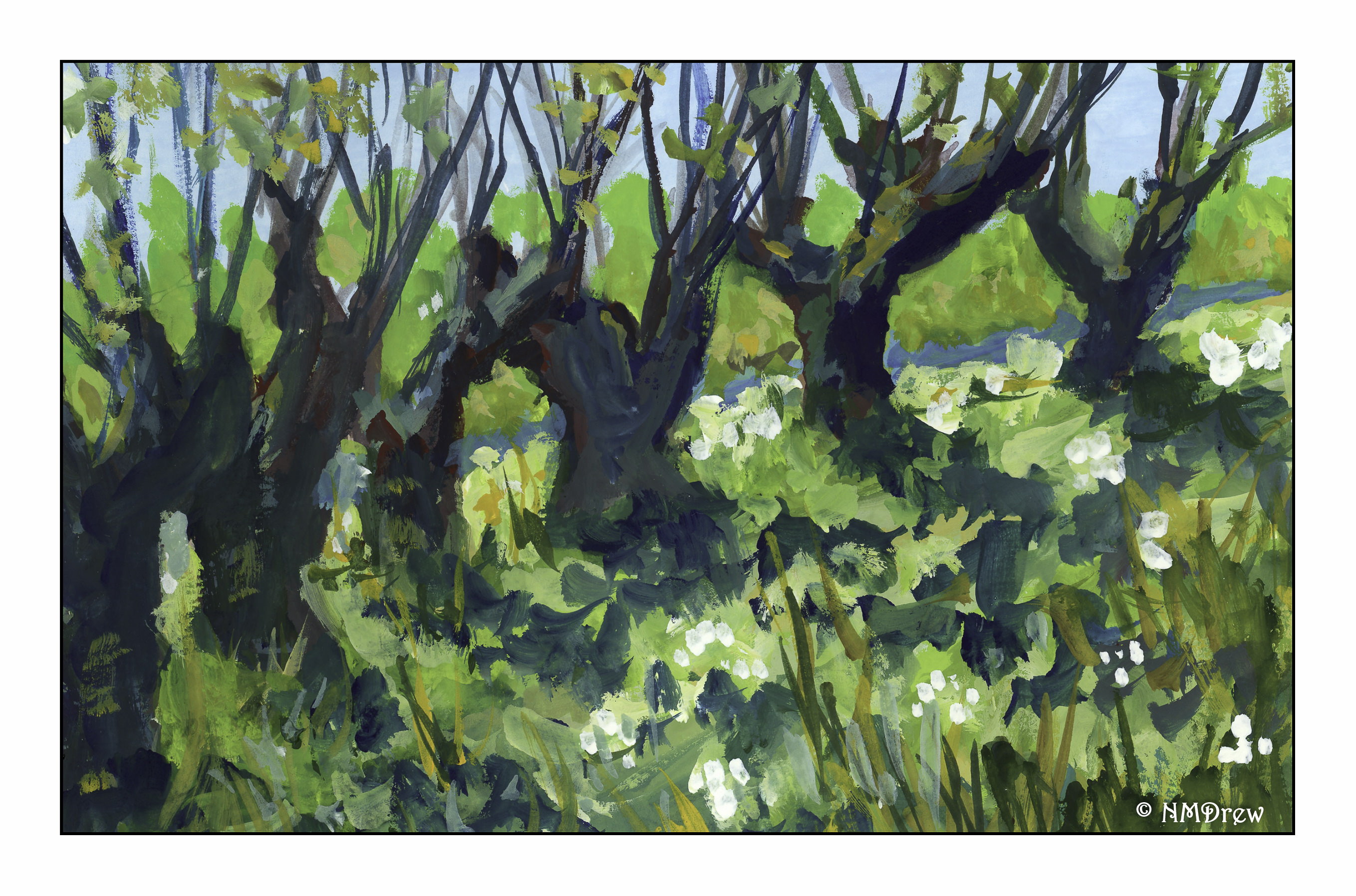
We spent a few days up on the Monterey Peninsula last week. I took lots of pictures, some with the camera, some with the phone. Digital is wonderful for catching so much – but it also keeps you from seeing things at times if you use the scatter gun approach that digital photography allows. I tried to frame my photos more thoughtfully than I sometimes do, taking time to consider composition and so on. All of this was with reference to the idea I would like to use material from my trip as potential painting subjects.
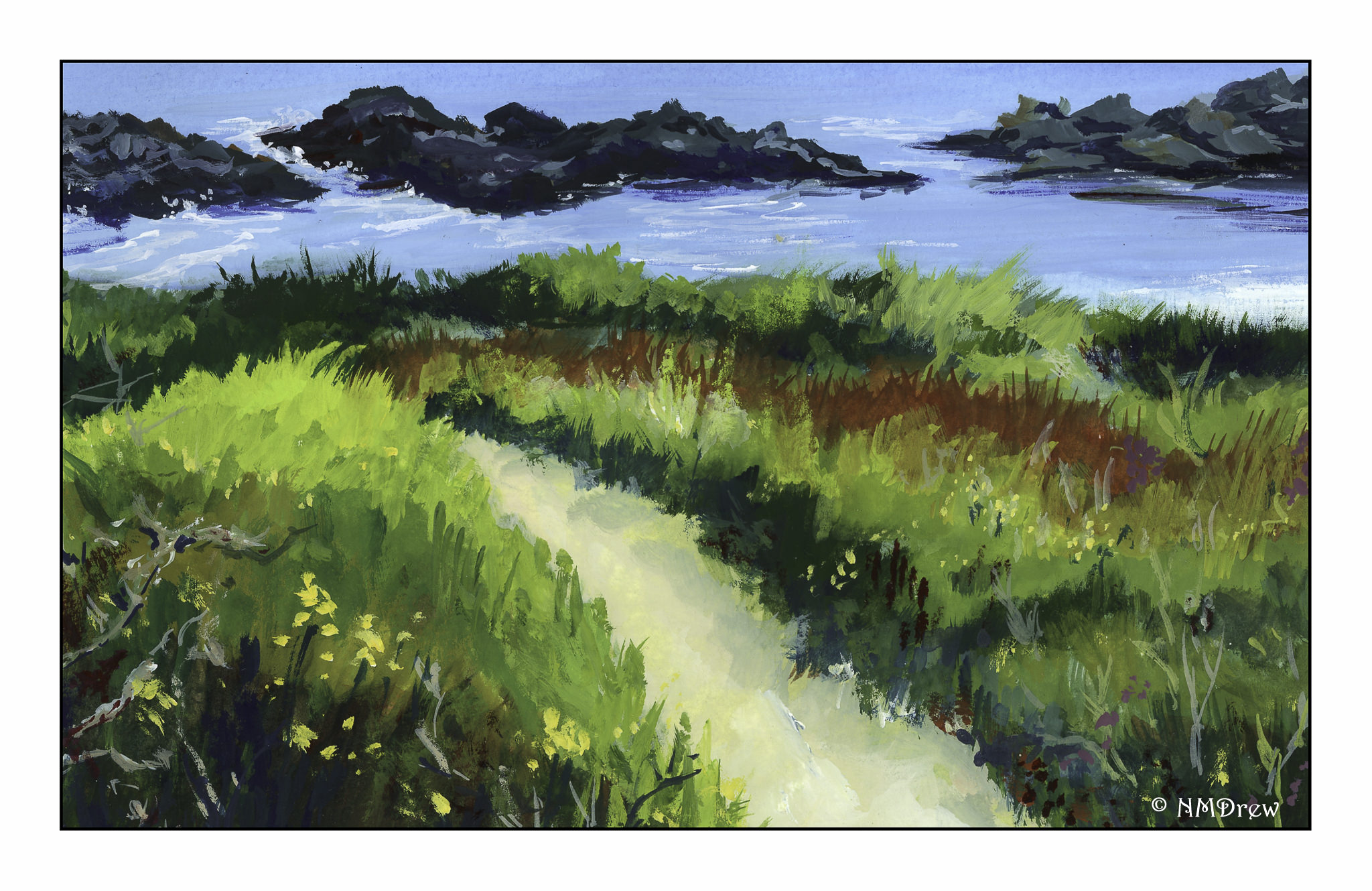
Above is one such example. Once more, my sense of depth is not the best. I tried to employ some of the techniques I know – atmospheric depth, less detail in the distance – but I really didn’t do a great job. In some ways, the painting sort of created itself. The path in the photo was curvier – way curvier – but it decided to become straighter as I painted. I just noticed that!
Anyway, I am planning to continue to paint every day. I do have some great subject matter. I plan to alternate watercolor and gouache, and become a bit more academic – find things I want to work on, and then study it, whether from a book or an online video.
I can say I have improved over time, but I am not where I would like to be. The question always at the back of my mind is, what do I do when I get where I want to be?