Yesterday was Painting Disaster Day. I suppose it had to happen after a couple of good rounds. It was also nearly 100F, and even with the air conditioning on, I was hot and cranky, and that doesn’t make for good focus. Anyway!
 I took this photo last month, and rather like its moodiness. The dead leaves and bright new leaves create interesting colors while the trunks create interesting lines. The first attempt to reproduce this painting in some form or another began with pastels, then gouache, and finally watercolor.
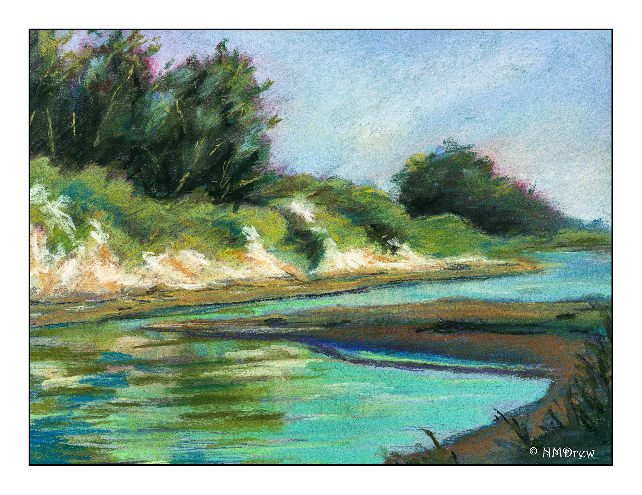
 This pastel painting is rather clumsy, but I have found in doing these kinds of series that usually the first one, in whatever medium I am using, is always the starting point. I learn more about the picture as I paint it. 9×12 on Mi Teintes paper.
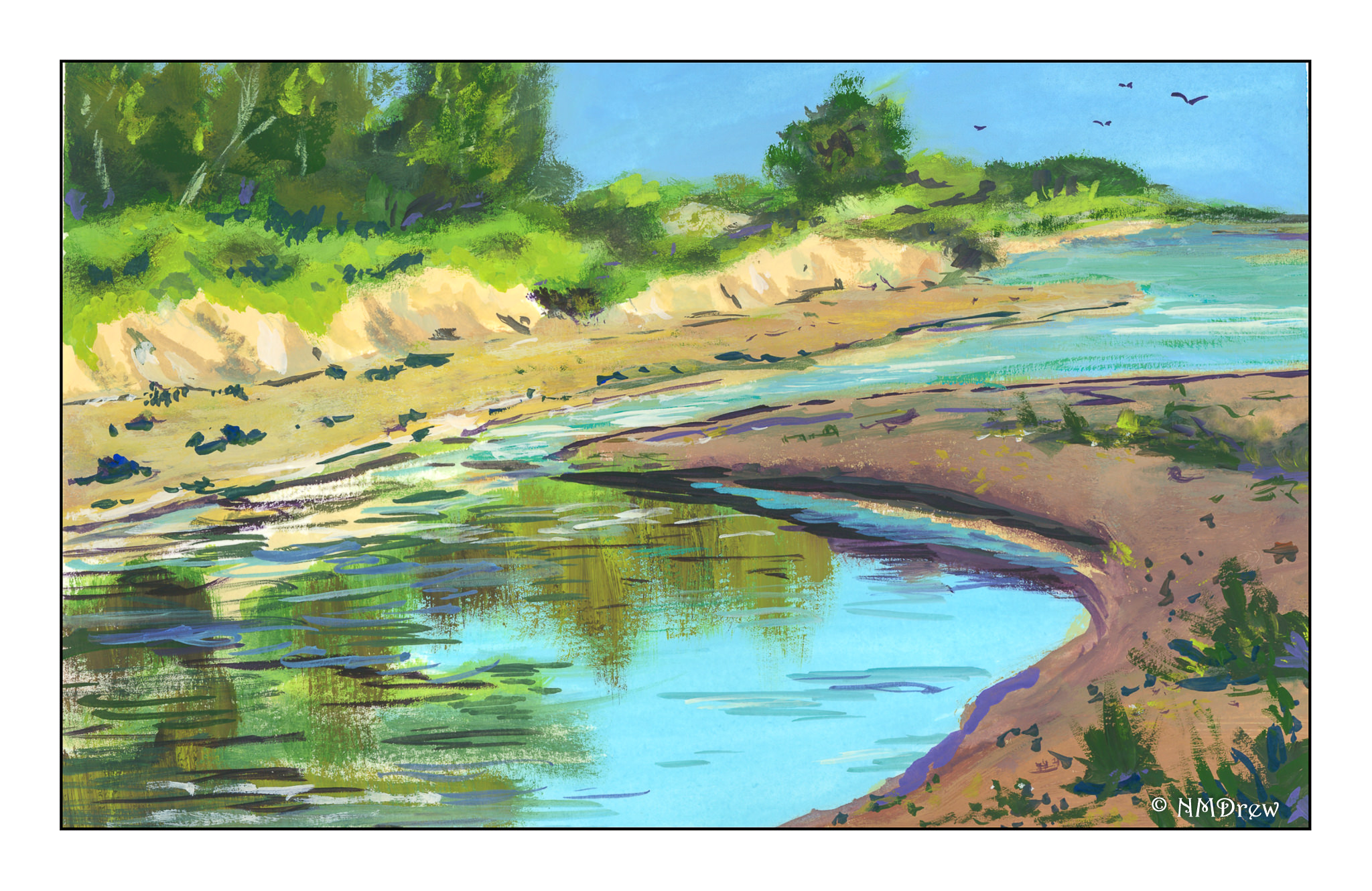
 This is the second in the series – a small 6×8. What I did differently here than my usual gouache is I used Arches hot pressed paper and worked to keep my gouache paints thin (cream consistency) and moist while I painted. The smooth paper and smoother paints made painting a lot easier. It turned out pretty good!
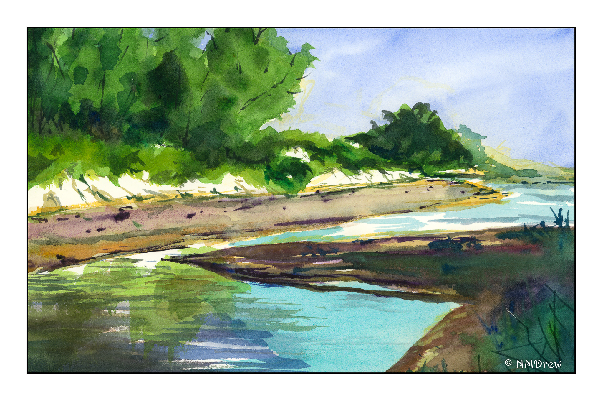
 Finally the watercolor. This is on the reverse side of another painting, on 16×20 Arches cold press watercolor paper. As both pastels and gouache allow for opaque overpainting of other colors, by this time I had a pretty good idea where light and dark were and could plan ahead. I used frisket on the tree trunks and in areas where the leaves are hit by the sun. Keeping these areas masked off let me apply broad washes across the paper without losing the shites.
Altogether, I am pleased with this series. I think I may redo the pastel painting as I have some new pastels to try out! Meanwhile, I am looking for some buildings for my next triad (or “try-at”) of paintings.