Contrast Studies in Gouache

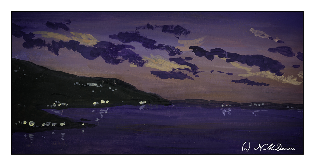
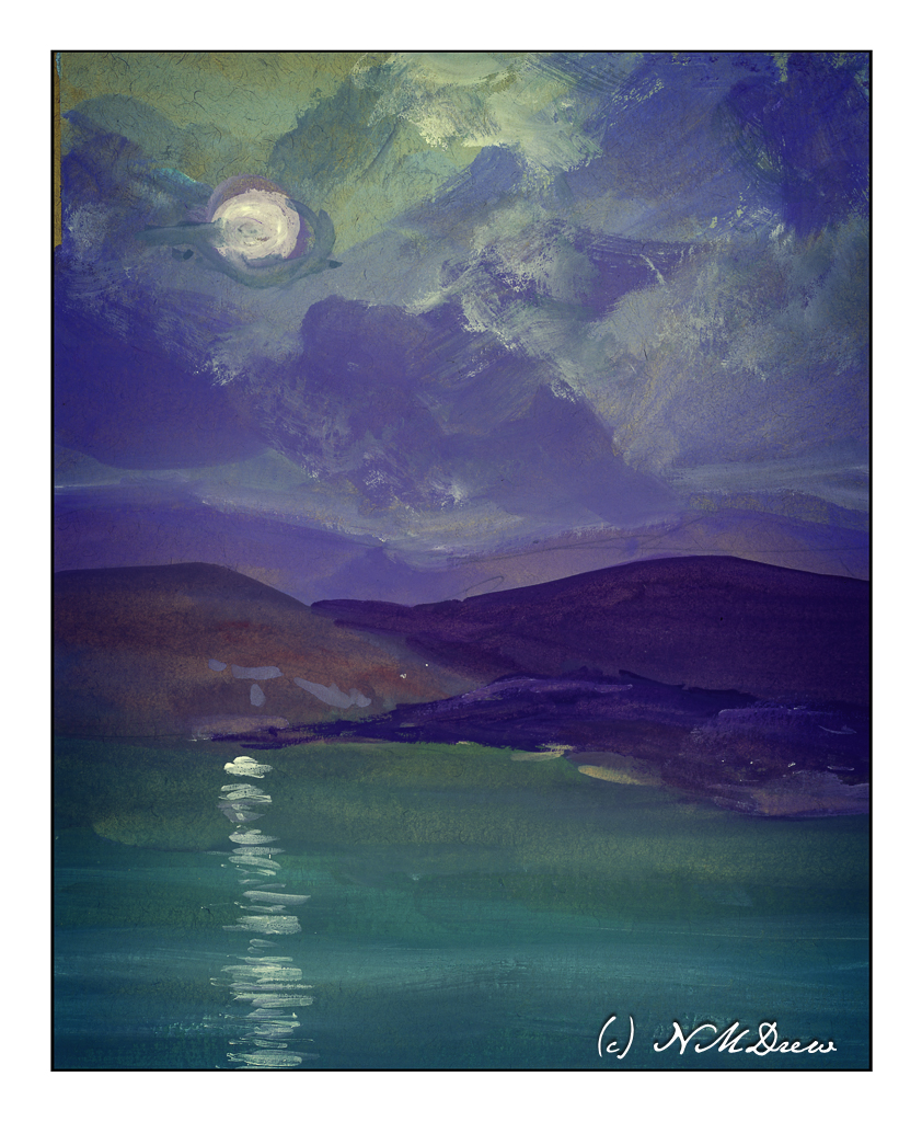
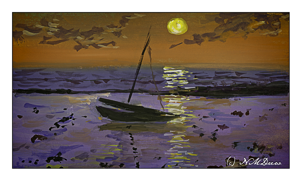
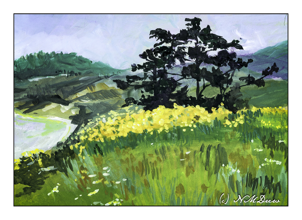
Today I set another painting goal: contrast. This means working toward bright whites and dark darks. Catching light is what art is all about, at least in photography and more realistic painting. I tend to struggle with contrast, more so when the colors are very similar. Today I decided to work on the light-dark contrast, but in the near future, monchromatic studies in black-grey-white and in variants of tone will be done.

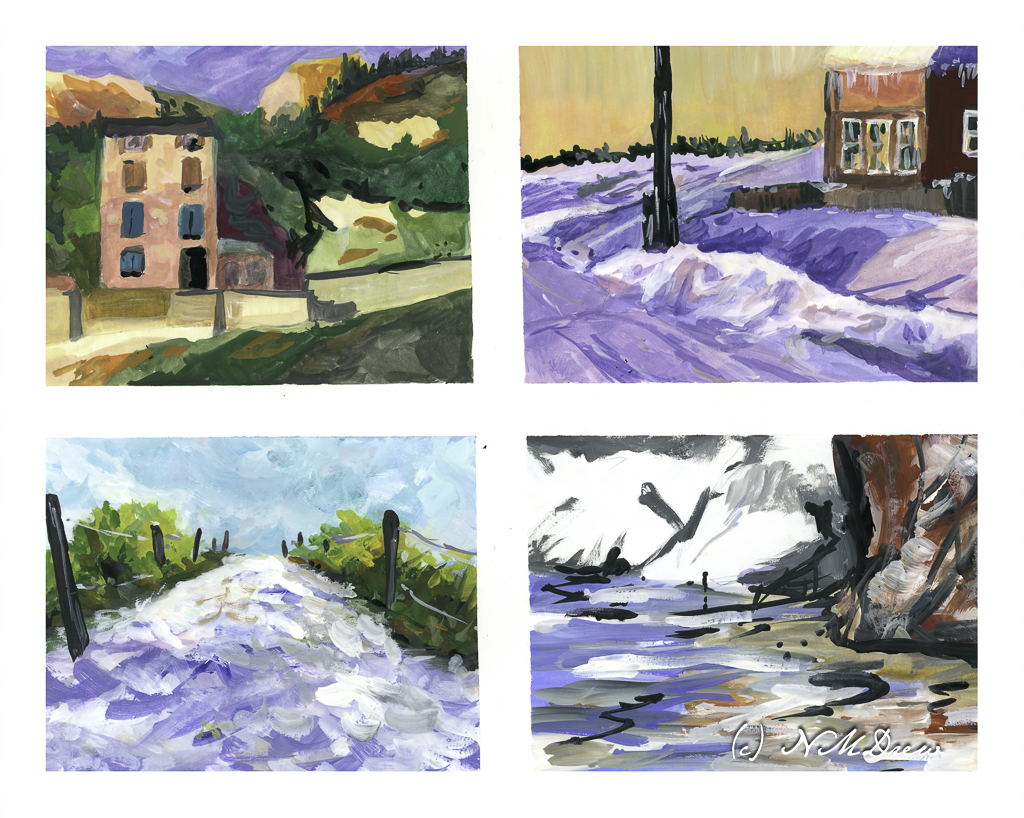
Today I chose a white, multi-media paper with a very smooth surface. I blocked off 4 rectangles on a 10×14 sheet of paper, so each rectangle is about 4×6. This is the single sheet I used.

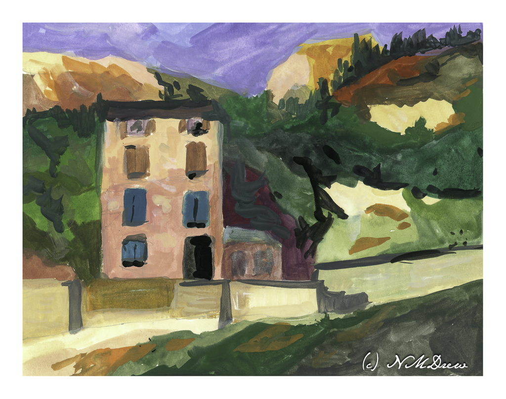
This is the first painting I did. I looked to have a shadow on the lower part of the building and the upper part in sunlight. The same for the various bits of light and dark rock and walls, or whatever they are, to give a sense of a strong light, perhaps from a late afternoon.

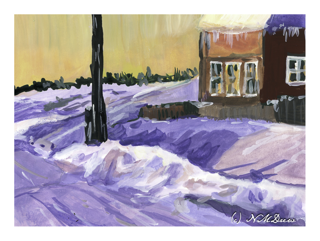
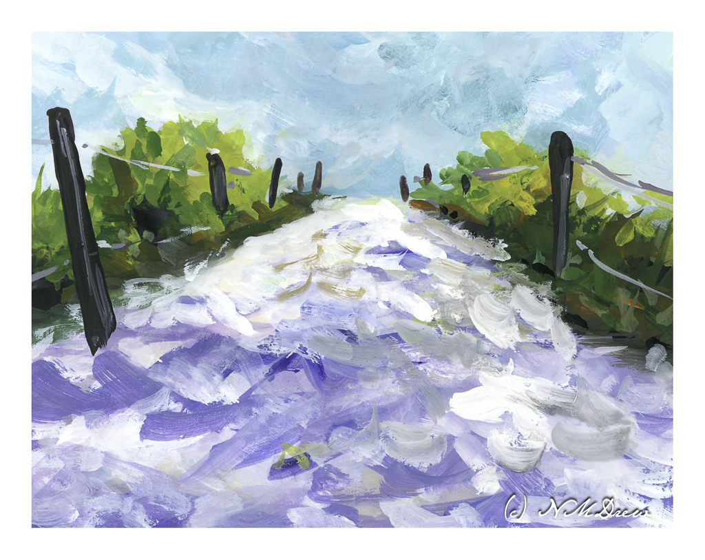
This painting was a bit easier to do than the first – I was warmed up. Here, I wanted to catch bright snow and shadows on snow and buildings. I used titanium white for the really bright bits of snow alongside the road. The contrast is much stronger than in the first painting, but the real challenge lay in capturing the snow – which is white – in shadows. I also put in some icicles on the building, which was rather fun!

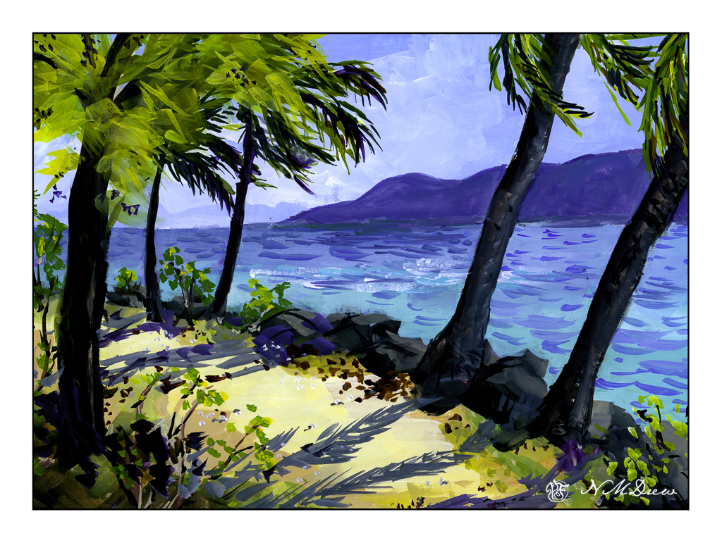
Moving from the dead of winter in the middle of nowhere, I now went for a bright day in the Caribbean. White sand, bright sky, brilliant light, strong shadows. I think this worked out fairly well and am rather pleased with my contrast.

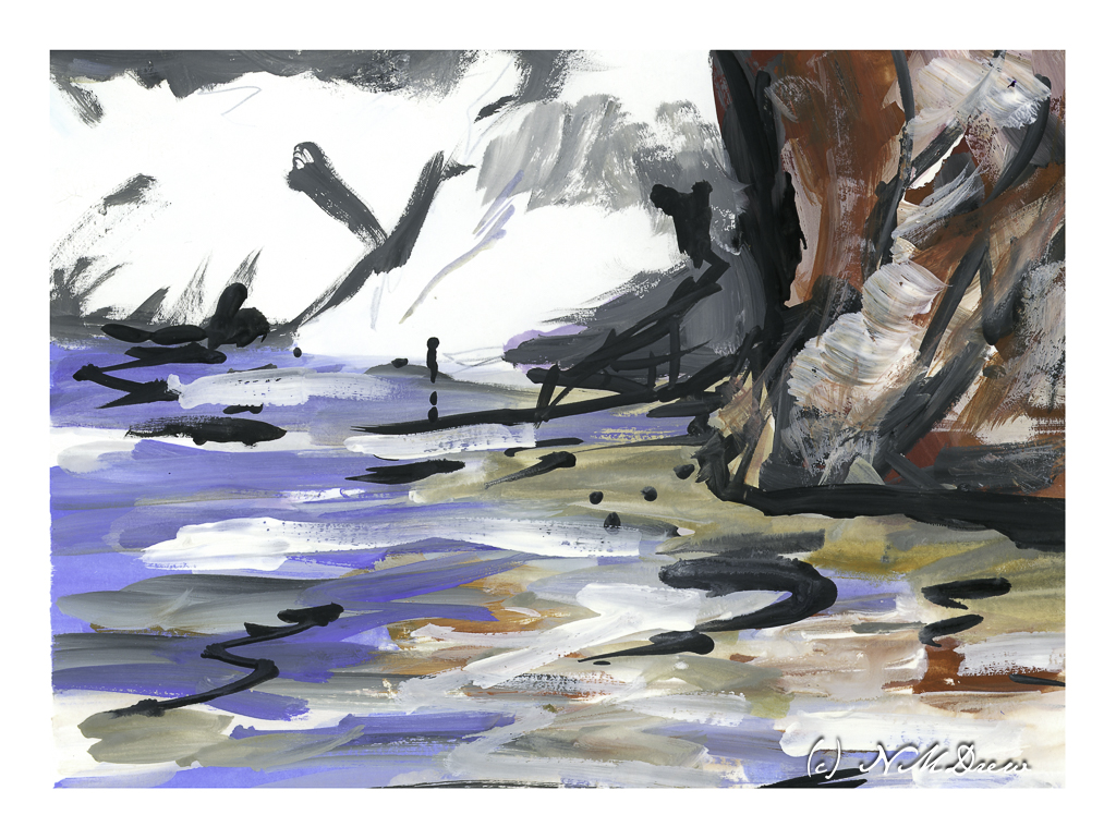
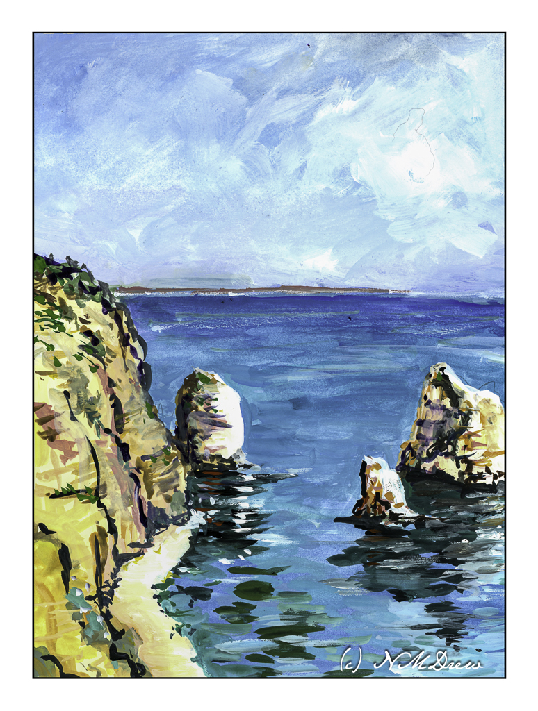
And this one? A crazy bit of abstraction of a beach, reflections in shallow water, and bright white cliffs in the background. I did this just to be “painterly” and use up the paints left over on my tray. Playtime with a bit of success.

Today’s activity accomplished what I wanted to do – strong contrast in different settings. There is a challenge in gouache insofar that colors are a bit odd in some ways. I played with colors as I mixed them trying to get a color you might call a “rosy glow” that could portray the golden light of a late afternoon or early evening. A strong white, too, with very little if any color added, was used for the cliffs and sand. More than anything, the experience of working on a lot of little paintings turned out to be a bit of fun because each painting had a slightly different area, or areas, of brightness and darkness.

Gouache, 10 x 14 paper divided to about 4 x 6.

Nocturne Studies in Gouache

For some reason, gouache seems to be especially good for depicting strong colors and contrasts. In part I think it is simply because the colors can be so very saturated compared to watercolor. Their opacity also lends to this. Artist gouache is also water soluble, and you can re-wet what you have painted to modify it. You can hide mistakes, but you can also scumble and scratch and get some rather nice effects.

I divided up a sheet of tan paper which measures 11×14 inches. I used a lightly sticky artist’s tape to make up the different areas to paint. The first I painted is the large rectangular area on the right, and then on the left I did the next largest rectangle, and finally the one in the lower left corner. This image is directly from the scanner, so if you look carefully, you can see my mistakes which I corrected using Photoshop. The one in the lower left has 2 masts in the reflections – that is because I misplaced my mast and had to fix it for the final image.

Cheating? Well, if I were printing these critters, I would fix them, so for purposes here, I don’t think so. Also, these are all studies and the point is not accuracy so much as atmosphere – night, whether after sunset, before sunset, and on a full moon night.

In the above painting I wanted here was a sense of dusk, when the sun is down and darkness is coming on. I worked with the sky, making it brighter than the water because with the earth’s curvature, the sky will still be bright. Lights coming on, too, add to the atmosphere, some warmer than others. And reflections, too, on the rather calm water.

This one I played with in post because all of a sudden, in one foray of this or that setting, the light of the moon suddenly seemed to light up the surrounding clouds! I really liked it. Now, as far as the moon’s reflection on the sea – should it be more narrow closer to shore, and wider toward the bottom of the page, suggesting that is where the viewer is? The same applies to the painting below.

Once more, dusk. The sun is still out, but it is becoming increasingly dark. The sun’s reflection on the sea may need to be more narrow toward the horizon – again, something I need to check. What I wanted to do here was to get a sense of a boat resting on shallow water because the tide has gone out. The water is acting as a mirror and a bit of glass for the light above and the sand below.

Altogether, I had so much fun doing these studies! I want to carry them into watercolor, which I think could be extremely challenging, as well as into acrylic and oils. I also think that, much as I like the tan paper, it is very absorbent and perhaps I need to use a layer of acrylic paint or casein as a bottom layer for the paints. That is something to try later on.

As I post this, I have been awake about an hour. Rather funny to post a bunch of nocturnes as I watch the sunrise.

Now, back to my coffee!

Toward Yaquina Head

Awhile ago I went to Newport, Oregon, with a friend. We spent a few days there and went to the various touristy areas around town as well as visited the Yaquina Head Lighthouse. It was a rather overcast day, quite chilly for the middle of summer. The hills were green and filled with wildflowers, the sea air fresh. Coming from a dry SoCal, it was a bit of paradise! I took a lot of photos, and this painting is based upon one of them.

The medium of choice was gouache with a tan heavy-weight paper as the surface. I usually paint on white, but as I have a big tablet of it, I decided to go ahead and try it out. I rather like the results, but truthfully have no idea if the tan paper makes a difference in the final appearance. The whites do seem brighter in this painting than they usually do, so perhaps there is merit in using toned paper. More paintings on the toned paper will be done as I like the surface for the painting.

Gouache, tan toned paper, 7×10.

All on a Saturday Afternoon

There are times when it seems all the piddly little things pile up and I spend my days doing them, like a list of a million bits of this and that. It gets depressing. It is important to do more than just tasks and chores and the to-do list. Today, after spending too much time on oil painting and working on getting myself organized, I just pulled out the gouache and some paper and played.

First around, trying a paper that I haven’t tried before. This is an inexpensive cotton paper with a decent texture for watercolors, but too much texture for gouache. I had forgotten that gouache is much better on smooth paper. I chose flowers as it is summer time.

I have yellow cosmos – a bit past their prime – in the front yard. A tall, jolly mess!

Here, echinacea. I often grow it, but this year did not. I like the way the petals fall back and the center is bright orange and black with bits of yellow. Not a good painting – too dark and messy.

Mullein is a wild plant but it has been hybridized to grow in colors such as pale yellow, lavender-pink, and whitish. It is normally a yellow flowering plant with dark centers. I have thought of growing them but so far haven’t. Maybe next summer.

And then, I moved on to a smoother paper. Here, a coastal scene with rocks and sea and clouds and a distant shoreline. Here in California the coastal fog comes and goes, making for some chilly summer days!

I like this one the best, in part because it was easier to paint on smooth paper. Gouache is such a fun medium as it is easy to use, never looks real but does, and so on and so forth.

Altogether, a nice way to spend an afternoon outdoors ignoring the list of petty crap that seems to be dominating my life these days . . . .

A Bit of Paradise

I’ve lived on both coasts of the US as well as been to a few other places. The color of water never ceases to interest me -blue, turquoise, grey, green, fluorescent!

Along with the waters, the intensity of colors is also dependent on where you are and the weather. Here in California, as in other dry climes, when the sun is out and the moisture in the air is very low, the light has its own intensity. This light changes with the seasons and the tilt of the earth. Landscapes without water problems are more abundantly green and often may seem softer simply as the water in the air creates an invisible filter.

Like many people who have enjoyed harsh winters, tropical scenes with palm trees seem like paradise! And I will leave that thought – paradise – up to your imagination!

Gouache, 9×12 Strathmore Vision 140# CP paper.