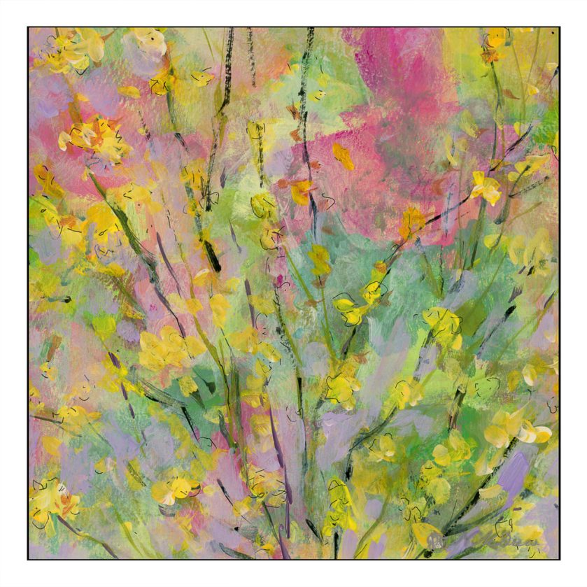
Today I wanted to paint but had no desire to do anything more serious than play. This is the second of 2 paintings I did using big brushes, color, and slapping on paint. Eventually this evolved, and it’s a bit soppy if you ask me.
Tag: Golden Fluid Acrylics
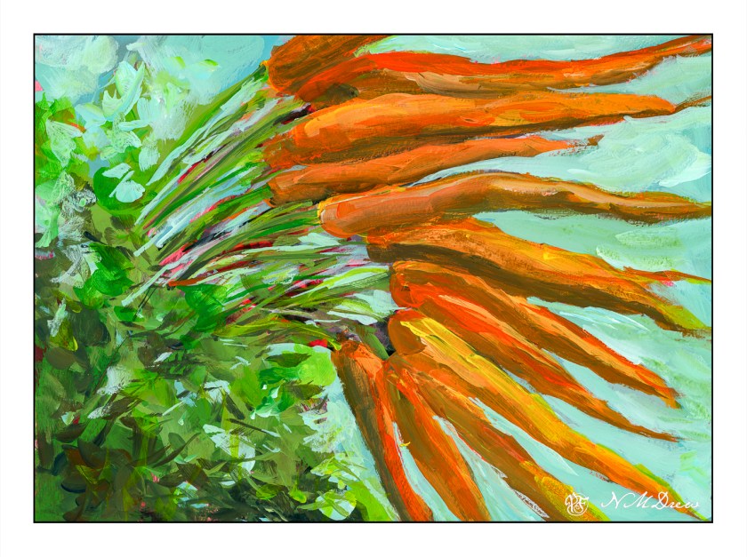
Carrots
I watched a few videos by Jane Slivka, an acrylic painter out of Florida. She tones her canvas with a reddish orange color, paints in the major shapes in Hooker’s green, adds white for highlights, then proceeds to build her painting. Her paints are heavy body while I have been using fluid acrylics. I thought her process was quite interesting as it is seemingly spontaneous, but not without structure. Her steps give it structure, but she is not a slave to her subject – she sort of moves along with a game plan and no game plan, if that makes sense.
What really fascinated me was how she actually creates values by working in the lights and darks before adding colors. Additionally, the red tone beneath the brushwork pops through, and adds a bit of sparkle to her paintings. Negative and positive space and shapes are worked back and forth.
I tried to follow this approach, and found it really quite interesting. In many ways it simplified what I wanted – lights, darks, values, contrast. Carrots are not especially exciting things to paint, but they are quite cheery with their bright colors of orange and green.
Painting the carrots and their tops was really fun. I didn’t take this painting seriously, and sort of slapped around colors, working to see what might be successful, might not be. Never before have I toned a painting surface with cadmium red, but I think it could become a favorite thing to do. Yellow ochre is a wonderful color, but it is not especially dramatic. The little bits of red poking through the greenery is quite pleasing to my eye. I expect I will try more paintings like this.
Golden Fluid Acrylics, Strathmore 300 watercolor paper, 10×14.
Sunflower Field
Yesterday I posted some of my paintings and a master copy of Khan’s Ground Fog to practice using large, simplified swaths of color to create abstractions of landscapes.
I like abstraction and simplification of things in paintings, but pure abstraction seldom attracts me. Recognition of whatever a painting is trying to depict seems to be essential for me to want to look at a painting, but as I study colorism / colorfield / abstract expressionism more, I find that sometimes pure color by itself can be enticing. I used to detest Rothko’s work, but now I am finding it quite entrancing as I appreciate the subtle qualities of color, and colors adjacent to one another, a lot more.
With this in mind, along with observing the work of Wolf Kahn, Richard Mayhew, Hashim Akib, and Andrew Faulkner, I painted this field of sunflowers.
I started out with big color fields for the sky, trees, and sunflower field using the basic colors of blue (sky), dark green (trees), and yellow and green (sunflower field). From there, I really worked to keep the foreground simple enough as the treeline, mountains, and sky do not beg for detail.
Initially I wanted to paint dots to represent the center of the sunflowers, but in the mindset of color planes, I didn’t. It paid off, but I was still not happy with how the sunflowers and foreground areas looked. Thus, some dabs – but bigger ones, brush strokes instead of dabs to be more accurate. Negative painting, too, and straight lines to represent the sunflower stalks. The buildings and poles were added at the end to add interest to a very horizontally oriented painting.
I am quite pleased with this painting. Goals were accomplished and my own style emerged here. I also did a lot of thinking about colors, how to paint a straight telephone pole (put a card down and run the paint brush along the edge), atmospheric perspective. Simplifying was difficult, but the broad swaths of color with variations within worked. In short, I have a bit of an abstract landscape in which the subject matter is recognizable, but not realistic. If I want a photographic rendition of something, I’ll just take a picture with my camera!
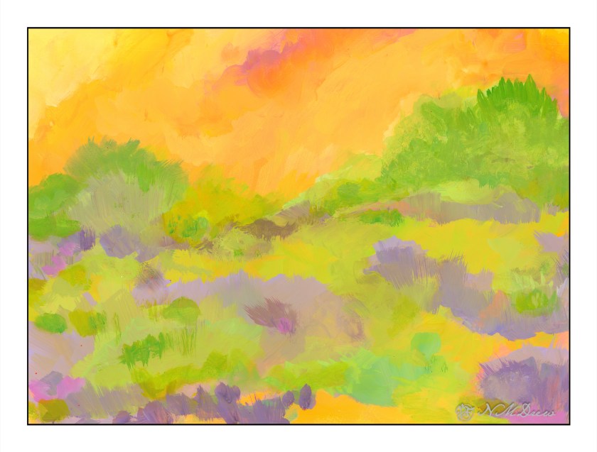
Into the Blazing Hills
One thing I enjoy about a retrospective show of an artist’s work is to have a sequential progression of his / her development. As an erstwhile “artist” I find myself is bopping around. It is my erratic personality – my magpie personality – drawn to this and that. That is probably why I like Hawaiian print shirts – colorful and rather crazy. When I look at my own paintings over time, color is always the primary theme. Sometimes my color usage is quite bad – nay, awful! – and sometimes very much to my liking.
In this vein, I decided to just paint with the Golden fluid acrylics, spreading around colors and creating shapes. I figured it would make itself known to be whatever it is to be. As someone who likes landscapes, I figured it would become one. My thoughts were, as I progressed, a flower meadow, hills of flowers, trees, and then just putz. Using acrylics means putting paint down in a way which works with their quick drying qualities, but I did use matte medium. A lot of times I just dumped color on the palette paper, mixed, added white, and then mooshed it around on the paper. The matte medium creates a bit of transparency, and it makes a sort of glaze over underlying colors.

Painting was done with wide, flat brushes – 3″ and 1″ flats – later a large round – and my fingers encased in nitrile gloves. It took about 3 days and 6 hours to paint this on 15×20 watercolor paper. Golden Fluid acrylics, matte medium.
Colorism is something that truly appeals to me. Not Fauvism, which I find a bit too loud for my taste, but colors to create an emotion or feeling more than reality, with a bit of a suggestion of reality.
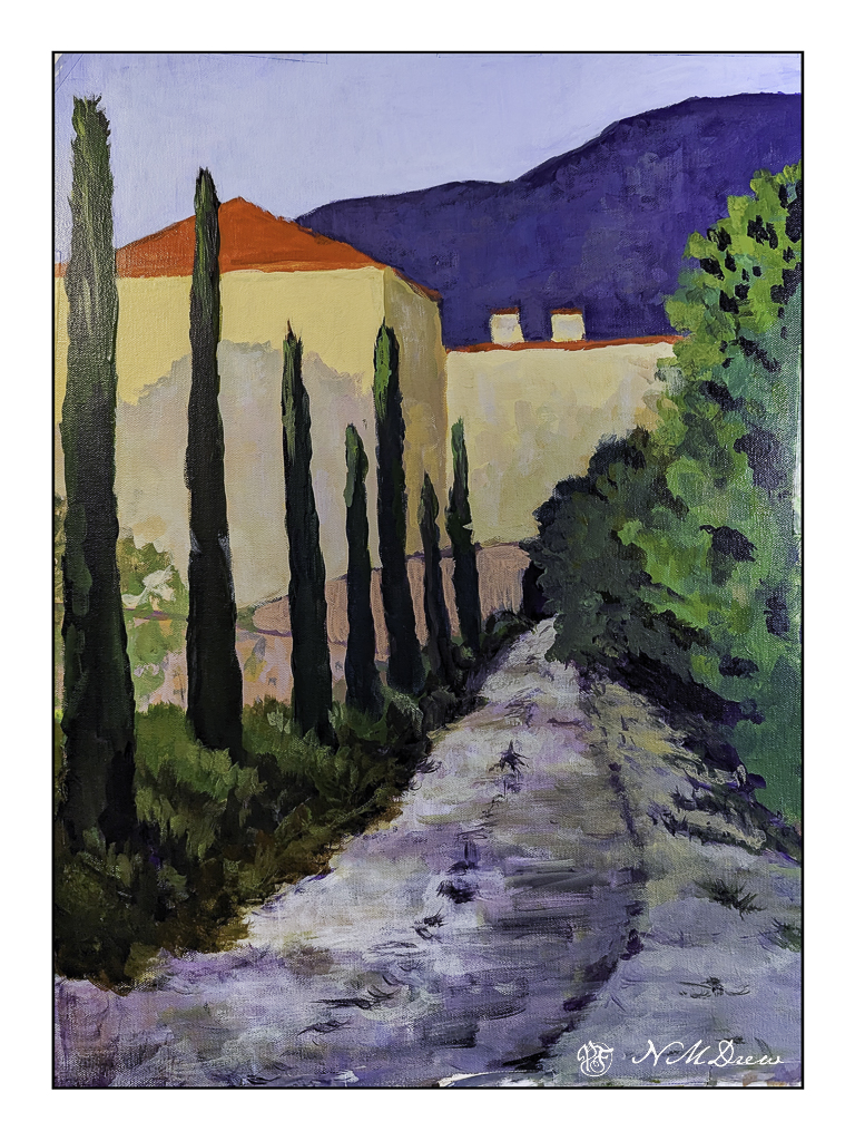
On the Road to Somewhere
….via plane and ship!
In between everything and all the organizing and deciding and packing and griping and whining and worrying and daily stuff, I did manage to start a painting. It’s on a bit of 14×18 inch Fredrix canvas, taped to coroplast, and on the easel. It has been through multiple iterations since its inception, and still has a way to go. I will finish when we return, and I am sure I will see it all with fresh eyes.
This is not a great picture – a photograph rather than a scan – but it does show where it now stands. I thought a painting of a road and building might be fun to do. I still need to put in windows and work a bit on the middle area where the two pinky curvy bits of architecture are, as well as some of the leafy trees on the left. The photo makes it a bit askew, but the roof lines are actually straighter in the painting.
I usually work in watercolor, and that is usually a more immediate event than returning to a painting daily for a few hours. In fact, it is an altogether new experience for this impatient person, and I am finding I rather like the time I have to come and go with a painting. Having it on an easel to look at all the time is also a new experience. It let’s me look at it and review it from where I sit in the studio, typing away about it or other things. I wonder how this newfound taste and appreciation for time and painting will play out on our trip.
Golden Fluid Acrylics, 14×18 Fredrix canvas.


