Delicious Dessert: Clafoutis!

I’m a sucker for summertime desserts, especially those involving fresh fruit.  Besides pies and crisps, clafoutis is a brilliant one – simple, not full of sugar, and very tasty.  Most ingredients are right on hand, too.  I made this one for people with gut problems (IBD), but put the non-gut-problem ingredients in ( ).

Clafoutis

  • 2 large eggs, beaten
  • 1/2 c. almond milk (or regular milk, half and half, or cream)
  • 1/4 c. honey (white sugar)
  • 2 T. melted butter
  • zest of 1 lemon, more or less depending on taste
  • 1 tsp. vanilla or almond extract
  • pinch salt
  • 1/2 c. oat flour (regular flour)
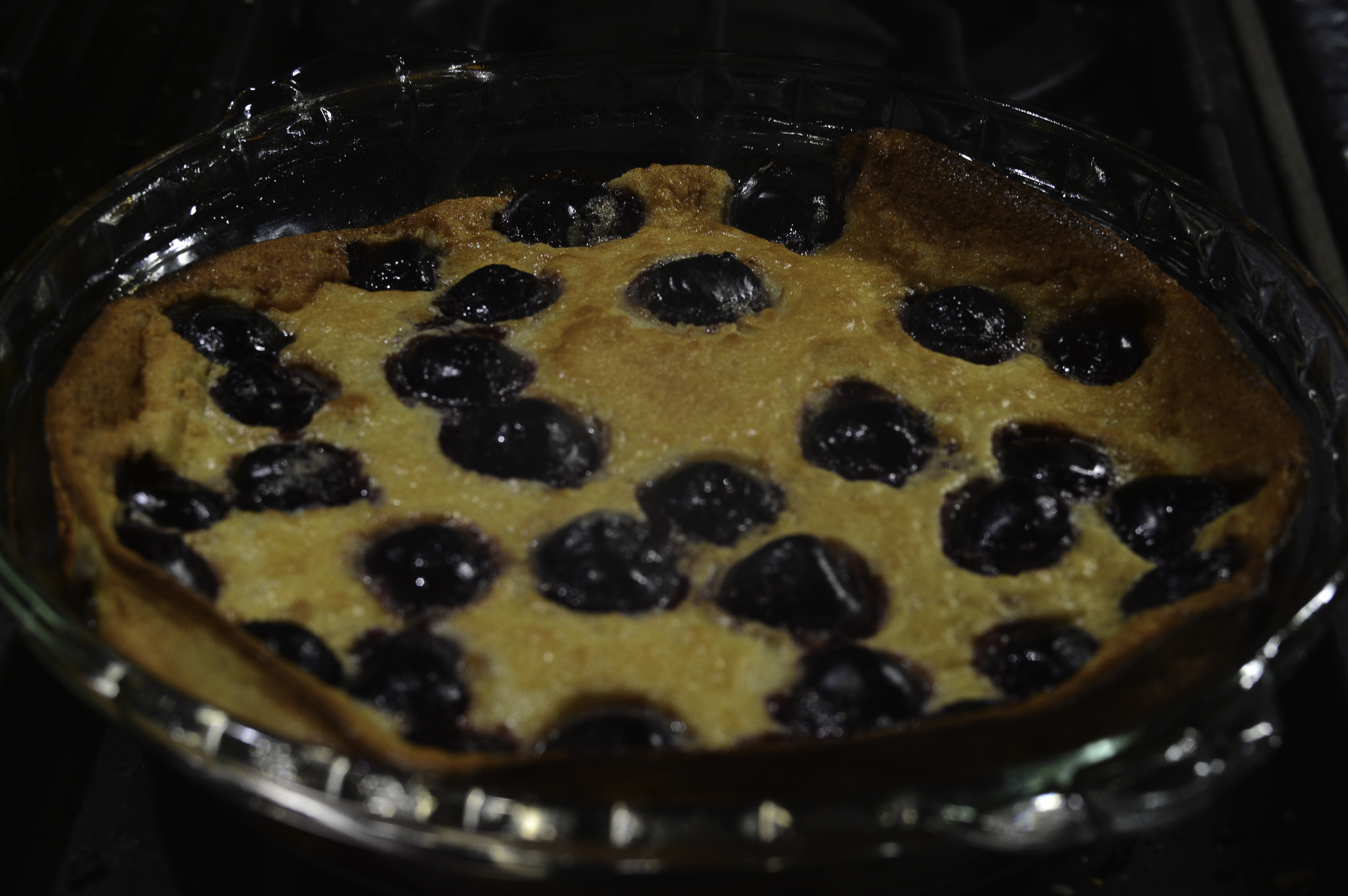
  • 2 c. fresh fruit – cherries are traditional – I used frozen (other fruits such as berries, stone fruits, etc.)
  • (1 – 2 T powdered sugar for garnish)

Preheat oven to 325 F.  Grease 9″ pan with butter or non-stick spray.

Beat together eggs, milk, honey, melted butter, lemon, salt, extract.  Mixture will be thick like cream, but not heavy batter.  Use a whisk – save some dish washing.  Whisk in flour gradually to keep a smooth batter.  Pour into pan.  Place fruit in pattern or randomly on top.

Bake on middle rack of oven 40-50 minutes, checking half way through to see if you need to rotate pan.

Remove from oven, cool.  If you want to add the powdered sugar for garnish, wait until clafoutis is cooled so it doesn’t melt.  Serve warm or cold.  Great for dessert or breakfast.

Devour!

WWM #3: Picnic Food

The third prompt for #WorldWatercolorMonth!  Here, picnic food.  Bread, wine, cheese, fruit.  Sounds a lot more healthy than burgers and fries, and certainly more attractive to paint!  But, oh, what a challenge gouache is compared with watercolor.  I haven’t worked in opaque medium in years and years and years.  Personally, I don’t like the picnic basket, but the cheese, bread, wine, and (sorta) the fruit look okay.

I started with broad swaths of the major colors, such as the green, browns, blues, and laid in the underlying colors for the bread, cheese and apples.  From there I moved into less thin paint to thicker, working from the most distant (the grass) to the foreground.  At the end, I laid a thin wash of ultramarine blue to dissolve a bit of the underlying gouache to create shadows, knowing full well it would lift and blur the paint underneath it.

While I cannot say I love the painting – still lives are not things I pursue, preferring landscapes – I can say that it was definitely a worthwhile study.  Paint handling is getting a bit more intuitive and logical.  So different than watercolor – but at the same time comprehensible, if that makes any sense.  It’s really just understanding the logistics of the medium . . . And, I think I am improving (a bit) in using gouache, which is a good feeling.  I’m looking forward to the challenge of alternating transparent with opaque medium during #WorldWatercolorMonth.

Loquats for the Picking

A couple of weeks ago I took a photo of loquats, not really ready to be eaten, but certainly not too much sooner!

The loquat is a fruit tree indigenous to southeastern China. It is frequently grown in California gardens for its fruit and decorative qualities. The fruit is a pale yellow to a golden color, and the leaves are stiff and dark green. The contrast of the roundish fruit with the wide, pointy leaves makes for an interesting painting subject.

The photo from which the drawing evolved:

Painting the loquat has a bit of cross-cultural history behind it, too; ink painting tradition honors the loquat in Asia.

It would be easy enough to paint a loquat in watercolors, without ink, as well.