Sketching with Shari, iv

The very last lesson in this delightful class on ink and color sketching by Shari Blaukopf. As soon as I saw it I knew it was La Super-Rica Taqueria on Milpas Street in Santa Barbara, CA. Excellent food – it opened years ago and was a walking dinner destination when I lived in the area.

Anyway, this drawing is a culmination of drawing people and buildings, learning a bit about perspective and thoughts about how to do things. I enjoyed this one a lot even in my moments of frustration. Rather than using Bristol paper, I used 140# CP watercolor paper. The first frustration was the texture of the paper and my pencil – a lot of smudges. Still, I continued and laid down the ink lines after I had it limned out. Then, erasing all that smudging with the kneaded rubber eraser, and it cleaned up very well.

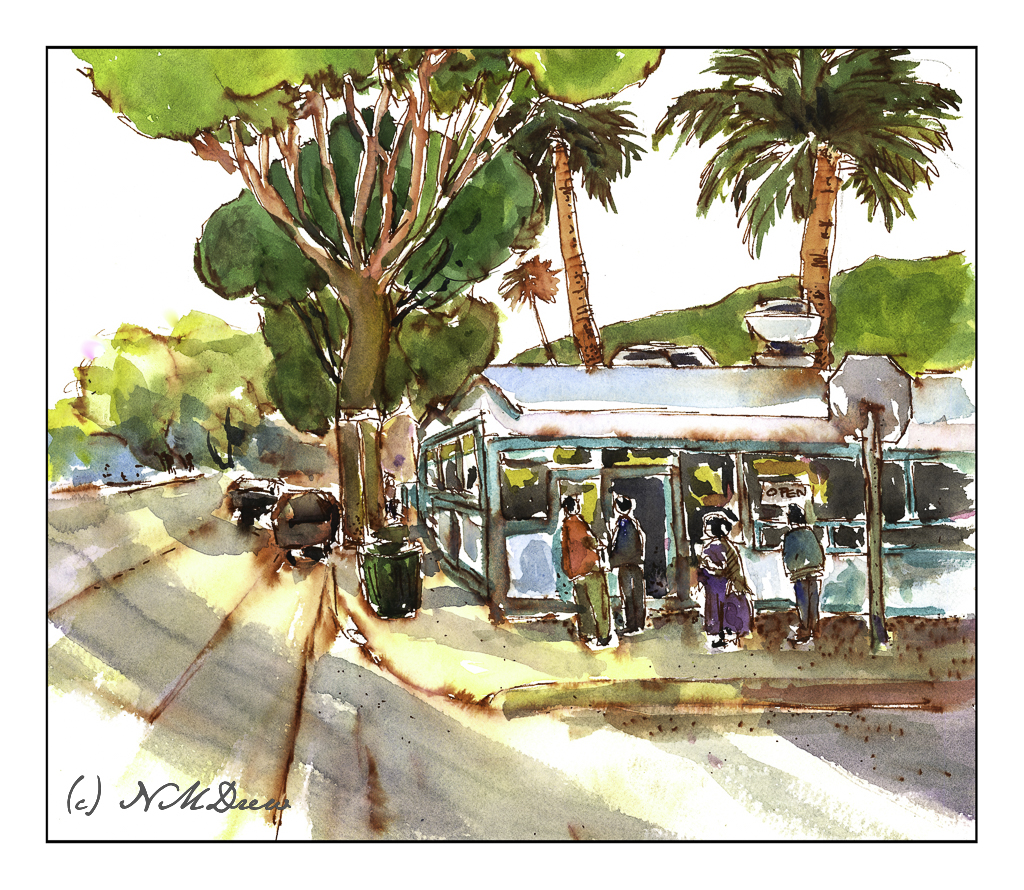
As you can tell by the shadows, this is either early morning or late afternoon – and it is late afternoon. The sun is to the left, which is in the west toward the Pacific. This is an older section of Santa Barbara, and because it is not filled with new and modern buildings, it is charming and pleasant, and certainly a break from modern suburban architecture.

When I started inking the outlines, I began with the stop sign on the right. Can you see how stupidly out of proportion it is? You could knock an elephant out with it! The people and the rest of the drawing are in decent relationships to each other. Unfortunately, I used colors which are rather saturated and did not pay attention to the fact that the ink bleeds a lot. When I painted the major tree to the left of the building, the trunk should have been very light. The same with the mountains above the taqueria itself. Despite that, I like the way it turned out overall. A word of caution – don’t drive the cars as they look quite unsafe.

Ancient Copper ink; fountain pen; 140# CP watercolor paper; brush and watercolors. About 11×13.

Sketching with Shari, i

I think I have purchased every single course that Shari Blaukopf has online! She is such a good teacher, puts together short and affordable courses, and I always learn a few things – or oodles of things – from her! Her latest one is “Sketching Techniques with Pens and Inks” which you can check out here. I do a lot of pen and ink, but figured I would dip into this one just to see what I could learn. And, I did – such as a more clear way to view things from eye level. Ellipses become more round below and above eye level (duh!), and she explained it in a way that made me review my own way of drawing a bit, and perhaps will help me solve some perspective problems.

So, this first one is a potted plant in a planter somewhere in France. It’s a cool planter, too. Shari pointed out that it is good to begin with the big shapes and determine ratios. Top is a circle for the pruned tree or bush. Make a square, insert your circle. Below is the trunk, and beneath that is a large rectangular shape which you can divide into upper pot and lower pot, as well as the stand. Texture a bit for the gravel and stones upon which this planter stands. Shari put in light pencil lines, which she later erased in her video, but I left these in. You can see them very lightly in the painting. Contrast and shape coupled with expressive lines and here we are.

The Victorian door is considerably more complex than the planter, but once more Shari’s clear instructions helped me set up the proportions to make things work. Both the planter and this door came with reference photos, which is very helpful because things can become a bit confusing. This subject was definitely a challenge.

The detail in this subject matter makes for a desire to put it in – one of the good things about pen and ink – but I also needed to make sure I did not lose a sense of light and dark. I used waterproof ink, but to get the greys I put a bit on a plate and used it straight or diluted it as needed. I check the values to the side of the drawing before inking. Lines and dots also add to the texture and contrast of the drawing.

I like my potted plant as it works well with contrast, value, and textures. The Victorian door is more complex. Under the stairs is a second door, and I may go back in and fictionalize it a bit or darken it a bit to the right of the stairs. Something to look at and rethink.

Sailor black ink; fountain pen with Sailor ink; water and brush. Strathmore Bristol paper.

New Pen, New Ink

These past several days just seem to have been filled with stuff that needed doing, not necessarily things needed and wanted. Getting taxes done, going to the dentist, etc., are not my ideas of a Fun Life, but things Needing to be Done.

Despite duty, I have been putzing around. I realized that I don’t have a fountain pen and permanent ink for drawing any more as I lost a pen somewhere – which, no doubt, will soon be found as lost objects always are once replaced – and used up all my waterproof fountain pen ink. I now have a new drawing pen, a $17.00 job from Amazon with an extra fine point, and some of Platinum’s Carbon Ink, which is a long time favorite of mine for drawing. My Not Taken Vacation sketchbook was easily accessible, so off I went to the sunny patio to do some drawing. I used a few reference photos for ideas, and then began with ink and pen.

I chose to draw some snow drops in a vase, Pigeon Point Lighthouse here in California, a little cleft in the landscape, and a wintry farm somewhere. From there, my box of Schmincke pan watercolors, some water, and a brush. All this was sort of awkward as I have not done ink and wash for a bit, but it always feels so good to just sketch and paint, more so when it is out on a sunny patio on a beautiful spring day between last week’s rains and this weekend’s expected downpour.

I am quite pleased with my inexpensive fountain pen which came with the fillable screw adapter I prefer to cartridges, and coupled with the Carbon Ink, I think I have landed a rather happy combination for my drawing pleasure. Hopefully you like them, too!

Quill & Coil

Sounds like the name of some pub . . . but in reality, this is a macro with my Nikon Z 50mm macro lens. 

Quill & Coil

Anyone who does post production with photo editing software knows about pre-sets. I have a lot I have made over time and it can be a lot of fun to manipulate a picture. The original of this was in color, so I converted it to black and white and then used a high-key preset I have made. I like the way it has softened the feather but retains enough detail to let you know what things are.

On an aside, I need to cut some new quills and brew some new ink. I am using fountain pens right now to write, but do like the tactility of a quill pen! However, my fountain pens are a lot of fun, too, and with different pens and inks, the variety is equally pleasant . . .