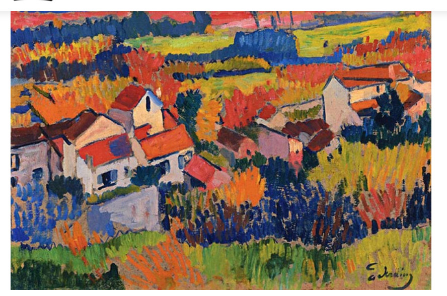
Lately I have been playing a lot with color and trying to use it not realistically, abstractly, and so on. There are a lot of people out there known for their color usage. Andre Derain, Georges Braque, Mark Rothko, Wolf Kahn are a few of them. The name for their color usage varies, from Fauve, Abstract Expressionist, Colorist / Colorism, Colorfield. I rather like the word Colorfield as it seems more all encompassing and broader in content / context than many of the others.
There is a lot more to using colors abstractly than I have realized, probably because I am a bit of a realistic if not realistically realistic person when it comes to artwork. Harmonious colors are important to me, and playing with these as I have has been a very difficult situation. While I like stormy weather, gloomy paintings are not my cup of tea. I don’t like them a lot as they tend to be depressing – but that is dependent, too, on subject matter. Picasso’s Guernica is a good example of a depressing painting – as are many of his portraits during his “Blue Period”.
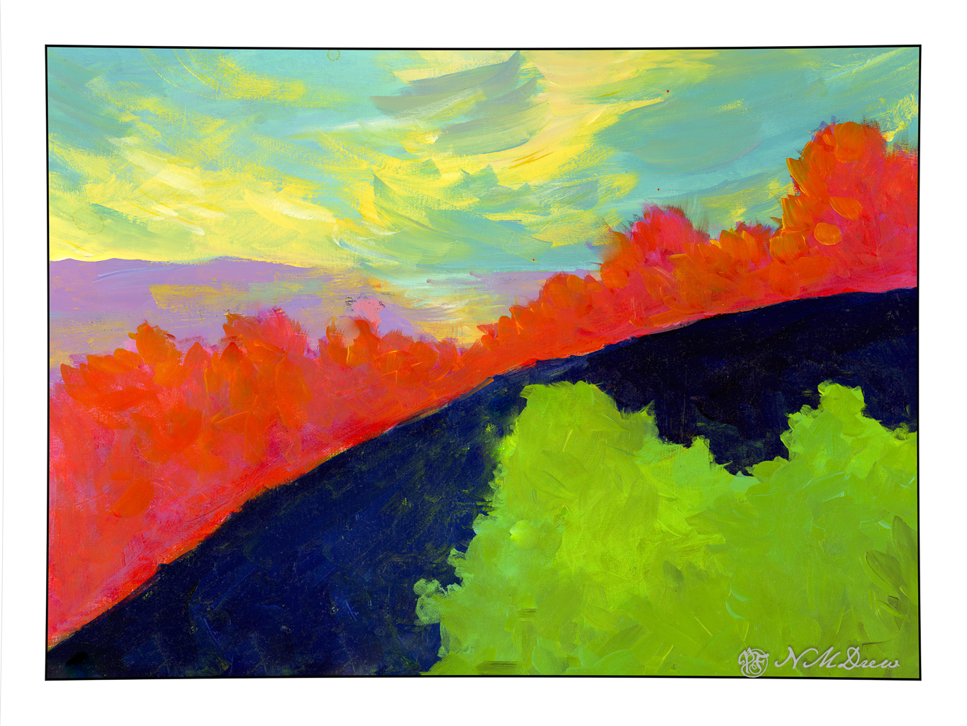
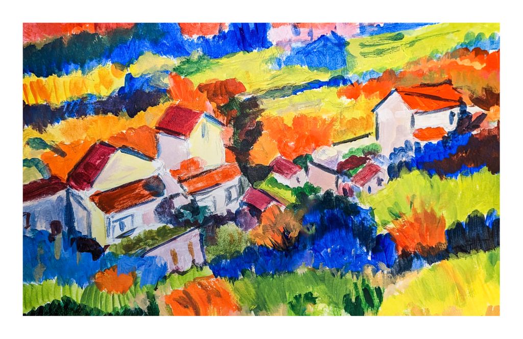
This painting, to my eye, is really depressing. There are parts of it I like, such as the sky and lavender land below it. Independently I like the red / lavender bushes. Below them, the navy and green just don’t do anything for me. Get rid of the bottom or change the colors may be something for the future, but I am pretty tired of this whole thing!
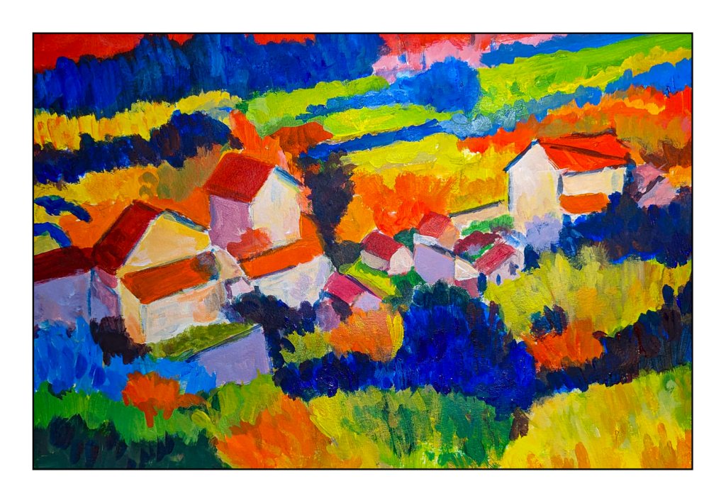
Colorfield – what do I want to do with it? When I did Into the Blazing Hills, I was much happier with the colors and certainly not depressed by them.
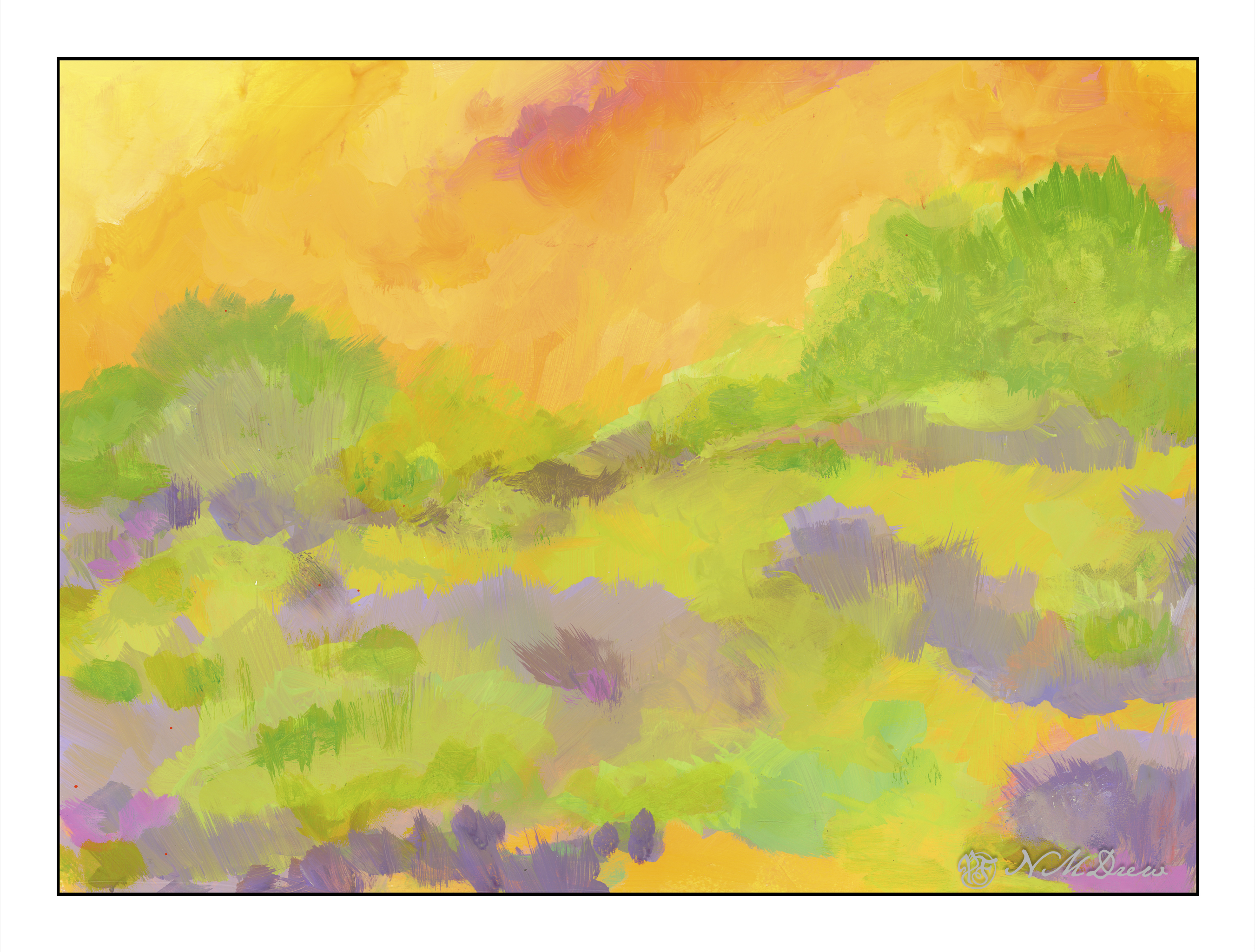
Looking at the above painting, I realize I like the lightness and warmth of the colors. The blob of blue and green in the top painting are cold and too contrasting in comparison with the rest of the painting. The orange bushes / trees create a hard barrier and keeps the whole painting from working well together.
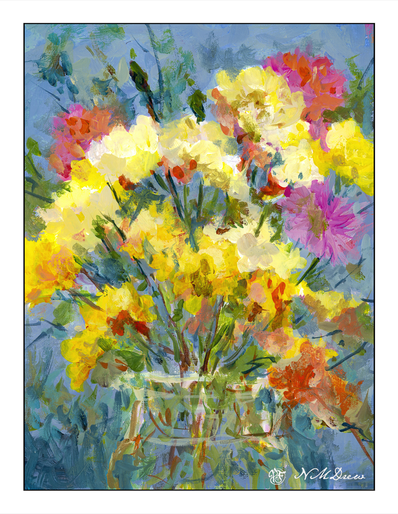
These flowers are also more harmonious and pleasing to me. A busier painting than the top one, and less abstract than the second one, but it doesn’t give me a sense of depression.
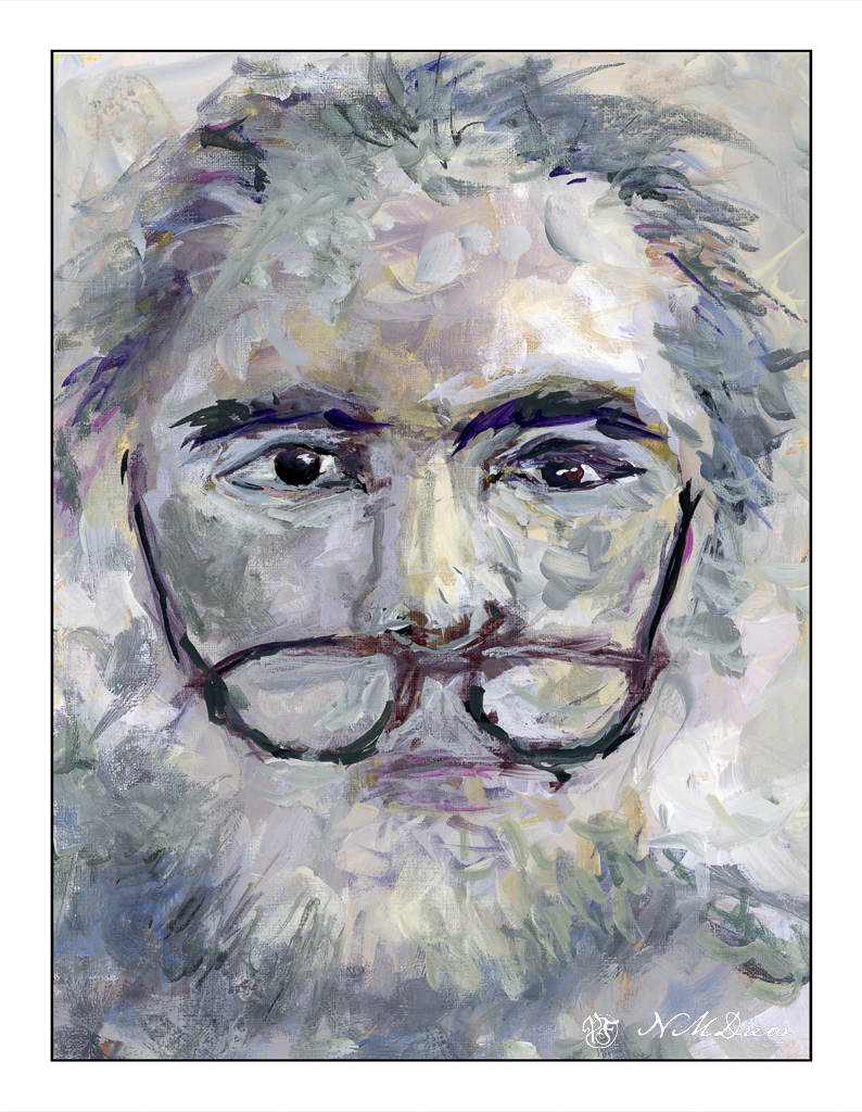
This portrait, too, is not depressing even though it is a low-key color palette.
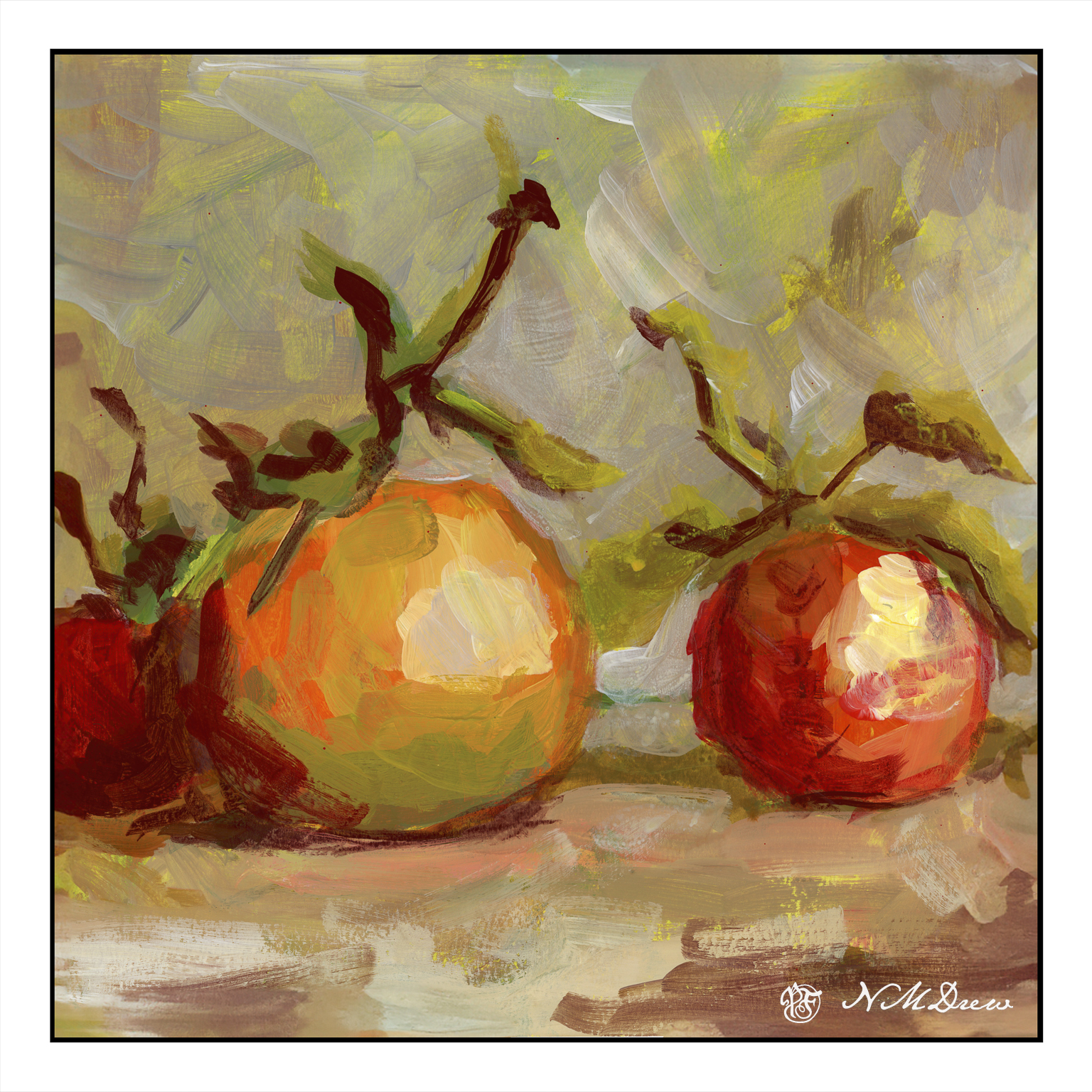
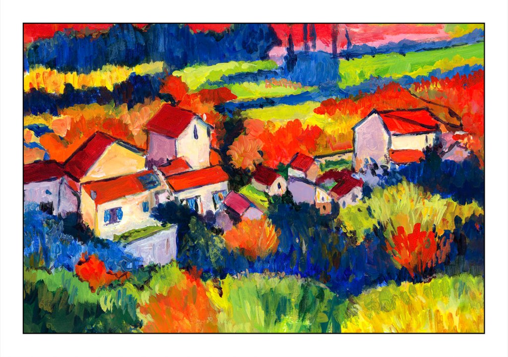
Colors here are also warm and friendly.
So, what does all this mean for me? It means that using colors – in say a “colorfield” style painting – that I like, that please me, are very important. While I like bright colors and contrast, how far should it go? That is really what this painting was all about – finding what works, what doesn’t work.
Play is a way to learn. I learned I need to pay attention to colors especially if I am using large areas, such as with this study. The teal / yellow sky is okay; the lavender land beneath the sky is also okay. The lavender / orange trees are fine too. But, that green and blue do nothing for me except repulse me. It is “not me” if I were to say anything about it. It is ugly and not harmonious. There is not a sense of balance in any part of the painting – rather it is a bunch of stuff stuck together to see what happens.
Not a happy camper with the results, but pleased with my analysis.