
Given my recent subject matter – Edward Seago and his paintings of Norfolk, a county in East Anglia, England – I was rather delighted to see this video! Living in California where the comment “some of these buildings are more than 25 years old” is so true and always makes me laugh, historical buildings, and historical paintings from the Saxon era, are wonderful. So, with no further ado:
Tag: England
Edward Seago: A Norfolk Farm
Quite a few years ago I read a really great spy novel that took place during WW2 in Norfolk, England, and this just happens to be the place Edward Seago lived most of his life. Looking at a lot of his paintings, I get the feeling that sky is quite amazing and huge over relatively flat countryside. I’ve never been there but a bit of research shows it is largely rural and has about the same population as my own county here in California.
Once more, a study from a watercolor Seago did. I think, as with the one yesterday, the paints have faded a bit and so I tried to replicate them to a degree, but also chose to make them a bit more intense, as perhaps they were when he originally painted the farm.
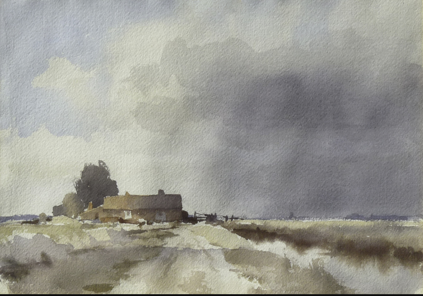
The use of wet washes works really well here. In the building, the light from left to right on the roof and building show excellent control – the gradation from light to dark is subtle. This take a bit of work – getting the paper and paint at the right stage of moisture to make this work. My own attempts were quite awkward and it shows. The sky to the right of the building has what appears to be very gentle streaks of rain coming down – maybe it is just warped watercolor paper – but I thought I might as well give it a shot! What I find especially wonderful is the foreground – a cloud shadow drifting across the scene.
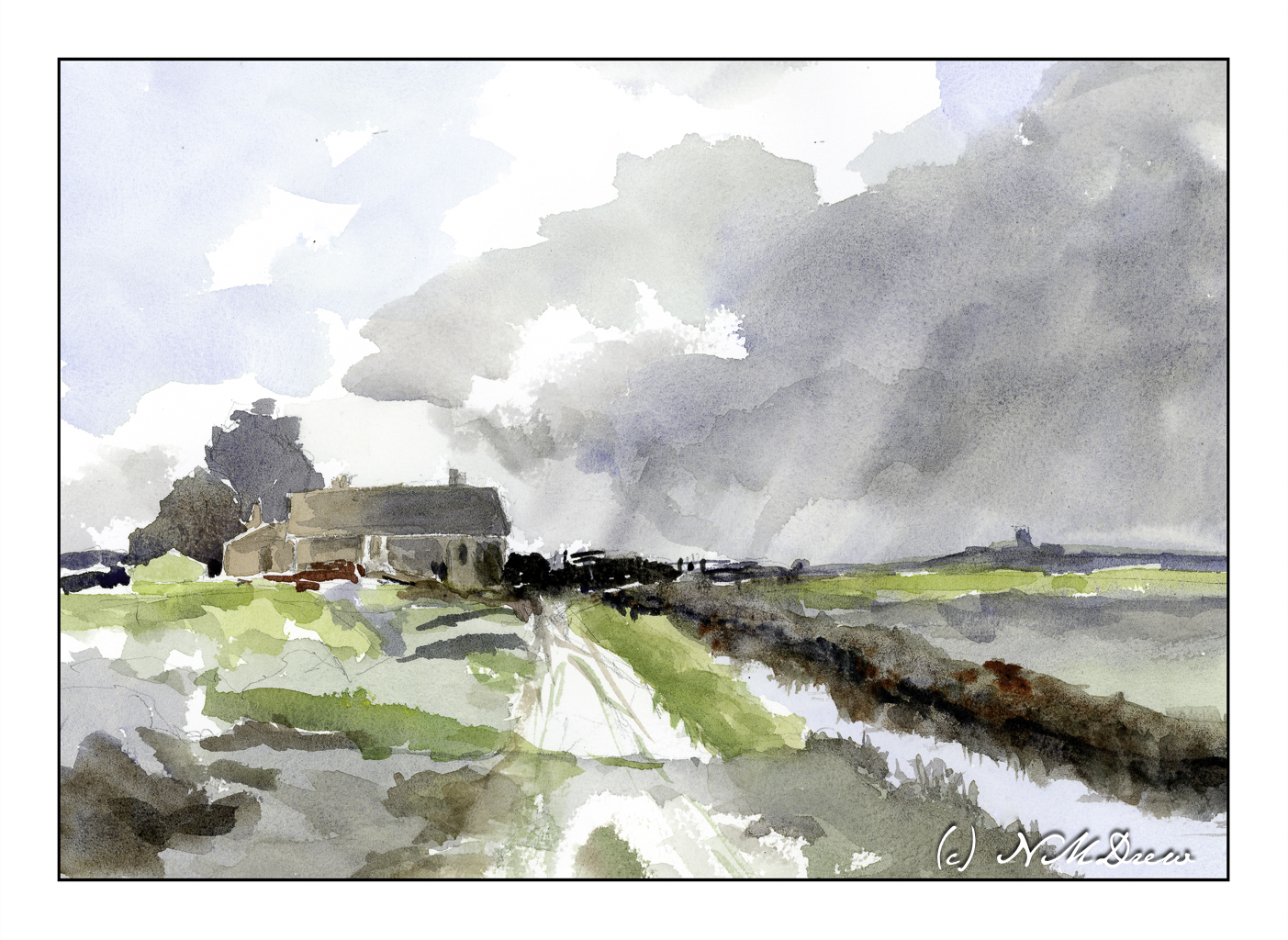
In many ways I am pleased with my master copy of Seago’s “Norfolk Farm”. I managed to maintain a bit of subtlety in color. I also tried to match the values of light and dark and mine is a bit stronger than the reference image. As well, my steeple or whatever to the right of the farm house is a bit too big and a bit too dark. The simplicity of Seago’s painting was challenging to replicate but I think I managed.
The colors I chose are ones I know to be available in the time period in which Seago painted this watercolor. I used cobalt blue and ultramarine blue for the sky and water reflection. Burnt umber and burnt sienna are my browns. Yellow ochre and cadmium yellow helped make greens, but I do use Hooker’s green a lot as a stepping stone for green, and my preferred on is made by Winsor Newton. Additionally, the info I have on Seago’s painting indicates it is about 10×14 inches, so I used rough 140# Arches paper in the same size.
Master copy, Edward Seago, limited palette, Arches 10×14 rough 140# paper.
The Not Taken Vacation: Port Sunlight Village
i was so looking forward to visiting Port Sunlight during our brief stay in Liverpool. While I have enjoyed the Beatles since the 60s, I will say I opted for gardens and museums as I prefer the countryside! However, I expect the foul weather which forced the trip we were on to bypass Dublin carried into Liverpool and rather than a bright spring day, we would have needed galoshes and slickers! So, a rough sketch of a rather lovely bridge and buildings, playing a bit with some things gleaned from my building drawing class.
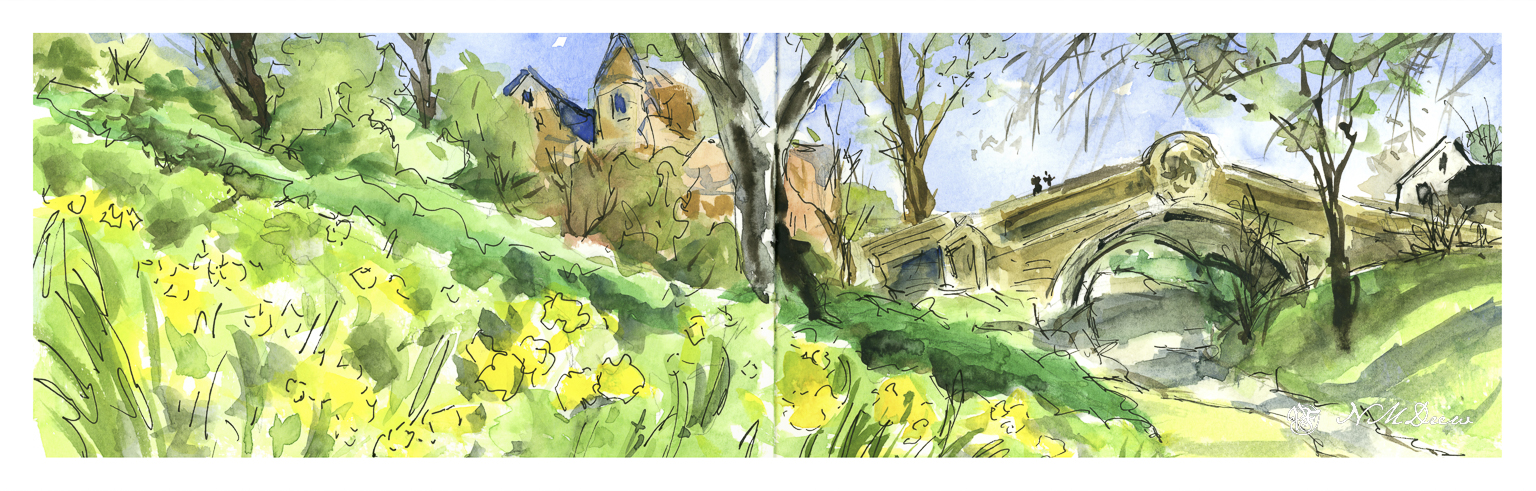
When I do these not-taken-vacation sketches, I confine myself to my limited supplies I would have been using onboard. And limited room. Elements of the colors I brought with me annoy me no end, meaning no good violet at all. The same with pinks or alizarin. I may visit in my imagination to buy some extra colors….or not. Let’s see where all this takes me!
Impression of Slater’s Bridge

Bridges are something we take for granted until you have to wade across the creek, or hop stone to stone, praying you don’t fall in! Way back when, the arch bridge was discovered, and it takes its form in many ways, from giant aqueducts to small stone bridges built in lonely country.
Slater’s Bridge is found in the English Lake District. It’s shape seems to have grown out of the countryside and keeps catching my eye. I don’t think my painting is especially accurate, either; hence “impression”.
