Up the Hill: A Plane of Color

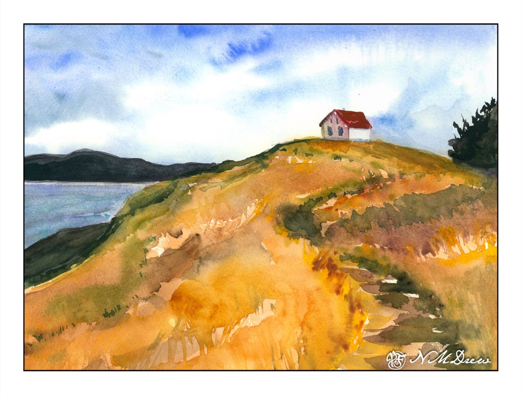
One of the things that is often a point of contention for many who work in watercolor is when to stop – when not to paint any more – when is overworking the painting happening. Today’s study is of a lone building on Saturna Island in British Columbia. It sits on a hill, silhouetted against the sky.

The building itself is not well done – it is overworked. That, though, was not the point of the painting. The point of the painting is the hill up to the house – paint it, work the colors, create depth and dimension and a sense of the vegetation. I worked wet-in-wet; put a few glazes on; re-wet the paper and painted again when I needed to add some detail, such as the shape of grasses or vegetation. I also wanted to create a way to get the eye up the hill to the house, and the pathway itself does the trick.
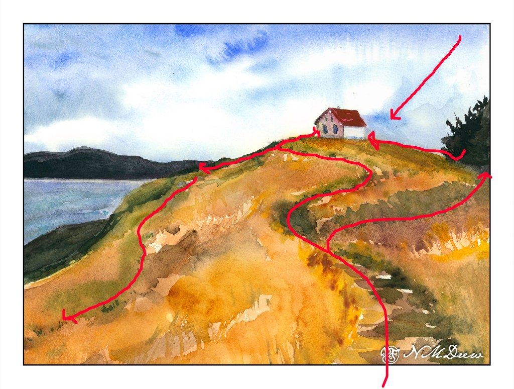
Composition is also something I was considering. How am I leading the eye to that little building? Above is a an overlay with some of my eye-deas. I can think of more, too, but I could also go nuts analyzing things. The darks acted as a balance on either side of the hill, but the tree on the right is too big as far as I am concerned. It just kept growing – spring??

Finally, values. Lights, darks, mediums. Is my contrast working? If I look, I see the zig-zag of the darker path leading up the hill, but more subtle is the light zig-zag to its left. The darker values on the right of the hill repeat the zig-zag. Various areas of light and dark point your eye toward the building.

I am pleased with the hill in this painting, and that is what I wanted to focus on. It is an oddly shaped mass of color, but within it are variations of all sorts – warm and cool, dark and light – that give it shape and depth.

My current focus on watercolor is planes and dimension. I am trying to break down my ability to create structure, and for me the natural shapes of hills and trees are far easier to work on for now, although buildings will come in the future. Negative painting was a first study, but that surrounds as well as creates other planes and dimensions.

Let’s see what is next!

The Road into Town

Today I put together a new watercolor paint palette, adding some colors I normally don’t have on my main palette, as well as adding ones back that didn’t make it into the first one. This palette forces me to work harder to get greens as I don’t have phthalo green, sap green, or Hooker’s on it as “primary” greens; instead, I have viridian, which is not one I have been fond of in the past. However, it works nicely with cadmium lemon and aureolin to make those crazy spring greens I like. I also added manganese blue, verditer blue, and phthalo blue (green shade). I don’t have any yellow ochre or quinacridone colors, but do have Davy’s Grey and Peach Black. In the red arena I added transparent red oxide in place of light red, and cadmium orange as well. All of the earth tones – burnt and raw sienna and umber – are on this palette.

The result is looking to be a brighter series of colors to work with, at least that is my impression. I tried to use nearly every color in the palette on some level in this painting to see what would happen. As it was, I didn’t use every color! Too many!

The subject matter was also something that I wanted to work on – a small town with a few buildings at the base of a mountain range, and the goal was to have a road leading in to it, sloping down hill, and conveying a bit of depth. It’s a busy scene, one from my travels over the years that I caught on camera. Depth is not easy for me, so I used shadows across the road and landscape to catch a bit of it.

First watercolor of the New Year, and started with a New Year Palette!

Detail and Edges, ii

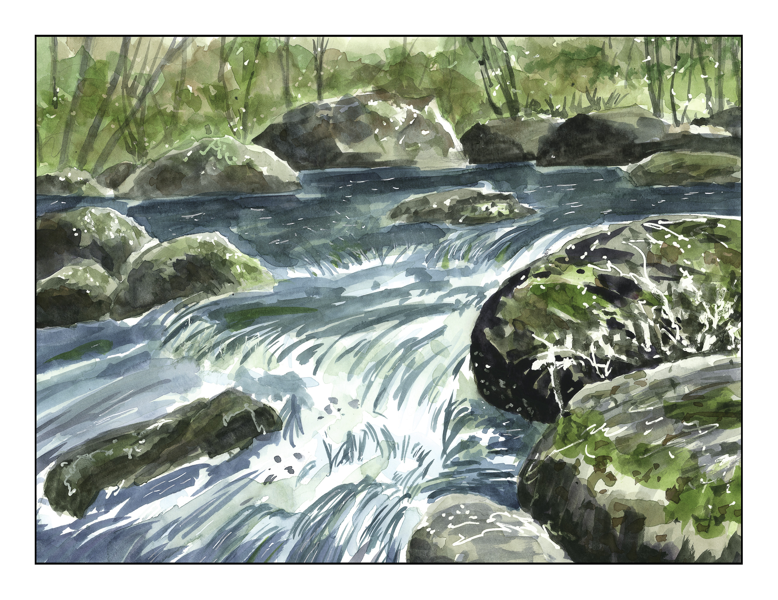
Phil Metger’s chapter on detail and edges compares a photograph, with different focusing levels, to a painting.  By this he demonstrates the area of interest – foreground, middle ground, or background.  In general, the foreground or middle ground will contain the area of interest.  Therefore, the edges and details will be greater in these areas.

In this painting, the focal point is the lower right corner, where the rocks meet the small waterfall of the stream.  The two rocks carry the greatest amount of detail, and as we move away from them, details gradually become less and less.  In the background, the right side is a bit more dominant than the left background because the rocks and tree trunks are a bit darker than those on the left.  (What logical lighting reason exists for that, I have no idea!)  I tried to simplify everything the further I got from the lower right rocks and the center foreground water.  Additionally, I limited my palette and tried to tie together all “grounds” of the painting by using the same colors to some extent throughout the painting.

This is my first attempt at water in a stream.  I’m rather pleased with it overall.  Not a masterpiece, for sure, but I am getting where I want to be more each time I paint.

In the Park

I refilled a pen with some Private Reserve Copper ink, a water soluble ink, to see how it works as a sketching ink.  The pen is an Aurora with a medium nib, one which I like to use when I need a broader line.  For some reason, maybe it’s just me, but the pen is not writing quite like it did with a different ink.  (Hey, maybe it’s the ink!)  The idea is to see how well the ink blends into the watercolors or affects the colors themselves.

From what I can see, it just merges into the paint without polluting the clarity of the colors.  If you look at the trees on the left, you will see a lot of lines representing the directional flow of the bark.  In other areas, I used the pen to outline white spots or fallen leaves.  In the background, you can see the outlines of the tree trunks.

Besides just playing with ink, I am trying to use simpler swaths of color in my painting to convey a sense of depth.  I struggle with depth – and maybe it is because I don’t have any depth perception – and too often I think my paintings are rather flat in appearance.  Luckily, there are “rules” out there to help me, such a lighter colors in the distance, which I do see.  I just don’t have a sense of dimension.

I wonder how many people really do have eyesight problems – just recently I read that Da Vinci may have eye issues, having one eye which turned outward.  Degas, too.  Others?  Interesting thought.