Stone Buildings – And What Photos Don’t Show

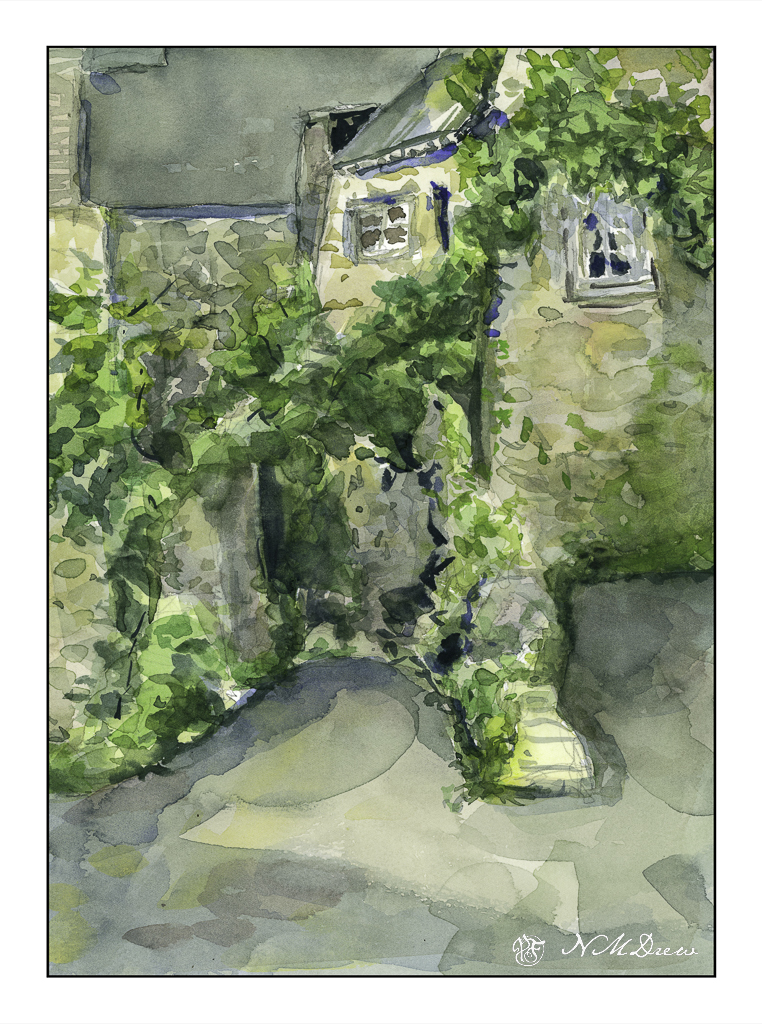
Anyone who paints from real life and then references a photo of the same knows that photos do not get all the information. This is even more evident when you paint from a photograph of something or someplace totally unfamiliar. Such is the case here – stone buildings from somewhere in Brittany, downloaded from a royalty-free site for the primary purpose of trying to render stone buildings in a painterly fashion, not a nit-pickingly detailed fashion.

First round – colors applied to a pencil sketch in a very wet and general way. As color and paper dried, some details added and attempts at creating contrast done. It took awhile as I didn’t use my trusty hair dryer to speed things up.

I like to desaturate my color scans to see how the picture I am painting works with contrast. IMHO, not too bad, but still in need of stronger contrast. I used my brush in LR to get an idea of where to make things darker, and using that as a reference worked on the arching greenery in the middle and other areas, as well as choosing a source of light – the sun – from the left somewhere.

As I looked at the reference photo, I noticed a window I had not seen in the tunnel below the arching greenery, as well as shapes and areas of light and dark. Was there space without greenery beyond that arch? Was there a turn to the left at the end of the tunnel? How did all these buildings all interconnect? The fact is – I don’t know! So, artistic license as you will, reality is also important as I would like to figure out what I am dealing with, especially when painting the challenging and unfamiliar – old, stone buildings.

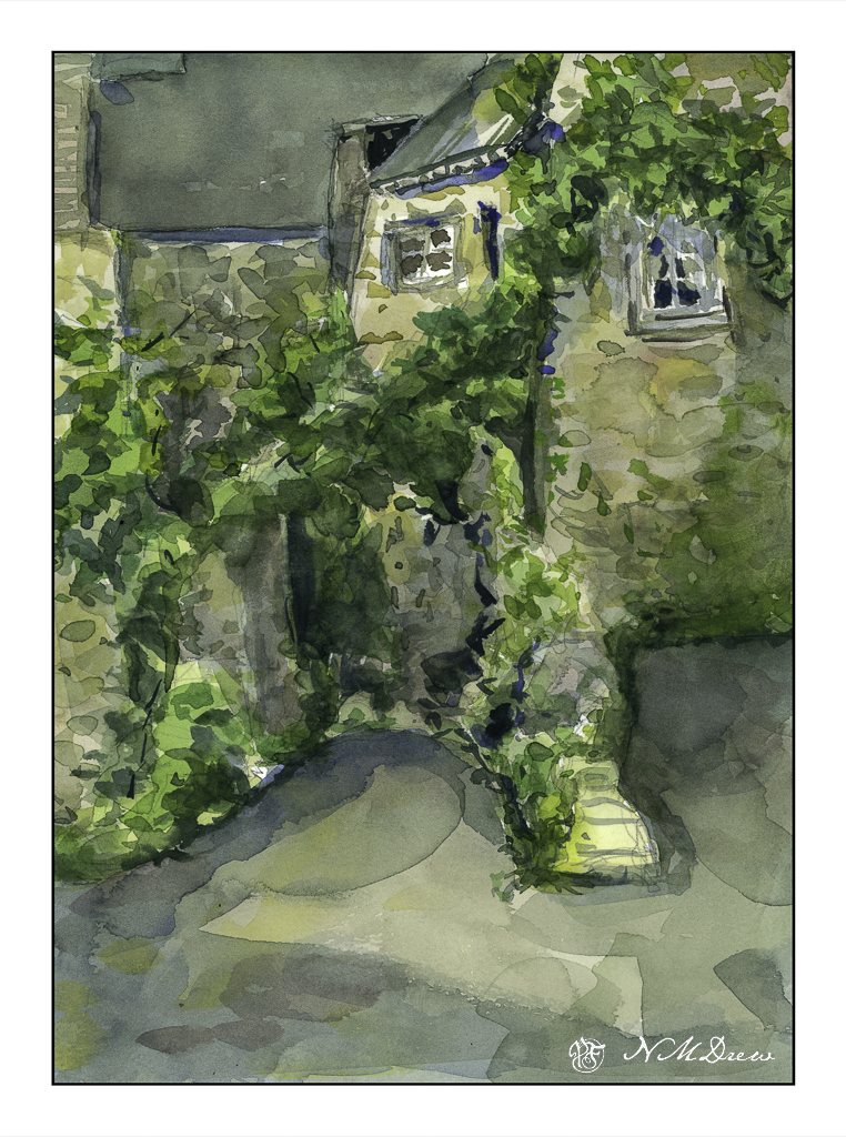
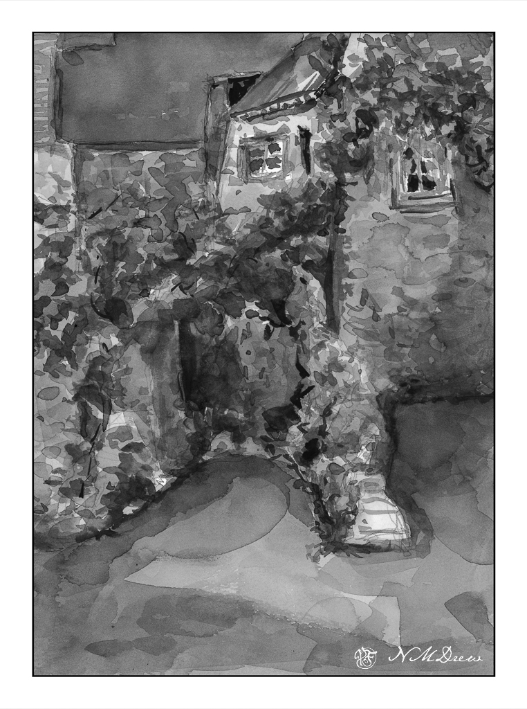
Wonky perspective, inappropriate contrast, but I rather like the stone buildings and interplay of shadows, such as in the foreground. The shadows lead the eye (good question where!) and add some interest to an otherwise dull foreground. The light in the reference photo was very flat, so I made up my shadows. As the focus was on the buildings and rendering them in a way I liked (which I do to a degree) I was not especially concerned with the plants.

Looking at the paintings, I am rather pleased with them, but think that perhaps the center upper roof might need some horizontal texture, or do I need to use some ink to define some of the shapes better?

Your thoughts would be appreciated . . . .

Anne said she liked the first one better – it is lighter. In LR I increased the exposure a little bit.

Cliffs

There is nothing so dramatic as a sea and cliffs, sometimes a sandy shore – but rugged rocks and trees clinging on for dear life always catch my eye. Northern California has its share, as do Oregon and Washington. All over the world such drama is there for our pleasure and to keep us humble.

My approach, thanks to having a sketchbook – my lovely sketchbook! – is becoming more deliberate and more patient. I am working with larger planes of color, going for the grand before homing in on the detail. I also wanted strong contrast of sun and shadow. Simplicity. Clarity. Less is more, etc. As well, warm and cool.

I am honestly very pleased with how this painting turned out. I think I will leave it at that!

Morning Sketch 7 – Negative Painting & Daffodils

More work on negative painting and flowers. I wanted simple but interesting flowers to paint. Daffodils are perfect for this – beautiful flowers, usually one color, and have a relative simple shape – petals and a tube in the middle.

To begin, I obviously did a sketch, and obviously also depend on the sketch to let the viewer know these are (supposedly) daffodils. I painted the blue around the drawing first – working the dark in against all traditional watercolor rules. Then, the vase. Then a loose blobbing of yellow, darker yellow, some greyed yellow for shadows, and a touch of orange for the centers of the flowers. The leaves happened somewhere, and final daubs of darkestness to accent things.

Not a great painting but it was a good practice piece. Still more practice is needed. Negative painting is getting easier. Color blobs are getting easier, too, to show lighter and darker areas, as practiced in yesterdays press-release brush play. Once more, I am not after a botanical painting with detail, but an ability to have a loose, expressive style that shows things in a painterly manner for what they really are.

One day, one day . . .

A Few Flower Studies

When you find an artist whose work you like, and who is also a good teacher, an online class can teach you a lot! The nice thing with videos is that you can watch them over and over, catching little things with each viewing.

Shari Blaukopf is a painter that I admire. Her watercolors are clean and fresh. She also has a really nice online personality, whether it is on her blog or in her recorded classes. I’ve made comments on her blog and she replies; I have uploaded a painting or two, and she is always gracious. One day it would be nice to take a class with her in person.

Anyway, I have / am taking two of her courses on flowers. One is painting wet-in-wet flowers, and the other is painting fresh cut flowers.

The above one is from the wet-in-wet flowers class. The paper is wet on both sides after the initial pencil sketch is done. The paper is then blotted. And from there, you go to town! It was really fun to see how the paper and paints all worked together. Not a great rendition, but the experience is the most important part as that is how you learn. My contrast issues are not too bad.

The hydrangeas are from Blaukopf’s course on fresh flowers. She does three different flowers – a blue salvia, then echinacea and black-eyed Susans, and finally the hydrangeas. I’ve done the salvia, but have yet to do the second one. I wanted to do the hydrangeas especially because of the delicacy of colors involved, as well as work on the contrast and negative painting, the latter which is just as much as a challenge for me as good contrast! Having been very frustrated with my colors always being too intense, this was also a good challenge for me with pigment and water control.

The past few days have been spent practicing free-motion quilting for a class this morning, so it was really a treat to wade back into painting. I love flowers, so painting them is the challenge, especially as I prefer a looser rather than more precise rendering of them. I think precision can be a lot easier than abstraction.

1st Colored Pencil Class

Nothing like learning a few things! I’ve drawn with colored pencils on a very causal basis, but what I learned today included: use of Saral, a waxy transfer paper; use of burnishing and blending pencils. Never heard of those before today, but used all three.

Where to begin? I got there 30 minutes late – I thought class began at 9:30 but, no, 9:00. Oh, well.

Subject was a rose. Place the Saral between the picture you are going to use as reference and the paper you are going to draw upon – like carbon paper. Press hard to be sure it is on the drawing surface. Then, remove the Saral, and use a rubber eraser to blot the lines. This lightens them so you can still see them, but not so dark they are obvious. The paper we used had a bit of tooth, to catch the colors, and we worked from light to dark, white to reds and pinks and into the greens of the leaves. The suggestion was to moosh up a background to keep the rose from floating in space, so I did.

When I got home, I was interested in trying my hand on different papers. I have some bristol paper, which is a very smooth and very white paper.

This paper is so, so smooth that it is actually slick. As a result, colors are blended into one another very easily. I think the Prismacolor Premier pencils may be too soft for this paper and a harder, oil-based pencils, such as Polychromos, may be better suited for bristol.

The next experiment was done on some of my MiTeintes pastel paper; here, a mid-blue. I sketched directly onto the paper, using a very pale yellow pencil to create the general shapes as well as limn in the lights and darks. I decided to look at values the best I could, as well as whether they values tended toward warm or cold. The sunlight was dappled on the leaves, with some bright yellow green, and other a deep, blue-green tending toward black.

Out of all of these, I like the galangal the best. I like it because I had gotten a better sense of how to use the colored pencils, learning some of their characteristics and qualities. The blue background adds to the picture. The light and dark colors worked pretty well, and remembering to use complementary colors to dull down shadow areas I think kept the vibrancy. So, for a yellow-green leaf, the shadow colors were a purplish red, or a layer or two of each.

I don’t know if colored pencils will become a big love in my life, but I do enjoy drawing. My Pencil Portrait class was a real joy. I think I learned a lot in it, and moving to colored pencils is interesting. Shades of grey in graphite now are translated (or attempted to be translated) into values in color – something that is very, very challenging for me.