
We spent a weekend in the wine country of the central coast in California . . . .

We spent a weekend in the wine country of the central coast in California . . . .

A decidedly more fussy painting than I usually do, but is also a fairly chromatic painting. The primary colors are yellowish greens and grays. More color planes with a few more details.
In a lot of ways this was a more “serious” painting than my trees of yesterday. I plotted more. I did a sketch, a value study, and carefully placed my lines and considered the composition. Steps were thought out on how to approach the painting process itself since there is a lot of plain, white paper left in varying spots.
First step was to lay down a light wash of a neutral color, painting around the white areas at the tops of the plants and a few areas of the rocks. Then, light colors of the plants were added to remind me where they were. In general, I worked light to dark – standard watercolor – but then more intuitively I moved into dark areas while other areas were still covered with the first wash. I needed to establish values and found this worked out fairly well.
Another thing I took into consideration was the paper. This is the 100% cotton student paper I have, and I know it cannot handle a lot of water. Consequently, my washes were not wet and sopping. The light washes I applied were watery, but before picking up the watery wash from the palette, I squeezed or blotted the extra water from the brush, picked up the wash, and then applied it to the paper. It worked as the paper did not get really wet.
The rocks were hard to do. Part of me wanted to be fussy and detailed – hence the dots on the rocks and boulders closer to the viewer – and other parts just wanted to use planes and strokes of color to express their dimensionality. That is something I will try on another version of this painting and on paper that can handle a lot of water.
So, the planes of color continue, even in a more complex painting. I rather like this one as the backlit plants are so pretty, whether painted or in real life, and the pathway itself is alluring. Nothing like a hike in the desert . . .
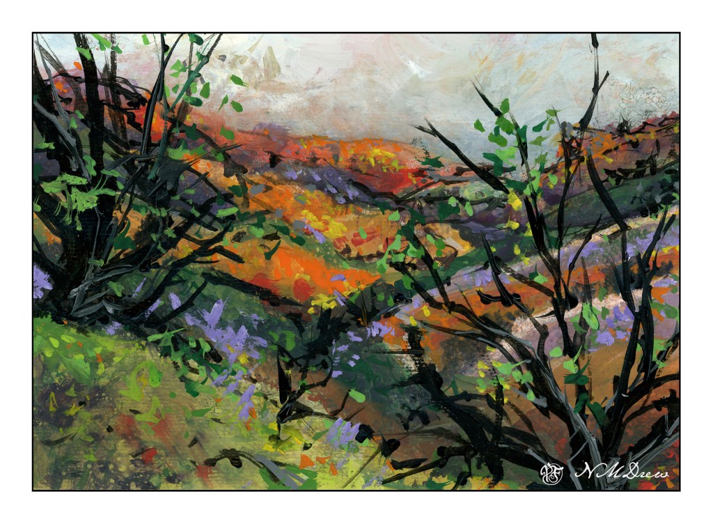
Gouache sketch. After all the rain, we have green hills covered with flowers – fields of lavender and orange – lupines and poppies – and bright green leaves.
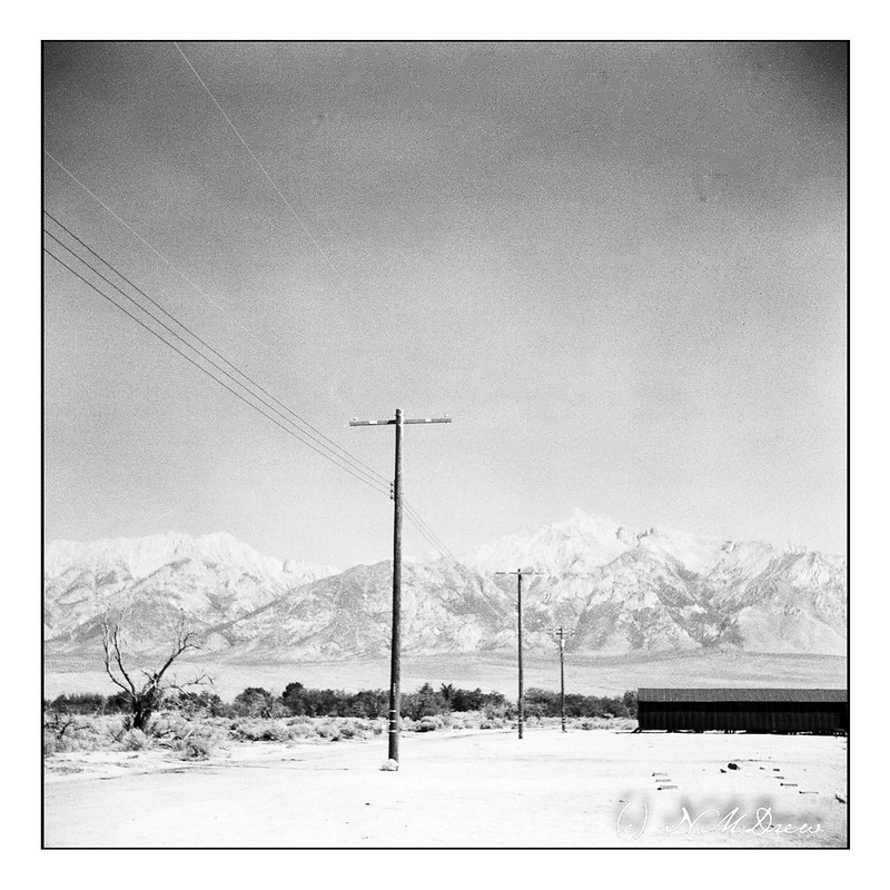
In 2021 we headed out on what was to be a 3 week long road trip. The first part was up the Eastern Sierra along Hwy. 395, stopping and staying in Independence, CA. One of the most notable places to see along this route was Manzanar National Historic Site – a not very nice part of US history. It is a Japanese internment camp which was built for imprisoning Japanese Americans, natives of this country, and therefore citizens, as well as immigrants.
I took along a digital camera, and a folding camera, the Zeiss Ikon Ikonta 521/16. Only now am I scanning the film – it took quite some time to finishing up the roll! I used Kodak TriX 400 and got twelve 6×6 images out of the roll, which is 120 film. To process the film, I took it to a local lab and then scanned it myself using the Epson V600 and Negative Lab Pro in Lightroom.
However, the trip ended when we got breakthrough Covid. We headed back home, sadly, but better safe than sorry, eh?
I have been taking an oil painting / acrylic painting class through the local adult school, and the current teacher is pretty good. I am only doing oils this go around – I did acrylics last class – and I am finding them far more to my liking than acrylics. Much more to offer in terms of – what? – pleasure in using. With acrylics I feel like I am in a mad dash to paint and that really is not a fun experience. With oils, you can play and take your time, and that for this impatient person is actually a pleasure after the pressures I felt with acrylics!
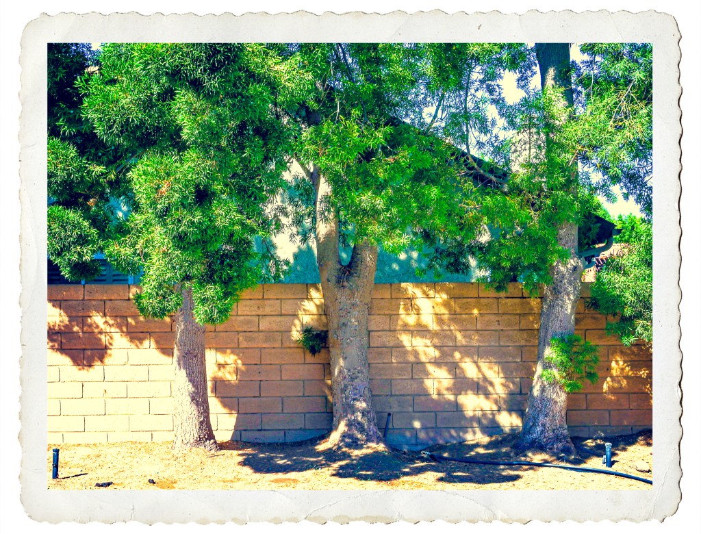
This is what my backyard looks like – hell. There is no grass and there are too many big trees. Once we get rid of 10 more 35 foot tall trees and have the back yard plowed up to be rid of tree roots, then I might be able to make it far more habitable. Nonetheless, looking for something to paint, I decided to take a photo of some of the trees against the back wall and push it in color to an extreme. By pushing the colors in LR I thought I might find new colors to use in the painting. And, it worked – I found purples and turquoises and rather icky orangish yellows.
So, I am trying to do this alla prima, but it’s not going to happen. It is happening so far in two alla prima sessions, and probably will need three or more. I am not trying to create a masterpiece. I am trying to learn how to use oils. So, this is play, and here it is, after my second alla prima session.
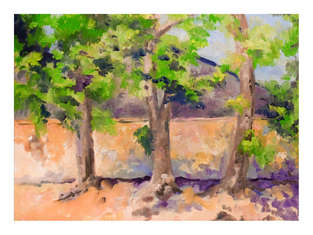
Next class is in a couple of days, so let’s see where it goes from here . . .

