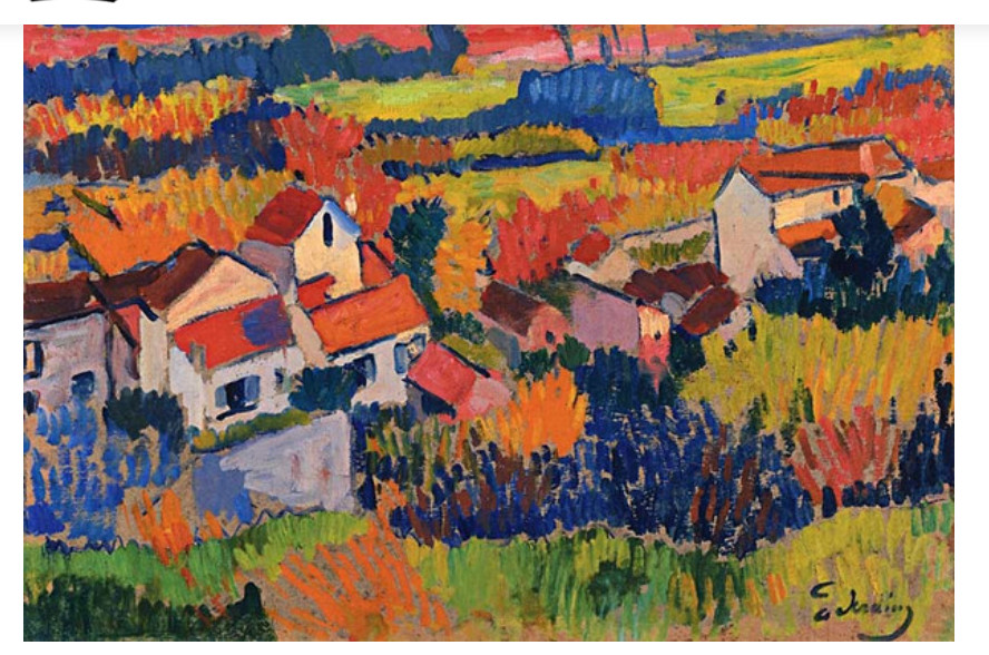
Above is a copy of Derain’s painting, ca 1904, done during his Fauve period. In an online class I am taking, we are encouraged to copy the work of a master artist, new or old, and learn from the experience. This is the second I have done, and certainly one I would not have really considered just because it is so bright! But, the colors and composition caught my eye, and off I went.
The first thing I did was to grid it onto paper. Derain’s work is obviously oils as acrylics did not exist in 1904. I used acrylics on ungessoed paper. As I moved along, looking more carefully, I think he underpainted his canvas with raw sienna or yellow ochre – you can see such colors along the bottom of his painting.
This painting took me probably about 8 hours. I gridded the image, which is about 11.5×17 inches, whereas the original is about 18×22 inches. Then I painted the basic shapes and colors yesterday morning.
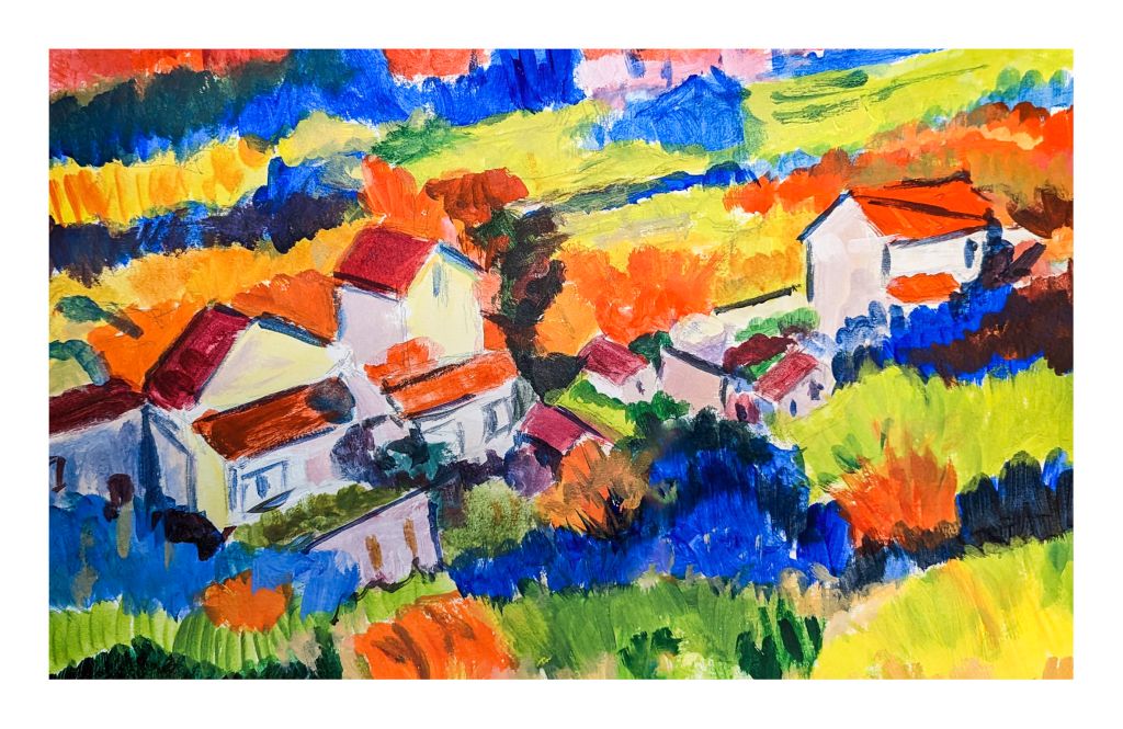
This took a lot of time! I am glad I did a grid as the overall areas to be painted were fairly apparent as to shape. What they were – well, some leave me wondering. However, colors are shapes, and Fauvism is not reality, so I could do a bit of my own interpretation, too.
Next, I began to define areas as well as correct mistakes, such as my lopsided building in the lower left side. My paint was thicker, too. Below is this morning’s work.
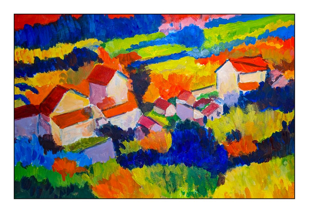
After lunch, I aimed to complete my copy of Derain’s painting. As I moved along, I looked at Derain’s brushwork. There is a very graphic quality about his painting, which is very pleasing, but the brushwork, too, is fascinating. I did try to emulate it a bit, not just dabbing, but trying to see when he did a dab, a long horizontal push, and so on. Easier to do than to describe!
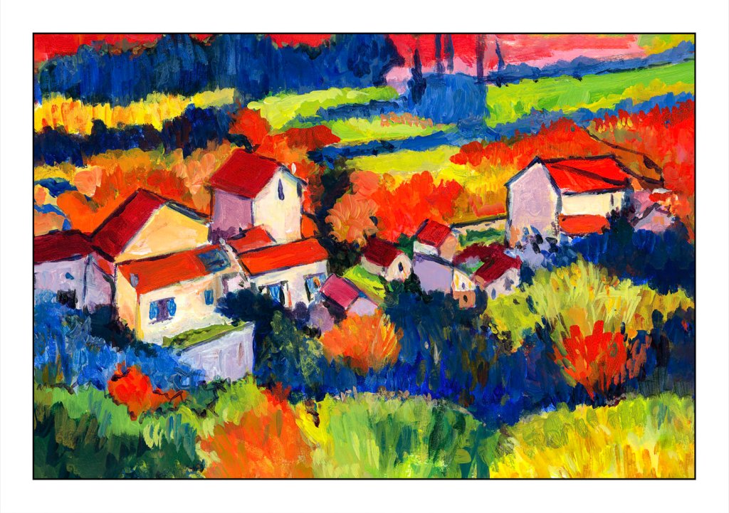
My final work really does please me. I love the bright colors. My limited palette worked pretty well and there was joy in mixing colors. I usually tend toward more “natural” colors, but the truth is I am a magpie at heart, and bright colors always do get my attention and make me happy. That is an emotional reaction. Classical paintings, though, do appeal to me. Copying a master is opening doors to me and leading me into areas I have never explored.
I am kind of a cheapskate at times, especially when it comes to paying for educational experiences. Too many times I have been disappointed by the experience, especially when it comes to art classes. Cost vs. course value and content are a big issue for me, and more often than not I am very disappointed.
One person, though, from whom I have taken online courses, and who has never disappointed me, is Shari Blaukopf. She is a Canadian watercolorist with quite a following – her workshops are always sold out – who provides economical and informative online classes in various subjects. Subjects have included snowy urban scenes, wintery scenes, flowers. Her courses last from an hour or so to more, depending on how you do them, for very good prices of about $30 US. I ain’t complaining!
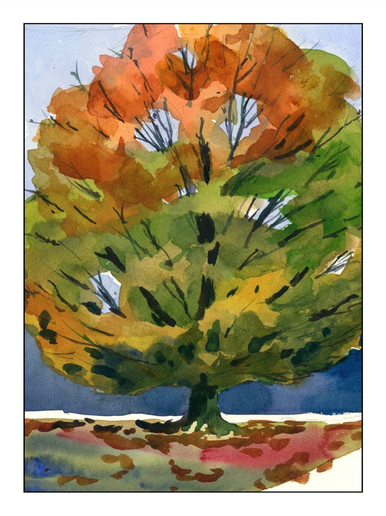
Let’s begin with her most recent course on trees throughout the seasons. I think this is one of my favorites. What did I learn? As a dabber – tiny brush strokes – this class was perfect for me. I got a better grip on painting foliage, not a leaf at a time, but as color masses. Most instructors will tell you “paint foliage as a mass of color.” Okay, clear enough, except it doesn’t really sink in well for me. Shari’s method of drawing an outline of the areas in question is brilliant, and a lightbulb-going-off-in-the-head experience for me. My samples from this enlightening experience gave me quite a bit of pleasure.
While she is painting her tree she says that midway through, when the tree is just a bunch of colors, she begins to wonder if it is going to get any better – and it does. My own thoughts were the same, but continuing on, the results were pleasing.
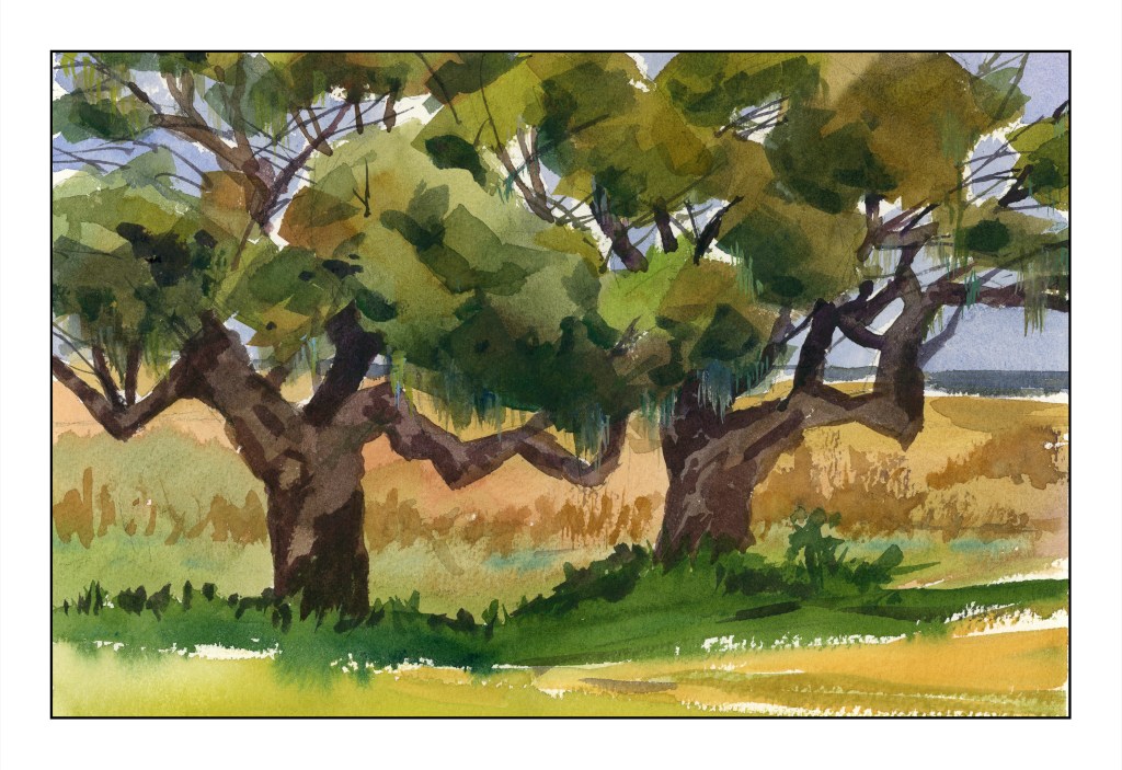
These southern live oaks (above) were also done with masses of color, but a bit more detail. The maple tree was a great segue into the oak trees.
The standard or classical “way” to do watercolor is light to dark. I have followed this “rule” with mixed success, and as a little automaton, I do what is “expected” far too often. However, Shari often does the sky, then darker areas, or outlining certain areas with color.
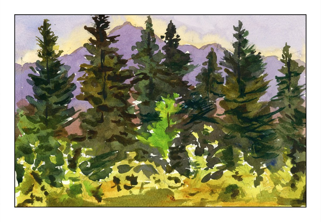
Above was the very first tree study – a vast area of pine forest against a mountain and sky. Sky and mountain were both worked around a lot of the treetops. From there, the very dark pines were painted with the lower edge of lighter vegetation done last.
What?! That is the “wrong” sequence!
Working around the trees leaves areas of white paper, and this this gives a sparkle to the end painting as well as keeping colors more pure and fresh. Painting around the bright green tree was also a challenge – and to remember it was there. Shari had to remind herself, and did so as we moved along. I didn’t quite succeed, but caught myself in time.
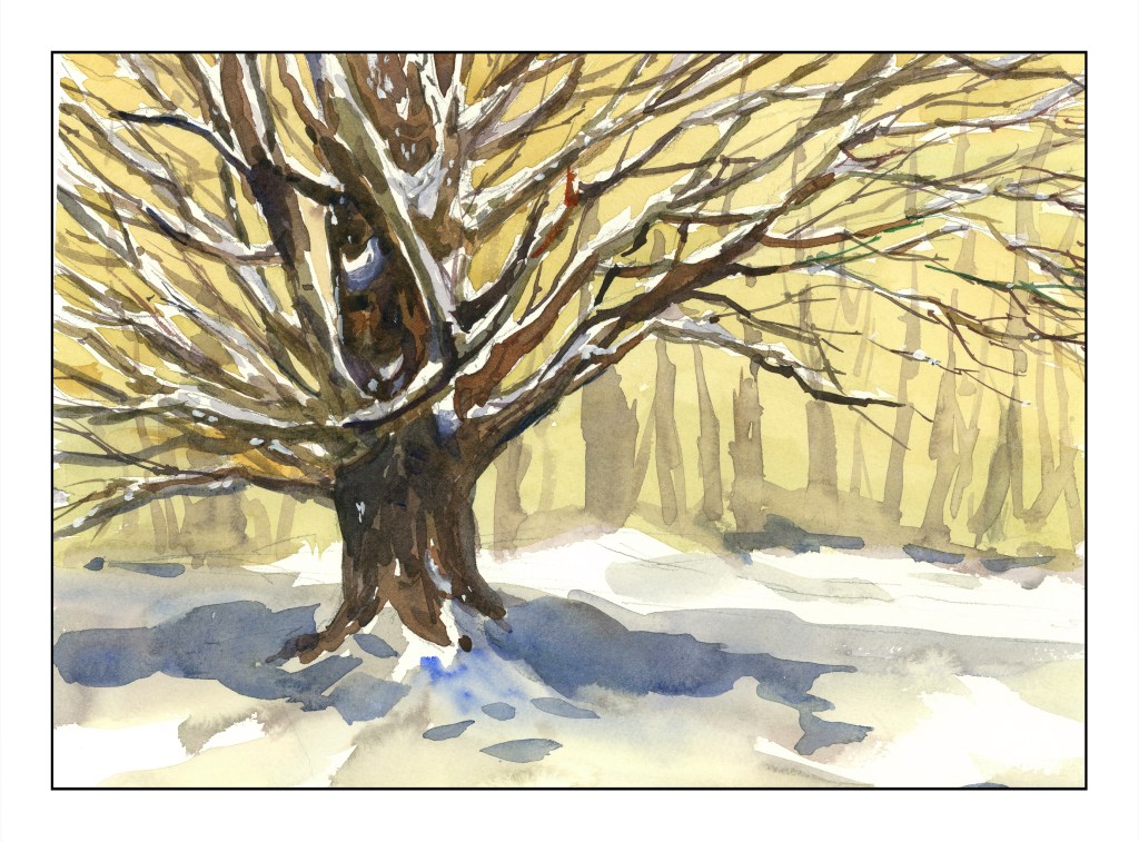
This snow-laden maple – the brightly colored one from earlier, now in winter – was the last study. No frisket was involved to leave the snow fresh on the tree. Instead, hints on how to leave snow areas apparent in the drawing – put a dot on the snowy areas to remind you – worked very well. I’ve done such things myself, but it is a good reminder of little tricks.
In many ways, this winter tree was perhaps the most challenging of the studies because so much advanced thinking was involved in the journey to the final result. Snow on so many tree branches was sort of a logistical nightmare, but oddly enough easier for me than masses of colored leaves. Titanium white covers up a few mistakes, too, where the snow was painted over. Blue, too, was added very lightly to make shadows on the snowy branches, giving more dimensionality than without that subtle touch.
Shari even returns to her trees to add a bit more here and there to improve them. I like these little forays into imperfection or dissatisfaction – so many workshops don’t show these little bits of humanity.
If you like watercolor, need some good instruction, and are on a budget, Shari’s classes might be the answer. She doesn’t teach you the basics but assumes you know how to do washes and use colors and what a paint brush is. Her classes range from pretty straightforward to more sophisticated and complex subjects. No matter what, she leads you through the process quite nicely. For example – buildings terrify me. Perspective is not my forte and suburbia throws it at you from all directions. But, I did this, and learned that even I, who has no depth perception to speak of, can actually produce a painting with buildings!
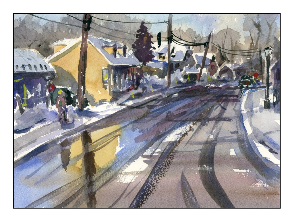
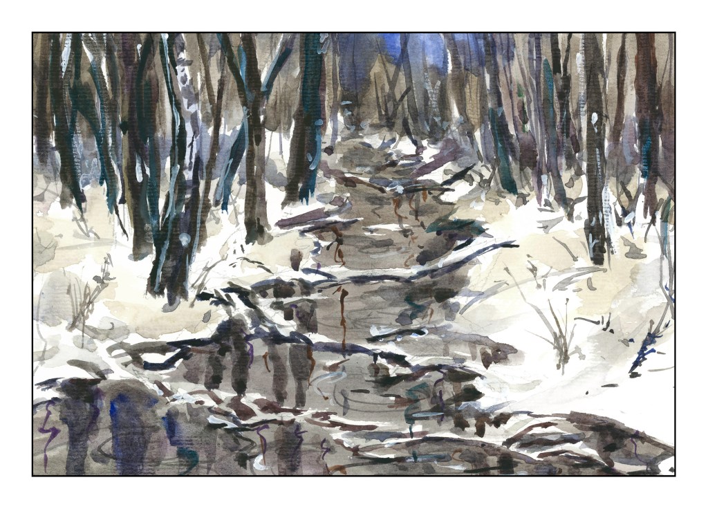
I managed to produce the above – albeit with some glitches – by following her along with her “Urban Winter” class – which you can find here. Check out her work and courses – I don’t think you can find better value and better education almost anywhere. And as a final plug, here is my painting from her course “Winter Woods and Stream”.
And, for my own frugal heart, Shari offers course bundles that discount her already fabulous prices a bit more. Check her courses out and sign up if you are interested. Some courses allow you to upload your work – the later ones in particular. She always leaves feedback, too, even a bit late as she travels a lot. The personal touch is so nice, and being able to see what other students produce is good, too.
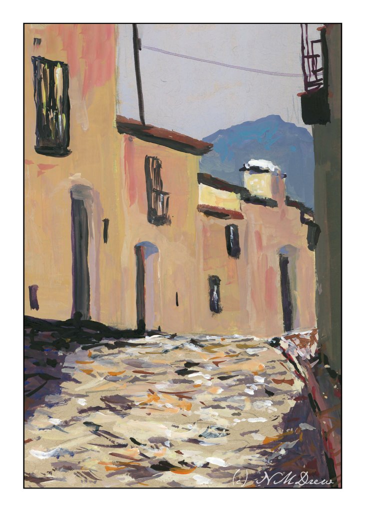
More gouache, this time on toned paper – tan specifically. The tan paper seems to give an extra warmth to the colors applied over it. Besides using toned paper, I am trying to venture into different areas – here I am doing a totally urban scene. One thing nice about painting old buildings is that standardization wasn’t quite like it is now, so my door don’t all have to be the same size, nor my windows! Heck, even the cobbles are rather rough.
I like painting in gouache, but there are times when it gets to be a bit tricky as it re-wets and it is easy to pull up lower layers of color. To help prevent this, you need to start with thinner paint and add the heavier colors later. If a drop of water falls off our brush, you can make a bit of a mess in the area it lands. Most people when they use thicker gouache paint smaller paintings – it is not a paint that spreads out generously and stays opaque. The charm and challenge!
I do love the bleak look of winter. With watercolor, a limited palette of 3 or 4 colors can express so much. Admittedly I used more, but I usually like alizarin, ultramarine, burnt sienna, and Hooker’s green for the colder time of the year.
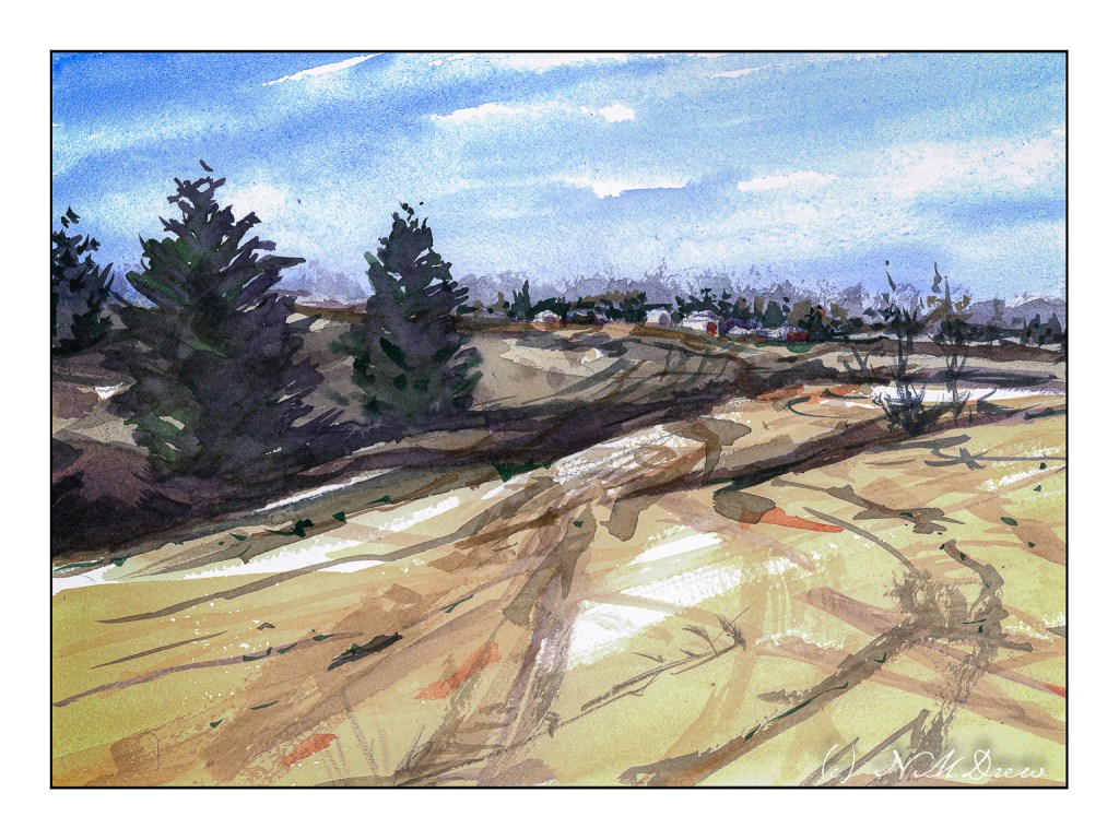
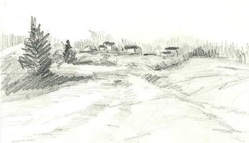
Following through on points for some of the classes I have been taking, I am working to simplify subject matter, colors, and lead the eye. I think I managed to do this here, leading through the fields to the houses on the hilly horizon. I tried to contrast warm and cool colors, with a bit of warm on the buildings with the hope it will draw the viewer in. I also used wet in wet and dry brush, working from general shapes to more specifics; light to dark in general.
In addition to the painting, I am trying to make myself do a preliminary drawing before I touch brush to paint to paper. I did this one today. Lesson – it is actually worth the time, and I have been a silly bunt not to take on this fine habit sooner!
Watercolor, 9×12 CP Extra White Fabriano Artistico 100% cotton paper.
Nothing like a slushy pile of dirty snow alongside the road to make you really appreciate bright, white clean snow!
I thought I would do this for more practice painting snow, using some of the things that stuck in my mind from the Shari Blaukopf’s class on painting snow. Add to that, I tried to recall and implement some of the things I have learned over the past several months from my courses with Ian Roberts. Something seems to be shifting!