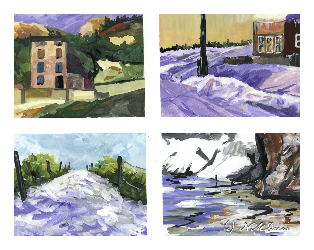
Recently it has brought to my attention that my watercolors have very intense colors with strong contrast – too strong colors and clashing contrast. It is an interesting thought. Often I feel my colors are a bit over the top, but after working hard to get rid of mud and blandness, I worked to have more pure colors. Now that I can do this, perhaps it is time to scale back a bit. This means, the way I see it, is to create more middle tone values in general throughout a painting, and then have areas of light and dark.
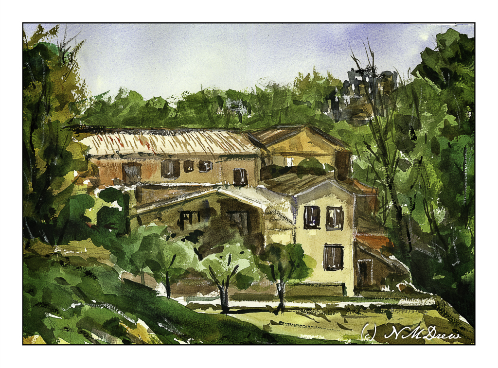
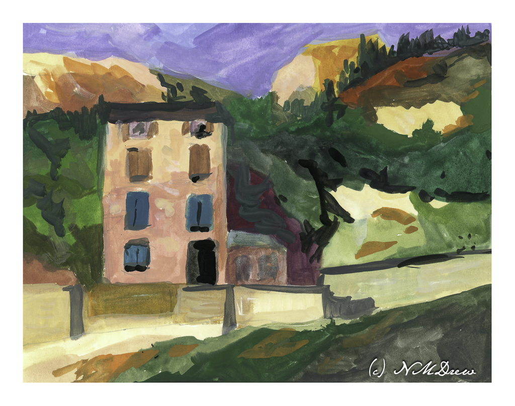
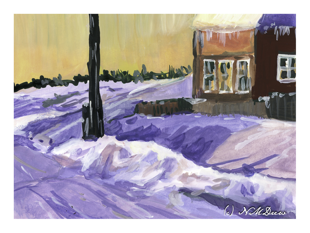
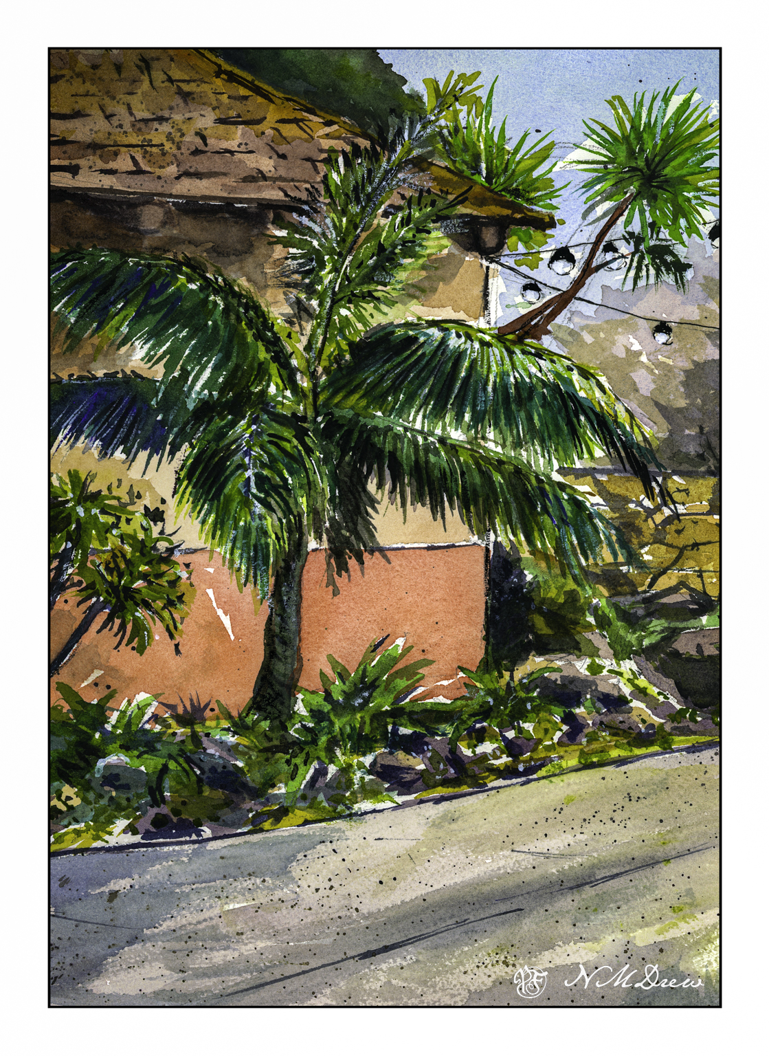
So, let’s begin. On Pixabay I downloaded an image which was not too complicated but, in color, provided a pleasant array of colors and a few areas of bright and dark while the overall tone was middle values
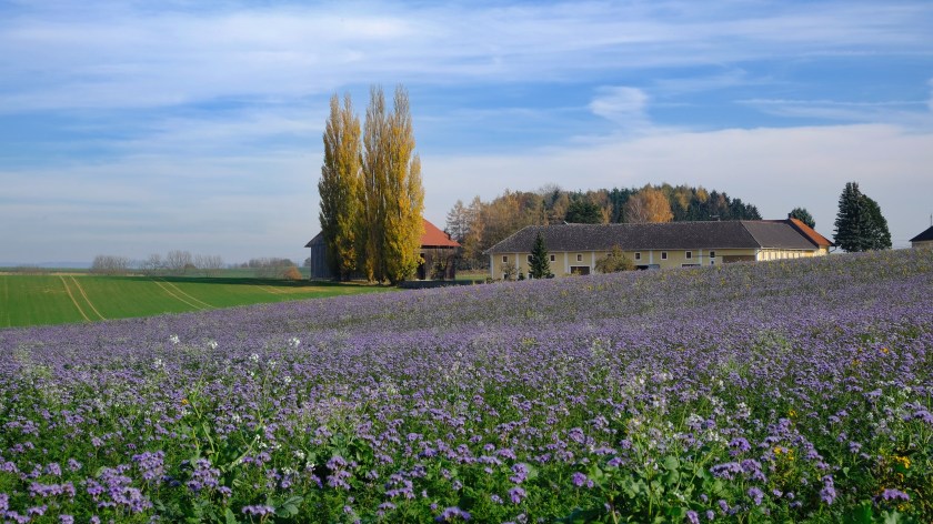
As you can see, the shadow in the left middle ground is strong, as is the tree on the right, as well as bits of the buildings and trees. I converted this to grey scale to see how well it held up to my perceptions in color to actual black and white.
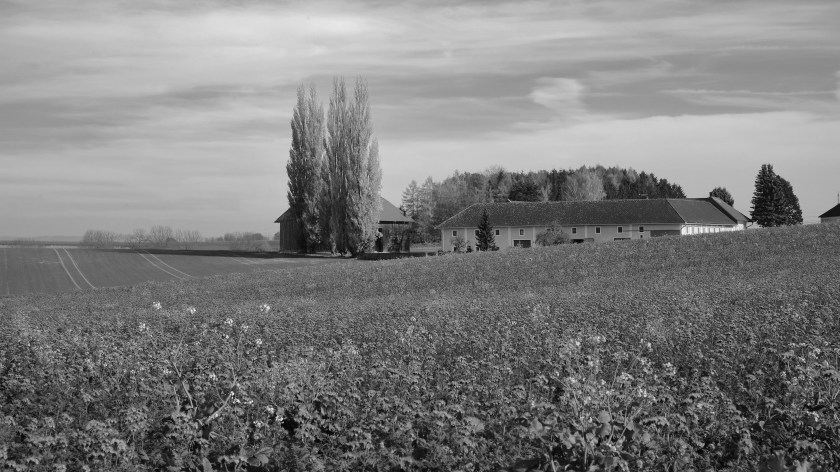
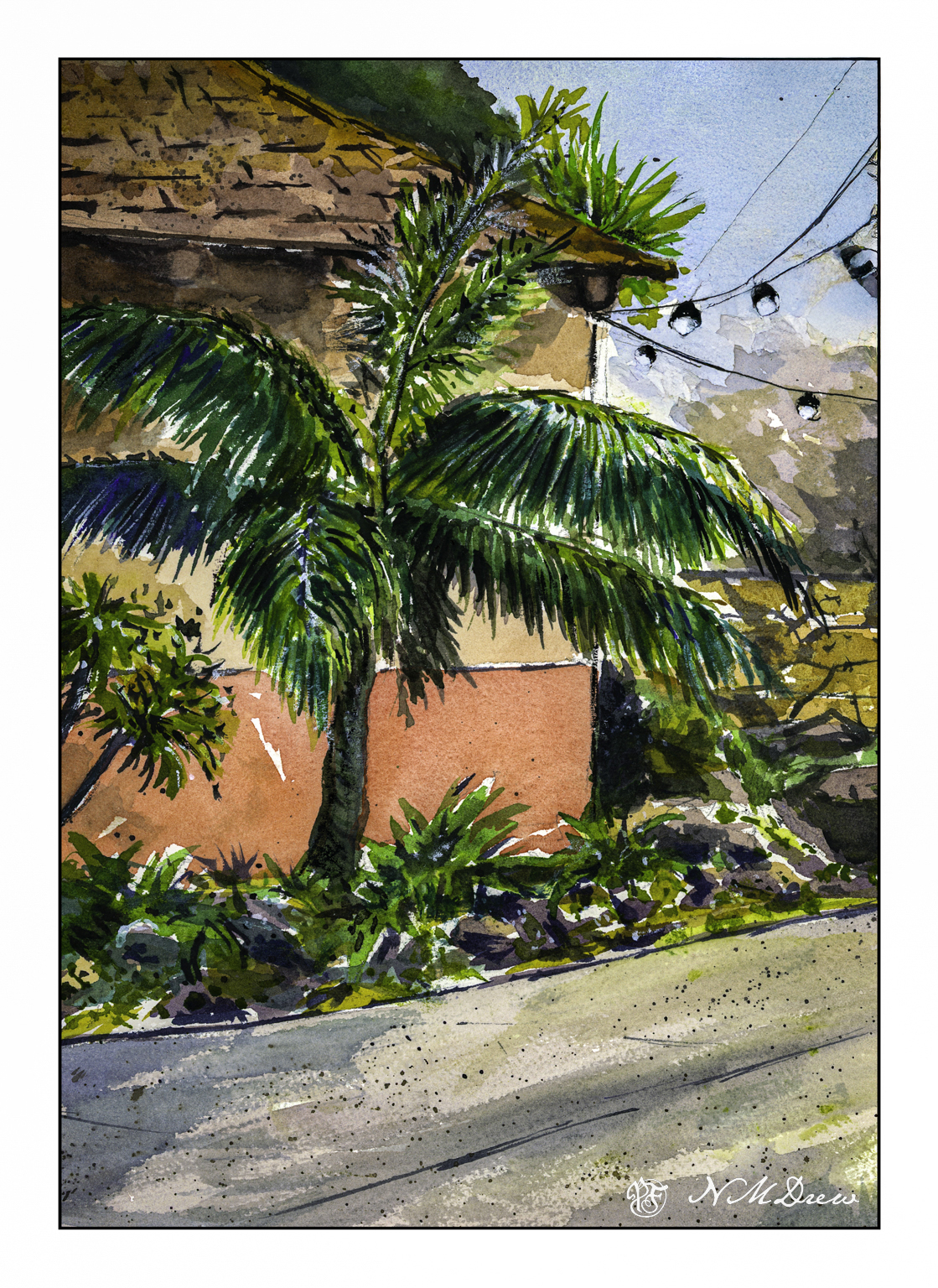
My suspicions were confirmed! My eyes did not deceive me! And, if you are interested, I simply desaturated the photograph by reducing the vibrancy and saturation in Lightroom Classic.
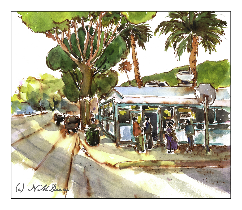
From here, on to my watercolor. I chose a limited but coherent palette of about 6-7 colors – yellow, green, red, blue, browns. Which ones I chose, I don’t recall, but I worked to create secondary and tertiary colors while I painted. My painting is meant to replicate values in the painting as well as make it recognizable without painstaking details. Below is my color rendition.
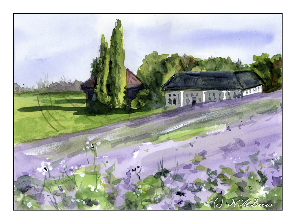
My painting looks a bit more dynamic than the photograph, I think, but it is interesting to see how it looks in black and white – again done in LR by reducing vibrancy and saturation.
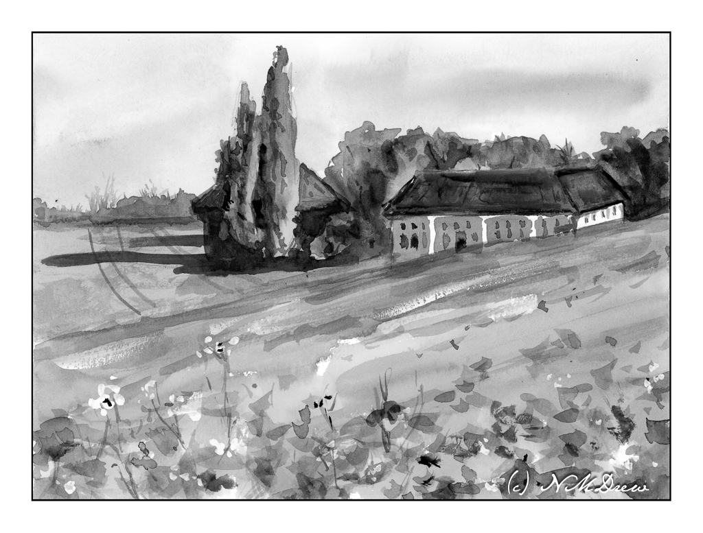
Overall, most of this painting is in middle values of grey with some areas of bright and dark. So, I did achieve what I set out to do. I plan to work on this a bit to see if I like my paintings better – and, I expect I probably will. Working with color is challenging as colors distract so easily from value!!
Thoughts?
Watercolors, Hahnemuhle CP paper, 9×12.