Flower Flop

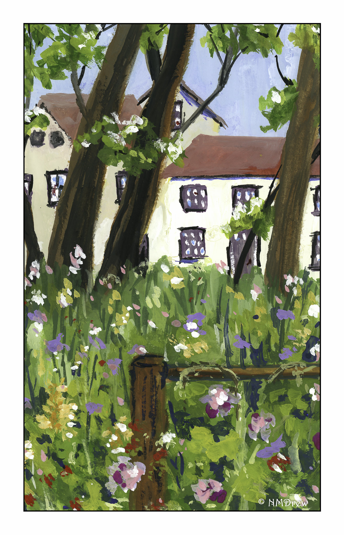
For the next several weeks I have decided to focus on watercolors, except for the remaining few sessions of my oil / acrylic class. The reason for this is we will be out and about, traveling across country by car, and watercolor is the most transportable art medium I can bring with me.

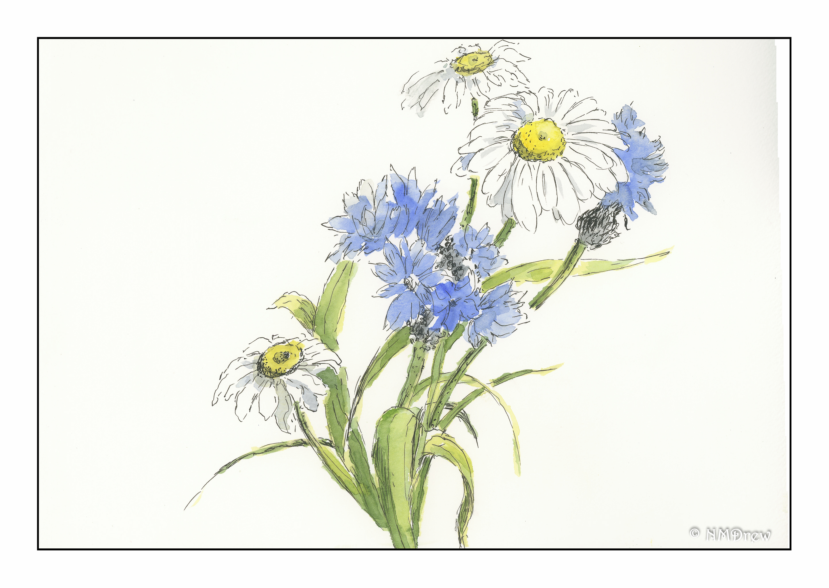
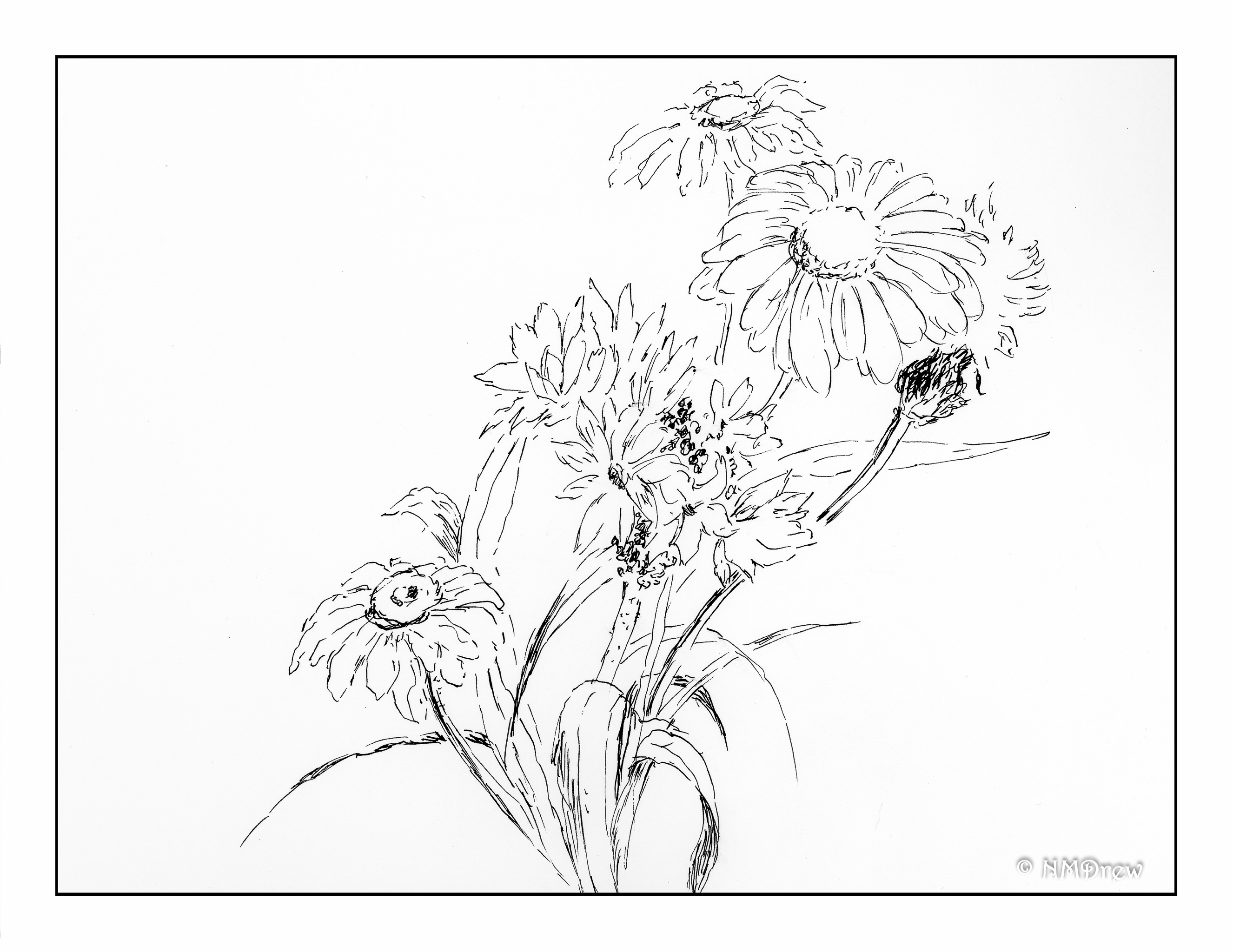
Two areas in watercolor are foremost in my mind at present. One is negative painting. The other is flowers.

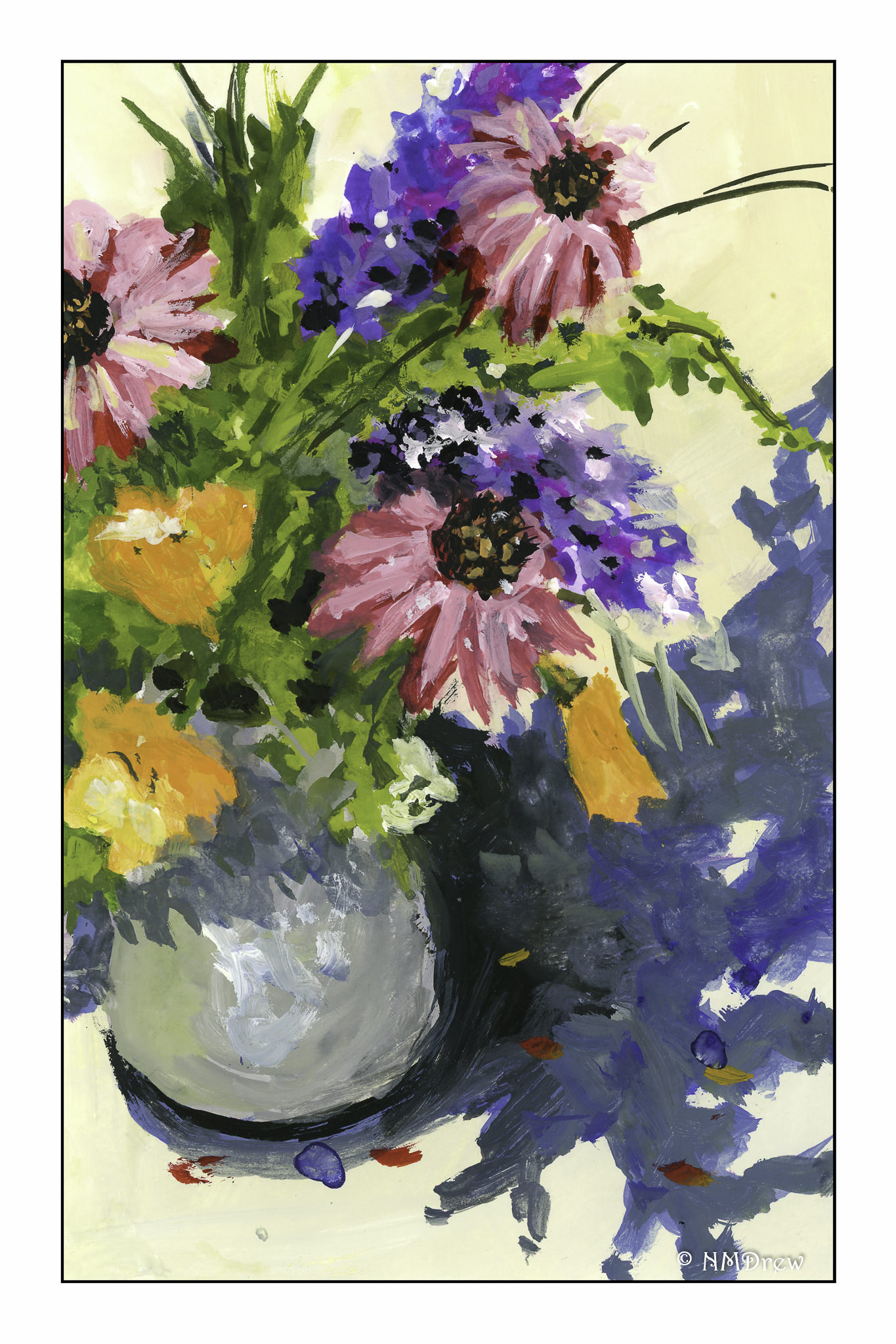
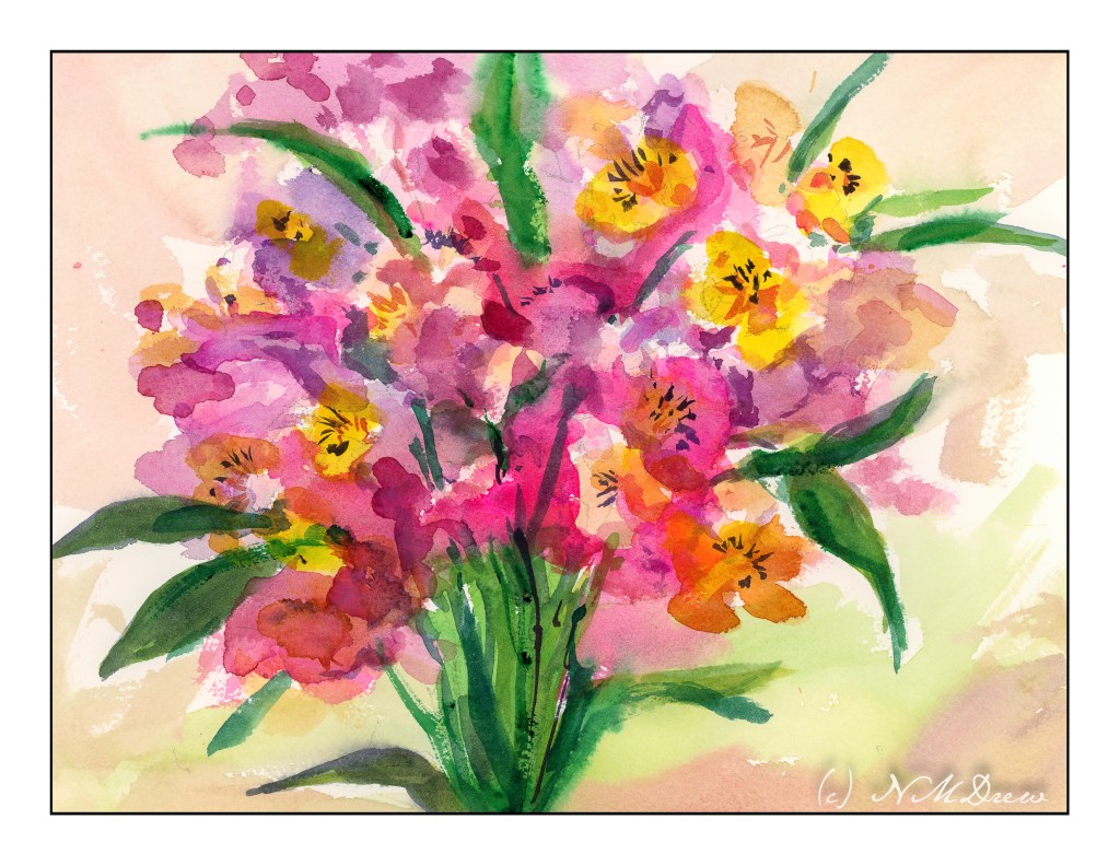
Like anything, you need to practice. Here, an attempt at negative painting, and painting flowers. While not creating mud, I definitely need to simplify what I am doing and figure out how to do it. Supposedly these are alstroemeria, but not sure it anyone would think that is what they are!

I’ll just make the statement a few areas of negative painting worked and leave it at that!

A Summer’s Bouquet


I decided to attempt a more high key painting today – one with a lot of white!  I always look for contrast, but here I tried to lessen the usual contrast.  Maybe it’s because I rather like contrasty photos as opposed to subtle one with a long scale of color or black and white.  Even here, I kept adding contrast!  It’s a fixation . . . but contrast is how we differentiate shapes and depth, so it’s necessary, but I am trying to minimalize it.  Not sure if it worked or not!

WWM #19: Splashes of Color

I’ve been thinking about how I am developing a sort of painting style in gouache, as well as giving thought to the painters whose work I admire.  It definitely falls in the impressionistic and expressionistic varieties.  Gouache just seems to be made for exuberant color and enthusiastic brushwork.My colors are more subdued that I wanted – I wanted turquoise skies and pink flowers and a brilliant sunset.  Instead, I have a rather northern European type of town scene, with a garden or flowering park in the middle.  Summer’s abundance flourishes under the trees, but in the shade it seems.  In doing this painting, I didn’t do much planning.  I stuck to the prompt of “splashes of color” – and splash I did.  The result was a serious loosening up of my style, and a letting go of “this is what I want it to be.”  That is significant – I can be a real tight ass about painting, and in the end dislike the results.  When I let go – let things splash – I am usually much, much happier with the results.

Regardless, both paintings appear muddy to me.  I wonder if working with pure color – straight from the tube – would help.  Practice certainly will.  The flowers in the vase seem a bit overworked, too.  Again, practice and experience.

So, lots of splashes of color for #WorldWatercolorMonth 2019 is producing some rather pleasing results and, more than anything, a daily involvement with painting.

White & Blue Flowers

After a lot of watercoloring, picking up a pen and using ink to draw feels really relaxing.  Adding watercolor to a pen drawing doesn’t need a lot of color, but it does require a bit of thought about light and shadow.

I thought about a daisy study of Peter Sheeler’s on YouTube – I remembered how very little color he added to his ink drawing of the daisy.  With this in  mind, I put in some greys and grey-blues.  I tried to apply the same concept to the blue flowers (which I want to call cornflowers, but don’t think they are), and to the grasses and leaves.  Below is my ink drawing, done freehand without a pencil sketch beforehand.  I am rather pleased with both – my inking skills are improving, as, perhaps, are my watercoloring skills.  Less is more has become more of motto than before!