As a kid with blue eyes and blonde hair, everything I wore seemed to be the color blue. So much blue! Too much blue! I really didn’t like it after awhile, but these days it is probably next to greens as a color I enjoy.
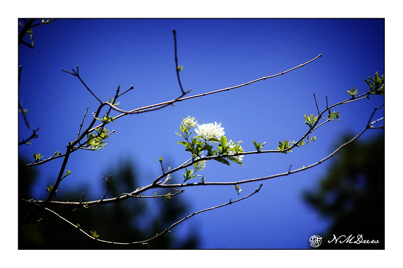
Looking through my photo archives this morning, I found a number of pictures I took in the local botanical garden one spring – a brilliantly blue sky with no clouds, but branches blooming and leafing out. This is when I love blue!
Over the past two or three weeks – really, since the last posting – I have not had time to lift up a paint brush or pencil. It makes for a good break up to a point but when I look back, some of the stuff keeping away from watercolor and paint have been the less attractive necessities of life! Today I have finally settled a bit, enough to take the time out of the day to see if I could even focus on paint without creating mud.
Apparently I can!
Whenever I have not painted for a bit, I like to dive into something which is comfortable – landscapes – and makes me happy – brilliant greens against an intense sky. The American Southwest can provide it, as can spring in California, but today I went to Pixabay to look at pictures of Great Britain. I love their landscapes, especially the Dales and the South Downs, and anything along the coast. Here, living in dry California, such lushness always appeals to me.
This is certainly not my best work, but it is not my worst. The usual lack of depth dogs me except perhaps for the hilltop in the upper left below the sky. I do like the simplicity of my colors, though; it is too easy to do detail after detail after detail.
Anyway, I spent a few hours somewhere in England, and it feels pretty good.
I love the colors of houses seen throughout the Caribbean. Brilliant sunshine sets them off beautifully. The same with white – it becomes so bright it can be as blinding as snow in the sunshine. Where I live, if anyone paints their house anything other than beige or some other neutral color, they sort of get a weird look, like “what’s wrong with them,” so the colors you see in the Caribbean is eye candy.
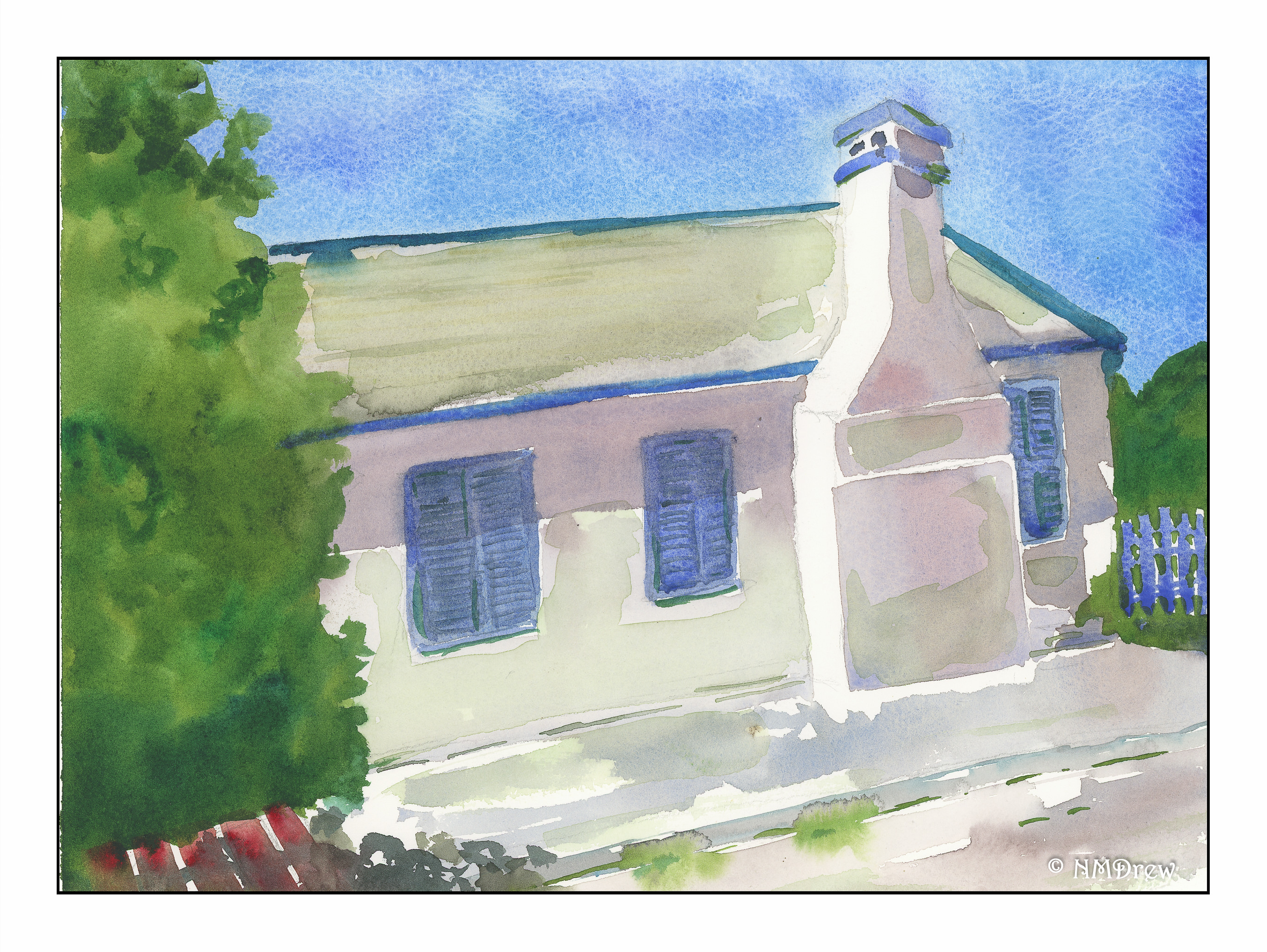
Of late, I have painting snow and water. And skies. Now, I am looking to trying to include buildings in my paintings. I want to improve my perspective (the chimney here is cock-eyed) and to make them focal points. At some point I may even brave putting people into my paintings.
Here, the study was not just architecture, but white and how to express it as something other than just white. Fabriano Artistico, cobalt and ultramarine blue, sap and Hooker’s green, yellow ochre, and red oxide (I think).
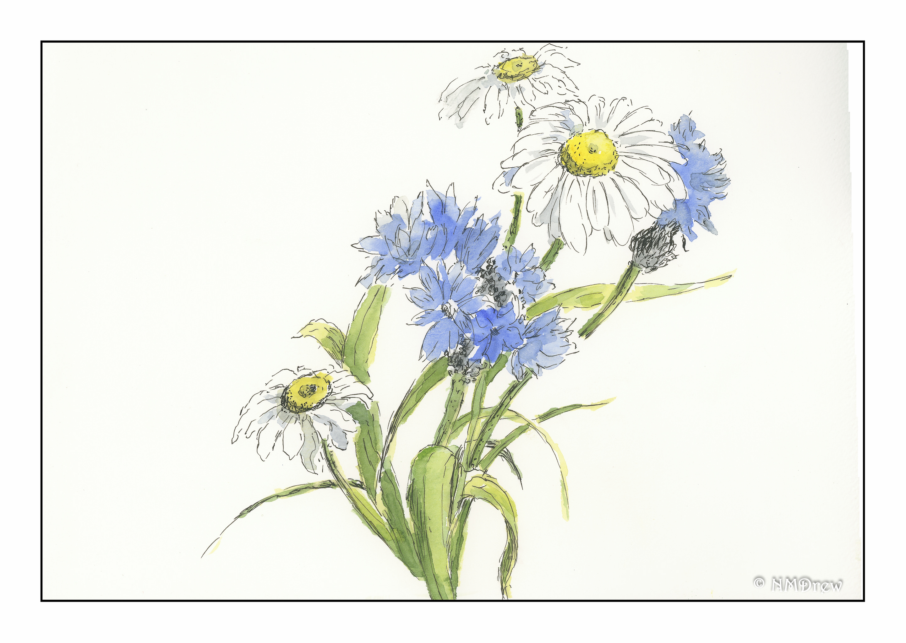
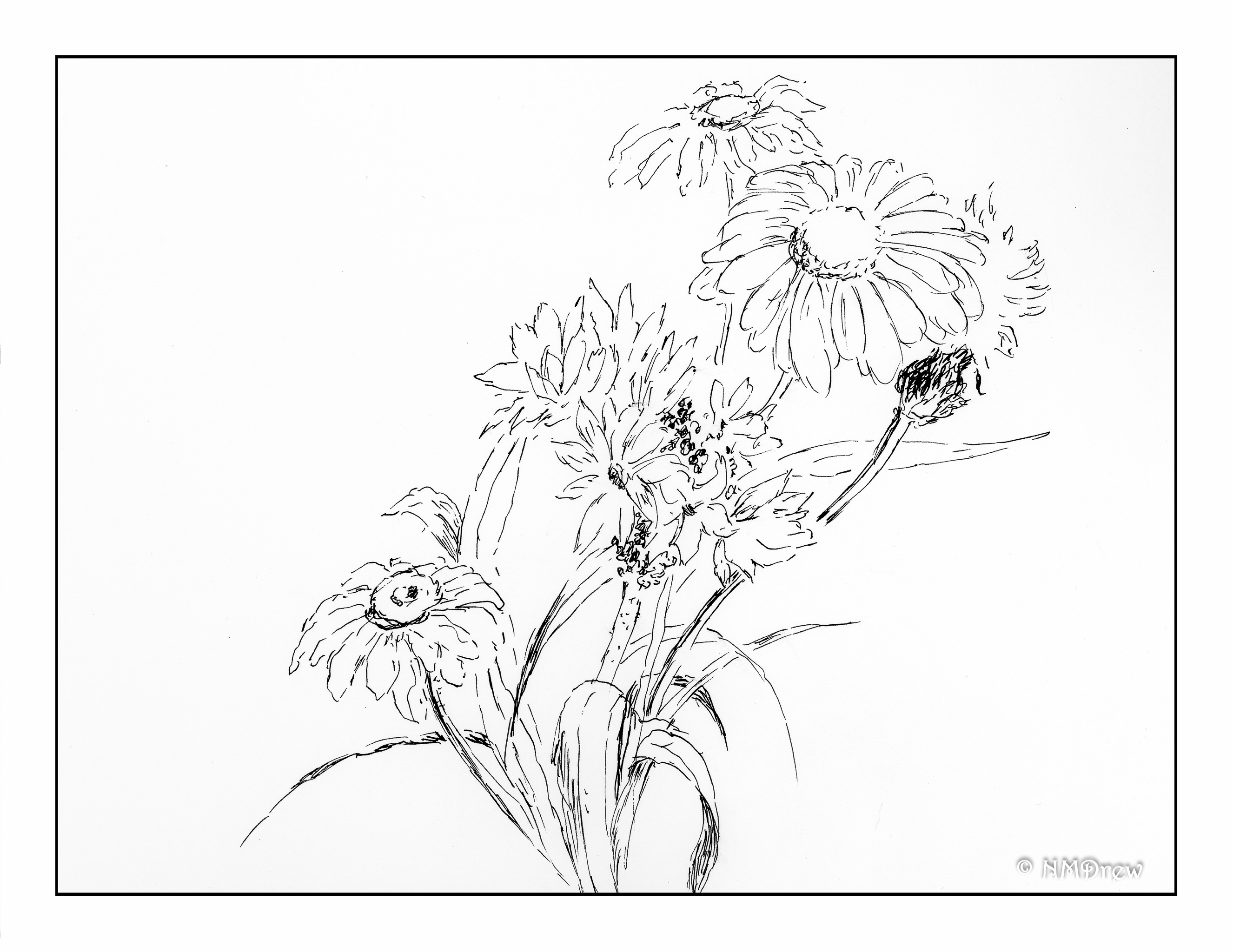
After a lot of watercoloring, picking up a pen and using ink to draw feels really relaxing. Adding watercolor to a pen drawing doesn’t need a lot of color, but it does require a bit of thought about light and shadow.
I thought about a daisy study of Peter Sheeler’s on YouTube – I remembered how very little color he added to his ink drawing of the daisy. With this in mind, I put in some greys and grey-blues. I tried to apply the same concept to the blue flowers (which I want to call cornflowers, but don’t think they are), and to the grasses and leaves. Below is my ink drawing, done freehand without a pencil sketch beforehand. I am rather pleased with both – my inking skills are improving, as, perhaps, are my watercoloring skills. Less is more has become more of motto than before!
The other day I was trying to paint a something-or-other, and realized I had no idea how to paint something to suggest it, rather than give all the gory details. It may have been yesterday’s rocky cliffs. In particular, I started to think about buildings and windows. Stucco – brick – stone – how to express it without excess?
I decided lets start with just windows. Here is one set deep into a stucco building. I had to look at the shutters, the shadows, the casement, the small details such as hinges and cracks in the wood, as well as the shadows between the louvers.