Into the Mists

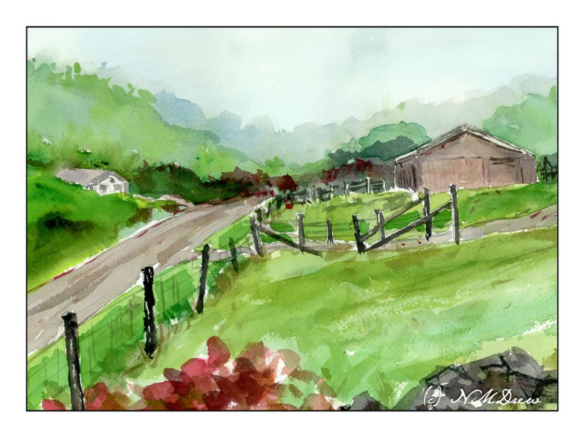
The Great Smoky Mountains get their name from the mists that rise up from the hollows. The park was established in the 1930s and are part of Appalachia, itself which covers parts of New York south into the Carolinas, Georgia, Alabama, and more. My own family on my father’s side can trace itself back through many areas, in particular Tennessee. As a kid, my family traveled through these mountains a bit, but I have never had the opportunity to spend a lot of time exploring them.

Here, I tried to work with a limited palette as well as a wet-in-wet technique to create the sense of fog and mistiness of the distant trees. The sense of just a wetness to the landscape – lush greens, trees, mists – is another thing I wanted to convey. I think it works.

Watercolor, 9×12, Arches 140# CP paper.

A Palm Tree, ii

After my satisfaction with yesterday’s watercolor and my ongoing interest in palm trees, I thought about a couple of things. First, I need to get over my fear of buildings. Second, I need to paint more palm trees! So, I decided to use a photo I took awhile ago and posted here to use as subject matter. Below is the original photo which was taken at the Santa Barbara Zoo, near the condors (I think). The zoo itself is a wonderful resource and is always undergoing change and development. I’ve been going there for decades and always like it as it is large enough for a good visit and small enough so you don’t have to move in for a few days!

A Palm Tree

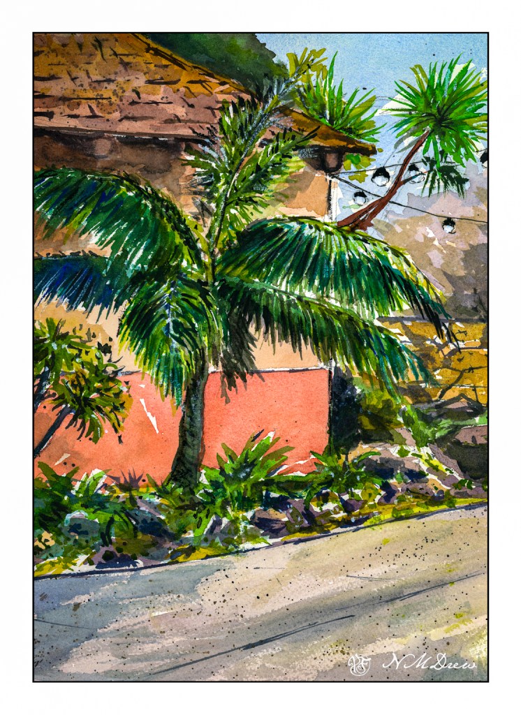
The photo itself is nothing especially exciting but it does give a good display of palm fronds. I am not sure what species this palm is, but it so classical! As well, there are some dracena palms on the right by the lights, which are very different in growth pattern that the one front and center.

Part of me wanted to make the painting simpler, but I also wanted to suggest a bright, sparkly day. The photograph was of a rather hazy day so I had to use a bit of imagination to get the fronds to catch the glittery appearance such palm fronds can have, especially in intense light with a bit of a breeze.

Overall, I like the way this painting turned out. I had to do a bit of glazing to tone things down here and there. Splattering helped for texture. White gouache to do a bit of glare here and there. Yesterday’s painting of an adobe reminded me how easy buildings can be, and today, though simple areas exist in the form of walls, the roof was a bit mossy from the damp of being a few blocks from the Pacific Ocean.

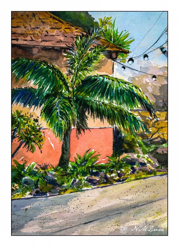
As a quick after thought, I think that the palm tree – the dracena – emerging from the right side of the building is perhaps unnecessary. Into Photoshop and tree removal very poorly done with generative fill – just because I can and could.

Watercolor, Arches 140# CP paper, 9×12.

Adobe

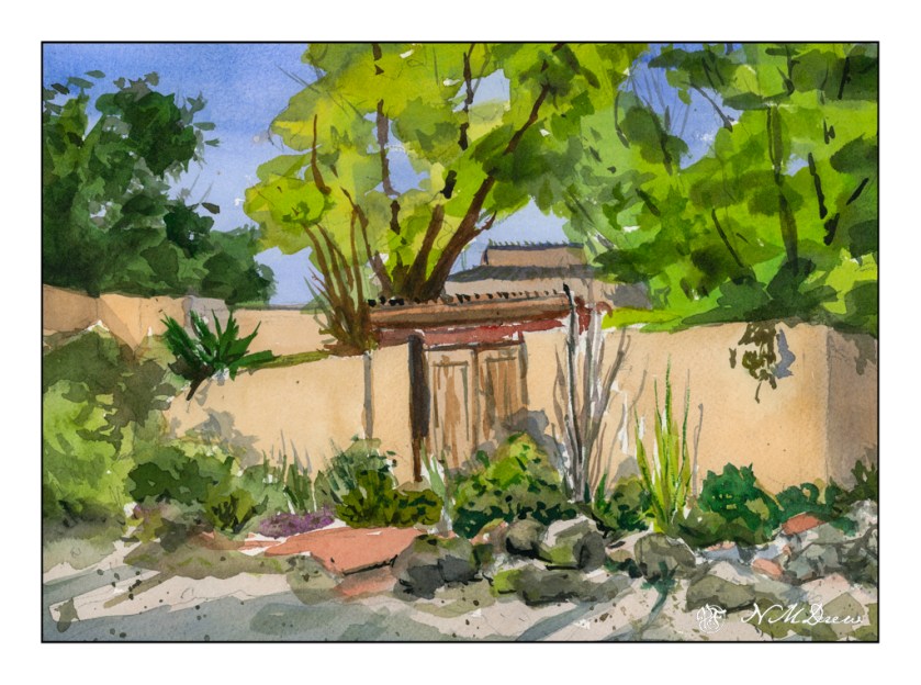
Yesterday was Easter, a quiet time for us. The day was gorgeous and the weather so pleasant – perfect Spring. I love the way the light catches as the seasons turn, and the clear, dry air of the southwest pushes colors to a harshness which at high noon can be glaring, but early or late in the day, when the shadows are long, the light is clear and bright but doesn’t hurt your eyes.

For the past several days I have been working in watercolors on smooth paper to practice pale colors which would work well with ink. I think I am getting it. Easter Sunday, though, I was getting a bit bored with the colors I was using as well as the lack of papery tooth to hold colors. As a challenge, I decided to paint a building. I realized why I am intimidated by buildings – they have straight lines and a jerk of the brush can ruin a good, hard edge.

A few straight line glitches, but I will say I am pleased with what I did here. I took my time and tried to create a simplification of a complex structure that works well with shape, shadow, contrast. I know where I messed up my straight lines, but you can find them and tell me if you like!

Watercolor, Arches CP 140# paper, 9×12.

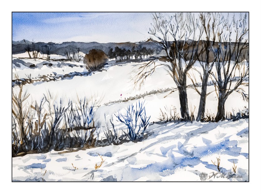
Winter Valley

Today I thought I would be a bit self-disciplined and work with only two colors to create a winter landscape. I used MaimeriBlu’s “Faience Blue” and somebody’s artist quality Burnt Umber. Add to that, as needed, some white gouache.

I have never used MaimeriBlu paints, much less Faience Blue. This blue seems a bit of a cold one, which is perfect for a winter day. The Burnt Umber, mixed with the blue, produces a nice dark as well as plays into the coldness I am trying to express.

The first part of the painting was done with the sky – start at the top and work down. This is pure color, diluted, to create a sky. First the paper in the area of the sky was wet, and then the blue brushed in. Before the paper dried I lifted out the color.

Next I painted the distant hills and background area, solid in color, but varying the intensity of the colors and mixes of brown and blue. I painted through where the trees in the mid-ground would be as I knew the tree branches would be a bit darker once painted. Next came the trees in the foreground right and shrubs and grasses on the left as well as under the trees. All dried with the hair dryer. The middles areas were done after these dried.

Finally, the snow was tinted with blue in varying strength, bits of grasses, and final details. The snow on the trees was done with white gouache, as in the front left shrubs. Once the gouache dried, a mix of blue and brown was glazed over it to tone it down. Finally, a light wash was put into give a sense of dimension to the snow.

In the end, I am rather pleased with this painting. Using triads made me recall some other watercolor exercises I have done with limited palettes of color. The cold is much to my liking as is the complexity of the foreground giving way to simpler forms in the distance.

Arches 140# CP paper, MaimeriBlu “Faience Blue” and Burnt Umber. 10×14 inches.

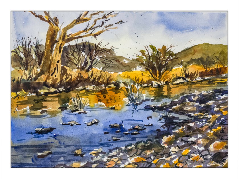
Watercolor Triad – Desert Wash Scene

Well, the electricity is off again. I feel like I am living on a little island because only a few people in my neighborhood are affected. Fortunately, we have our generator! So, light, electricity, internet, and the opportunity to continue with my course on color triads by Shari Blaukopf.

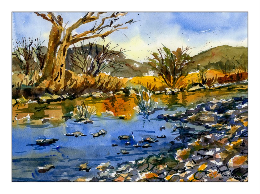
I did the first one, a tropical scene in Florida, and this is the third, the Arizona desert. The second one is winter and since it is cold and rainy outside, the desert appealed to me a bit more. The color triad used here – and easily, too – consisted of New Gamboge (yellow), Ultramarine Blue, and Burnt Sienna. I did not have the New Gamboge, so I mixed Cad Yellow Medium with a bit of Pyrrole Orange to get the color she suggested. These colors are perfect for a late evening in the Arizona desert.

The above scan is with VueScan. It is a bit more subdued than the one below, scanned with Epson Scan. I like both of them, but think the richer colors of the Epson Scan are a bit more to my liking. The warmth of the scene is well done here, and matches my own colors perhaps more closely.

All of Blaukopf’s courses have been a real pleasure to follow. If you like watercolor, I suggest her more than any other online teacher. I never fail to learn something new. For instance, in this class, the golden middle ground, just above the opposite shoreline, included painting the colors up into the trees on the left. From there, at a later point, more detail was added.

The other thing I learned was a really interesting and unique way to do reflections in water. The two colors – golden yellow and then blue – were mixed up in big puddles. First the golden yellow was laid in, with a bead of color at the bottom. Then, with the blue, with space between it and the gold, the blue was brushed in with only a touch onto the golden yellow here and there. This allowed the colors to merge, but not become murky or form blooms. Finally, the darker water of pure ultramarine was mixed with a bit of the golden yellow mixed with burnt sienna.

This triad study was so much fun to do! Time to try some of my own from my own photos.

Watercolors, Arches 140# CP, 9×12. Cad Yellow Med, Pyrrole Orange, Ultramarine Blue, Burnt Sienna.