A Touch of the Fauve in Cinque Terre

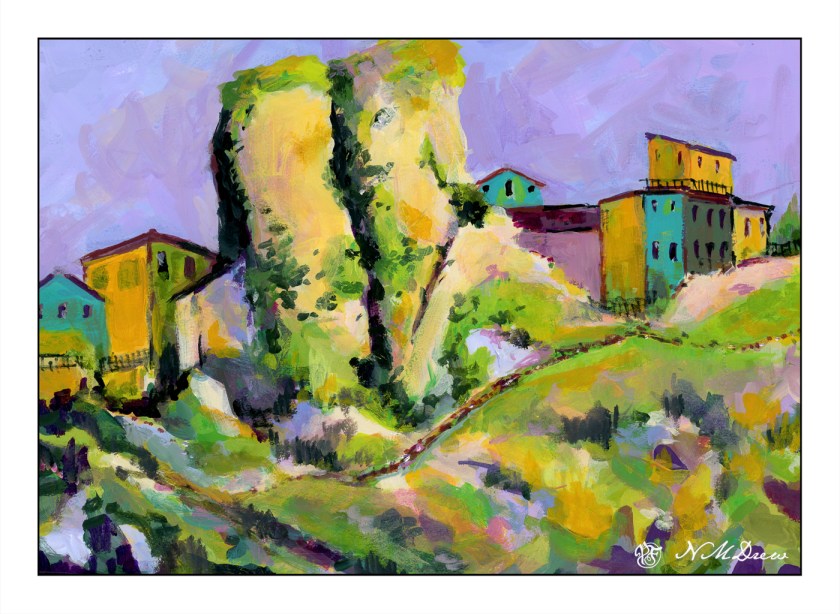
Cinque Terre is located in Liguria, in northwest Italy, and comprises 5 villages built into the steep cliffs along the coastline. You can find all sorts of articles, videos, photos about it, and to my thoughts it sounds like an incredible place to see. However, it is not something I will get to do next week, so I thought it would make a good painting study. The idea of living in a house, built on a cliff at the edge of the ocean – I don’t know, but it seems quite a fascinating way to live!

I was more interested in playing with the paint and experiencing how to use the Golden fluid acrylics than I was in making a finished work of art. I am finding I like them when they have dried a bit and become rather sticky but still maintain the consistency of cream. Opacity seems to improve as the paints become more viscous. This stickiness makes for some rather nice ways of creating color combinations – one on another – and texture. This is all play, and play is the best way to learn how to use something, I think. The plan is to continue and come up with an opinion about if I like them – I think I do, sometimes more than other times – as well as just exploring painting with them.

This painting was inspired by a photo taken offshore and looking landward. The houses cling to the cliffs, and if you look closely at the photo, you can see pathways and stairs leading from one area of houses to another. There were more outcroppings of rock in the photo than I have here, and I think it would have been a better painting to have included them. It looks like I have two rock columns madly in love, and having a good smooch! Despite that, I had fun playing with not just the colors, but ways in which to apply the paint – like rubbing it in with a paper towel in addition to a paint brush. Soft and hard brushes also have and impact, as does using a filbert, flat, or round brush. So much to learn . . .

Golden fluid acrylics, a bit of a fauvist or colorist approach, 15×20 paper.

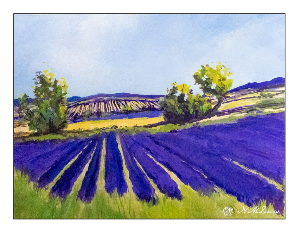
Lavender #2 – Stage 2

With a hurricane, what else can you do beside bake bread and listen to music and watch TV or read a book?

Paint, of course!

Below is Stage 2 of my Lavender #2 of yesterday. I worked on brushwork, details, and all those other lovely things. It is still mounted on the coroplast and taped down, but I like to see what I have by importing the image into Lightroom and then adding a frame. It does help me see things.

I am not too sure where I am at with this painting – I rather like it, but it is a bit more fiddly than I want it to be. I tend to dab – other people I know tend to use short vertical strokes. What I would like to see is an effective stroke, simple, long or short, in my own work. Not easy to do . . .

The rain is falling with a soft sound – the air is cool – and the birds outside the studio window are twittering away. Time to get away from the lights and the lavender and enjoy the peacefulness of the day.

Lavender #2 – Stage 1

Hurricane Hilary is supposedly barreling toward SoCal, so after battening down the hatches and getting a virus and sleeping for more hours during the day and night than normal, running a fever, I finally emerged with some sense of clarity today and accomplishment insofar and I am awake-ish and my mind may be capable of functioning. And, I am bored with being so uncreative and dedicated to duty and chores that need to be done despite the desire to crawl back into bed.

So, more lavender. Let’s just call it Lavender #2 for now, as I am sure there will be other versions sometime in the future. Stage One is below.

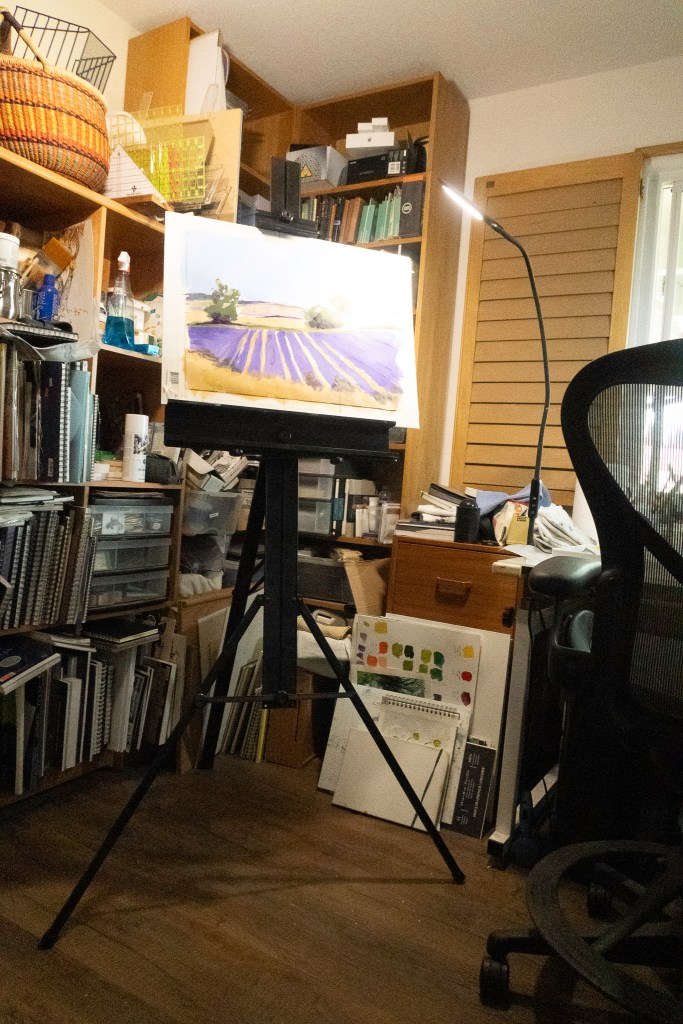
I am using the Golden Fluid Acrylics again, and really do like them the more I use them. The paper is some badly sized watercolor paper which is fine for acrylics and dreadful for watercolors. It is 15×20. I mounted it on a piece of coroplast with some tape and went to work. Because of its size I put it on my easel.

I have my paints to the right, with the window facing east. Lots of LEDs with variable lighting – I hate overheads! Anyway, I adjusted the easel to my height and find I rather like this set up. The easel is lightweight aluminum and folds flat. The esposo is kind enough to fetch it when asked as it resides on a shelf in the garage, up high and out of the way.

Colors, at this point, are limited. So far I have used yellow ochre, chrome green, carbazole violet, titanium white, cobalt blue, ultramarine blue, and a drop or two of cadmium yellow medium. My palette is a mess. I just cannot create a tidy one like other artists . . .

For today, I am done. I am getting tired, but painting is refreshing! That is definitely good for the soul.