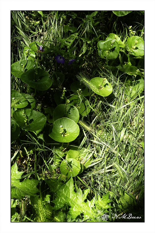
Miner’s lettuce is a “wild edible” that is quite tasty! Here in California it grows in damp places, usually along streams, but on our trip up to Paso Robles last week I found some flourishing beneath an oak tree. After all the rains of this past winter I am not surprised, but I was really delighted to find this little patch.
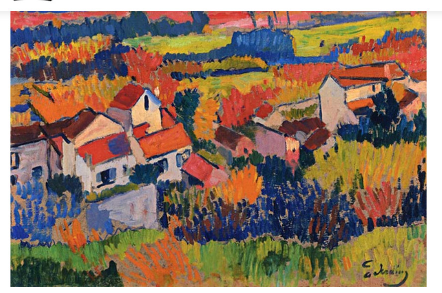
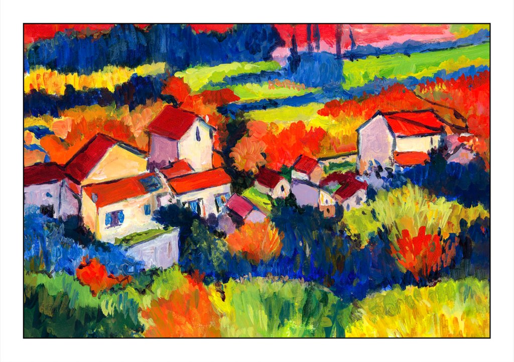
Above is a copy of Derain’s painting, ca 1904, done during his Fauve period. In an online class I am taking, we are encouraged to copy the work of a master artist, new or old, and learn from the experience. This is the second I have done, and certainly one I would not have really considered just because it is so bright! But, the colors and composition caught my eye, and off I went.
The first thing I did was to grid it onto paper. Derain’s work is obviously oils as acrylics did not exist in 1904. I used acrylics on ungessoed paper. As I moved along, looking more carefully, I think he underpainted his canvas with raw sienna or yellow ochre – you can see such colors along the bottom of his painting.
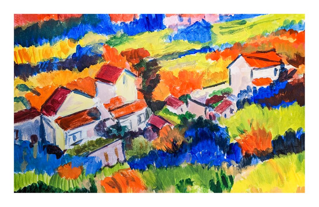
This painting took me probably about 8 hours. I gridded the image, which is about 11.5×17 inches, whereas the original is about 18×22 inches. Then I painted the basic shapes and colors yesterday morning.
This took a lot of time! I am glad I did a grid as the overall areas to be painted were fairly apparent as to shape. What they were – well, some leave me wondering. However, colors are shapes, and Fauvism is not reality, so I could do a bit of my own interpretation, too.
Next, I began to define areas as well as correct mistakes, such as my lopsided building in the lower left side. My paint was thicker, too. Below is this morning’s work.
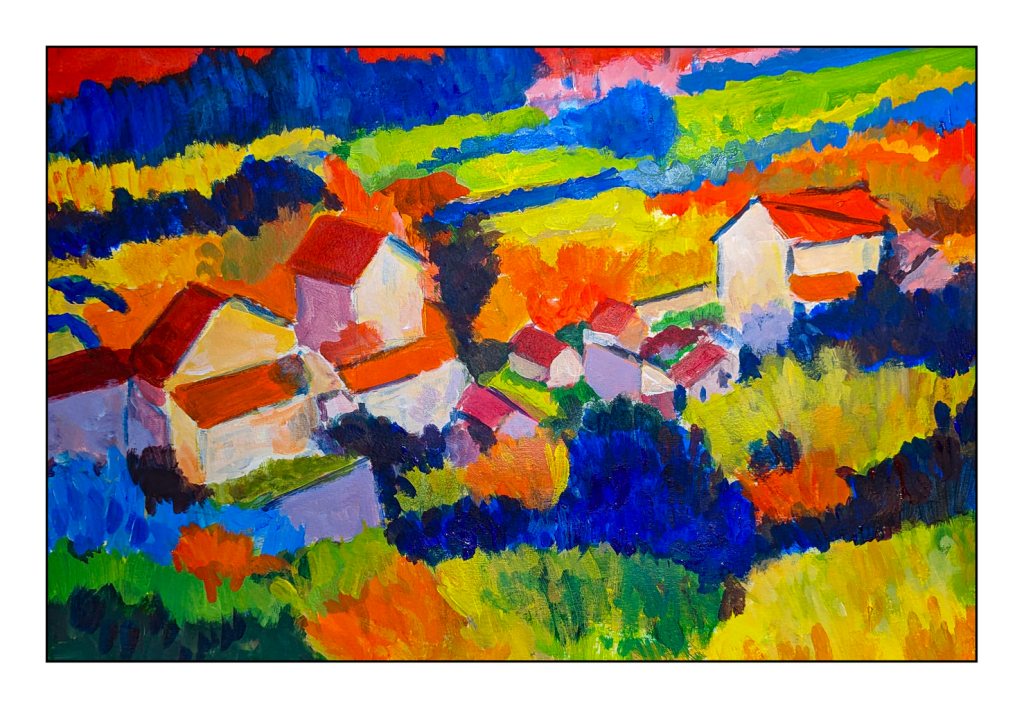
After lunch, I aimed to complete my copy of Derain’s painting. As I moved along, I looked at Derain’s brushwork. There is a very graphic quality about his painting, which is very pleasing, but the brushwork, too, is fascinating. I did try to emulate it a bit, not just dabbing, but trying to see when he did a dab, a long horizontal push, and so on. Easier to do than to describe!
My final work really does please me. I love the bright colors. My limited palette worked pretty well and there was joy in mixing colors. I usually tend toward more “natural” colors, but the truth is I am a magpie at heart, and bright colors always do get my attention and make me happy. That is an emotional reaction. Classical paintings, though, do appeal to me. Copying a master is opening doors to me and leading me into areas I have never explored.
Last weekend was the first time since last year that we spent the night away from home. We went up to Paso Robles, CA, for a couple of nights with the main goal of getting to the Mission San Miguel Arcangelo. The esposo’s parents came with us, and it was good for them to get out of town, too. It’s always nice to travel with them.
We stayed in the wine country outside of the town of Paso Robles itself, amongst rolling green hills covered with wild flowers, studded with oak trees, and lined with vineyards.
Paso Robles is located in the central coast California county of San Luis Obispo, and since the mid 70s or so has become well known for its wine production. We enjoyed Daou Vineyards and Le Vigne wines. I also think it should be recognized for its beer, too! There are a couple of breweries we enjoyed, with good pub grub and a nice variety of beers. Since we were staying 20 minutes outside of town, we soon became familiar with all the strange roads and twists needed to get into Paso Robles itself.
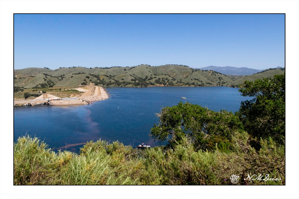
The drive up took us inland from the coast. Along Hwy 154, which connects Santa Barbara to the Santa Ynez Valley, we were able to see just how the rains have filled our water reservoirs. Lake Cachuma was full. Stopping at various points, we could see how green our hills have become and lots of lovely water!
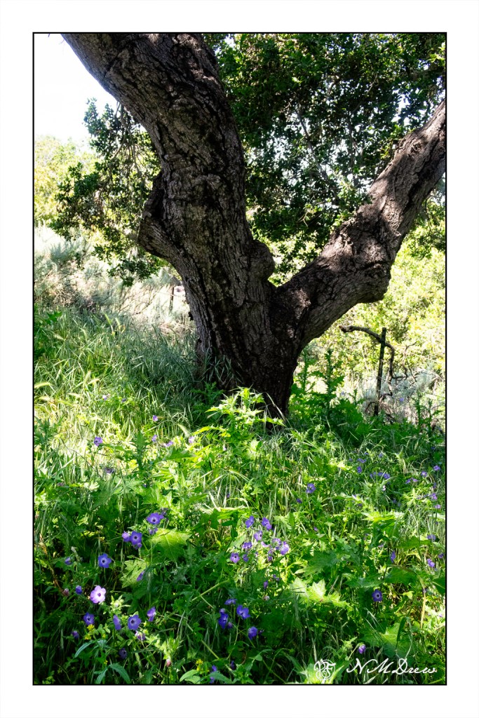
Alongside Lake Cachuma, the oaks and undergrowth were filled with grasses, miner’s lettuce, and flowers. A lot of green! There was a sandy path to follow above the lake, and it led to some wonderful springtime surprises.
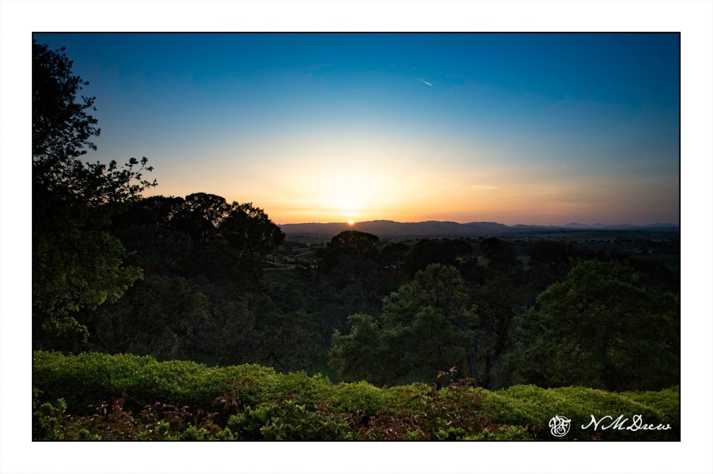
And so we drove on through, along the 154 to connect once more with the 101 to Paso Robles. We had coffee in town and then off to the B&B. And then back into town for dinner. And finally, a sunset from the patio at day’s end.
I bought a travel camera awhile ago – a Canon G7X Mark II – and am playing with it. I am trying out the different modes. This is one of the earlier photos after I just got it, and then I reduced the picture to black and white, not aware that there is a B&W mode in the camera. I want to get comfortable with the camera to get it to do what I want it to do when out and about in strange and exotic places.
I have some really good cameras – but I don’t want to have to change lenses or stay limited to one lens on a range finder. The G7X Mark II was the one I chose after looking at a bazillion digital point and shoots as I can actually set priorities (ie aperture, speed) or go totally automatic or totally manual.
We spent the weekend in the central coastal area of California. The drive up and back were beautiful, with miles travelled in the Paso Robles wine country. This is an oak tree, leafing out in a field alongside the road home. This has been an extraordinarily beautiful spring!