
Looks like something out of a SciFi flick or something, but it is just a tunnel under a road in Mesa Verde National Park.

Looks like something out of a SciFi flick or something, but it is just a tunnel under a road in Mesa Verde National Park.
Ahhh. Frustration. Nothing like it to make you feel like crap! Or to push you past your comfort zone.
Comfort zone: Ink, watercolor washes.
Sort of comfort zone: pencil drawing.
Disaster! Warning! Alarm zone: Watercolors! We won’t even consider these at present.
Comfort Zone
There are times when a good book helps you out a lot. These are studies copied from a book by Claudia Nice. What is good about these kinds of studies is that there is detail, but not a desire to be so realistic you are going to scream, if super realism is not your thing. (It’s not mine.) Here, you will fine stippling and hatching, and cross-hatching. Each of these brings dimension and texture. Add some watercolor washes, and it can really make things pop out.

Sort of Comfort Zone
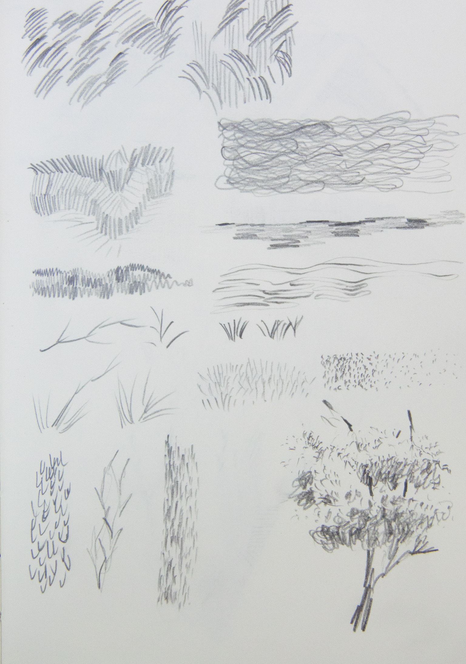
I think I mentioned in an earlier post that I have never really done any formal consideration of pencil drawing. To me it seems counter-intuitive to think about pencil drawings beyond pencil drawings of a casual quality, like the scribbles and doodles students turn in with their work. Rather, I looked at a drawing book from the library and had a deeper appreciation for the textures pencils can make. As with pen and ink, stippling and hatching are at work – but so are circles and lines in varying directions, along with lines which depict texture, such as the little hook-shaped lines at the very bottom.


Alarm Zone!
Today, I filled up a palette with watercolor pigments. Now, I am slowly studying washes and wet-into-wet. I am also using a whole slough of pigments I have never used and dropping some of my old standbys. I am feeling like crap. But, perseverance. Onward.
Whatever.
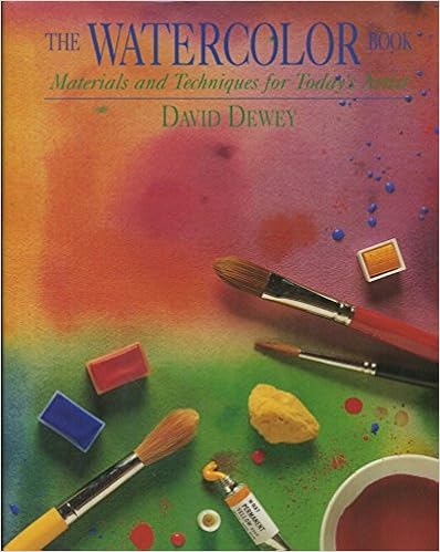
I did some watercolor studies, derived from David Dewey’s The Watercolor Book. This is the edition my local library has – there is a newer edition, but I have no idea how much different it is from this one.
Dewey’s book came highly recommended from one of my favorite sites, www.handprint.com. There are others, too, but this one is the one at the local library. Packed full of text and pictures, demos and a plethora of information, at first it seems like a rather intimidating book. It is. There is a ton of information, and to me, it was hard to sit down to look and to read. However, once I started, I decided my best approach is to begin with some exercises. Other parts can be read for information – I wanted to get into actual painting! What really draws my eye to Dewey’s work is the beauty of his washes – clean, simple, expressive. You can see his more recent work on his website. Given my usual propensity to messy, muddy stuff, his work is simply elegant – not splashy and spontaneous like Charles Reid, but serene and calm.
Okay, so here is what I did. This is the first exercise I did. I used glazes and mixed colors. This was a drawing from one of Dewey’s exercises in warm and cool colors.

Not an especially inspiring image – and poor photography as well! However, what I did learn was a bit about glazes and managed to leave some planned white, some bleeding, some patience, and how certain colors mixed. I did an overall underglaze of Quin Gold. The sky was laid in with a glaze of cerulean blue, while the ocean was a layer of ultramarine. I mixed some alizarin and viridian (complementary colors to tone down the red of the alizarin), along with some burnt sienna to create the float of the shack. The islands were my favorite part – carbazole violet and burnt sienna. I’ve never used the violet, so it was a fun mish-mash.
Next, water studies, which I feel were more successful than the washes and glazes, but I was also warmed up. These are also from demos in Dewey’s book. Here, an underlying wash of ultramarine with a touch of cerulean. Once dried, ripples in cerulean with a bit of permanent rose. Finally, the greenish color is a combo of phthalo blue and burnt umber, a blend I’ve never done before. I really like the colors!

This next image is done in essentially the same way with the same colors, only the ripples are circular. The photo is crummy, but the results are rather clear.

Certainly no works of art, but successful exercises in a few areas. First, getting reacquainted with watercolor is rather painful. Glazing and washes take a bit of patience. Finally, there is the real pleasure of learning new color blends, as well as having a sense of derived satisfaction with a study fairly well executed.
I am excited to be painting again. During the week, it won’t likely happen because of work, but I hope that some drawing might occur. Weekends are likely to be very much taken up with painting . . . yay!

And then it did.

If in heaven we don’t meet,
Hand-in-hand we’ll bear the heat,
And if by chance it gets to hot,
Coca-Cola hits the spot.
