A Bit of Dishonesty

I’ve been editing photos for a while now.  One of my favorite tools is spot removal, from spots on a dirty digital lens to lint in film.

The other day I was comparing my second edition of the Moonlit Sycamore with the first edition of the same.  I liked the first one better, but did not like all the little twiggy lines I put in to represent a tangled undergrowth at the base of the tree.

Then the thought hit:  edit it out!

So I did.

For your viewing pleasure, here is the before, and then the after.  The third image is the second real painting of the same subject.  What do you think?

Moonlight

My original “Moonlit Sycamore” is below.  I like it a lot – except for the squiggly black lines I put into it.  They ruined the painting for me.

So, a second attempt, this time on 12×15 paper rather than 9×12.  No squiggles in front of the main trunk.  Instead, this new version is much darker, and the squiggly lines don’t exist, but dark lines, to suggest other trees and branches, exist, but not across the main trunk.  Here is the new version below.

The scan doesn’t really do it justice – the burnt sienna is a bit less intense in the original.

Both painting were designed to work on negative painting.  This is not easy and I expect it takes a lot of practice to do it well.  Years ago, I did take a workshop and saw negative painting and masking fluid for the first time.  It was quite impressive and looked deceptively easy.  I am finding it is not – but it will improve with time!  Funny how a scan makes you see a painting so differently . . . flaws are more apparent, as are areas of success.

Lines of Bodie

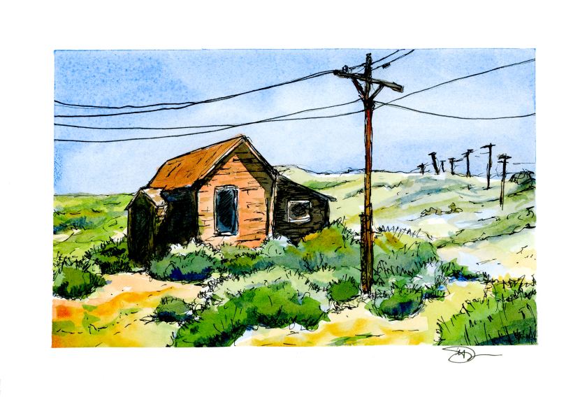
Today I ventured out on my own, influenced by practice sketches by Peter Sheeler and his videos.  This is from a photo I took in 2016 up at Bodie, California, when it was moving toward noon on a hot, hot day in August.

I rather like the composition, particularly the lines of poles marching over the hill in the distance.  If you ever have been to Bodie, you know it’s a long drive down a long and bumpy washboard road.  The telephone poles and lines emphasize the town’s isolation.  As far as painting the subject matter, I started out with a line drawing, painted, and then came in again with the ink pen.  It was so, so, so hard to not try to draw and paint every line and rock.  Simplification was a big challenge for me.

As I painted, I worked hard to recall what I have learned doing the practice studies.  Keeping things simple also meant keeping the palette simple, and the brush choice as well.  I started out with sky in Cobalt Blue after wetting it down with a big round brush.  Then I kept myself isolated to a dagger brush – first time to use one, too.  The remainder of the palette included Quin Gold, Burnt Sienna, Ultramarine Blue, Sap and Hooker’s Green, and by accident, a tad of Indrathene Blue.  The paper is 5×7 Arches Hot Press and taped down with a 3M painter’s tape with specialized edge-sealing qualities, which really worked to keep the tape from pulling up as it got wet.

Overall, I like the lack of mud and the contrasts I developed between light and dark.  Pen and ink come to save the day again!