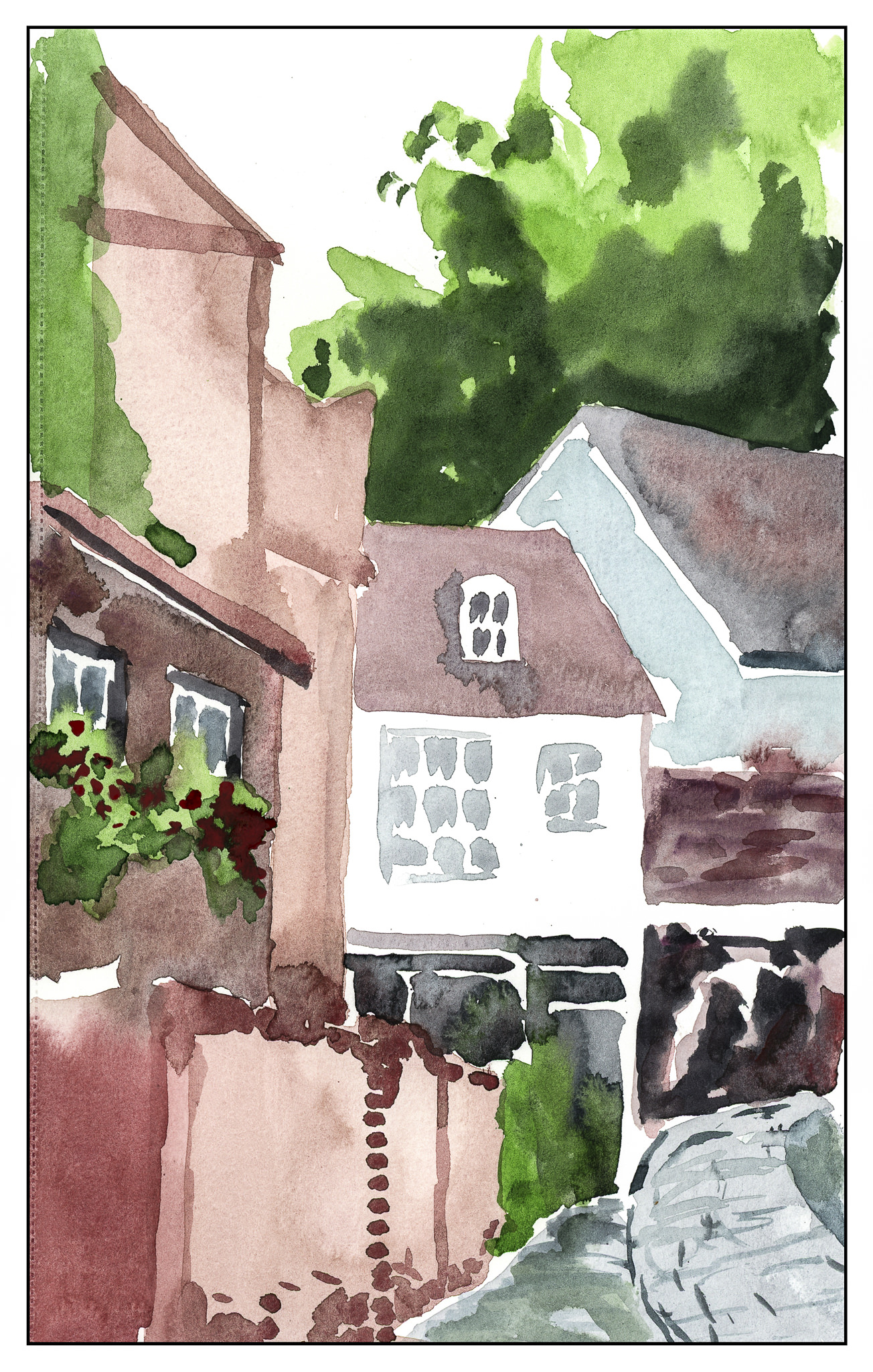
Another focus on direct watercolor – no lines, no pencil. Here, my main focus was to draw straight lines with a brush, as well as consider how not to get everything bleeding into each section. I tried to do one area at a time – say, one building part – and then move on to one adjacent to it, working carefully to make each area separate but connected. Sounds like a lot of hooey when I read it, but that’s best description I can give right now! I’m running late to work.
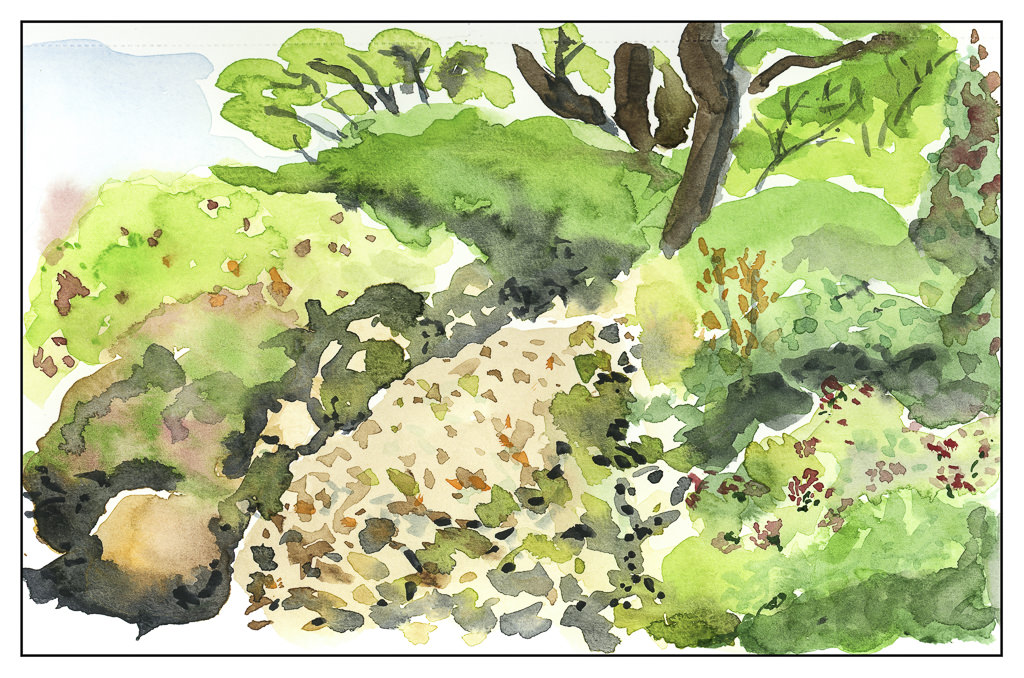
From a photo I took not too long ago – a bit of the local botanical gardens. There is a path in there somewhere, but it got lost! Direct watercolor is not easy to do.
This has been a busy weekend! A lot of painting – certainly beats housework, I tell ya.
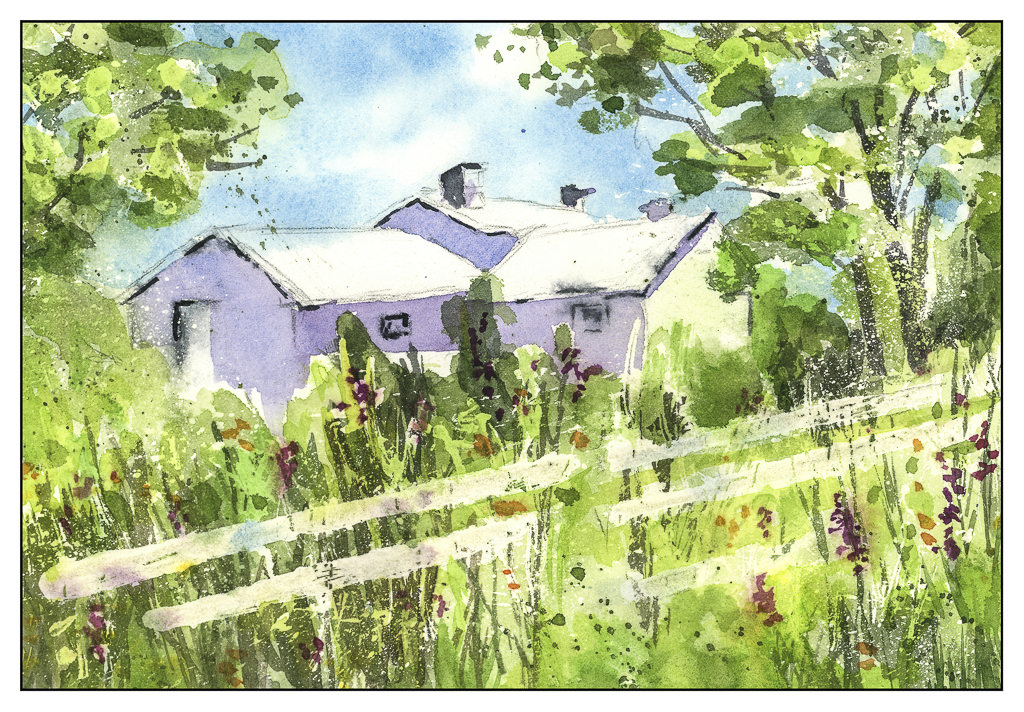
Here is another study from Rick Surowicz’s YouTube channel. This is the “Inn at Brandywine” study. Again, use of masking fluid, glazes, warm and cool greens. If you like to paint and want to get better, you cannot go wrong with his videos. They are detailed and informative – info on brushes, colors, techniques, thoughts on what he is doing. All very helpful and insightful.
Using the masking fluid is becoming easier, as is thinking ahead. Like painting in negative space, planning ahead is a different way of looking at a painting for me. It’s hard to explain. The thing is, while kind of frustrating to do, it is becoming more of a part of painting, if that makes any sense.
A workshop all day Saturday, playing with Yupo (a plastic paper) and masking fluid. What did I accomplish? A familiarity with two unknown – unfamiliar – items. I produced not a thing worth talking about, and truth to tell, if a friend at the workshop hadn’t shown up, I would have been down in the dumps – I FORGOT TO BRING MY PALETTE OF PAINTS!
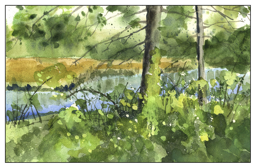
Oh, well. But, it did get me rolling, and this has been a weekend spent immersed in watercolors and studying techniques by watching videos on YouTube, specifically, those by Rick Surowicz. I followed two of his, one called “Creek’s Edge” and the other called “The Inn at Brandywine.” His stuff is great. The question is, will I carry his lessons into my own paintings, not copies?
So, here is what I did this weekend – the first is the “Creek’s Edge” and the second is my rendition of the “Inn at Brandywine.”
Once more, Rick Surowicz has produced a video for study, and I did it. This time it was more successful than the one on negative painting, probably because I used better paper and was not too fussed about things. I had been to a workshop earlier in the day, and though I didn’t produce anything noteworthy in the workshop, I was warmed up and ready to go!
I watched it three times! First to just see it, second to take notes, third time to follow along. The biggest point to it, for me, was the cool greens used in the beginning were nicely complemented by the warm green glazes at the end. I used a 300# paper, which is the first time I have ever used a paper that weight. I was pleased with the end result.
The color differences are notable. Surowicz used colors I don’t have, such as royal blue and peacock blue. I’m not sure what the colors in my palette were as my color reference wheel is packed up some place. I do know that I used cobalt teal in place of turquoise and a lot of Hooker’s Green, while he stuck with sap green, which is more yellow, and a lovely color. I also mixed some greens differently, such as using cobalt teal and quinacridone gold. The colors, while important, were not the main focus – the focus was to follow the steps and get an idea what to do! The photo Surowicz used is for compositional suggestions only – the execution is very individual.