Pastels just feel so natural. Get your fingers into the colors, dust, papers, blending. So tactile. I can’t tell you how many times I washed my hands here, but more than I would even with Covid-19 lurking around . . . . !

Pastels just feel so natural. Get your fingers into the colors, dust, papers, blending. So tactile. I can’t tell you how many times I washed my hands here, but more than I would even with Covid-19 lurking around . . . . !
Or should that be “treeful”?
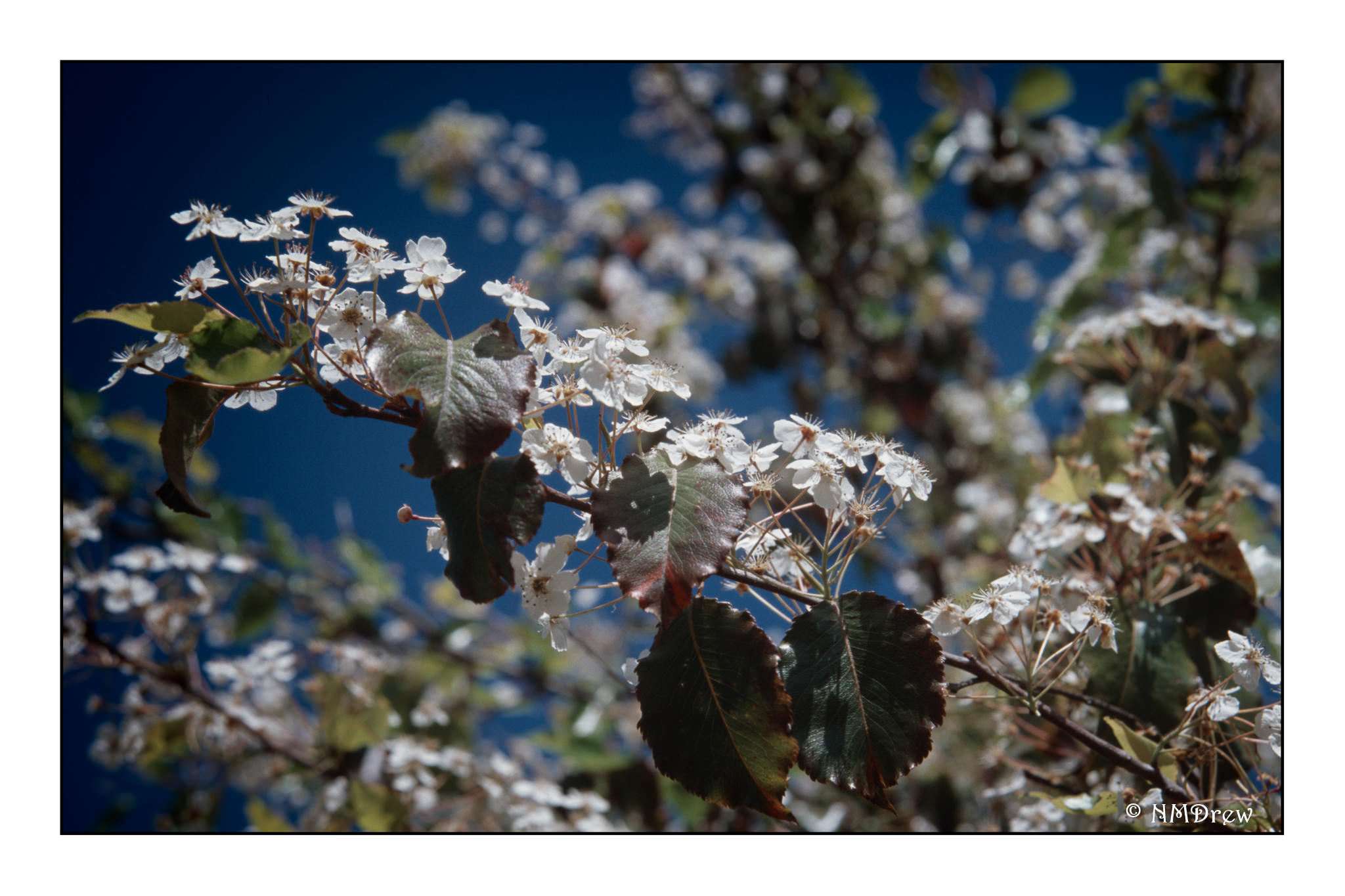
Ektachrome E100 comes through again!
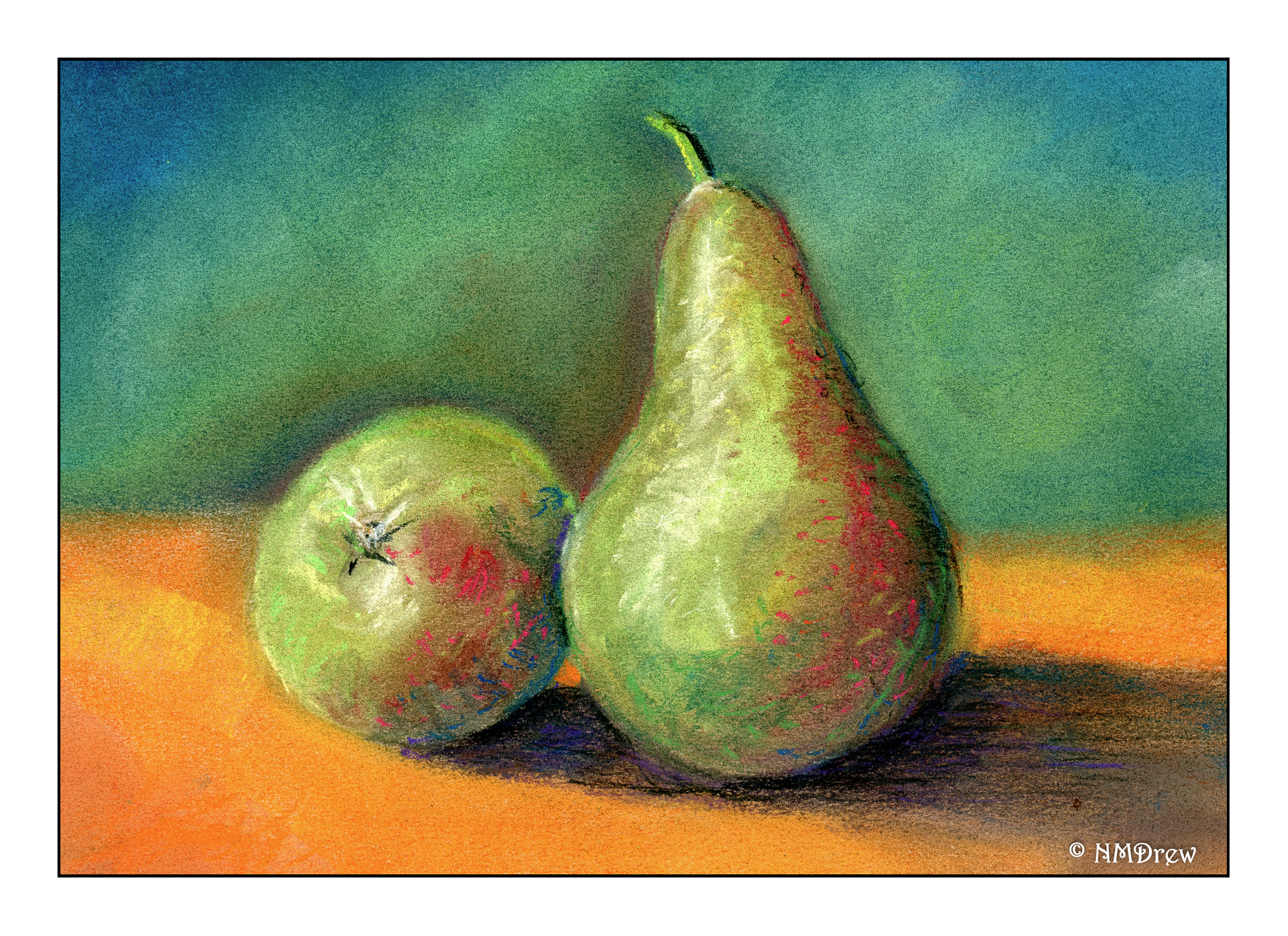
By far, this is the best of the 4 pastels I have done thus far. It sort of came together. Watching a YouTube video helped, too, to get an idea about how to proceed.
I used my fingers for most of the blending, and used a baby wipe in between to clean up dirty finger tips. I also worked the primary background and foreground first, working around the pears before doing the pears themselves. For the Saguaro painting, I had done the cactus first and then the sky – not really successful as the sky became a bit smudged with the greens. Live and learn! I used a torchon / stump for the areas closest to the pears and in the shadows to help isolate things. I cleaned them off with rough sandpaper – 100 grit.
Another thing I did was consider color and complementary colors in the painting. I simplified and did big areas before moving into smaller and more defined regions.
Of course, not all paintings will be this successful! It’s fun to compile knowledge and start using it when creating a picture or painting. The simplicity of this painting pleases me, but it was a more complex process than may appear because of the multiple layers of color put down.
I have had a few boxes of pastels, hard (Nupastel) and soft (Rembrandt) lying around for years. I finally found a class on pastels through the local adult school. It’s 8 weeks long, so a lot can be learned in that time. The teacher is also good, organized, and capable of teaching a wide range of people. I am learning a lot about a medium I have never really used, and that makes me happy. I always think of pastels as “drawings” but it turns out they are actually considered “paintings” because of their being made of pigments. I guess charcoal and pencil produce drawings.
In each class there is a focus. The one below was the very first one – paper and strokes, and a study on how to set up the Rule of Thirds in a painting. The photo we worked from was quite different than what we were instructed to do. Simplification of the overall photo along with placement of points of interest where the lines of the Rule of Thirds intersect. We also experimented with different strokes, atmospheric perspective, and color. I like the colors and textures I got here.

This one is one I did on my own. I tried to catch the coldness of a winter day. I used a blue paper for the base, and worked at keeping the distance simpler than the foreground. As usual, I really do struggle with depth and perspective, and had to work on this a bit.

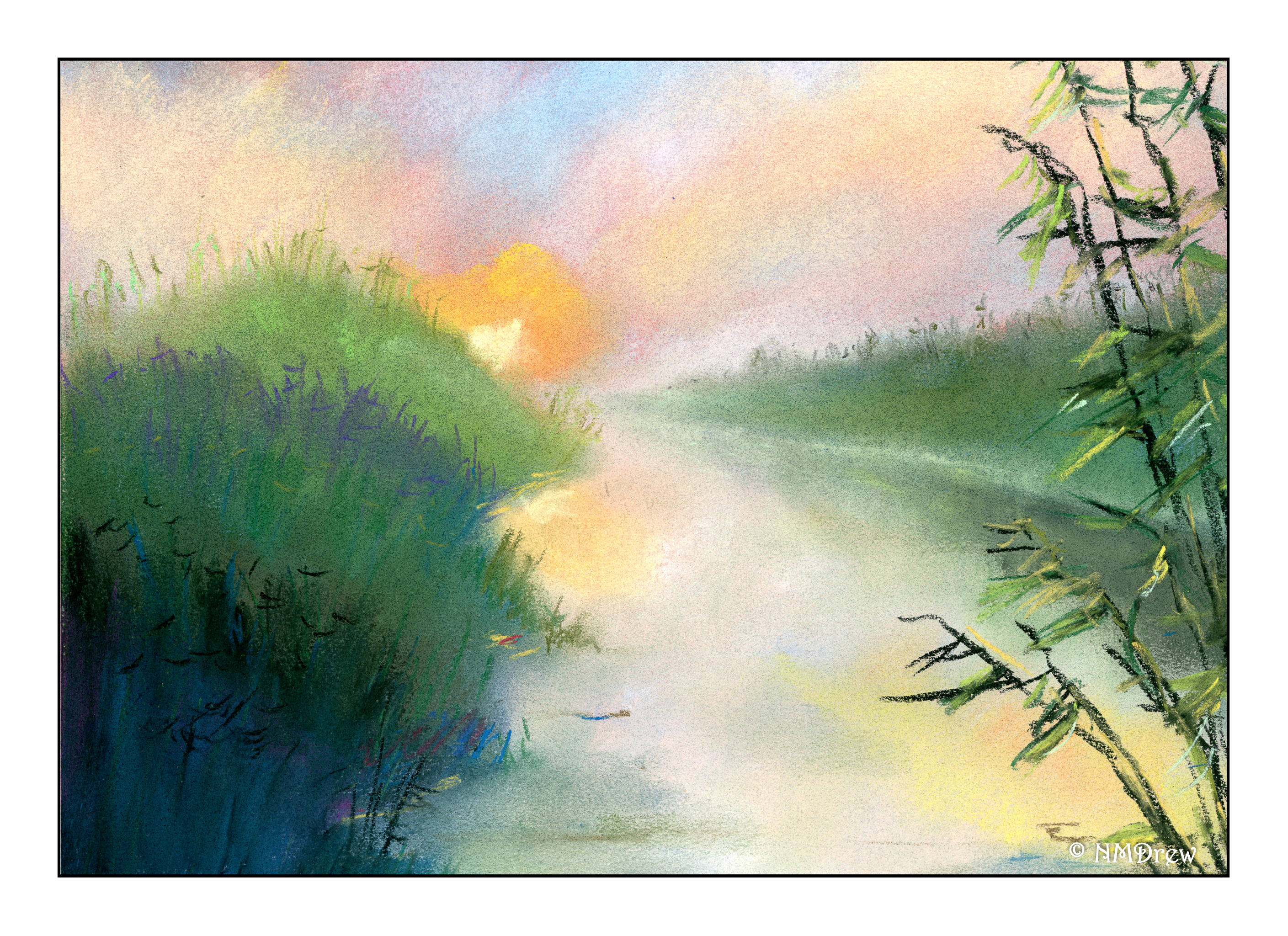
Below is our study from last week’s class. The focus of this lesson was atmospheric perspective, meaning how distance and atmosphere change with distance. The sky is lighter at the horizon than higher in the sky. The further things are from the viewer, the more the atmosphere changes their detail and color. The foreground is brighter and darker (though I cannot quite get what the teacher means when she says that – I should ask – but I think she means the colors are more intense). Distance means paler colors and simpler shapes. I really worked a lot on this one once I got it home – my foreground was just a mush of color all in the same tonality. I laid in a lot of white and lighter colors to create the sandy soil in the foreground for the final image.

This next week we will be working on clouds during the day – not sunset, not sunrise. I saw a video on YouTube about this same thing, so I plan to watch it before next Monday’s class.
Playing around with various settings on the X100V. So much to learn!
