Misty Morning

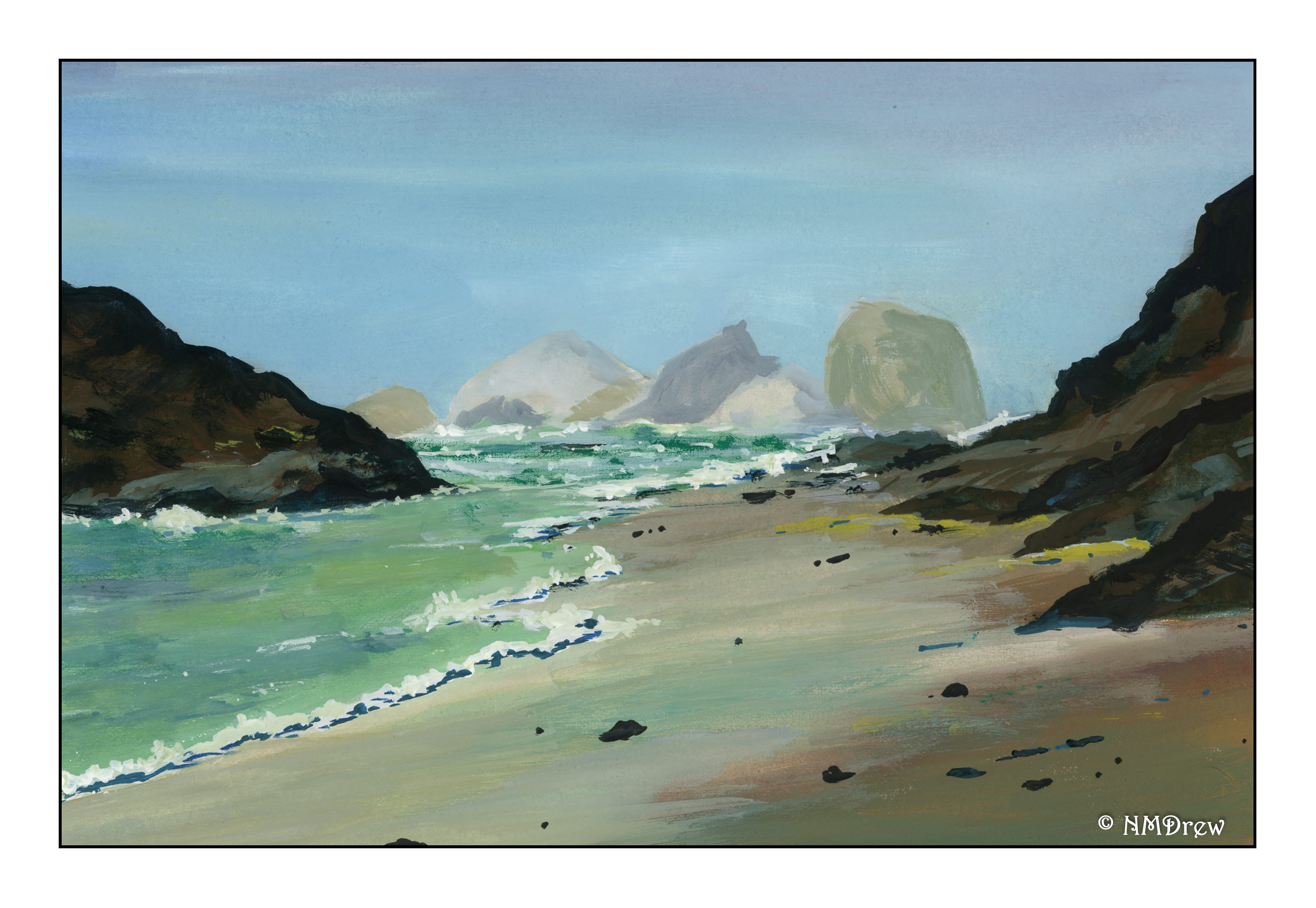
Summer, fog, early morning rising mist. One color blends into another, overlapping, blurring together. How to express this?

Gouache does not readily lend itself to the color movement as does watercolor. In watercolor, you can discharge one color into another, and the wicking action of water and paper do the work for you. Here, I thought a lot about how to blend and merge colors to create that soft effect of fog. In the end, for this painting, I decided to use a narrow, flat brush with stiff bristles and scumble all the colors together.

Rather a brighter painting than I anticipated, but I think it does express the rising fog and early morning sky fairly well.

7×10 Arches hot press paper.

Breaking Fog

Another study of an Oregon coastline. Morning fog with a bit of sun breaking through.

I must admit, I am really pleased with how this painting turned out. It seems that returning to the scene (of the crime?) is helpful, as well as working in different media. I did this same scene in watercolor a bit ago, and I plan to do it in pastels as well.

Done on Arches 7×10 inch hot press 140# watercolor paper. Hot pressed paper seems to be the best choice for gouache. Time to order some more!

A Lonely Coastline

Continuing my water and fog series, and my simplification attempts as well. Here, another deserted coastline, with a few birds.

What is it about a lonely beach? It’s spooky, it’s sad, it’s exciting, and quiet. If the sun is trying to break through, the warmth begins to disperse the fog. Hopeful. Sun. If it is heavy weather, the sky lowers and threatens. Cold. Damp. Dangerous.

Fluid paper, limited palette of ultramarine, sap and Hooker’s greens, burnt umber and raw sienna, and a bit of alizarin. Probably other colors, too – hard to remember where the brush wandered.

Gazanias

It’s been a busy few weeks it seems, to the point nothing is getting posted! So, back at it with some images in C-41 black and white, Ilford XP Super 400 and the Bronica SQ-AI 80mm f2.8 Zenzanon PS lens (for you techies out there!).

I took these in particular because the gazanias are a two-toned variant, in yellow and an orangey color. I wondered how they would look with the orange lens filter I had on. I wonder if the contrast would have been stronger if I hadn’t used the orange filter, but still, I think they turned out pretty good! The overall contrast is pretty nice even if not as strong as I had hoped for on the flowers.