For some reason, gouache seems to be especially good for depicting strong colors and contrasts. In part I think it is simply because the colors can be so very saturated compared to watercolor. Their opacity also lends to this. Artist gouache is also water soluble, and you can re-wet what you have painted to modify it. You can hide mistakes, but you can also scumble and scratch and get some rather nice effects.
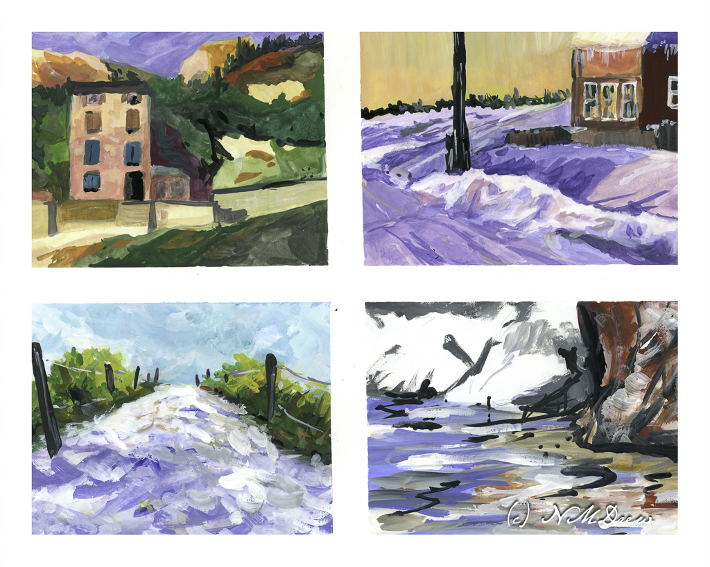
I divided up a sheet of tan paper which measures 11×14 inches. I used a lightly sticky artist’s tape to make up the different areas to paint. The first I painted is the large rectangular area on the right, and then on the left I did the next largest rectangle, and finally the one in the lower left corner. This image is directly from the scanner, so if you look carefully, you can see my mistakes which I corrected using Photoshop. The one in the lower left has 2 masts in the reflections – that is because I misplaced my mast and had to fix it for the final image.
Cheating? Well, if I were printing these critters, I would fix them, so for purposes here, I don’t think so. Also, these are all studies and the point is not accuracy so much as atmosphere – night, whether after sunset, before sunset, and on a full moon night.
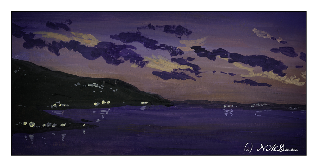
In the above painting I wanted here was a sense of dusk, when the sun is down and darkness is coming on. I worked with the sky, making it brighter than the water because with the earth’s curvature, the sky will still be bright. Lights coming on, too, add to the atmosphere, some warmer than others. And reflections, too, on the rather calm water.
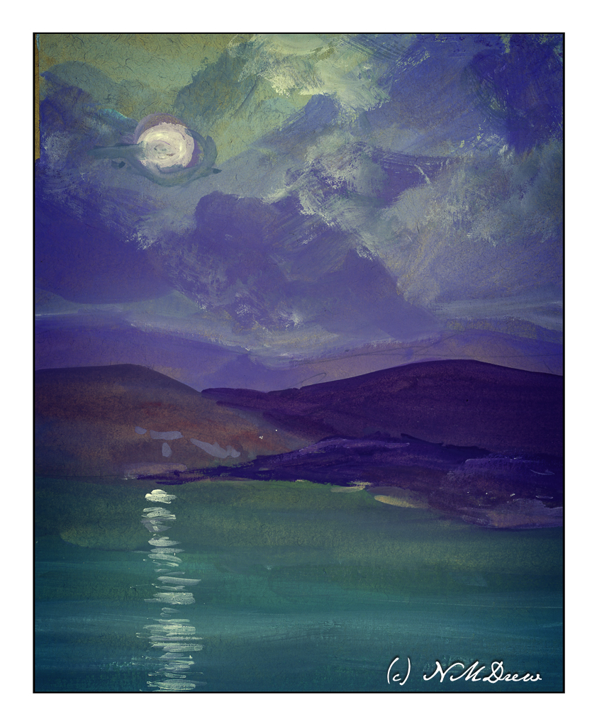
This one I played with in post because all of a sudden, in one foray of this or that setting, the light of the moon suddenly seemed to light up the surrounding clouds! I really liked it. Now, as far as the moon’s reflection on the sea – should it be more narrow closer to shore, and wider toward the bottom of the page, suggesting that is where the viewer is? The same applies to the painting below.
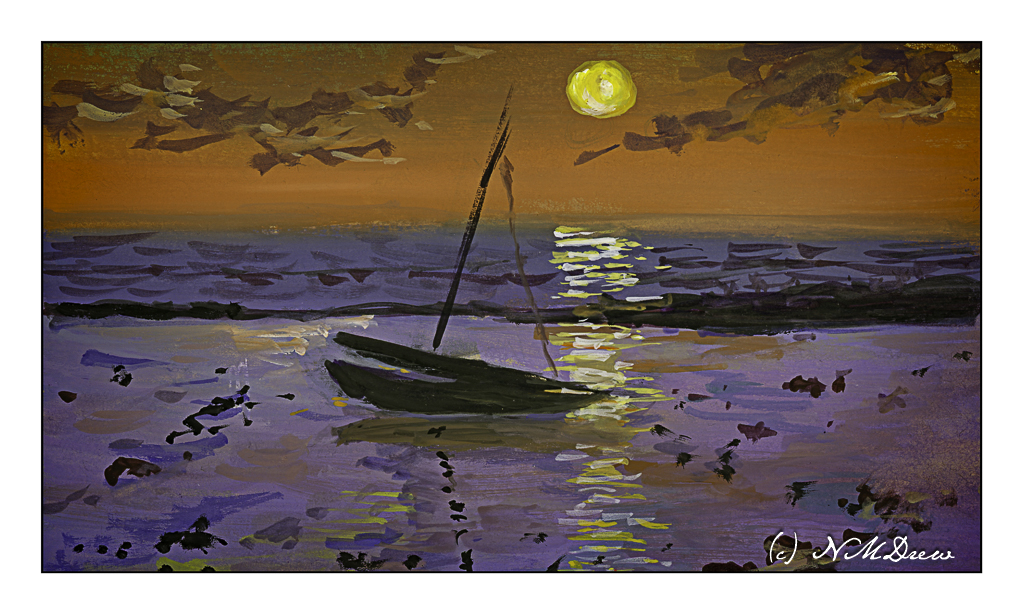
Once more, dusk. The sun is still out, but it is becoming increasingly dark. The sun’s reflection on the sea may need to be more narrow toward the horizon – again, something I need to check. What I wanted to do here was to get a sense of a boat resting on shallow water because the tide has gone out. The water is acting as a mirror and a bit of glass for the light above and the sand below.
Altogether, I had so much fun doing these studies! I want to carry them into watercolor, which I think could be extremely challenging, as well as into acrylic and oils. I also think that, much as I like the tan paper, it is very absorbent and perhaps I need to use a layer of acrylic paint or casein as a bottom layer for the paints. That is something to try later on.
As I post this, I have been awake about an hour. Rather funny to post a bunch of nocturnes as I watch the sunrise.
Now, back to my coffee!