The First Narcissus

I have been a real slug of late when it comes to posting pictures here on The Glass Aerie. Part of it has been just interests in areas outside of looking at a computer, coldish weather, and whatever other excuse I can offer!

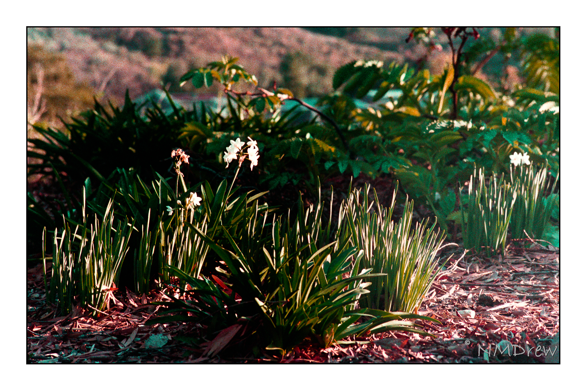
One place I do go with fair regularity is the local botanical garden, which like all such gardens, is designed to display plants and flowers throughout the season. Here, the first narcissus of earlier in the year – something I make special trips for as their presence is so fleeting.

I am finding the X100V to be an extremely pleasant carry-around camera, and the results aren’t have bad, either.

Tomatoes in Suburbia

Nothing like a mistake that is rather a fun one – here, double exposure in my Certo Six folding camera. I forgot to advance the film and thought there was an issue, so released the exposure button again by choosing the “bypass” button. (If you have a Certo Six, you know what I am talking about.) It makes me think that it might be a fun exercise to deliberately, rather than accidentally, create double exposures. Maybe even triple. Or quadruple. Such is possible!!

This is with Portra 400, a film I always find way to delicate in color for my taste, but it could be I will change my mind after cataract surgery. This is pretty much SOOC with just some spot removal in post. I don’t like spotty film . . .

Tanglewood Underpinnings (II)

A paintings is rather like rocket ship – different stages as it takes off.

I did this in yesterday afternoon’s class, trying to focus on both light and dark, warm and cool. Acrylics seem like a rather unforgiving medium insofar as they dry quickly and can have very hard edges. That makes it a bit of a challenge for someone like me who prefers blending and mushing painting. It took me a bit to figure out how to do it.

The fun thing about an art class is the class members and seeing how they paint. Perceptions and styles are all so individualistic. Naturally you prefer this to that, but admiration for an individual’s work doesn’t mean you have to copy them. Add to this, people are so full of information and stories, and this adds to the value of their art – you get to know them.

So, this may be put off for a few days as I have some other things I need to do – and it never hurts to take a break. I hope I don’t start more than one painting at a time, though, as then I will fall into my habit of UFOs lying around, sobbing for attention.

Tanglewood Underpinnings (I)

Back to “Tanglewood” – done already in gouache and watercolor and pastels. Now it is time to do it in acrylic! (If you want to see these, and the photo, click on the tag “Tanglewood”.)

Here I decided to work on setting up values – light and dark, warm and cool. I thought it might be fun to set up areas in complementary colors, but who knows. The whole thing could end up very odd looking, certainly for me and my boring outlook and driveness to reality. I am seeing this as an adventure. The photograph itself is rather dark and murky.

Colors used on Fredrix canvas pad are cobalt blue, Naples yellow, quinacridone magenta, and zinc white. These are applied atop 2 layers of gesso and then a substrate of yellow ochre mixed with Marigold (Holbein’s cadmium orange).