The Very Hungry Caterpillar by Eric Carle is one of my all time favorites. Story is good, but for me, the illustrations make it!
We have a wild and wonderful gardener in our family, Am, who got several of us started on milkweed plants. As a kid, we had them in the midwest, but they were very different than the ones which are the dietary staple of the monarch butterfly. She hands out plants to whoever wants them!
This seems to be my butterfly nursery. This is only one of many fat caterpillars – hopefully they are forming cocoons and not getting snatched up by the local wildlife. Sad if they are, but hopefully not, but such is the cycle of life.
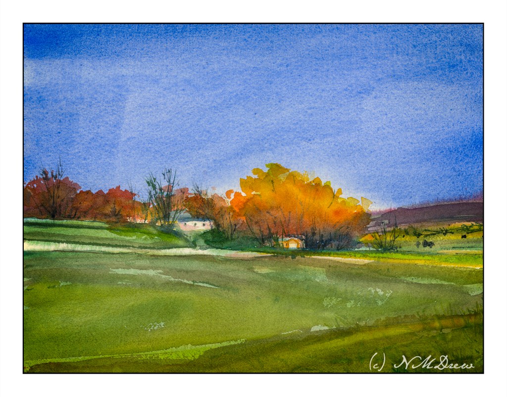
I started this painting a few weeks ago, at the first class at the local adult school with a new teacher. This is from a photo I took some time ago. I was at the bottom of a hill, looking up.
This painting has taken a lot of time – several hours – but the work has been worthwhile. I have been applying the various principles I am slowly garnering from hours at the proverbial grindstone, memorizing techniques, concepts, whatever. For instance, I think this painting actually has a nice sense of depth and perspective – something I have struggled with for a long time. The light on the trees also pleases me, as do other bits and pieces of it.
I have also learned just through doing how to get the heavy body acrylic paint into a more viscous and enjoyable mess to paint with, and that is a big help! It’s a combination of matte medium, water, and the paint itself. I dislike the plasticky quality so often that accompanies acrylic paints, so even thought my colors are bright, I think they moosh together fairly well.
I’ll ask my teacher’s opinion when I see her next week. Meanwhile, here is (to my eye at present) finished work. Below is the photo which is the basis for this painting.
Module 2 – Study 2 – Andy Evansen’s “Watercolor for All Seasons” Class
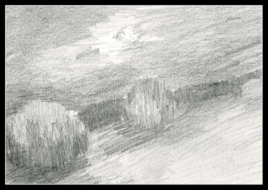
This is my second foray into the series of photos Andy Evansen has posted for studies in the second module of his watercolor class. Here the focus is on value studies.
One of the things I am attempting to do, from both my classes with Evansen and with Ian Roberts, is to work on value. Evansen is a watercolorist and Roberts is an oil painter. Evansen demonstrates the use of a value study on his YouTube channel by creating the middle value(s) as large shapes. Roberts emphasizes shapes rather than things as well. Unlike Roberts, though, Evansen begins his value study with simply the middle value, leaving lights as white. After he has painted the middle values in his painting, he returns to the value study to put in darks and perhaps details.
I managed to do the middle value study, and then painted in what I considered to be the middle values, working left to right as I am right handed. But, before that, I laid in the sky with paper turned upside down as I wanted to have a darker value at the horizon.
I am not sure if the paper is improperly sized, but the paint and paper did not interact well. This is a 300# CP Kilimanjaro paper, natural white, and the first time I have used it. I also wet both sides of the paper, which is a habit I have for watercoloring with 140# paper. I need to see what happens in the future with other paintings.
I don’t really think this painting has a focal point, but that is not the purpose of this study. This module is to paint left to right, working in midvalues and sky first and leaving areas of white or light colors intact. From there, darks.
Evansen has provided a number of photos as references for the basis of a painting, and for values, I think I will work on that and try to apply what I am learning from Roberts and Evansen to create some things worth the time I spend. The reference photos range from landscaapes to cityscapes – animals and people. I will begin with the landscapes and then try the harder subjects for me. Here, there are cow shapes – blobby things. I have also done geese – more blobby things. All thesse blobs have characteristic shapes for the critters.
So! I am dipping my toe into new territories . . . let’s see where it takes me!
Awhile back, I started a 30-Day drawing challenge. The goal: Create 30 small drawings, value studies, to see shape, value, and ultimately a focal point for a painting. The last means thinking about how you want to lead the viewer into the picture and keep him there – it’s a compositional element I am still learning to implement. I have benefited in the arena of shape and value, so now the focal point is becoming another element to work on.
But, I blither. Here are the 30 pictures.
Today is the last of the Zoom meetings until the next class begins. I have already enrolled in it, so expect to see a few things as time goes by.
You can see more of my artwork, if you are interested, at Journey By Paper.
I am getting burnt out on these drawings! I decided to take a few days off and will pick up again tomorrow. Since I have committed to 30, I only 6 more to go by 4/17. I think I can handle that!
Day 21
Cannon Beach, Oregon. Figure is too big, some foot prints too dark and too big in the distance.
Day 22
Initially I had drawn this shack so that the beach and waves in the distance were parallel to the edge of the paper. After scanning it, I realized it looked better with a bit of an angle to it. Interestingly, a comment said it made no sense because the ocean is out there, straight ahead. Obviously, too realistic of a person, or someone who hasn’t taken a photo. Really, to me, a very interesting and odd comment and viewpoint!
Day 23
Here is a scene of looking down onto a beach. The distant cliffs look okay, but the descent to the shore in the midground is definitely confusing.
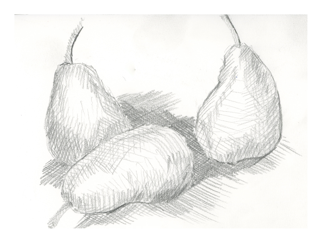
Day 24
During last Saturday’s zoom meeting, Ian talked about cross hatching. I use it a lot in ink drawing, but not in pencil since the idea for a lot of this 30-day challenge is to limit marks to horizontal and vertical. The idea is to create value studies, not finished drawings. Interesting lines do not make for good value studies of light, medium, dark. However, a simple use of lines, cross hatching, vertical, diagonal, horizontal, helps delineate shapes, such as curves. I based this drawing off a study of 3 pears by Cezanne.
Commentary
These studies are making more sense and getting easier to execute so that shapes have shape, even if not always understandable.