Hung Up

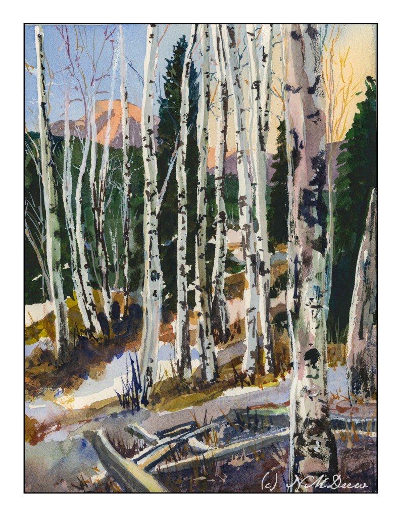
If you have been following me for a bit, you know that I have enrolled in a lot of painting classes. This is a study from my watercolor class, online with Andy Evansen. His work covers a lot of subjects, but I like his ones of the natural world the best. So, lazy me, I stick with his photos of the wilds, but will, at some point, take the dive and do something with buildings and people, and maybe even cars.
I used frisket to create the hard edges of the birch trees and the snowy areas of the logs in the foreground. The other white areas, the snow, is plain paper, no frisket. After the frisket dried, I did the sky, sunlit mountain, and dark background. Then, a bit of the foreground. Finally, the frisket was removed.
When the frisket was gone, I worked left to right, creating the shadows of the birch trees. Upon those shapes I added heavier paint to create the blacks characteristic of birch trunks. Various other details got worked in. White gouache came in handy to clean up some of the birch tree trunks as well as to create the fine branches of the trees toward the top of the painting.
The only thing I have some issues with is the very large birch tree on the right, the one which stretches top to bottom. It is not quite right, but that is something for correcting later on. Despite that, I am pleased with what I am learning, and creating, with all these classes. Painting and drawing and artwork is in the forefront of my mind these days, and it is beginning to show in more “successful” paintings from my viewpoint.
9×12 CP 140# Arches paper; primarily watercolor with a touch or two of gouache. (Maybe 3 or 4 or more….)
The Very Hungry Caterpillar by Eric Carle is one of my all time favorites. Story is good, but for me, the illustrations make it!
We have a wild and wonderful gardener in our family, Am, who got several of us started on milkweed plants. As a kid, we had them in the midwest, but they were very different than the ones which are the dietary staple of the monarch butterfly. She hands out plants to whoever wants them!
This seems to be my butterfly nursery. This is only one of many fat caterpillars – hopefully they are forming cocoons and not getting snatched up by the local wildlife. Sad if they are, but hopefully not, but such is the cycle of life.


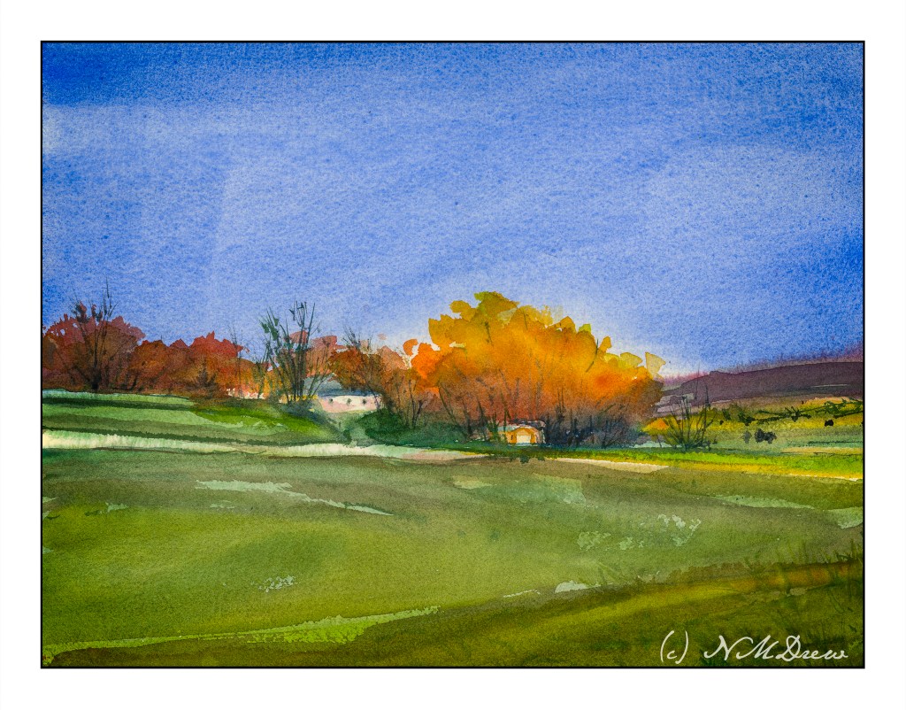
I started this painting a few weeks ago, at the first class at the local adult school with a new teacher. This is from a photo I took some time ago. I was at the bottom of a hill, looking up.
This painting has taken a lot of time – several hours – but the work has been worthwhile. I have been applying the various principles I am slowly garnering from hours at the proverbial grindstone, memorizing techniques, concepts, whatever. For instance, I think this painting actually has a nice sense of depth and perspective – something I have struggled with for a long time. The light on the trees also pleases me, as do other bits and pieces of it.
I have also learned just through doing how to get the heavy body acrylic paint into a more viscous and enjoyable mess to paint with, and that is a big help! It’s a combination of matte medium, water, and the paint itself. I dislike the plasticky quality so often that accompanies acrylic paints, so even thought my colors are bright, I think they moosh together fairly well.
I’ll ask my teacher’s opinion when I see her next week. Meanwhile, here is (to my eye at present) finished work. Below is the photo which is the basis for this painting.

This is my second foray into the series of photos Andy Evansen has posted for studies in the second module of his watercolor class. Here the focus is on value studies.
One of the things I am attempting to do, from both my classes with Evansen and with Ian Roberts, is to work on value. Evansen is a watercolorist and Roberts is an oil painter. Evansen demonstrates the use of a value study on his YouTube channel by creating the middle value(s) as large shapes. Roberts emphasizes shapes rather than things as well. Unlike Roberts, though, Evansen begins his value study with simply the middle value, leaving lights as white. After he has painted the middle values in his painting, he returns to the value study to put in darks and perhaps details.
I managed to do the middle value study, and then painted in what I considered to be the middle values, working left to right as I am right handed. But, before that, I laid in the sky with paper turned upside down as I wanted to have a darker value at the horizon.
I am not sure if the paper is improperly sized, but the paint and paper did not interact well. This is a 300# CP Kilimanjaro paper, natural white, and the first time I have used it. I also wet both sides of the paper, which is a habit I have for watercoloring with 140# paper. I need to see what happens in the future with other paintings.
I don’t really think this painting has a focal point, but that is not the purpose of this study. This module is to paint left to right, working in midvalues and sky first and leaving areas of white or light colors intact. From there, darks.
Evansen has provided a number of photos as references for the basis of a painting, and for values, I think I will work on that and try to apply what I am learning from Roberts and Evansen to create some things worth the time I spend. The reference photos range from landscaapes to cityscapes – animals and people. I will begin with the landscapes and then try the harder subjects for me. Here, there are cow shapes – blobby things. I have also done geese – more blobby things. All thesse blobs have characteristic shapes for the critters.
So! I am dipping my toe into new territories . . . let’s see where it takes me!
