Sketches Amongst the Potted

Today I finally had time to sit down and enjoy this absolutely gorgeous afternoon! The sun broke through the coastal fog and suddenly the world was aglow with light and shadow, not gloom and grey. That is the standard weather along the California coast, May Grey and June Gloom. It is dull and boring and monotonously monochrome.

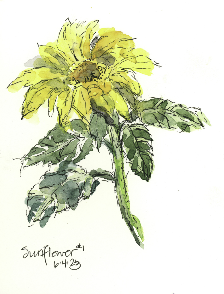
I have a lot of potted flowers on a side patio – my yard is worthless for any beauty at this point. First up, the bigger sunflower in ink and paint.

And then the smaller of the two.

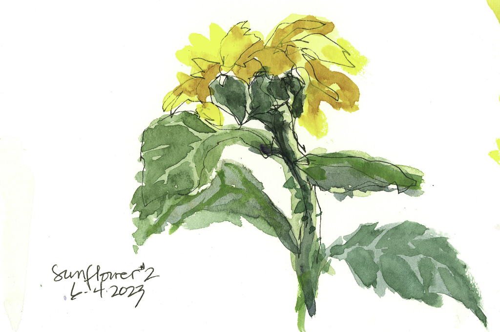
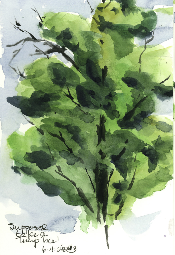
Sunflowers are far harder to paint than I think – don’t know why! From there, I decided to look at the tulip tree peeping over the fence a few blocks away. Here I tried to focus on masses of light and dark. It was a bit hard, but the idea was there. I am using my Schmincke pan paints, and they need to be worked a bit to get dense colors, which can be frustrating!

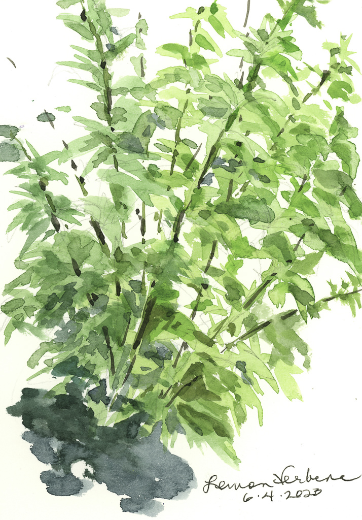
Lastly, my beloved lemon verbena bush. Every year I cut it back, every year it comes back. The leaves were half in the sun, half in the shade. I don’t have any of the delicate white flowers it produces, but the leaves always delight, in shape and scent.

It was fun to sit in the sun a bit. I don’t usually do this, so letting things dry between colors and pictures took a bit of patience. Plein air is not something I ordinarily do, but why not practice it along with patience?

More to come!

Greens Against the Sky – 3

I am having a lot of fun, despite frustrations, with this repeated subject for a watercolor. Today was bit more thought out, and the focus was just planes of washes to create depth, dimension, or at least some attempt at it. I think I am seeing this more and more as an abstract as I work on it – planes of color to suggest the trees along the base of the headland. I dropped a blob of color on the hill that wasn’t in the previous two, and tried to do a bit of a save, but not really successfully. Ah, the joy of watercolor!

Greens Against the Sky – 2

I was not especially pleased with yesterday’s painting. After leaving it alone, looking at it again, it seemed to have all the same values for the most part. Today I decided to look at shapes and values a bit more in depth.

One thing I did was to change the elements of the picture a bit. I cropped off a lot of the left side and then made a composition out of that. Left side, middle value sky against light land and dark trees. Right side, darker land against lighter sky. In the middle, land and sky of similar value, mainly middle.

Obviously, the right becomes darker, and what I attempted to do was to create a shape of dark values with connections throughout the painting, connecting with right side to bottom and then to the left. Darks were connected throughout with the stone walls and into the trees. The dark trees in the upper left shift into a darker middle value with the sky.

I also tried to work with shapes – dark shapes with the middle ground tree being the focal point. The lighter shape is the land and the slope down the hill from the same tree. I have been reading a bit about how to work values to create focus – such as light and middle values as focal points surrounded by dark. The same can be light and dark to focus, and then surround that by middle values. Maybe that is what I was doing with the tree and shadow on the hilltop.

Anyway, my head is spinning. I know what I was trying to accomplish – shapes, values, warm and cool colors. Words are not easy to find to describe, so I will leave you for now with my mental and painterly chaos!

Greens Against the Sky – 1

Over the past two or three weeks – really, since the last posting – I have not had time to lift up a paint brush or pencil. It makes for a good break up to a point but when I look back, some of the stuff keeping away from watercolor and paint have been the less attractive necessities of life! Today I have finally settled a bit, enough to take the time out of the day to see if I could even focus on paint without creating mud.

Apparently I can!

Whenever I have not painted for a bit, I like to dive into something which is comfortable – landscapes – and makes me happy – brilliant greens against an intense sky. The American Southwest can provide it, as can spring in California, but today I went to Pixabay to look at pictures of Great Britain. I love their landscapes, especially the Dales and the South Downs, and anything along the coast. Here, living in dry California, such lushness always appeals to me.

This is certainly not my best work, but it is not my worst. The usual lack of depth dogs me except perhaps for the hilltop in the upper left below the sky. I do like the simplicity of my colors, though; it is too easy to do detail after detail after detail.

Anyway, I spent a few hours somewhere in England, and it feels pretty good.

Fishing Shack

Rockport, Massachusetts, and Cape Ann, has been a destination for artists and tourists for many years, but it is also a place rich in history. Very picturesque, it is fun to comb through old and new photos to see what has changed – and in some places very little. This building – a fishing shack – is an iconic building which be seen in photos past and present. It sits on a rock jetty that has ladders running down its sides so boats can be accessed when the tide is in or out.

The drawing is not really well done here, but I worked my way through it despite my frustration. The left slanting roof is very different than the right side. The stony foundation upon which the shack sits, though, is actually as depicted – it slopes inward and so looks as if it bulges out at the water level. I expect this is the way it was constructed originally. I also had a problem with contrast – as always – and values. I think I will paint it again, this time gridding it out and doing a value study as the subject matter is really interesting to me.

I kinda like my seagulls!!

Fabriano 100% cotton 140# CP; 9×12.