Death Valley is up and off Hwy 395 along the Eastern Sierra Mountains in California. It’s a strange and eerily beautiful place with a lot of surprises and history. It is preserved as Death Valley National Park. The website is filled with great information and it is one of the best places to visit – in the right season, and in the right weather. People die in the desert because they do not understand it, so if you go, be careful!
Sand dunes always amaze me. I am still stuck in my child’s view of the world that sand dunes exist only in the Sahara, and can only be found by riding a camel. Silly, yes!
There are sand dunes everywhere – beaches and deserts mostly, but sometimes in places you least expect. Their shifting shape in the wind and blowing away foot prints or burying ancient cities all lead to a fascination as they make everything seem so temporal.
Anyway . . . . this is an oil painting using a limited palette. Some of the goals in doing this painting included smooth, smooth brushwork for the dunes. I tried to catch the gradual gradations and color changes I saw. In the distance is the flat valley before the towering mountains. For each I used directional brushwork and a deliberate vagueness to create a surreal effect. The mountains, when I look at them afresh, can also be visualized as swirling clouds. Interpretation I will leave to your eye.
A lot of people I follow in the contemporary oil painting world are of the school of “paint it and forget it”. That is easily done if you have a lot of experience perhaps. For me, since I don’t plot out compositions too much nor do preliminary studies, this doesn’t work too well. I am of the wing-and-a-prayer school, using what I do know, and proceeding to let things evolve. Somehow I find that more satisfying.
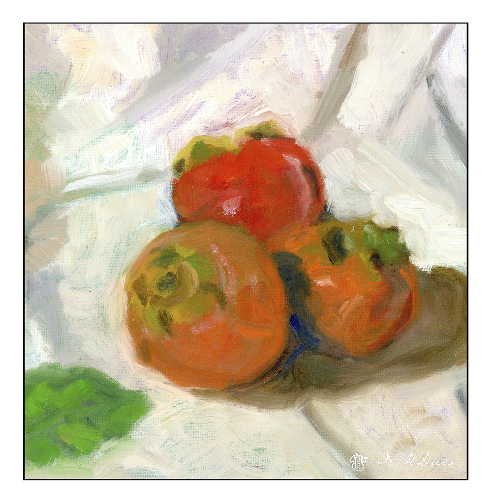
Below is the final (for now) rendition of some persimmons. These are fresh fuyu persimmons which appear in the grocery stores for a few weeks and then vanish. They can be dried and are quite delicious. Hachi persimmons make great bread – a fruit and nut bread. There are even persimmons native to North America and may be found in the southeastern areas of the United States.
It seems pretty well settled as a painting except for the background to the upper right of the persimmons. It is a bit too yellow for my taste, but as I am considering whether or not to leave the overall back and foregrounds on the lightish side, this is something to be addressed once that decision is made.
Prior to this painting, I made an underpainting to set up colors and values and composition. This one I was pondering about – the lower left hand corner needed something, so I put in a persimmon leaf. Then, the painting was banished for about a week, to dry as well as to be able to look at it with fresh eyes.
I didn’t like the leaf. In general, though, I did like the painting. I decided to remove the leaf using the generative background PhotoShop element to remove it. You can see the results below.
Much better!! And so I painted the leaf out with fairly thick paint and made the adjustments you see in the first painting of this post.
Like I said, painting is an evolutionary process in many ways. With watercolors you are sort of stuck with what you put down, so plotting and planning – to a point – is necessary. Being able to anticipate is a big part of watercolor. All other media can be fixed and corrected. Mistakes can be hidden and reworked. I prefer oil to acrylic and gouache as that the paint is very malleable – you can moosh it around, wipe it off, and so on. Acrylics dry too fast for this, even with retardants. Gouache paint can lift (with artist gouache, not acrylic gouache) up and reveal the layers beneath if applied too thickly. Alkyds added to oil paints speed up the drying process and odorless mineral spirits help make oil painting a less stinky medium.
I will continue to paint in oils for the most part. Acrylic paint may provide an underpainting at times. Evolution can be a bit of fun, and these persimmons have been a real delight so far.
Oil paint, 10×10 cotton canvas on board.
Below, click through the paintings to see the progress of with leaf, without leaf, and semi-finalized painting.
This painting took forever! And it is only on a 10×10 inch canvas! I used oils and labored over it for about 3 class sessions while it dried in between. The upper left corner is still drying.
I am quite pleased with it, so will leave you with that.
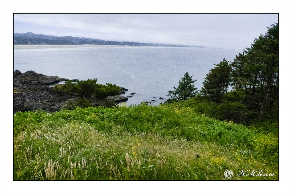
In early July I flew into Bend, OR, to visit an old college friend. We drove to the coast, staying in Newport, at an area known as Nye Beach. One of our outings was a trip to the Yaquina Head Lighthouse. The area was beautiful and we spent some time in the visitor’s center as well as wandering around. Of course, photos had to be taken.
The day was overcast and rather cold and gloomy – I think maybe 60F at the most in the dead of summer! Wind, too. Despite that, it was a great place to be, in part because of the whole area is so different than Southern California, as it is very lush in summer, rather than our drying vegetation and overall beige coloring. Here, the view is from a pathway leading toward the lighthouse, looking across the cove to Newport. You can see the wide expanse of beach, which is very flat, leading to another headland where I think another lighthouse may be found.
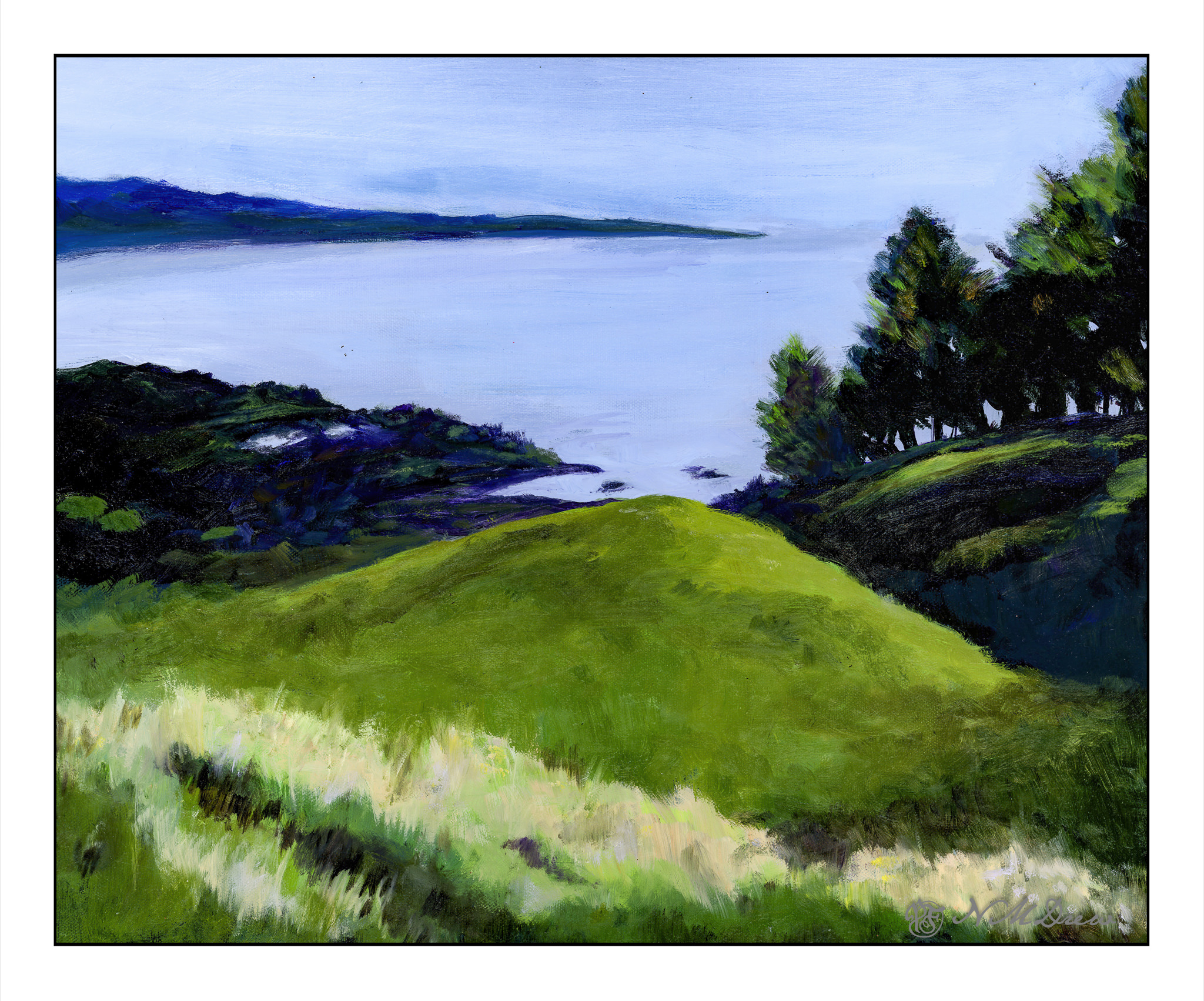
Every Tuesday I spend about 2-3 hours in my painting class. We paint what we want, but have a wonderful pair of teachers who give good advice. Classmates are friendly. Altogether, it is a good place to spend time for many things. I thought this photo would make a good landscape, so I decided to paint it. Initially, I had used acrylics, but it was flat and uninteresting, and the graphic effect I was trying to achieve wasn’t there. Acrylics may be painted over with oils, but not vice-versa, so I already had the colors, values, and mood laid out – and the oils proved far more satisfactory in the end.
Scanning art work is always a crap shoot and I had to do this a few times to get it to my liking. I did manage to capture mood and color. The overcast day dulled the original greens but in post with my photo, I brightened things up to my liking. It may be that the dull colors of my SoCal surroundings really make me push the greens, but the photo was the basis of the painting, even if not reflecting reality quite as it was.
I spent about 3 classes doing this painting, reworking it several times, especially the foreground. In the end, I am rather pleased. It is a bit gloomy and dark, but so is the photo.
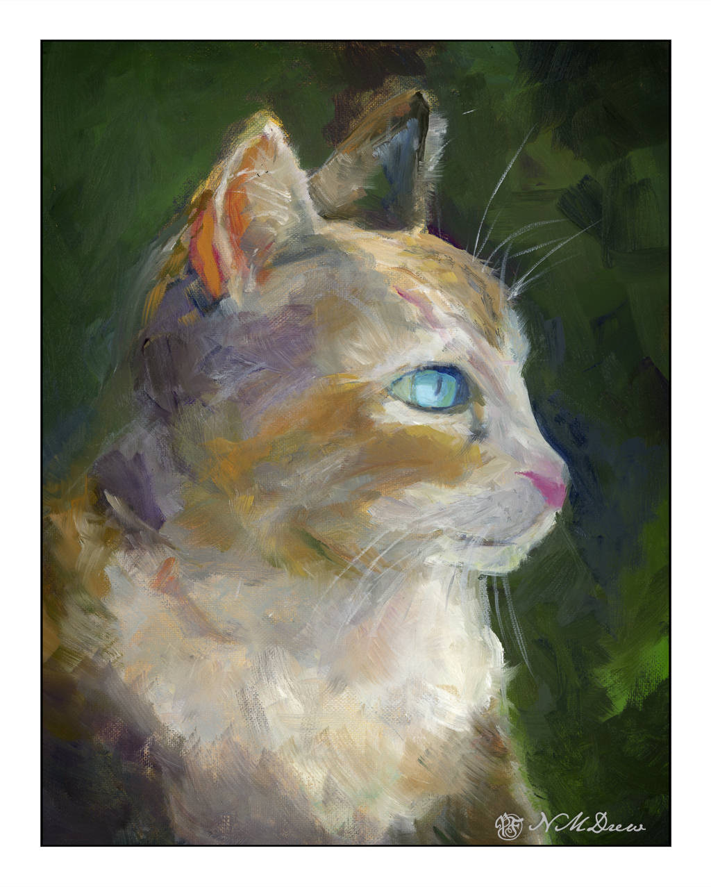
A couple of months ago I took an oil painting class with a very good teacher at the local adult school. He won’t be back until fall, sadly, but I do have another class I am attending and which is also taught by another good teacher.
This cat is one of the assignments we had in the class, a photo provided by him to copy. For me, it was a challenge, but more than anything I wanted to use colors to provide contrast in color and value. This is not something I do easily, but I did accomplish it! Part of it was I just was not going to let the subject matter trap me into copying the photo completely.
I finished this cat up last week – it’s in oil and has been drying – and could get the shape of the cat’s nose when the new teacher reminded me that using a negative shape to create a positive one helps a lot!
And so it does – my chin and nose area were more along the lines of the proportions seen in Egyptian statues of Anubis and Bastet – a narrow mandibular area, and one a bit elongated.
I will say that I am really pleased with this painting. There are a few tweaks I need to do to clean up a couple of areas, but that is something done in a couple of minutes. Painting an animal is something I have never done, and it really was intimidating. Doing it helped me appreciate just the different brushes I could use, such as a rather beat up bristle to create a sense of fur, and a soft, pointed one to create the whiskers. Patience is also becoming more comfortable than not, and this lets me take time to work on this painting at the right time. I also work on other paintings, too, while this one or that one awaits my talents.
16 x 20 (or 11 x 14?) cotton canvas on board, oil paints.