Tuesday’s colored pencil class was especially fun! The title says it all. One of my favorite exercises to date.

Tuesday’s colored pencil class was especially fun! The title says it all. One of my favorite exercises to date.

Nothing more appealing (to some) than a sad, stray kitten, abandoned by all. However, this really is not the point of the study!
I tried the Luminance colored pencils, rather than my usual Prismacolor Premier. It is a totally different experience using them, but not better or worse. I decided to just play with the pencils, not aiming for anything other than just experience. I used a grey-brown Mi Teintes paper and a picture from Pixabay. I laid in a number of layers, ending with a brush and Gamsol (odorless mineral spirits), followed by a few quick lines for whiskers.
Poor kitty, but I didn’t stop there, either. After scanning the image, I really didn’t like the roughness of the cat’s fur. In post, I dropped the black a bit and blurred them together. This made the kitten more opaque. I also pushed colors a bit – don’t remember what I did – and ended up with a picture I prefer to the original. The poor kitty also has lopsided eyes – how pathetic is that?
Anyway, original is below. What do you think? Each has its merits, IMHO.


I am retaking the beginner’s colored pencil class again as well as a more advanced class offered by the teacher later this month. It’s not a bad thing – it gets me out, I meet up with people I enjoy, practice continues. The teacher and group are both excellent, so why not?
Here, an orange, done with about 5 colors. Pencils are Prismacolor Premier drawn upon Stonehenge Legion 140# watercolor paper.
Now that social isolation is lessening and classes can resume in person, albeit with masks and social distancing, I have taken on colored pencils and acrylic painting. To say I have been having a blast is an understatement. Of the two, the painting class is more “me” but the colored pencil class is an adventure into unknown territory.
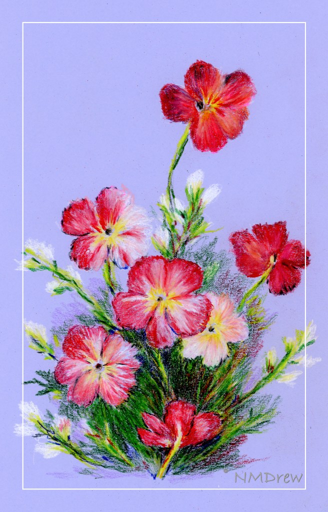
Colored pencil drawing seems like a logical next step to graphite (pencil) drawing, and in a way it is, and in a way it isn’t. With graphite, shades of grey is what makes the picture. With colored pencil, pencils become almost more important because color, pencil type, and techniques used to create effects in the painting / drawing are considerably more complicated than graphite! So, here are some more colored pencil drawings I have done.


Moving on from colored pencil, my acrylic painting class began last week. I chose “intermediate” as “previous painting experience” was the only requirement. Since I paint with watercolor and gouache with some success, it was a logical choice. And what a wonderful group! Many people have been taking the same class for 4 years – quite a tribute to the teacher. The class is not structured, so subject matter is up to the individual. This doesn’t mean a lack of instruction, but what it provides is direction from the student and help in the process. It works for me.
Years ago, like 40 or so, was the last time I worked with acrylics. I didn’t like them at all. However, today my attitude is a lot different. I have time, motivation, and the opportunity to learn from many resources – teachers online and in person. My sister also paints with acrylics and she has been very helpful with all sorts of information and such.

This was my first acrylic painting. I brought it to class with the underpainting done. I used a Daler-Rowney Acryla 3 set with about 10 colors. My approach was quite trepidatious! I pretended I was painting with gouache, which helped, but my fear was destroying brushes and having paint dry in seconds. Neither catastrophe occurred. I used Canson XL paper as the support, taped to a bit of gator board.

The next one, above, is a rendering of a photo I took while walking along the bluffs in Carpinteria, north of me along the coast. I did this on Fredrix, a canvas pad which is primed. I gessoed it, and like the paper, taped it to gator board. Here I used matte medium only, and the result was a really pleasurable application of paint – it was fun to feel the paint get all squished around with the brush. The canvas surface, too, was a pleasure to work on. Once off the gator board, the Fredrix is really like a canvas off the stretcher bars.

For this image, and the one below, I followed a couple of videos by Will Kemp on YouTube. The one above I only used water to thin the paints; the one below was only matte medium. The supports were canvas panels, 8×10, pre-primed but re-primed by me.

Comments from those who have seen these apples like the apple in the lower painting best, but the background in the upper painting best. I agree.

This is my latest painting. It is from a video I watched by M. Stewart on YouTube. The video is an hour long, filled with information and funny comments. I think I learned the most with this video insofar that there was more time and more detailed instruction. The simplicity of Kemp’s videos of the apple helped me get ready for the complexity of the Stewart’s video – both are excellent teachers.
Tomorrow . . . I think I need a bit of a break from painting, but I do plan to continue working on art as much as possible every day. However, sewing does call, and so does the beauty of the outdoors, and . . . life is too full for only one thing!

I have a habit of giving things, especially animals, honorifics. Mr. Frog. Mrs. Giraffe. Mr. Happy Pants. Mr. Grumpy Britches. Lady Dilly Dally.
Yesterday was the last of the colored pencil classes, and I signed up for more. I have totally enjoyed this class because we are not taught “how” but, instead, explore. Different techniques, tools, paper, colors, and so on. That is what has made this class particularly fun, besides the fact that the teacher is very nice, positive, and comfortable to be around.
This is a giraffe (obvious?) done on Pastelmat sanded paper by Clairfontaine. The surface has a bit of grit on it, but it is really, really fine grit. If you have used Uart 800 paper, this is finer. We drew our giraffes, then used Gamsol (odorless mineral spirits) to refine the giraffe by blurring the colored pencil and softening the edges. From there, a bokeh background with squiggles of color and more Gamsol. Finally, I decided to add some leaves and branches straight to the image, no Gamsol.
This image is a straight Epson V600 scan without color adjustment. Unlike Mr. Frog, this one is not layers and layers of colors, paint, and who knows what else. Fun and easy to do, and to scan.
