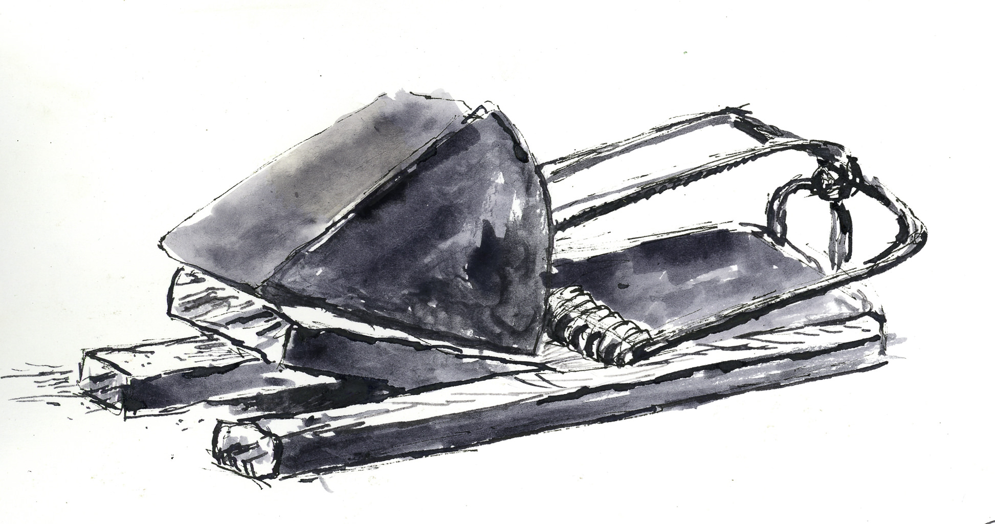
One thing that makes Surowicz’s online YouTube videos, and now his class “Abandoned”, is the fact he is very informative about color mixing. Color is essential to convey distance – foreground and background – light, warmth.
Today I worked through 4 studies of color, using for the greens cerulean blue, raw sienna, burnt sienna, and then some pyrrol red to help temper the green. The neutral color is made up of burnt sienna and ultramarine blue.

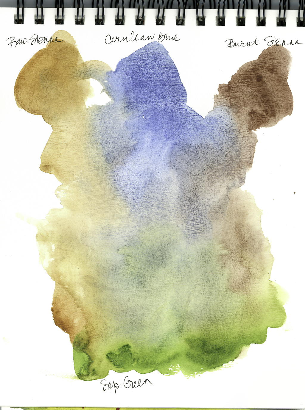
This scan is of the first study. The cerulean and siennas were at the top, sap green at the bottom.
Surowicz says he mixes his color on the palette, which he demonstrates, using large areas to get a lot of color. He rinses his brush, blots his brush, and varies the amount of color on a brush to determine how light (more water) or how dark (less water).
These little swatches show not only color that is strong, but how they merge and blend when more water is added. The studies are for warm and cool greens, but I find it hard to determine them. The following studies are supposed to demonstrate the warmth and coldness a bit more.

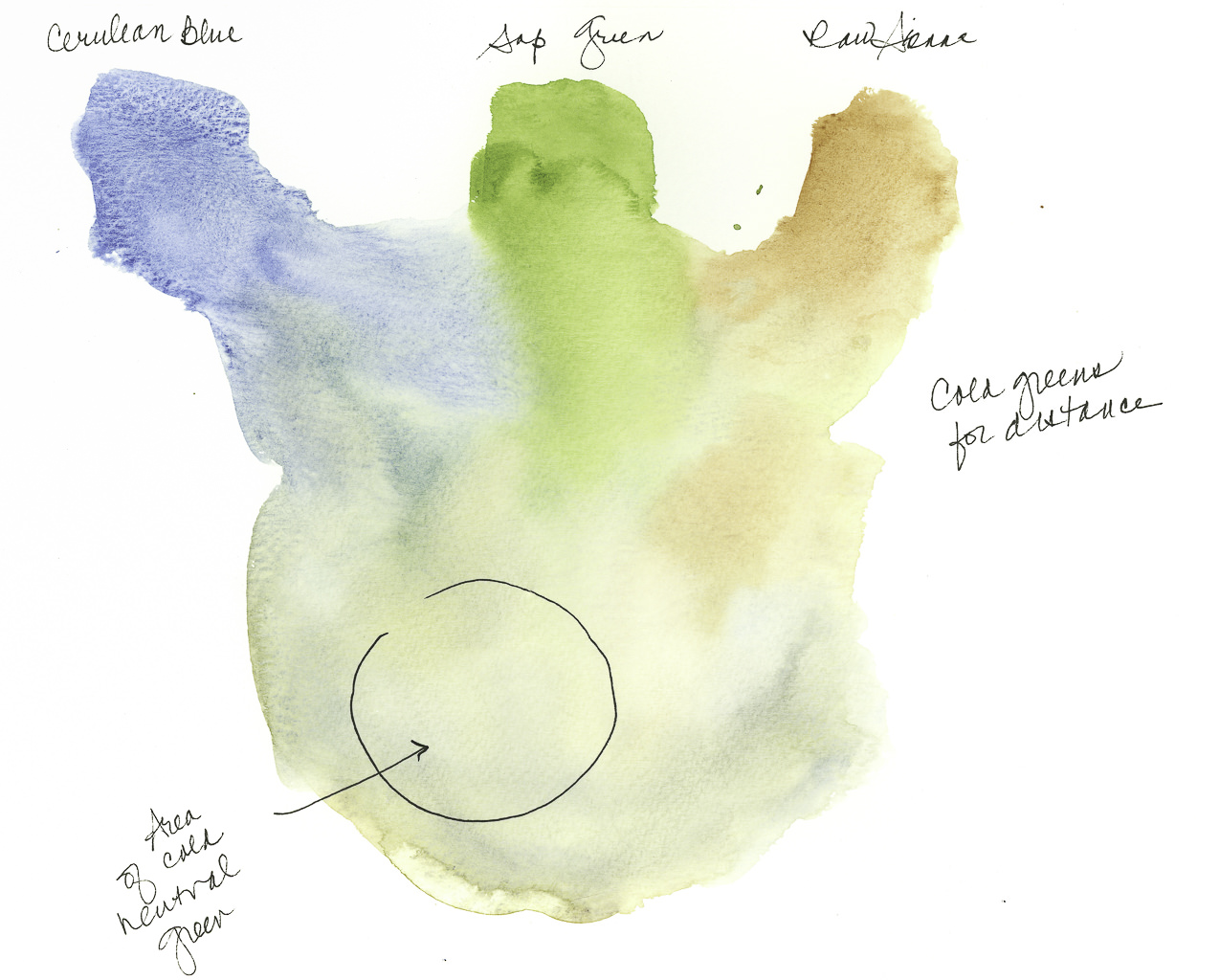
Here we have a formula for a cooler green mixture: Cerulean blue, Sap Green and Raw Sienna. The area circled is demonstrably a cold green.

Here we now have a formula for a warm green: Raw Sienna and Sap Green. The addition of the Cerulean Blue is what makes the mixture cold. The two colors by themselves create a warm green, and the formula is not one I would have considered prior to this class. The Pyrrol Red is used to move the green to a more neutral state (red and green are complementary, and can negate each other when combined), but more green may be needed to return it to green – Pyrrol Red is intense! The red is also warm, so the green remains warm, even if neutral.

Finally, the well-known (at least to watercolorists) combination of Burnt Sienna and Ultramarine Blue. This is one of the most useful color combinations as it can range from pale to almost black. Many watercolorists use the two as a replacement for black.
Thoughts
This section of the class is really valuable to me. I actually can see the warmth and coldness of the greens in these color combinations. That is very important. Conceptually it is very important for me as I lack depth perception and am a magpie when it comes to colors. Subtlety is not in my vocabulary. However, that doesn’t mean I do not have an appreciation of soft colors – they just are not my first choice! The neutral tones with the Burnt Sienna and Ultramarine Blue are some of my favorites, but it was a good study to remember the softness they can achieve as well.
Note
Because of Inktober 2019, I may not get a chance to view “Abandoned” every day and practice, but I don’t want to allow more than one day pass between sessions. I am really into this class and enjoying it a great deal!