This was going to be a nice beachy scene with a white house and rocky coastline . . . but things got out of hand. First, a part of me blames the paper – it is student grade and did not seem up to the task of a lot of large swaths of wet washes. Next, I got frustrated. And I was hungry. And getting quite annoyed. So, I just grabbed stuff and sort of scribbled on it – take that, you nasty painting! Anyway, this is the result, and while it is certainly no beauty, it makes me remember I do want to do some nocturnes – night paintings, night colors. How can that be done?!
Masses of color to create suggestions of shapes? Check.
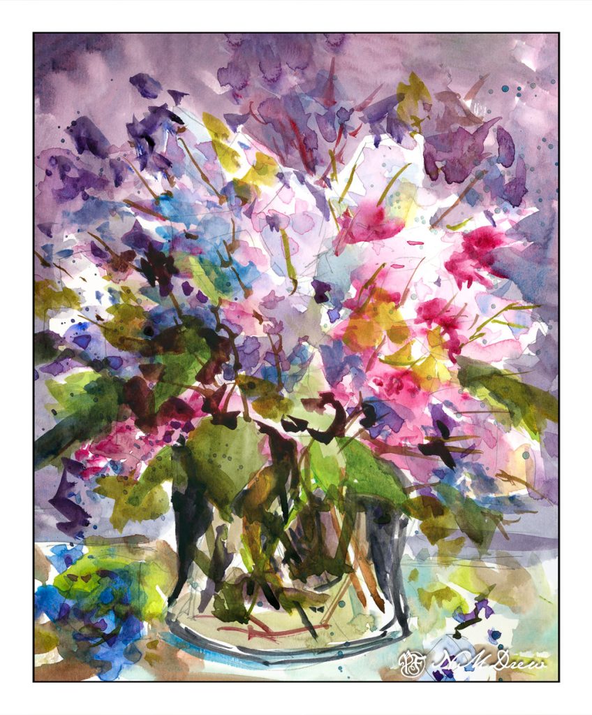
I am pleased with this painting – there are areas which could be better, but is any painting actually “perfect”? Certainly not in watercolor!
Lilacs are one of my favorite spring flowers. Their fragrance is heavenly and a welcome sight as winter fades away. Sadly, it seems hybridizing them for a coastal SoCal climate is not successful.
I drew the flower masses in pencil, creating general shapes. A few pointy leaf shapes. A glass vase. Dropped petals. From there, the rest happened with lighter washes of color, white areas left behind, and eventual deepening shades of lavender, purple, and pink. Some blue, too. It sort of happened all over rather than section by section.
And then my next painting was a complete disaster!!
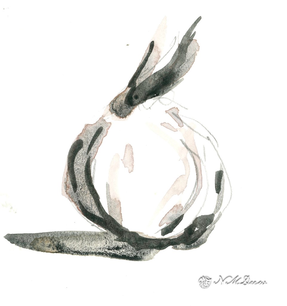
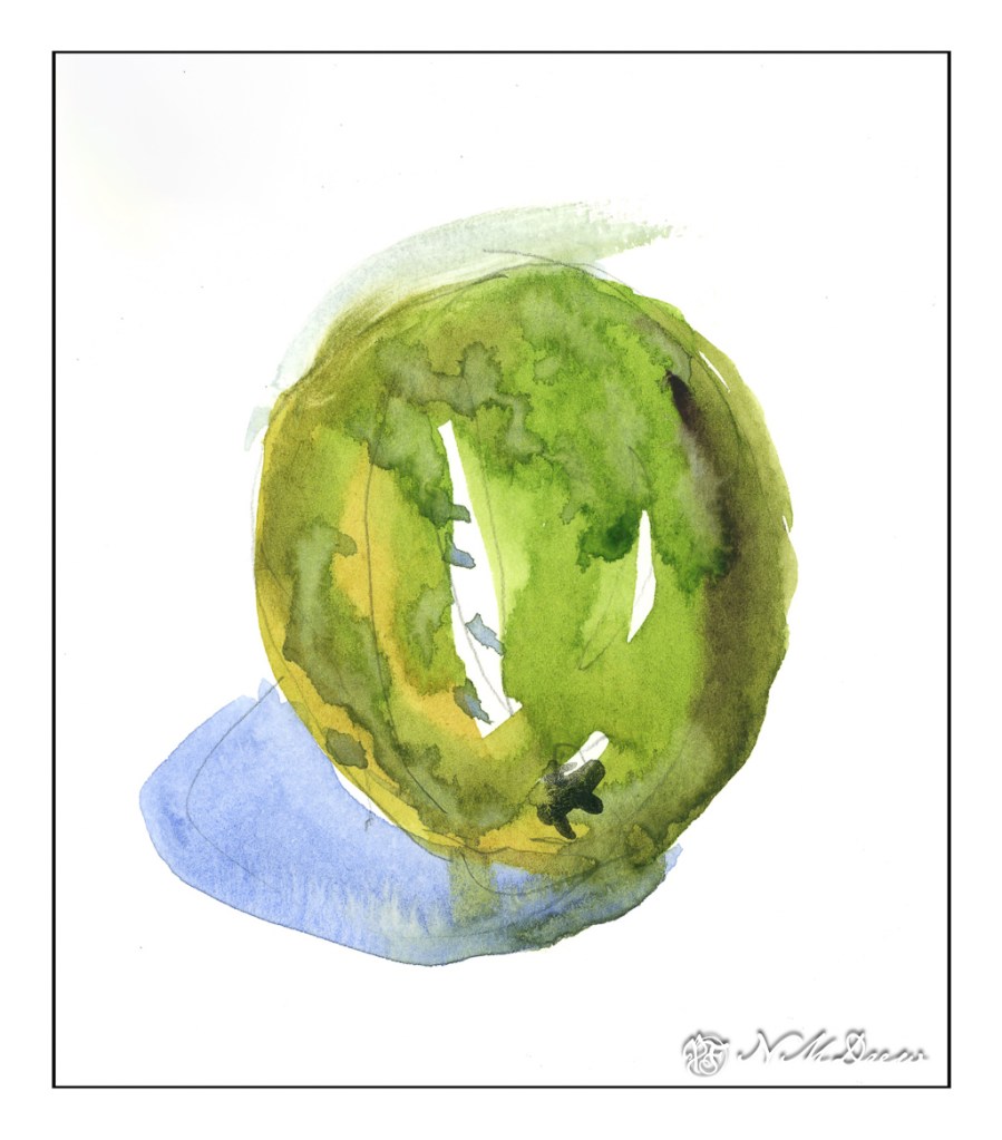
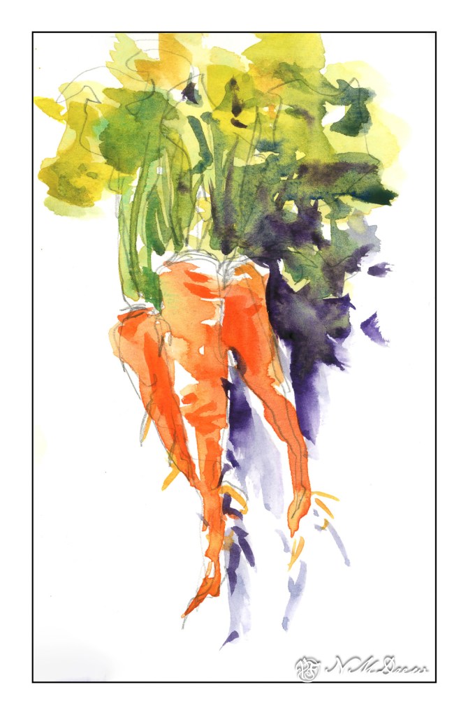
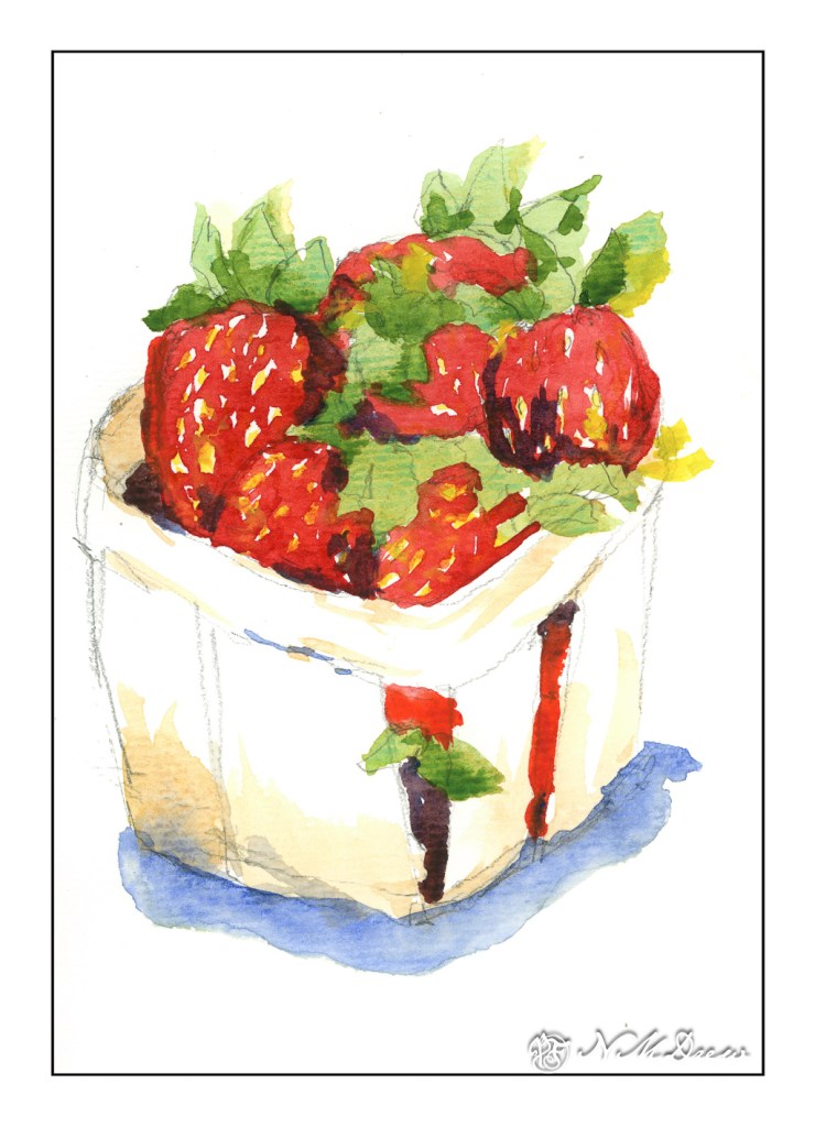
Negative painting can only go so far as other things in watercolor need attention. Shapes and shadows are very important for both realistic and more abstract things if you want to make them somewhat recognizable! Consequently, I have been painting fruit and vegetables all morning, to the point I am feeling crazy. Some subjects are more successful, others not, but the lesson is to paint shapes directly and with some finesse, as well as to create shadows while the subject is either dry or wet. Click through at your convenience for a trip to the market.
One thing I have realized from painting all these things is that patience, once more, and mindfulness, is necessary to get anywhere with these things! What looks spontaneous often is not. Instead, it is made up of experience and thought and so on. Persistence is my only hope . . .
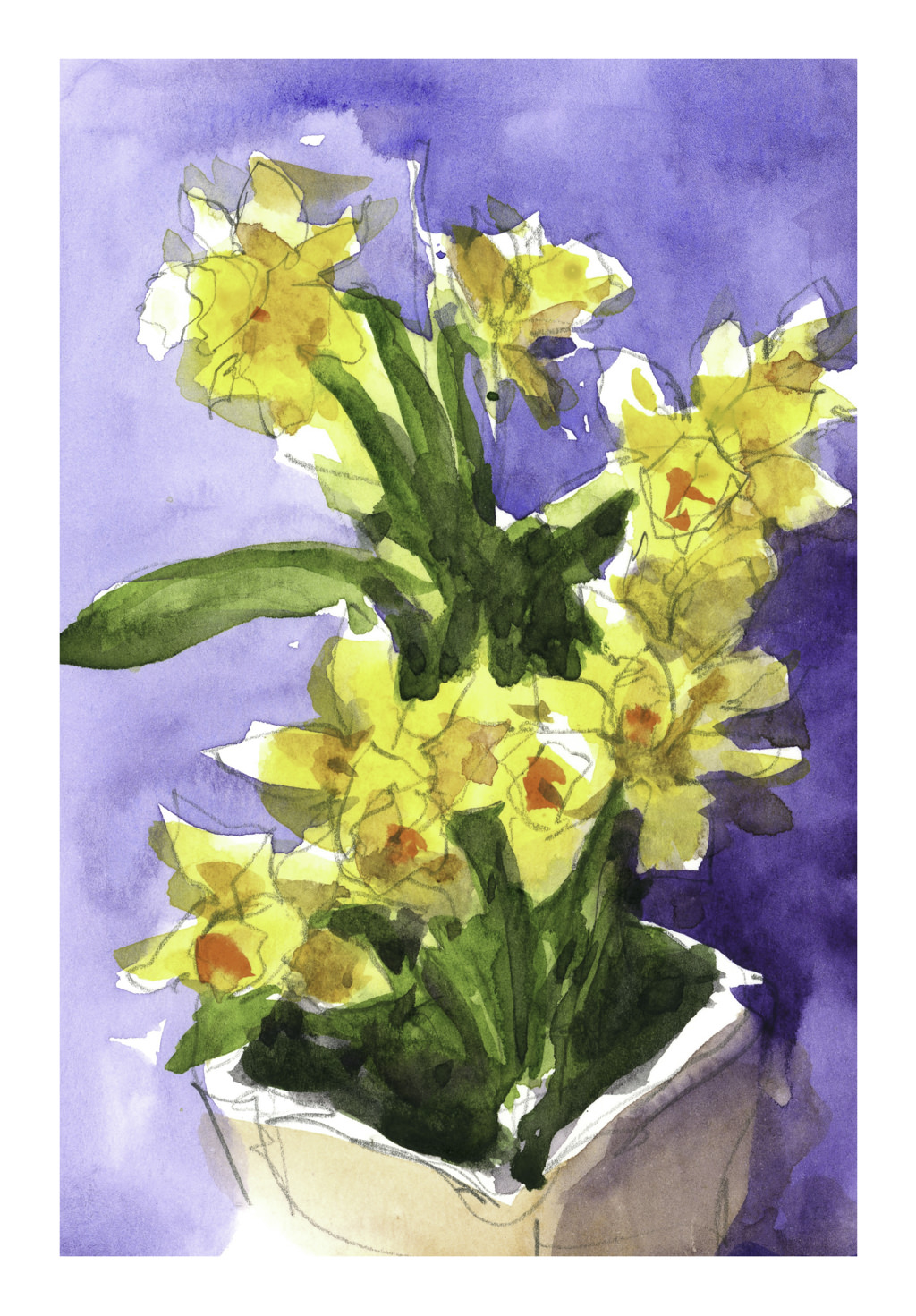
More work on negative painting and flowers. I wanted simple but interesting flowers to paint. Daffodils are perfect for this – beautiful flowers, usually one color, and have a relative simple shape – petals and a tube in the middle.
To begin, I obviously did a sketch, and obviously also depend on the sketch to let the viewer know these are (supposedly) daffodils. I painted the blue around the drawing first – working the dark in against all traditional watercolor rules. Then, the vase. Then a loose blobbing of yellow, darker yellow, some greyed yellow for shadows, and a touch of orange for the centers of the flowers. The leaves happened somewhere, and final daubs of darkestness to accent things.
Not a great painting but it was a good practice piece. Still more practice is needed. Negative painting is getting easier. Color blobs are getting easier, too, to show lighter and darker areas, as practiced in yesterdays press-release brush play. Once more, I am not after a botanical painting with detail, but an ability to have a loose, expressive style that shows things in a painterly manner for what they really are.
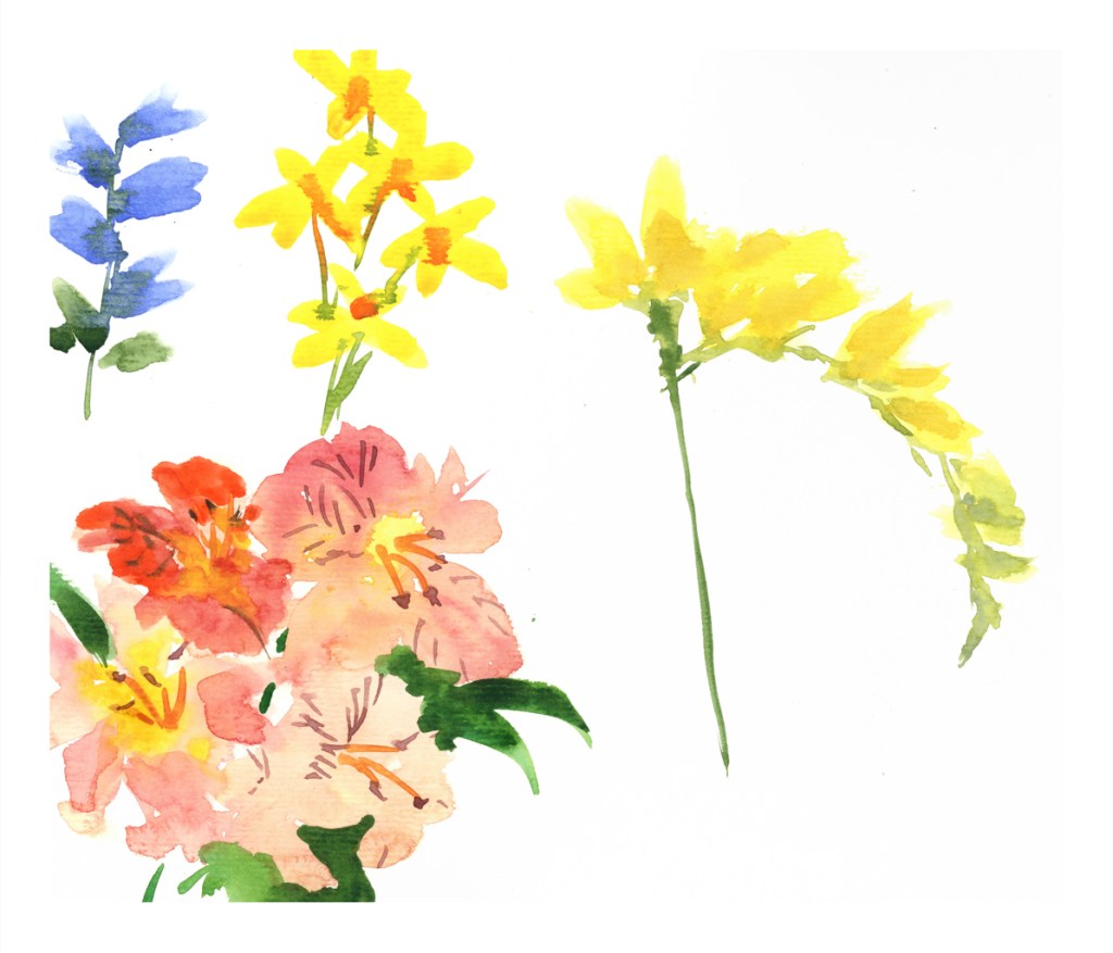
For many years I did Chinese painting and sumi-e (Japanese ink painting), and learned a lot about brush strokes. While the brushes used in these schools of painting are brushes, they are constructed differently than western art brushes and have very different characteristics. However, what you do with them is the same in many instances. Both Chinese painting and sumi-e depend on lines made with ink to create shapes and forms, express colors where none exist, and add color, too.
To create the flowers above, I simply loaded my round sable, placed the tip on the paper, and pressed down gently as I moved the brush from a vertical to more horizontal. The point has more color than the body of the brush and this allows for gradation of colors. The point can be near the stem of a flower and leave a lighter tipped petal at the edge, or be the outer edge and lead to the center; the outer petal is then sharp and pointed. As well, paint can be added to vary colors, provide details, and so on.
Above, the blue flowers have the brush point closer to the stem and the yellow daffodils have the point used as the end of the petal. The freesia, the yellow flower, employs both techniques with extra color added. The alstromeria is done with the pressing technique, extra paint added while still damp, and final lines added with a brush point once the paint was dried.
I tend to forget that brush work is as important in watercolor as it is in ink painting. Shapes and lines and textures are expressed as they are in Asian ink painting. The fact that color is always the most attractive element in watercolor keeps me from remembering the importance of good brushwork.