A Lonely Coastline

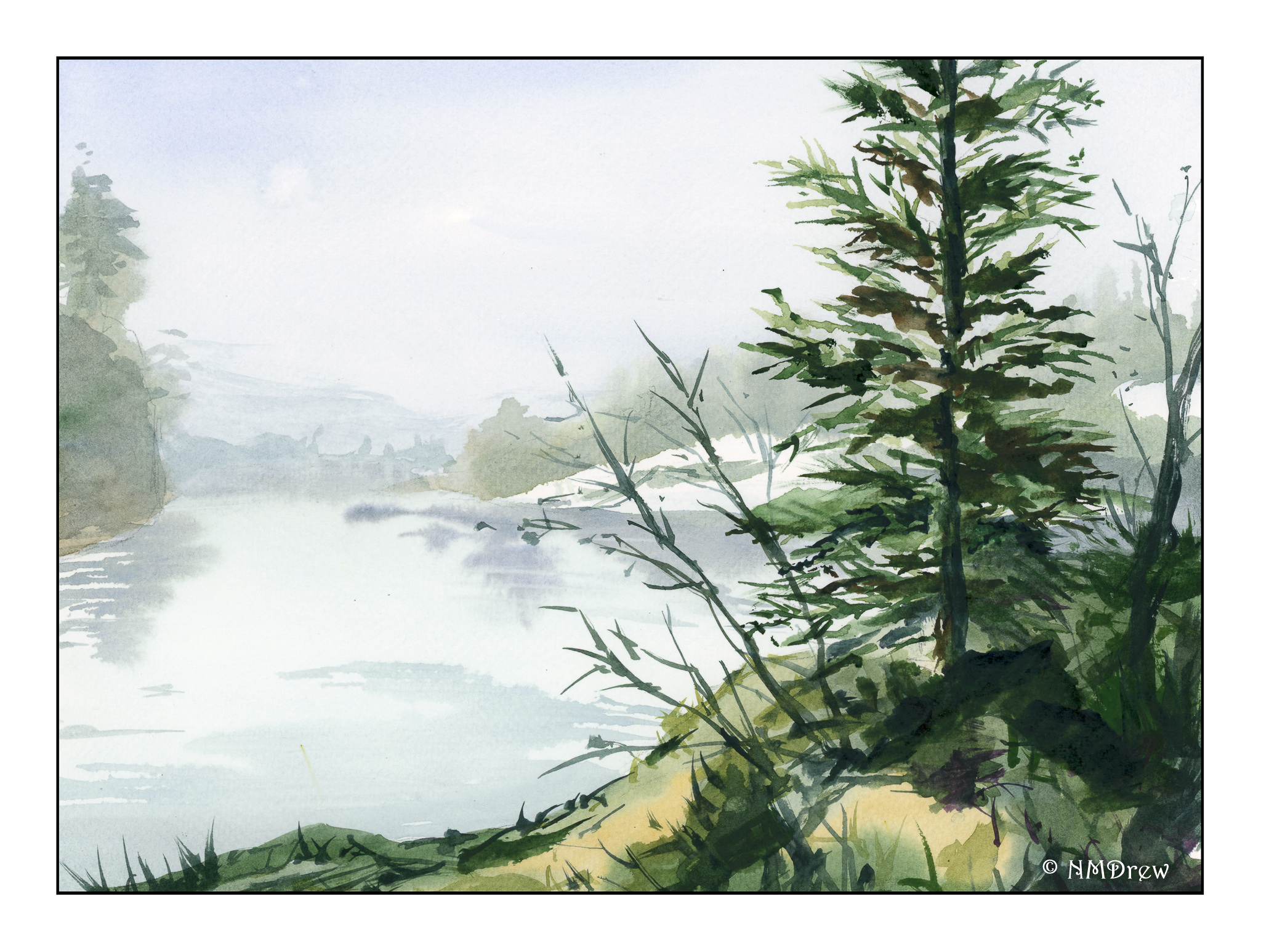
Continuing my water and fog series, and my simplification attempts as well. Here, another deserted coastline, with a few birds.

What is it about a lonely beach? It’s spooky, it’s sad, it’s exciting, and quiet. If the sun is trying to break through, the warmth begins to disperse the fog. Hopeful. Sun. If it is heavy weather, the sky lowers and threatens. Cold. Damp. Dangerous.

Fluid paper, limited palette of ultramarine, sap and Hooker’s greens, burnt umber and raw sienna, and a bit of alizarin. Probably other colors, too – hard to remember where the brush wandered.

Along the Oregon Coast

If you think that the SoCal coast can be foggy, Oregon is by far more foggy at times!  It’s an incredibly beautiful coastline with wide, nearly empty beaches.  Out to sea are the sea stacks, some large, some small.  In clear weather they are stunning, in the fog, spooky and eerie.

Today, a limited palette and paying particular attention to laying down water and thin colors.  Washes are the dominant technique used here.  My little picky brush strokes had to give way to broad ones for the beach and damp sand.  It actually worked fairly well.  Water, water, everywhere!

To the Sea

More work this morning with thin washes and working wet-in-wet.  Not as pleasing as yesterday’s work, but a good experience nonetheless.  A limited palette, some work with glazes, and use of dry brush.  Painted on Fluid paper, which was a new experience – rather different in handling than Arches, but similar to the Fabriano I used yesterday.  DOF isn’t there – I think the water further in the distance should be lighter . . . something to think about.

Foggy Lakeside Morning

California is not all joyful sunshine and playing on the beaches.  Fog is a large part of the coastal environment.  It is known as “May grey” and “June gloom.”  This morning I woke up to it . . . . inspiration for a foggy lake in the frozen (or not so frozen) north.

I’m still focused on water.  Today I wanted fog and water and hoped to use very wet paint thinned to mostly water.  I also wanted to work with wet-in-wet in the attempt to catch the softening of edges, increasingly more blurred and colorless, to denote distance.  A dull, muted foreground with intense color to add to depth of field.  I think it all worked out pretty good.

Fabirano 25% cotton paper, 9×12, neutral tint, sap green, Hooker’s green, phthalo green, Payne’s grey, quinacridone gold, yellow ochre, ultramarine blue, burnt sienna.